Divi Switch
Divi Switch makes customizing the Divi Theme easier than ever. Install the plugin and take advantage of a series of new ‘switches’ in your Divi theme options, each one makes powerful visual changes to Divi. In this documentation, we’ll look at each feature and setting of Divi Switch and see examples of how they work.
Divi Switch vs Divi Switch Unlimited
There are two versions of Divi Switch. The regular Divi Switch plugin has limited usage and includes all of the features except one. Divi Switch Unlimited ha sunlimited usage and adds an option to create a separate plugin. Lifetime and annual members have access to this version. Divi Switch can be purchashed for a single site or 3 sites. It’s available at WP Zone. Divi Switch Unlimited can be used on unlimited sites. It’s available at WP Zone.
Requirements
-Self-Hosted WordPress Installation -Divi Theme by Elegant Themes -PHP version 7.2 or greater -memory_limit 128M -post_max_size 64M -max_execution_time 180 -upload_max_filesize 64M -max_input_time 180 -max_input_vars 5000 -MySQL version 5.6 or greater OR MariaDB version 10.0 or greater. -HTTPS support -Nginx or Apache with mod_rewrite module Remember: For the Divi Switch Plugin to work, you must have Divi from Elegant Themes. If you do not have it you can purchase it here. Once you have it, please install it on your self-hosted WordPress website.
Installing Divi Switch
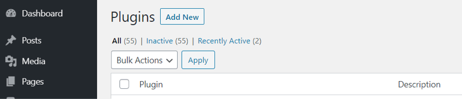
Download the plugin to your computer. To upload the plugin to your Divi website, go to the plugin list in your WordPress dashboard, and select
Add New. 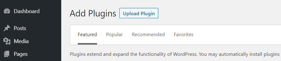
Click Upload Plugin.
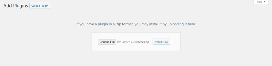
Click Choose File and navigate to the downloaded plugin file and select it. Click Install Now.
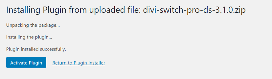 Select Activate Plugin.
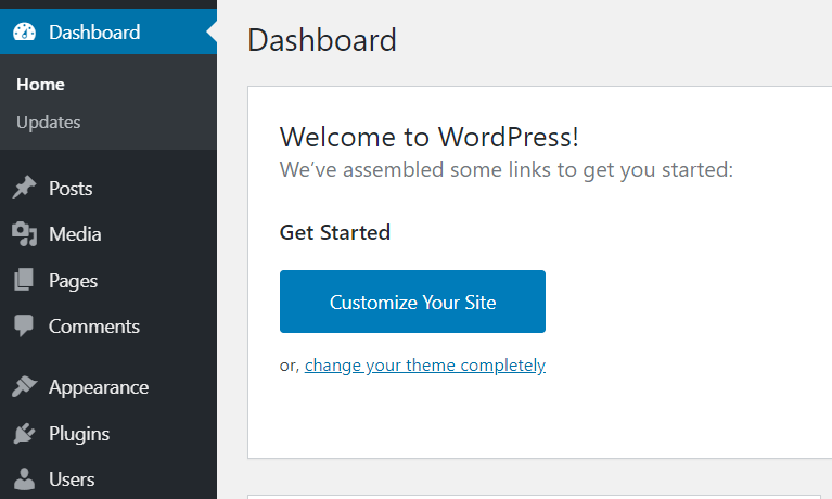
Divi Switch Menu
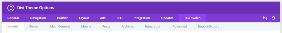
The Divi Switch menu is added to the Divi Theme Options.
Divi Switches
Here’s a look at each switch. We’ll show before and after the switch is enabled so you can see what it does. Once you’ve enabled a switch you must click the save button. Refresh the page on the frontend to see the changes.
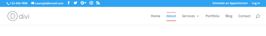
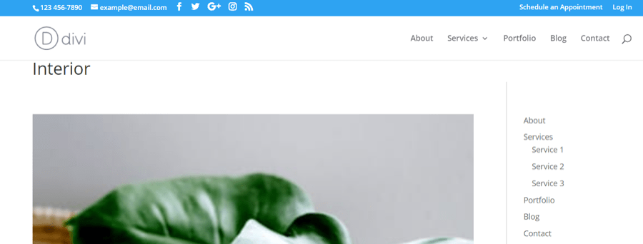
Header
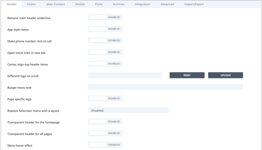
The first tab is Header.
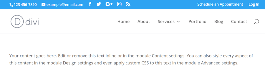
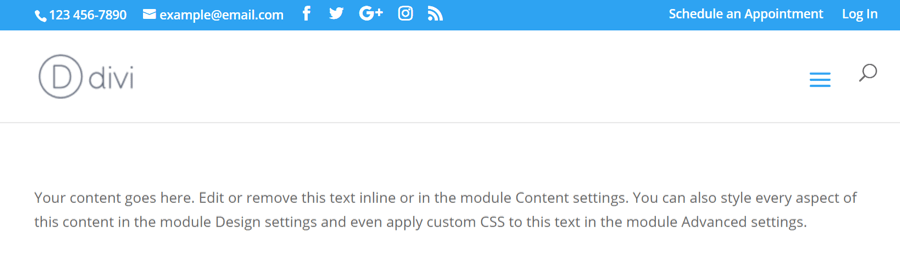
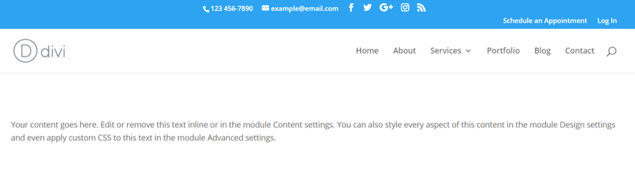
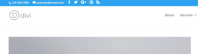
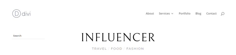
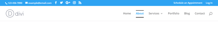
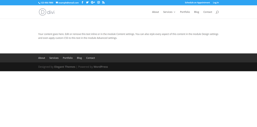
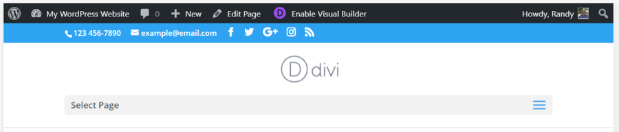
Here’s our example menu before enabling switches.
Remove main header underline
The standard header places a line at the bottom. This switch removes that line.
App style menu
This one places a mobile hamburger menu on the desktop header.
Make phone number click to call
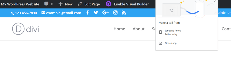
This one makes the phone number in the secondary menu clickable. Clicking the number on mobile adds the number to your phone dialer. Clicking it on a desktop allows you to choose an app to make the call with (as seen in this example).
Open social links in new tab
Social links now open in a new tab so users can stay on your website while visiting your social media pages. In this example, we’ve clicked on the Facebook icon, which opened in a new tab.
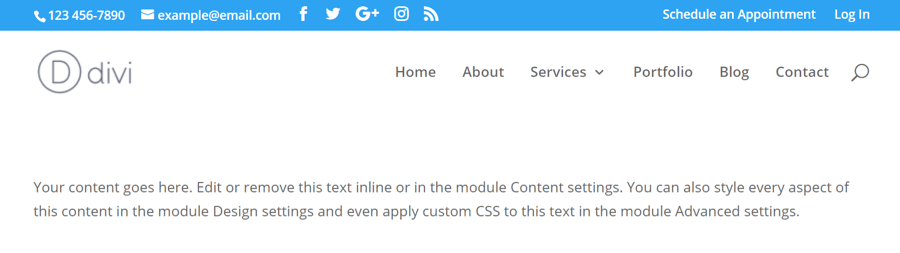
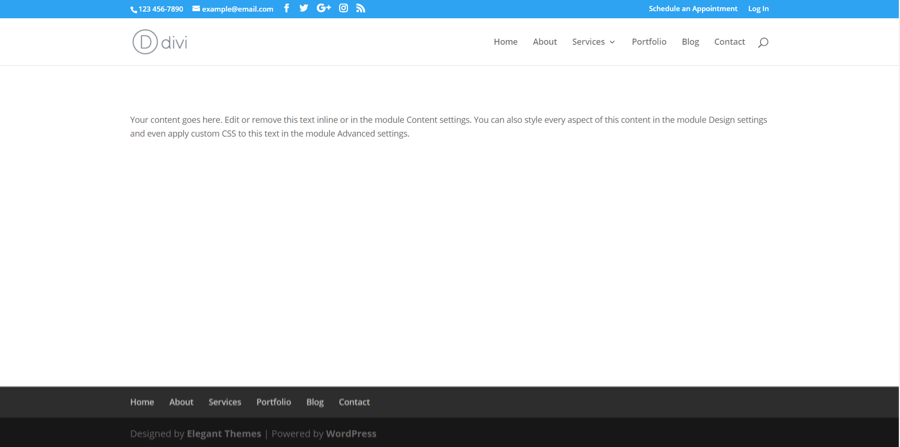
Center align top header items
All of the top header items are now placed in the center rather than on the left.
Different logo on scroll
When the user scrolls, the logo is changed to the logo you’ve uploaded.
Burger menu text
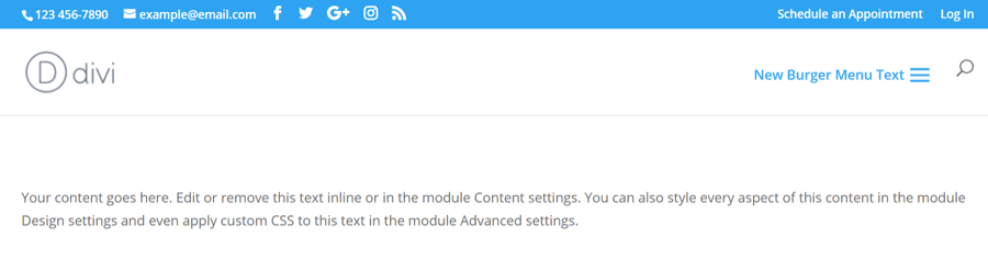
This works with the App style menu. Enter text into the field and place that text next to the hamburger menu.
Page specific logo
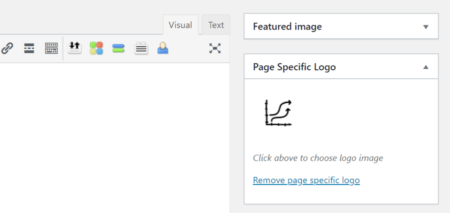
This adds a new feature to the page editor that allows you to choose a logo just for that page.
Replace fullscreen menu with a layout
This switch replaces the standard menu with a mega menu that you can create using Divi layouts. Choose a Divi library layout from the dropdown box and then select the Fullscreen header style in the Theme Customizer under Header & Navigation > Header Format. The menu includes the secondary menu across the top and a close button.
Transparent header for the homepage
This makes the header’s background transparent, removes the spacing, and hides the secondary menu on the home page until the visitor scrolls. All other pages keep the menu as normal.
As the user scrolls, the primary and secondary headers are displayed as normal.
Transparent header for all pages
This makes the menu transparent no matter what the page is. This allows you to create some interesting header and menu designs that work with your hero sections. The secondary and primary headers display as normal when the user scrolls.
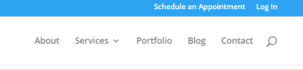
Menu hover effect
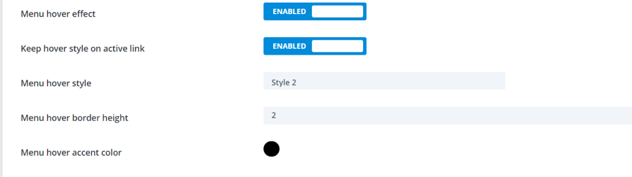
This works with the next few header settings. Choose the menu hover style from the dropdown box. Keep hover style on active link displays that style on the link for the active page. A hover style is required to use the hover effect.
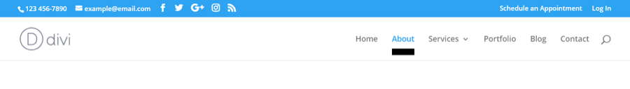
Menu hover effect of active link
This one keeps the style on the active page. The hover style still works as normal on the other links. This is hover style 2.
This one keeps the style on the active page. The hover style still works as normal on the other links. This is hover style 2.Here are the styles to choose from:

Style 1.

Style 2.

Style 3.
Style 4.

Style 5.

Style 6.

Style 7.
Menu hover style
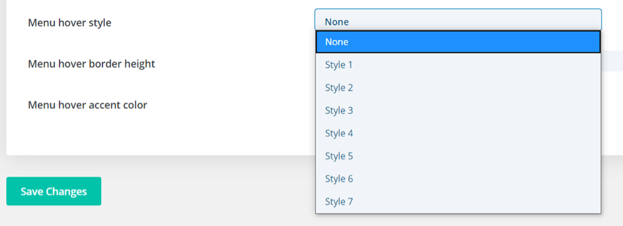
Choose from 7 styles to display on the menu.
Menu hover border height
This changes the thickness of the style. This is style 3. The border height is set to 12.
Menu hover accent color
This changes the color of the style. This is style 5.
Footer
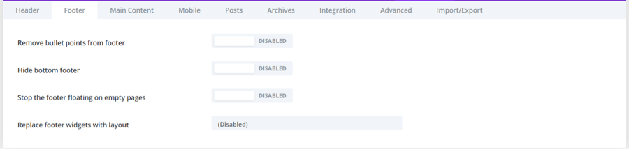
The second tab includes the switches for Footer.
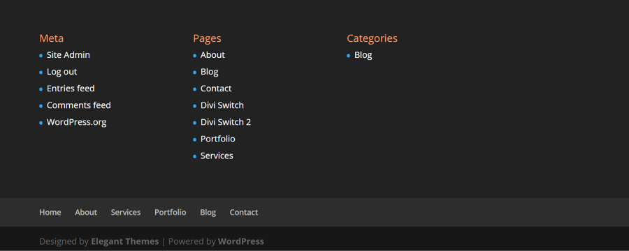
Here’s the example footer before enabling footer switches.
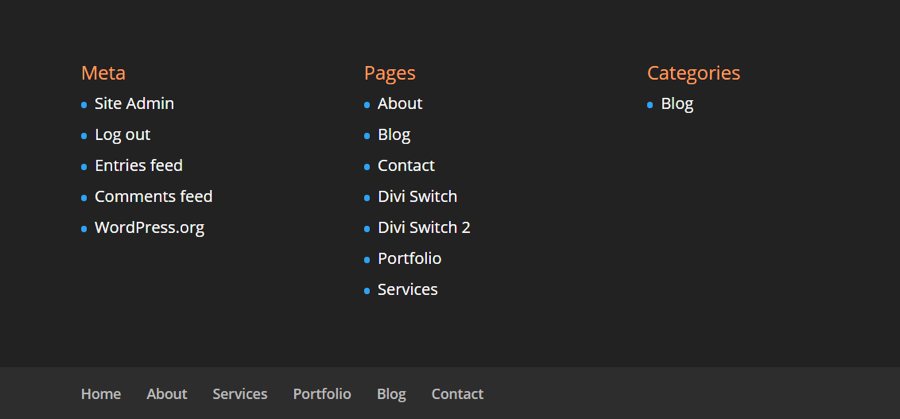
Remove bullet points from footer
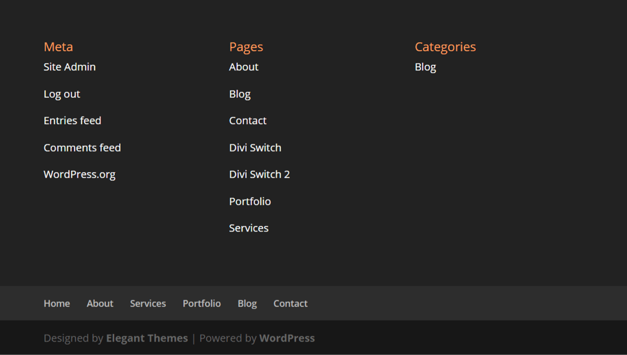
This turns off the bullet points to display the links without them.
Hide bottom footer
This disables the bottom area that normally shows who made the site and that it’s powered by WordPress.
Stop the footer floating on empty pages
Normally, pages without much content cause the footer to float. This leaves some awkward blank space under the footer credits.
This switch keeps the footer at the bottom of the page, even when the page has no content.
Replace footer widgets with layout
This lets you choose a layout from the Divi Library to display in place of the footer widgets, menu, and bottom section. This example shows a Divi layout in place of the default footer.
Main Content
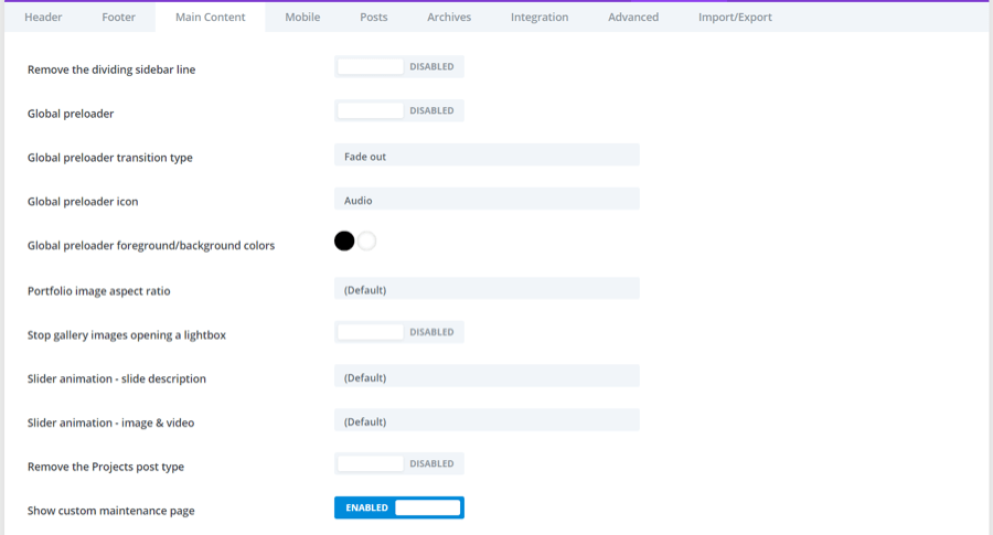
The third tab contains switches for the main content.
Remove the dividing sidebar line
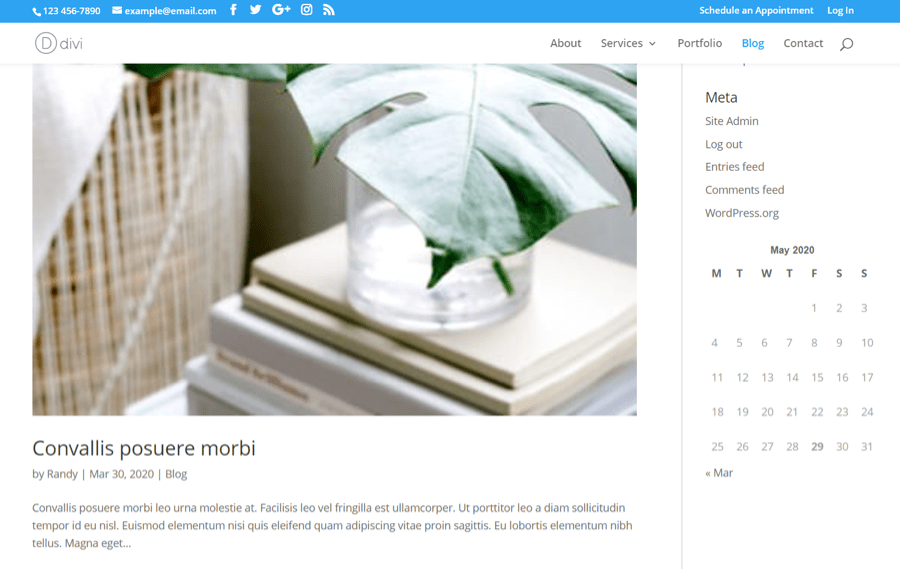
This removes the vertical line that separates the content from the sidebar. Here’s the example with a sidebar dividing line.
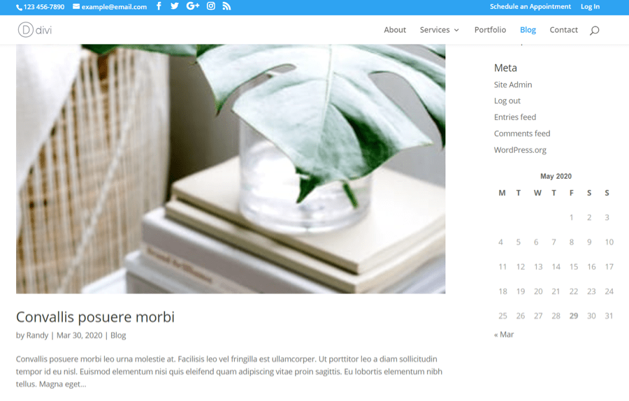
Here’s the example without the dividing line.
Global preloader
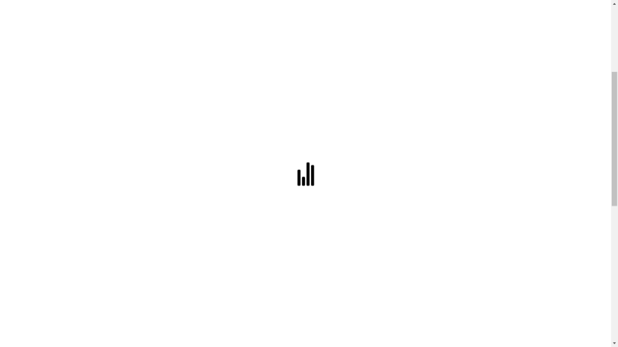
This adds an animated preloader to the screen as the page loads. The next few settings require the preloader to be enabled.
Global preloader transition type
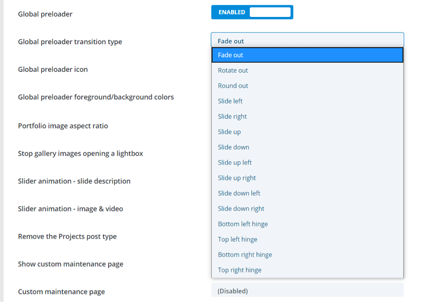
Choose the type of animation that’s displayed at the preloader transitions away to show the loaded page.
Global preloader icon
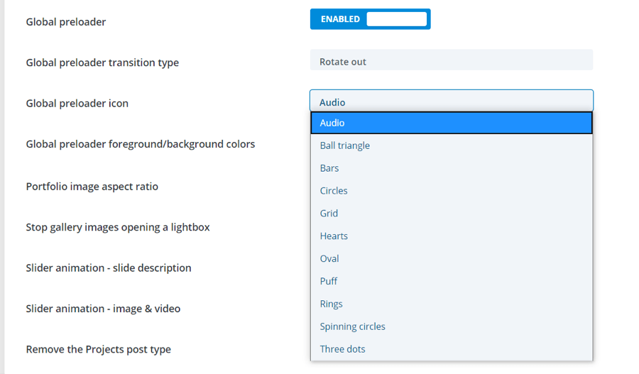
Choose the icon for your preloader form the dropdown box.
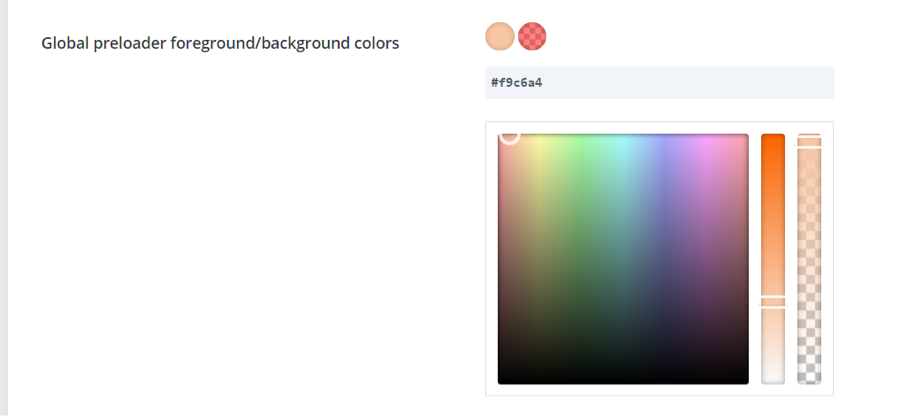
Global preloader foreground/background colors
Change the colors and opacity of the background and preloader icon. Select the color picker of the color you want to change and then select the color, make adjustments to the color and opacity with the sliders, or enter the color’s code into the field.
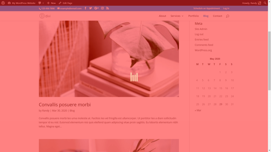
Here’s the preloader with our example colors.
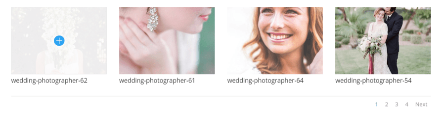
Portfolio image aspect ratio
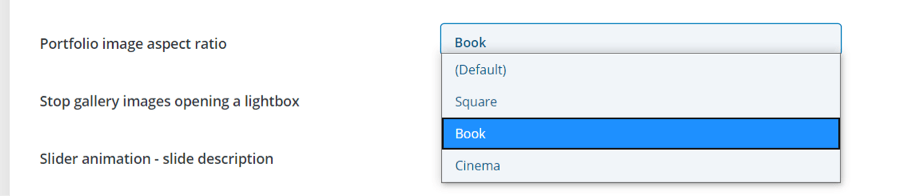
This changes the shape of portfolio images. Choose from square, book, or cinema.
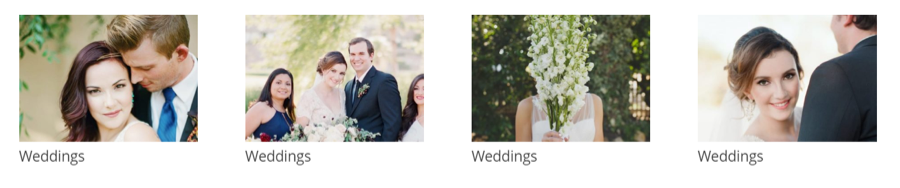
Portfolio images are rectangle by default.
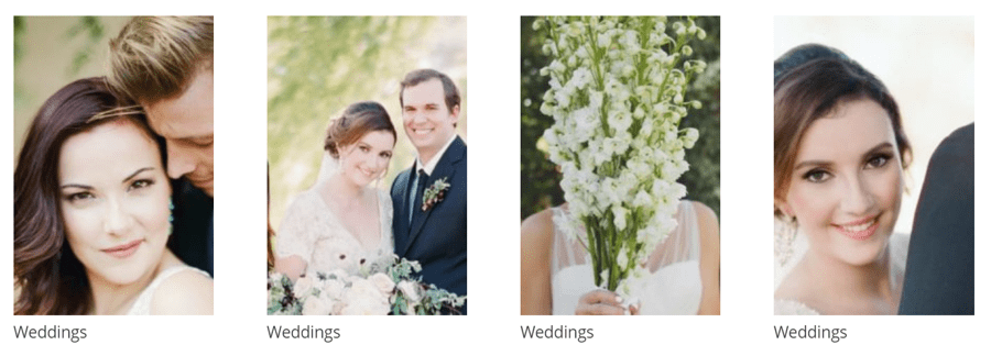
This is Book, which gives images the shape of a book.
Stop gallery images opening a lightbox
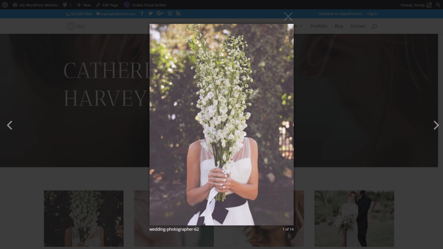
Normally, a gallery image can be opened in a lightbox that shows the website in the background and includes navigation. This is demonstrated in the example above.
This switch keeps the gallery image from opening. We can click on the image, but it will not open in a lightbox.
Slider animation - slide description
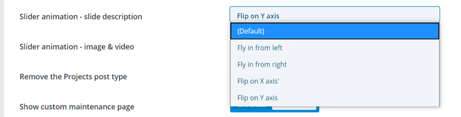
This lets you choose the default animation for the description portion of the slider. Choose between flying in from the left or right, or flipping on the x or y axis.
Slider animation - image & video
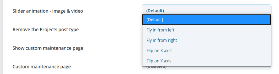
This lets you choose the default animation for the image or video portion of the slider.
Remove the Projects post type
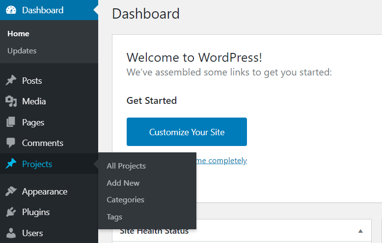
WordPress includes a Projects post type by default. Many people don’t use this post type.
This switch removes the Projects post type for a cleaner dashboard.
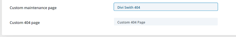
Show custom maintenance page
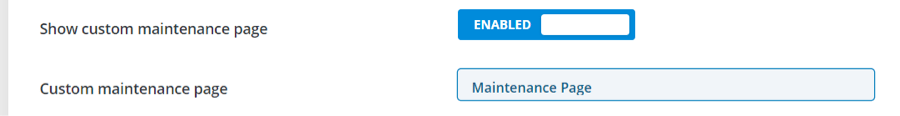
Select any page to display as a custom maintenance page. Anyone not logged in sees this page. It can be designed to hide navigation and provide information about the site. The page can be made with or without the Divi Builder.
Custom 404 page
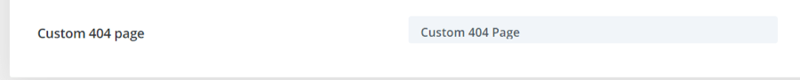
Select any page to use as a custom 404 page. This is great for providing information about searching and categories. The page can be made with or without the Divi Builder.
404 and Maintenance Page Layouts
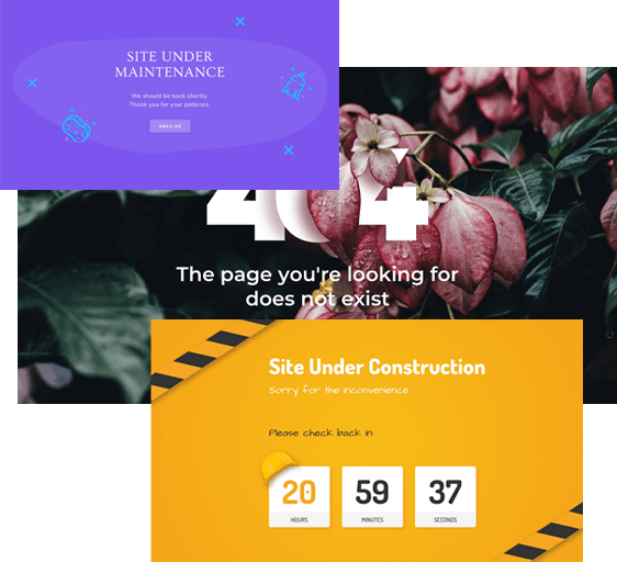
Divi Switch includes 10 404 and maintenance page layouts. They’re JSON files and can be uploaded and customized like any Divi layout. Add your information or use them as a starting point to create your own designs.
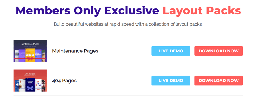
Layouts can be downloaded from the member's area. Unzip the files so they can be imported into the Divi Library.
In the Divi Library, select Import & Export.
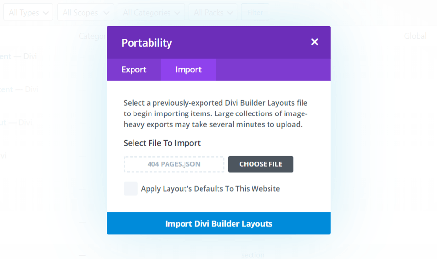
Select Import and click Choose File. Navigate the unzipped folder with your layouts and select the JSON file you want to upload. Click Import Divi Builder Layouts and wait for the upload to complete. Do this for 404 pages and maintenance pages.
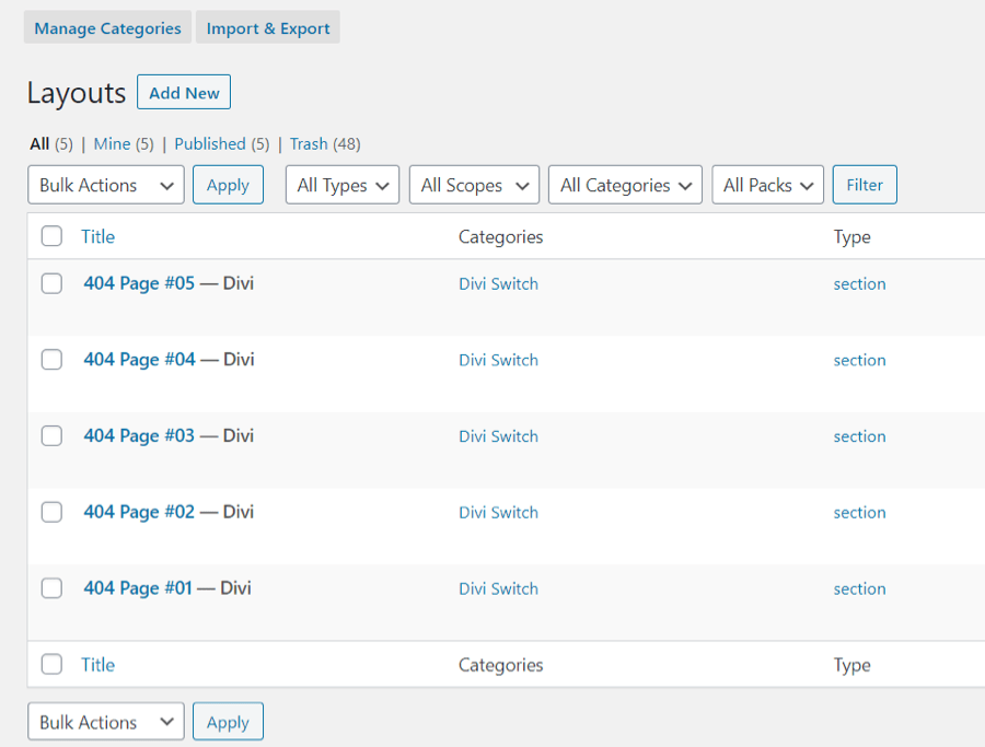
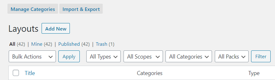
The layouts will appear in your Divi Library.
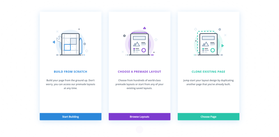
Next, create a new page and select to build it with the Divi Builder. When you see the popup with options, choose Start Building to build from scratch.
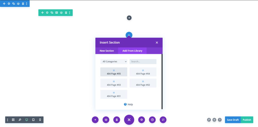
Select to insert a section and choose your layout.
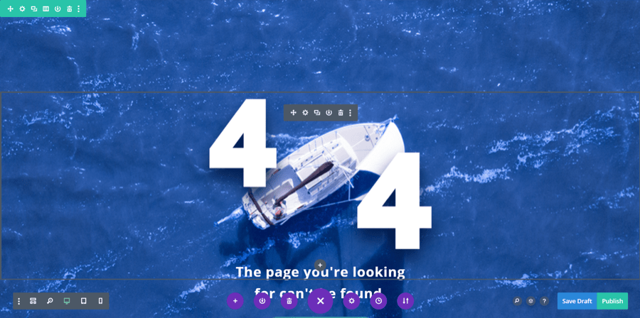
Make any changes you want and publish the page. You can use the standard template with the Divi header, a header you’ve built in the Theme Builder, or use a black template. It’s totally up to you.
Repeat the process for 404 and maintenance pages. The pages will then be available to use with Divi Switch’s 404 and maintenance page options.
Mobile
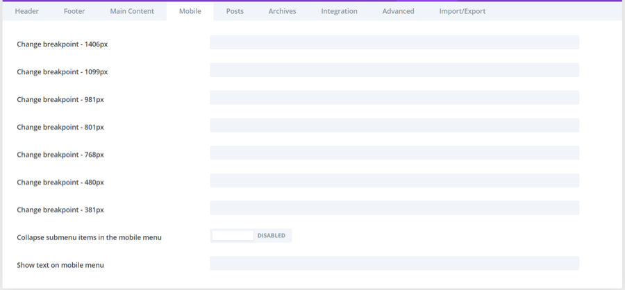 The fourth tab includes switches for mobile screens.
Change breakpoint
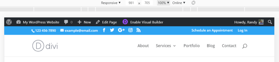
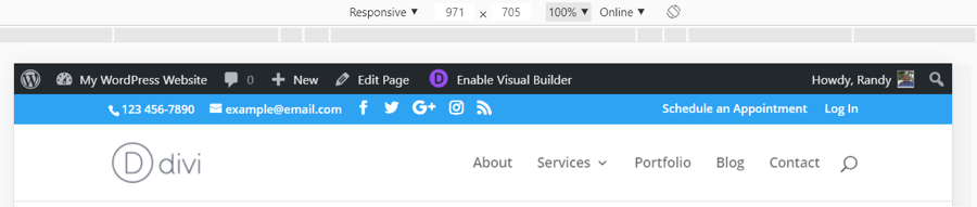
The breakpoint is the lower number of pixels that will show the desktop menu. The menu changes to the mobile menu when the width in pixels is one number lower than the breakpoint. There are 7 breakpoints that we can adjust and they all work the same. This example uses 981, which normally shows the desktop header and 981 pixels wide.
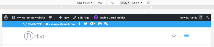
At 980 pixels, it changes to the mobile menu.
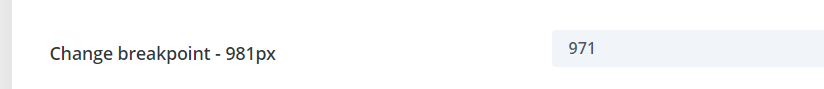
Adding a new breakpoint changes those default numbers.
In this example, the new breakpoint is 971. This width still shows the desktop menu.
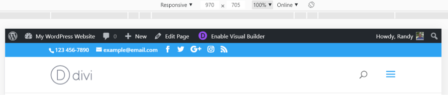
The mobile menu now shows at 970 pixels wide.
Collapse submenu items in the mobile menu
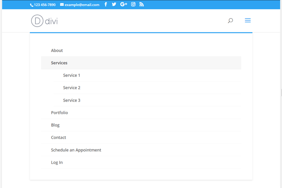
Normally, submenu items are open by default on mobile devices.
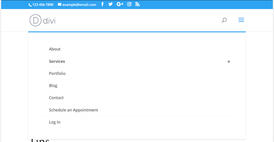
This switch closes those menus by default. A + icon is added to the menu that will open the submenus when clicked.
Show text on mobile menu
The standard centered menu on mobile replaces the links with a field that spans the header and displays the text "Select Page" on the left.
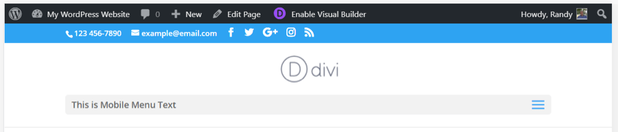
This switch allows you to replace that text with any text you want.
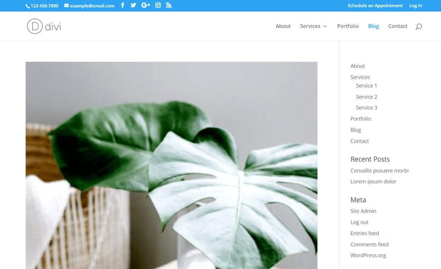
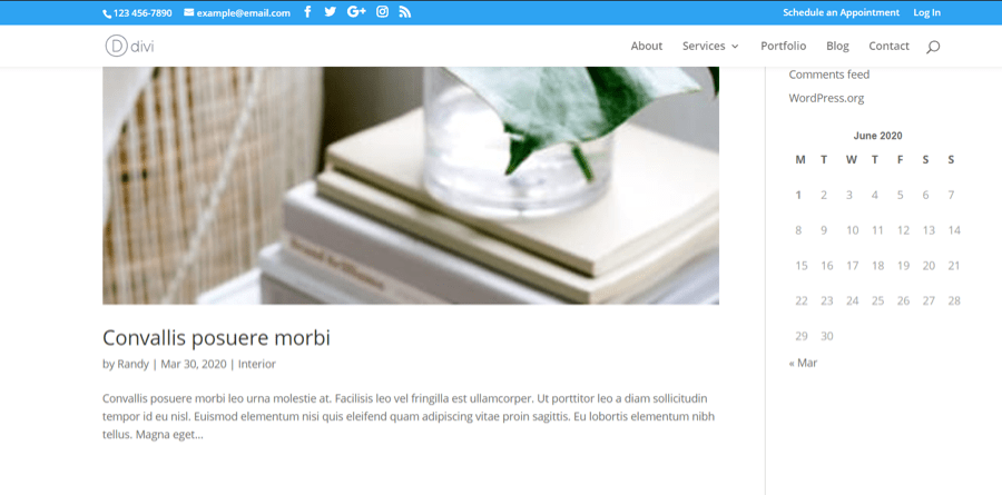
5. Posts
The fifth tab includes switches for posts.
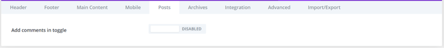
Add comments in toggle
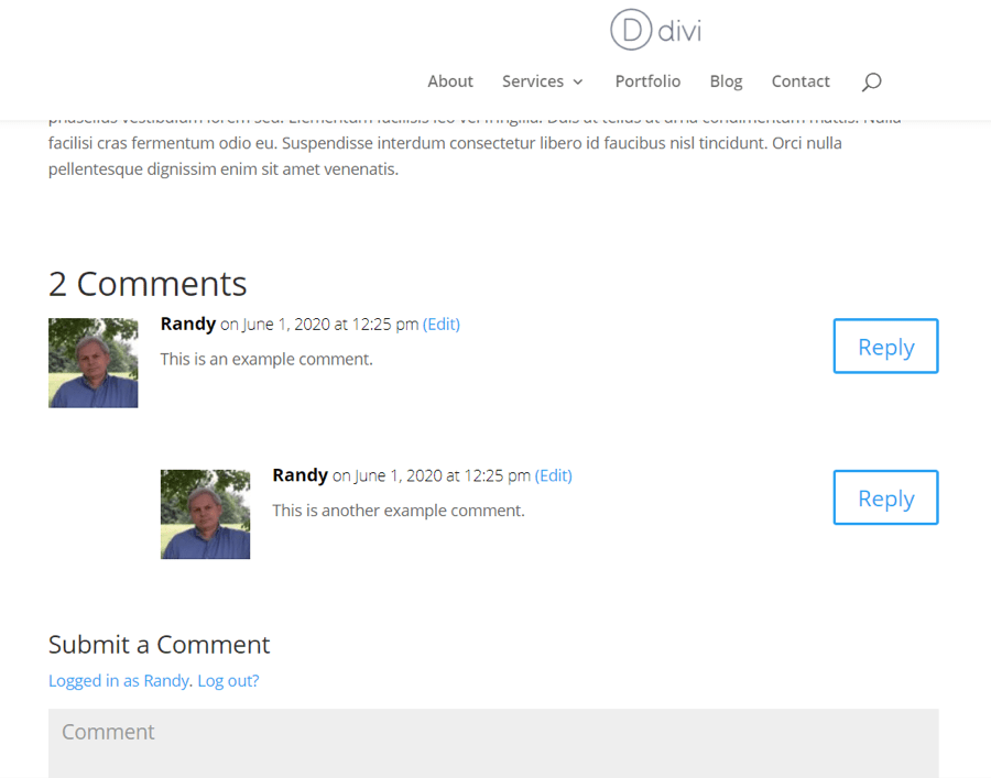
The standard blog post comments and the comment submission form automatically displays and can be read.
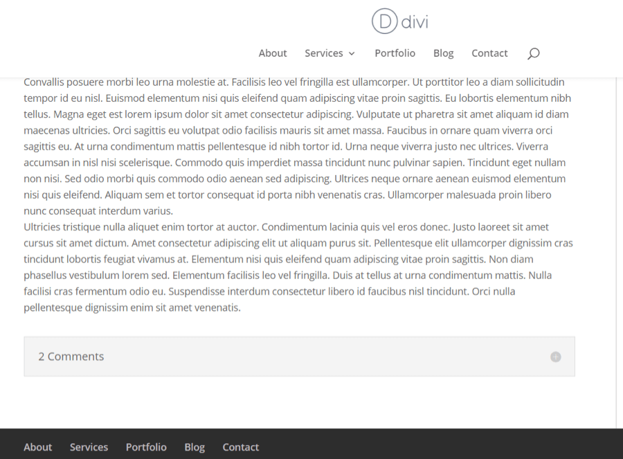
This switch places them within a toggle, creating a cleaner design. This example shows the toggle closed.
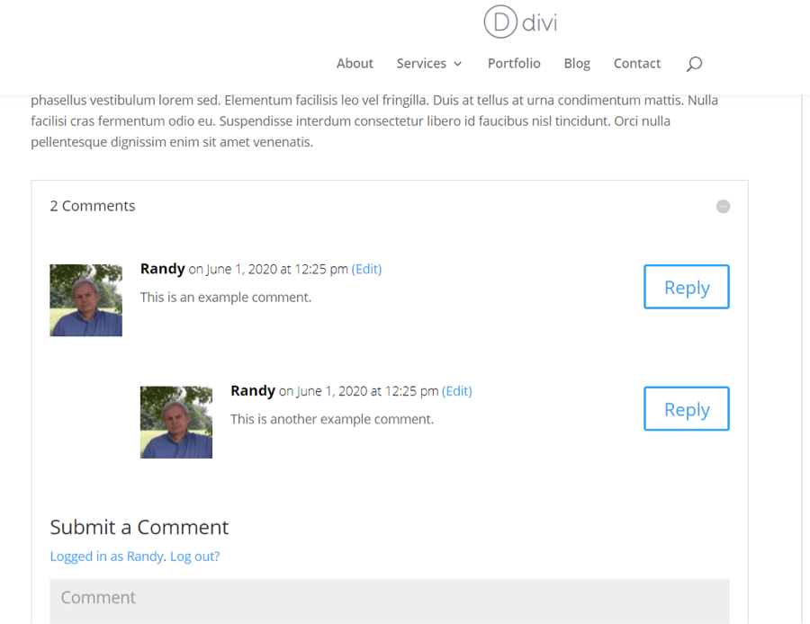
Users can click the icon to open the toggle to read and submit comments.
Archives
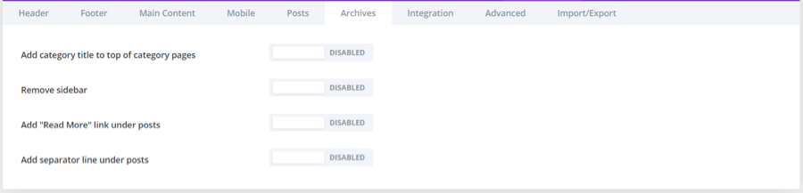
The sixth tab is Archives.
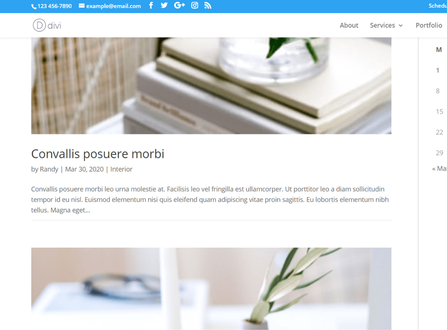
Add category title to top of category pages
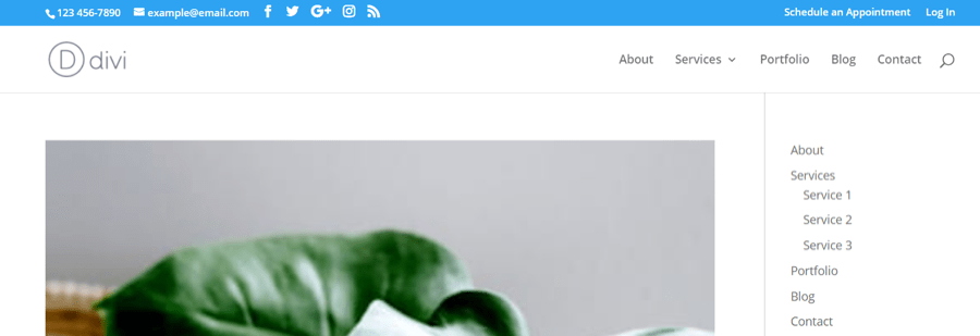
Normally, the archives for the various categories do not identify the category, as seen in the example above.
This switch adds the category name to the top of the archive page. This can be adjusted within the theme customizer.
Remove sidebar
Normally, the archive pages show a sidebar, even if you don’t include widgets.
This switch disables the sidebar on archive pages and makes the blog posts full-width.
Add "Read More" link under posts
Normally, the blog posts in the archive pages display an excerpt, but without a Read More link to indicate where to click to see the posts.
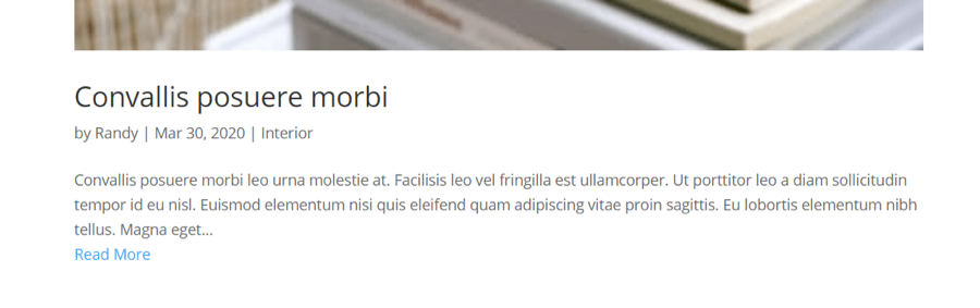
This switch adds a Read More link under each post.
Add separator line under posts
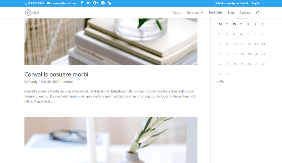
Normally, archive posts are separated by a little bit of space between the excerpt and featured image. They can run together, which can be confusing.
This switch adds a line to indicate the posts are separate. The line can be adjusted in the theme customizer.
Integration
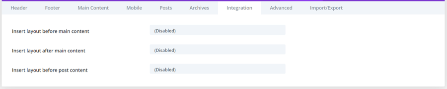
he seventh tab is a layout injector.
Insert layout before main content
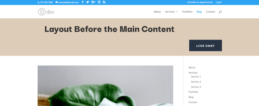
Choose a layout from your Divi library to place above the main content area just below the header.
Insert layout after main content
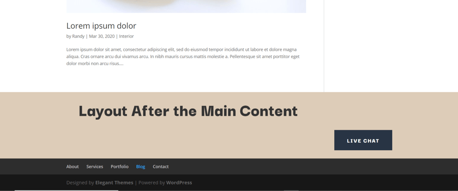
Choose a layout from your Divi library to place below the content area, just above the footer.
Insert layout before post content
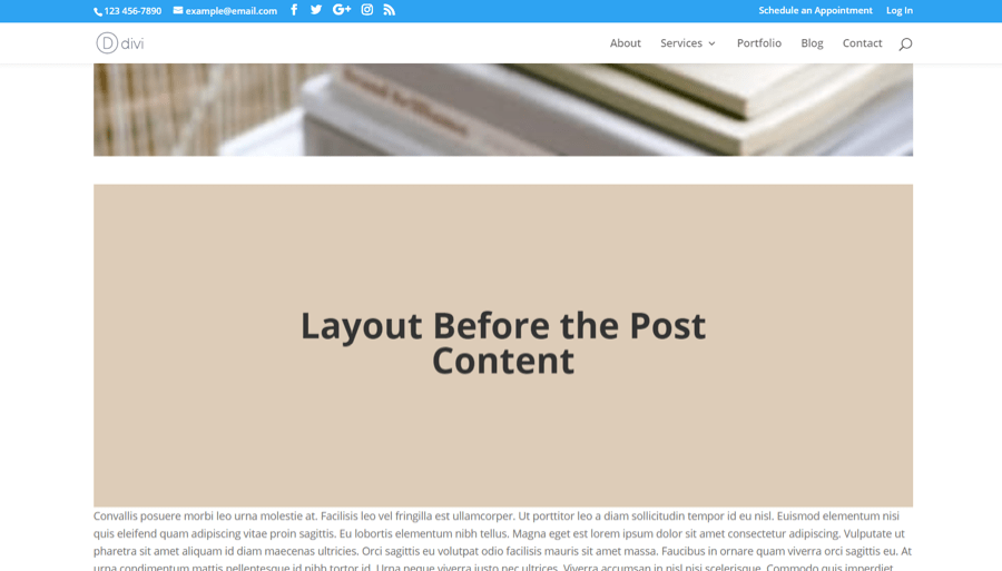
Select a layout from your Divi library to place before the blog post content, just under the featured image.
Advanced
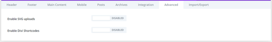
The eighth tab includes advanced settings.
Enable SVG uploads
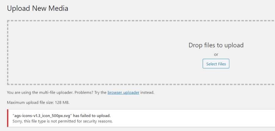
By default, WordPress does not allow you to use images in the SVG file format. It will give the error as seen in the image above.
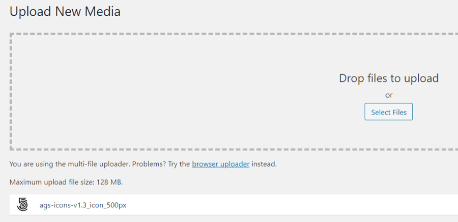
This switch enables SVGs so you can upload and use them. This shows the same file that is now uploaded to WordPress.
Enable Divi Shortcodes
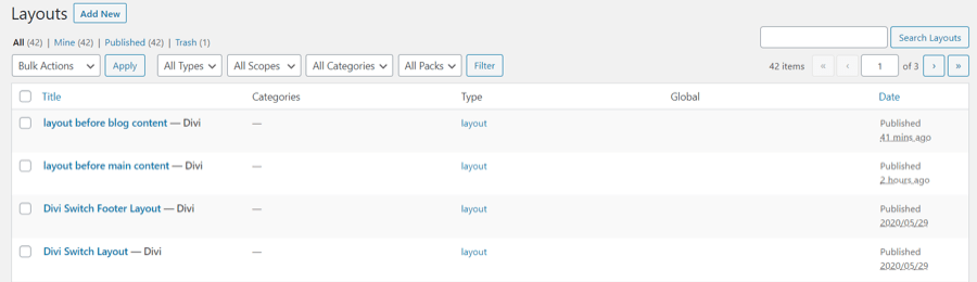
Normally, Divi layouts can only be used with pages and posts (including custom post types). The Divi library displays the title, categories, type, if it’s global, and the date the layout was published.
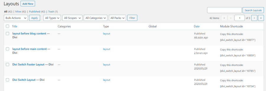
This switch adds a new column called Module Shortcode. You can copy these shortcodes and paste them anywhere you can paste a shortcode. This lets you display Divi layouts within other modules, widgets, PHP files, etc.
Import/Export
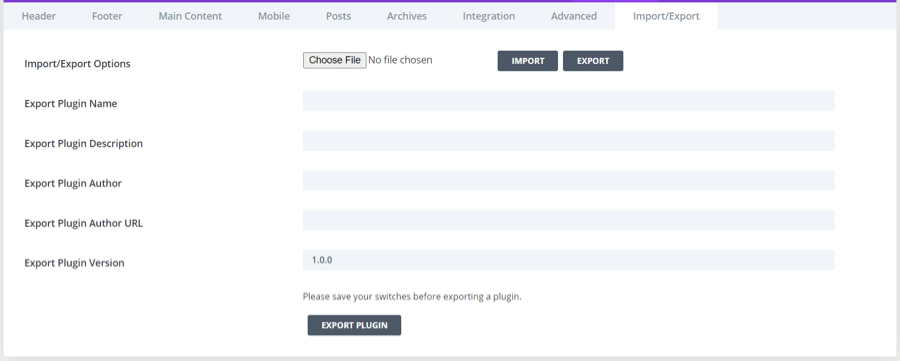
The ninth tab lets you import and export your settings.
Import/Export Options

This lets you import or export a JSON file with your Divi Switch settings so you won’t have to re-setup the same settings everywhere you want to use Divi Switch.
Export Plugin
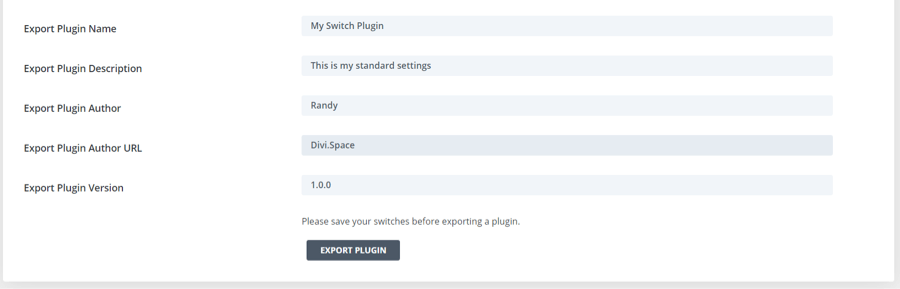
This lets you export your settings as a stand-alone mini plugin that can be installed on any Divi website. This features is only available in the pro version, Divi Switch Unlimited (available with WP Zone Membership).
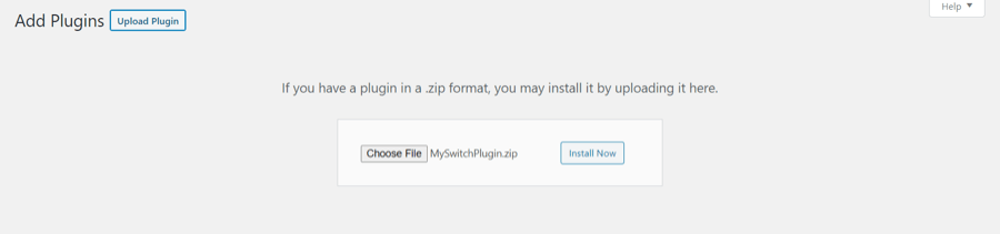
The mini plugin can be installed like any plugin. It does not include separate settings or a menu. It includes all of the features and settings from the Divi Switch installation it was created from. This lets you remove Divi Switch from client’s websites before delivery. Once you’ve made the changes you want in Divi Switch you can export those switches as a standalone plugin, allowing you to remove Divi Switch from a website before handing it over to a client. By adding your own name, description, URL, etc., your custom plugin can have your own name and branding on it so no one has to know you used Divi Switch.
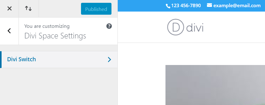
You’ll find a new menu added to the Theme Customizer called WP Zone Settings. Within this menu are the settings for any WP Zone plugin that includes theme customizer settings including Divi Switch.
Custom Mobile Menu Icon
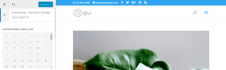
The default mobile menu icon is a hamburger menu.
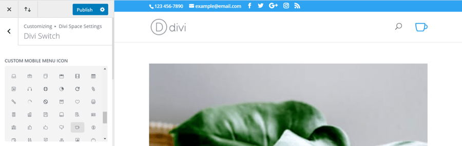
This setting lets you select a new icon from a list.
Header Background Image.
Theme Customizer
Theme Customizer
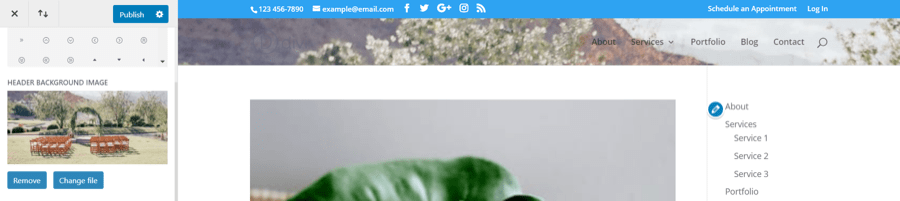
This lets you add an image to the background of the header. This works best with images resized or cropped to the size of your header. The following settings work with the background image to get the exact image positioning you want for your header.
Header Background Image Repeat
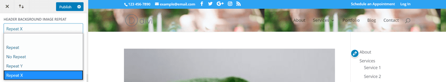
Choose how or if the image will repeat. Choose from repeat, no repeat, repeat y, and repeat x. This works best for images smaller than the header.
Header Background Image Position
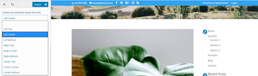
Choose the section of the image that displays in the background. Choose from the top, center, or bottom of the right, left, or center.
Header Background Image Size
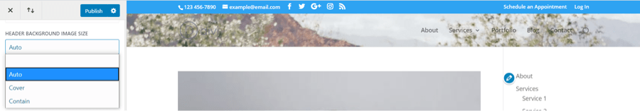
This setting lets you choose the image size between auto, cover, and contain.
Back To Top Icon Size
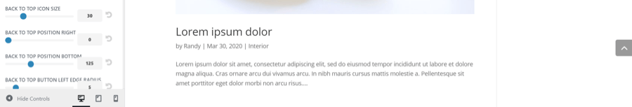
The normal back-to-top icon is an arrow with a square gray background. It’s placed in the bottom right corner of the screen.
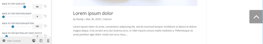
This setting lets you change the size to make it smaller or larger. Adjust the size by using the slider control or enter the number you want. Select the circled arrow to reset the icon back to the default size.
Back To Top Position Right
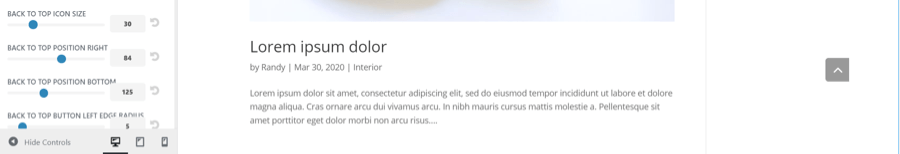
This setting controls the position from left to right. The example above shows the icon moved to the left.
Back To Top Position Bottom
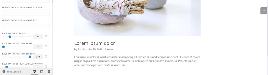
This setting controls the position from top to bottom. Set it anywhere from the middle of the screen to the bottom of the screen. This example shows the icon moved higher.
Back To Top Button Left Edge Radius
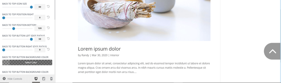
This setting adjusts the radius of the left edge. Make it as square or round as you want. The size has also been increased in this example to make it easier to see.
Back To Top Button Right Edge Radius
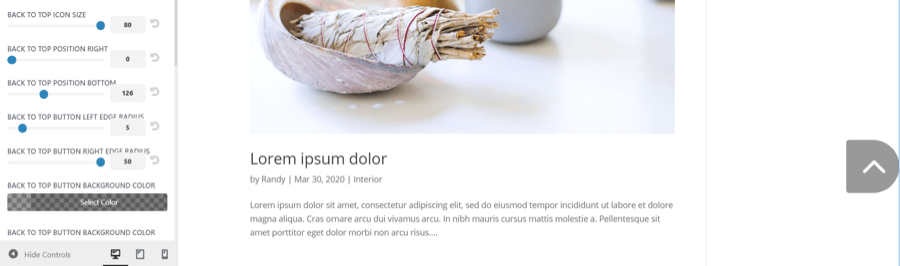
This setting controls the right radius. The right and left settings can be used together to create a square, oval, circle, and more.
Back To Top Button Background Color
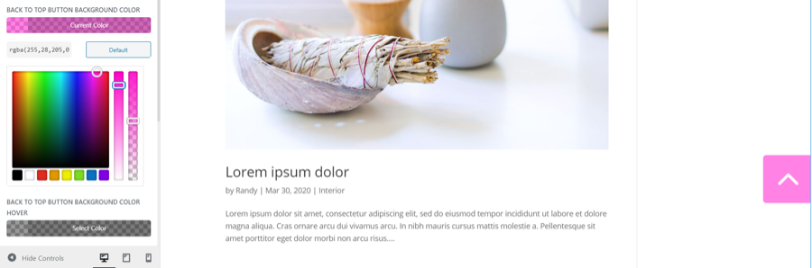
This one adjusts the background color and opacity of the icon. Choose colors from the picker, use the sliders, or enter the color code.
Back To Top Button Background Color Hover
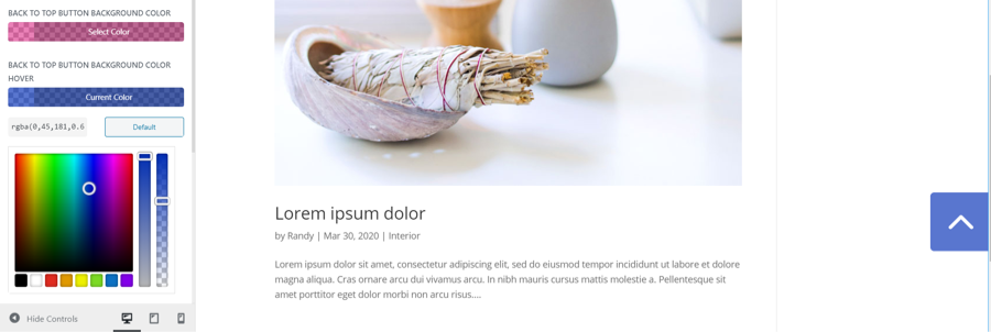
This setting lets you specify a different background color to display when the user hovers over the icon.
Back To Top Button Icon Color
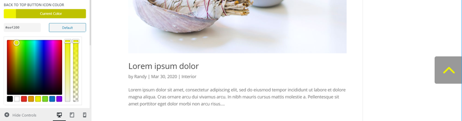
Use the color picker tools to change the color of the icon.
Back To Top Button Icon Color Hover
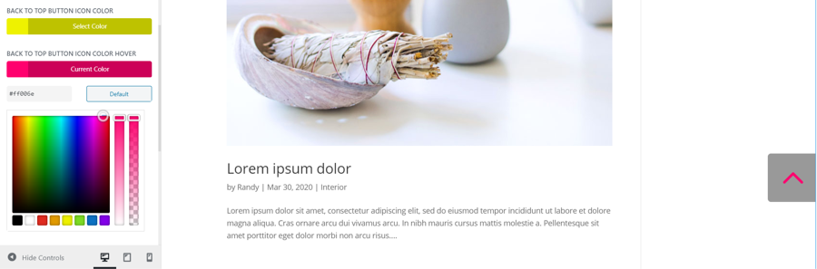
This one changes the icon’s hover color.
Archive Header Background Color
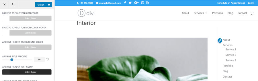
When you enable the category title for archive pages in the Divi Switch settings, the title of the category is added under the header. This example shows the default design.
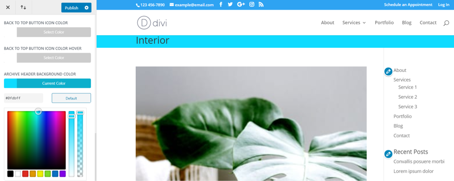
This setting provides color controls for the title background. Select a color with the color picker, adjust the color and opacity with the slider, or enter the color code you want.
Archive Title Padding
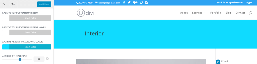
This setting changes the padding for the top and bottom of the title background. Use the slider to reduce or increase the padding or add the number in the field. Use the circled arrow to reset it back to default.
Archive Header Text Color
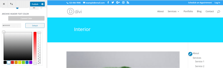
This adjusts the color of the category title text.
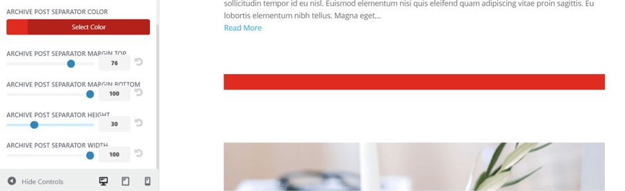
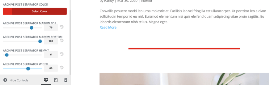
Archive Post Separator Color
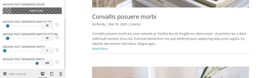
If you’ve enabled the separator line in the archives tab of the Divi Switch settings, you’ll see a thin horizontal gray line between the posts on archive pages. This can be styled using the following settings.
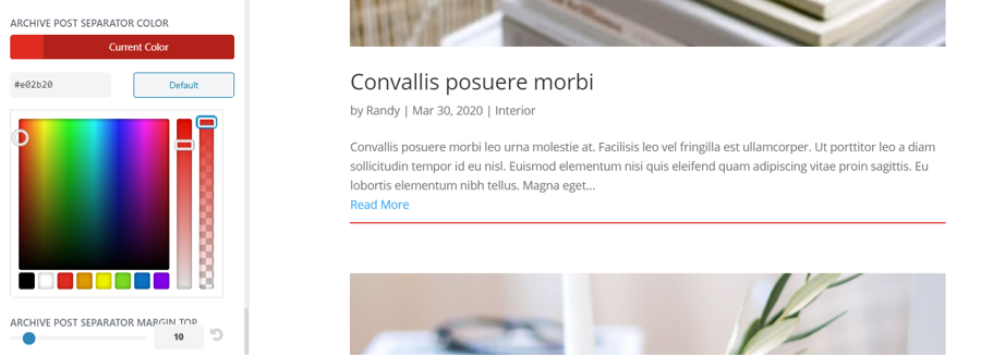
Adjust the color with the color picker. Choose a color, make adjustments for the color and opacity with the slider, or enter the color code into the field.
Archive Post Separator Margin Top
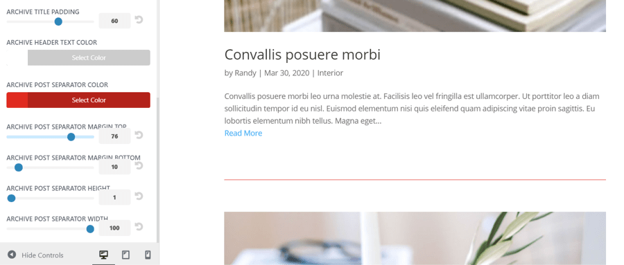
Add or reduce the margin at the top of the line with the slider or by adding the value into the field. Use the circled arrow to reset the value. This is great for adding space between the posts.
Archive Post Separator Margin Bottom
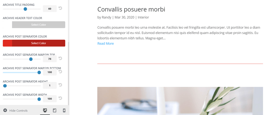
This setting adds or reduces the space to the bottom of the separator line.
Archive Post Separator Height
This setting adjusts the thickness of the separator line.
Archive Post Separator Width
Known Issues
Conflicting Switches��
Some switches try to do the same thing. The App Style Menu and the Mobile Menu on the desktop, for example, try to realign the logo and navigation items. If both are activated then neither will work as expected. There are two side menu toggles but only one should be used. If you notice a switch not behaving as you would expect, look for a switch that may be causing a compatibility issue.
Heavily customized Divi conflicts
If you’re using Divi Switch on an already heavily customized version of Divi then you may find some switches behaving oddly. Always check how a switch is behaving when activated.
Frequently Asked Questions
Will Divi Switch work with Extra?
_No, Divi Switch works only for Divi theme
Can I add my own color schemes to buttons etc?
Yes. We’ve listed the hex values for the six color schemes at the top of the plugin style sheet. You can simply ‘find and replace’ those values using any decent text editor.
Is this the same as Divi Booster?
No. Both are great plugins and both do different things. If you’re serious about customizing Divi then we’d suggest owning both.
Will I lose my changes if I uninstall the plugin?
You need the plugin to be active to take advantage of the customizations. Changes are stored within the plugin. However, if you deactivate the plugin or need to reinstall for any reason, your toggle choices will be saved and will activate as soon as the plugin is activated again.