Divi Product Carousel
Product Carousel for Divi and WooCommerce extends the functionality of the Divi Builder and it adds a new module "Woo Carousel" to default modules. The "Woo Carousel" module will allow you to create beautiful and responsive carousels for your WooCommerce products. Simply insert a module, insert, delete and drag and drop carousel elements and set.
This plugin also supports WordPress posts and WooCommerce products. It’s fully responsive, highly customizable, and works smoothly in all browsers. Product Carousel is compatible with the Divi Theme Builder, Divi Builder Plugin, and the Extra Theme.
** Visit the Product Page Here **
See the Changelog text for this child theme by following this link https://wpzone.co/product/product-carousel-for-divi-and-woocommerce/changelog/
Tip: For Product Carousel for Divi and WooCommerce Plugin to work, you must have installed WooCommerce Plugin and Divi, Divi Builder or Extra Theme from Elegant Themes. If you do not have it you can purchase it here.
Requirements
- Self-Hosted WordPress Installation
- Divi Theme by Elegant Themes
- PHP version 7.2 or greater
- memory_limit 128M
- post_max_size 64M
- max execution_time 180
- upload_max_filesize 64M
- max_input_time 180
- max_input_vars 5000
- MySQL version 5.6 or greater OR MariaDB version 10.0 or greater.
- HTTPS support
- Nginx or Apache with mod_rewrite module
- WooCommerce Plugin
Installation
Once you have installed the required products:
- WooCommerce
- Divi Theme, Extra Theme, or Divi Builder Plugin
install Product Carousel for Divi in one of the two following ways.
WordPress Dashboard
- Download the plugin zip file
- Log in to your WordPress Dashboard.
- Go to: Plugins –> Add New from the left-hand menu
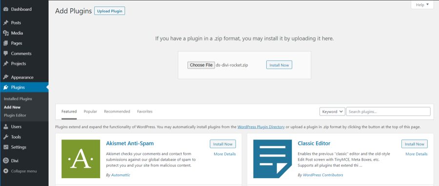
- Select Upload, then Browse to select the zip file from your computer.
- Select OK and select Install Now.
- Activate the plugin.
Using FTP
- Download zip file
- Extract the zip to your computer
- Upload the woocommerce-carousel-for-divi directory to the /wp-content/plugins/ directory and activate the plugin in the Plugin dashboard
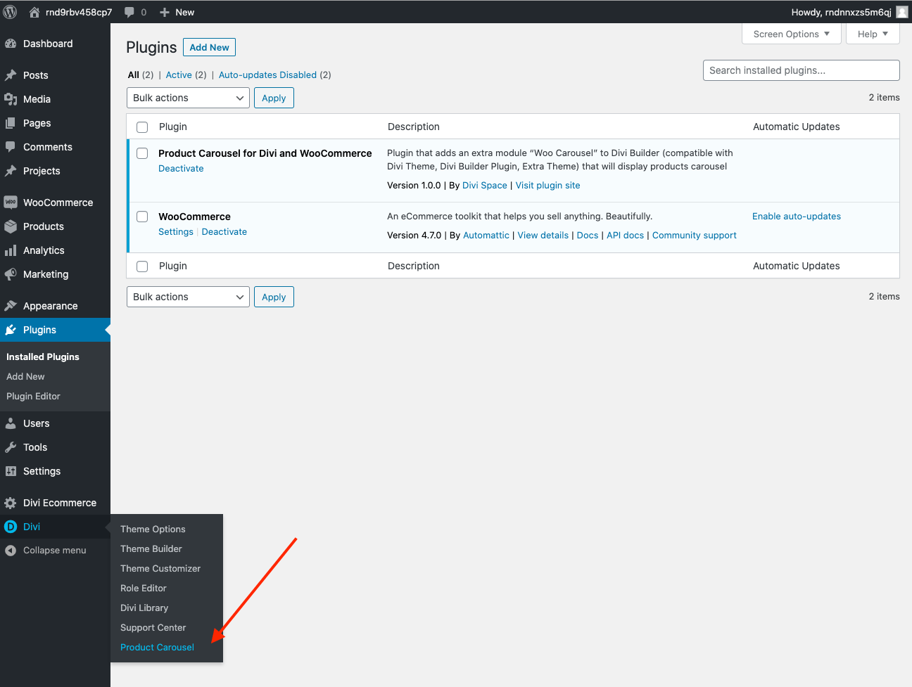
Activate license key
You will need to activate the license key before using the product. To activate the plugin, go to Divi > Product Carousel in your dashboard menu. Enter your license key and click Activate.
Features
- Choose elements and display order – titles, images, ratings, price, and buttons
- Dynamic product sorting – set what products show base on publish date, category, rating, price, availability, and more
- Set products count – choose how many items your carousel includes
- Easy style controls – set the space, size, and padding around each item
- Autoplay and user-controlled scroll options – set to rotate automatically and icon or paginate click-to-advance controls
- "Buy Now" button – allow users to purchase products right from the carousel
- Sales badges built-in – customize your sales bandages
- Include star ratings – Customers rely on reviews, display highly rated product ratings
- Animations and hover effects – animated slide and scroll-over overlays
- Divi integrated – Divi default plus all the expanded module settings
Plugin Options
Content
- Woo Carousel elements
- Product View Type
- Product Count
- Column layout
- Slide by number of sliders
- Active Center Slider
- Space between slides
- Equal height
- Loop
- Autoplay
- Autoplay speed
- Pause Slider on Mouse Hover
- Show Arrow
- Display Out Of Stock Products
- Show Controls/Pagination
- Button Text
- Link Target
- Background
Design
-
Title
-
Price
-
Sale Badge
-
Image
-
Star Rating
-
Arrows
-
Controller/Pagination
-
No record text
-
Button
-
Sizing
-
Spacing
-
Border
-
Box-shadow
-
Filters
-
Transform
-
Animation
Setup and Configuration
How to Add Product Carousel Module to Your Page
If you have already products on your site, you are ready to create your first Divi Product Carousel by inserting Woo Carousel Module to your page. One of the ways to access modules is to navigate to any page on the frontend of your site and click the "Enable Visual Builder" button in the top WordPress admin bar. The Visual Builder will be enabled.

Once you have entered the Divi Builder, you can click the gray plus button to add a new module to your page. Locate the "Woo Carousel" module within the list of modules. You can also type "woo" to see quickly the module.
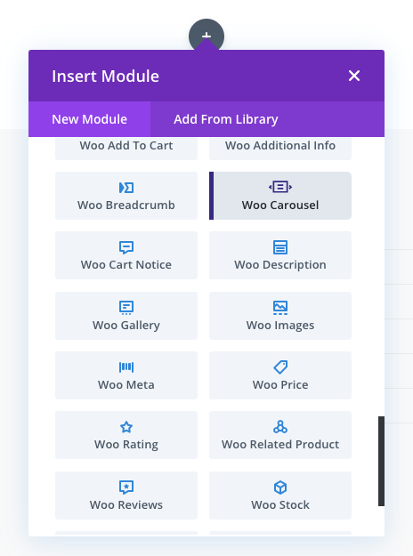
And click on it to add it to your page.
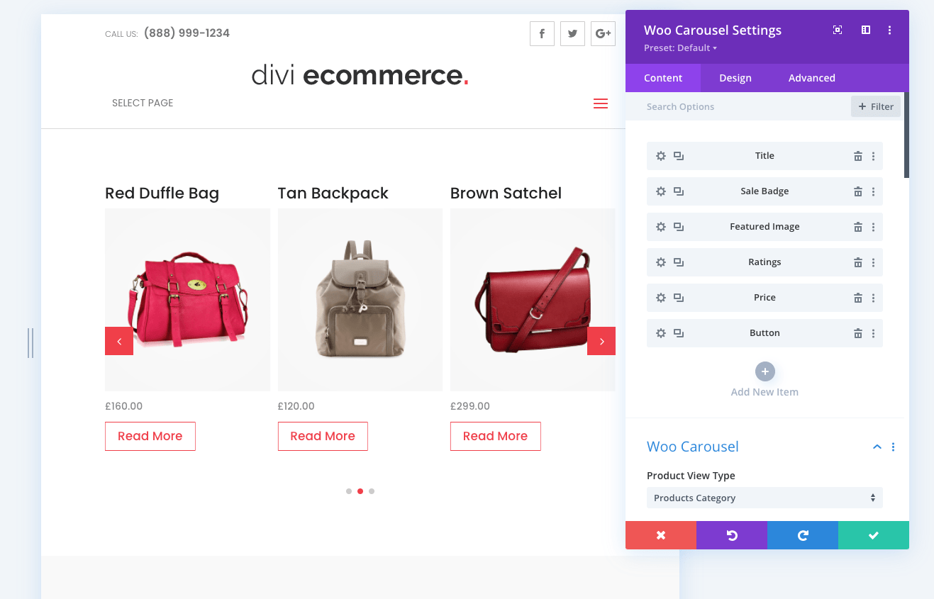
By default, all Woo Carousel will include all Carousel Elements: Title, Sale Badge, Featured Image, Ratings, Price, and Button.
Product Carousel Elements
Decide which elements you want to display and which order. Delete elements by clicking on the Trash Icon. You can also add elements by clicking on the Plus Icon and choosing element type.
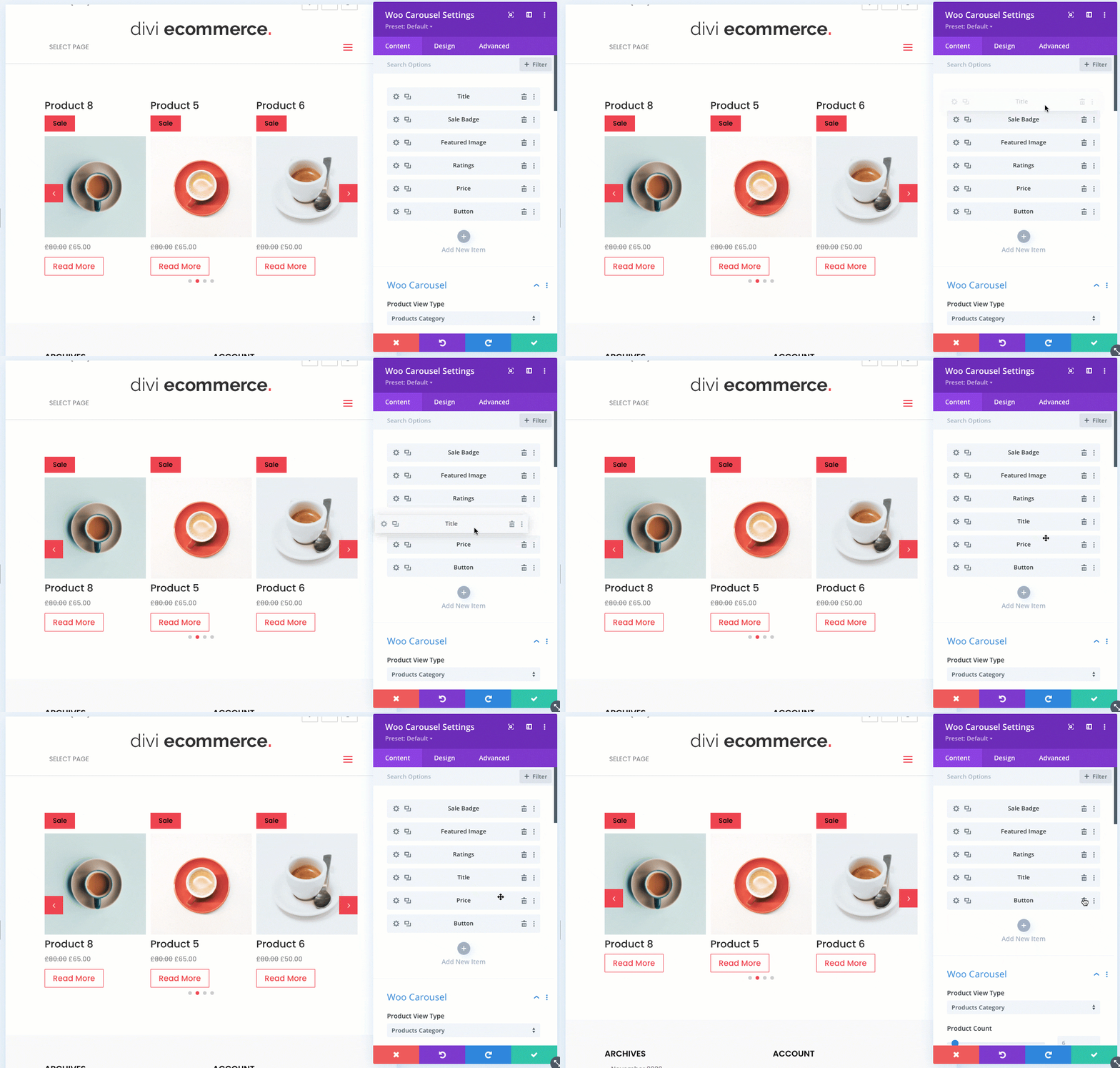
Default Carousel Settings
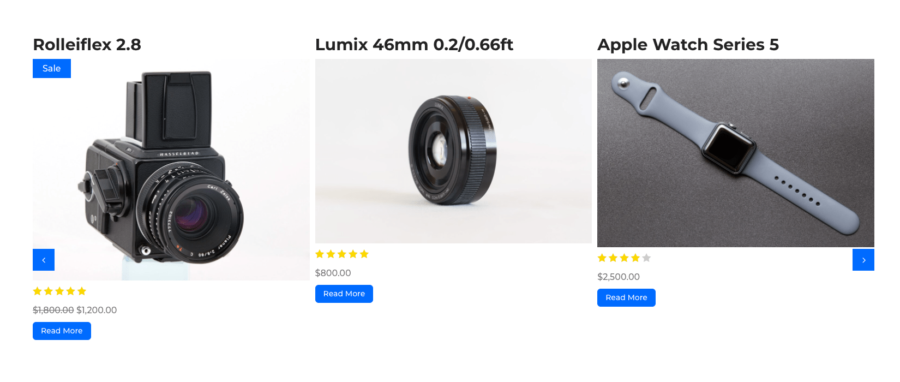
Default colors for the carousel are based on your theme accent color and other global settings set in the theme customizer settings. The design should already match your site design. Here is an example of the default carousel in the Divi Ecommerce Pro child theme.
Product View Type
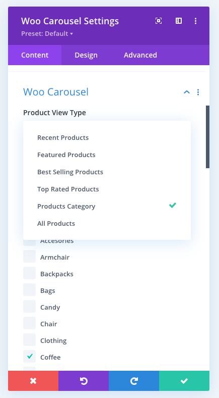
Define what product type you want to display:
- Recent Products
- Featured Products
- Best Selling Products
- Top Rated Products
- Product Category
- All Products
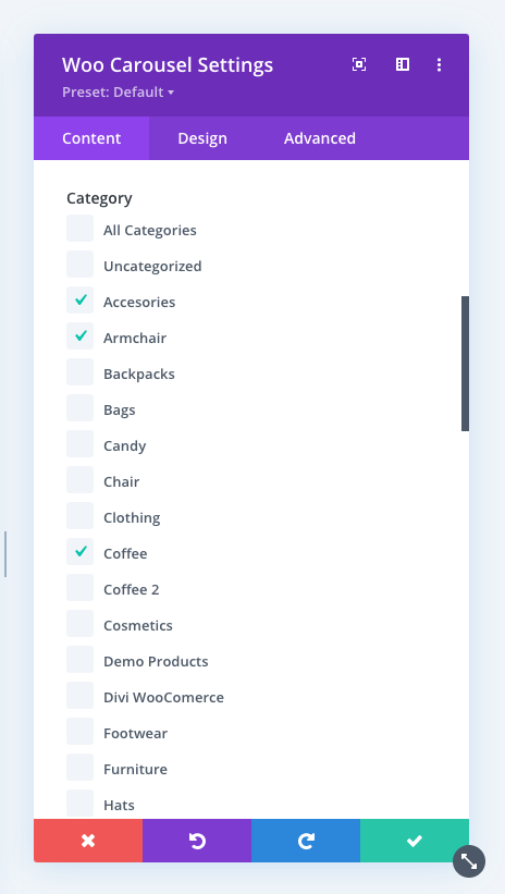
If Product Category is selected, you will see a checkbox list to select what categories should be included. Simple select categories you want to display.
Product Count
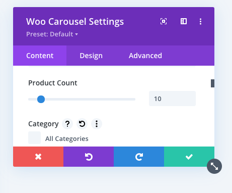
This setting defines how many products you want to display. The minimum is 1 and the maximum value is 100.
Sort By
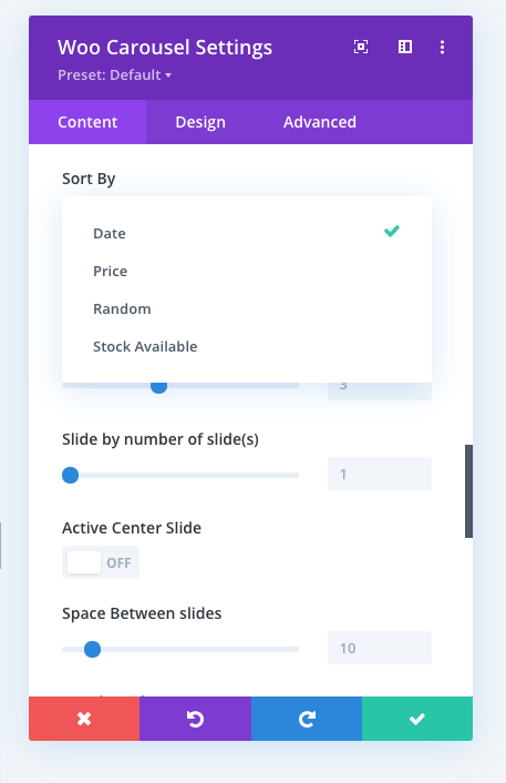
Define the order in which products will be displayed.
- By Date (based on the date when products were published)
- By Price
- Random
- Stock Available (first products available in stock)
Sort Direction
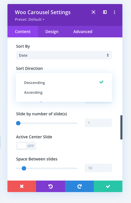
Choose the sorting direction: descending or ascending.
Column Layout
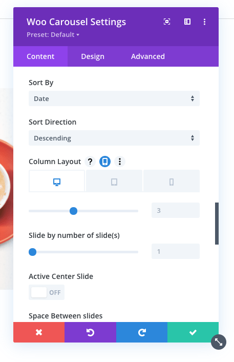
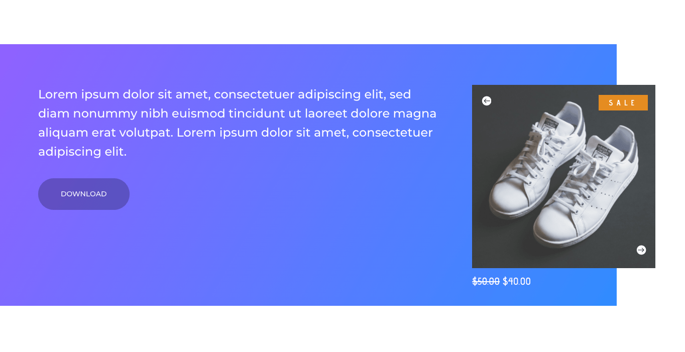
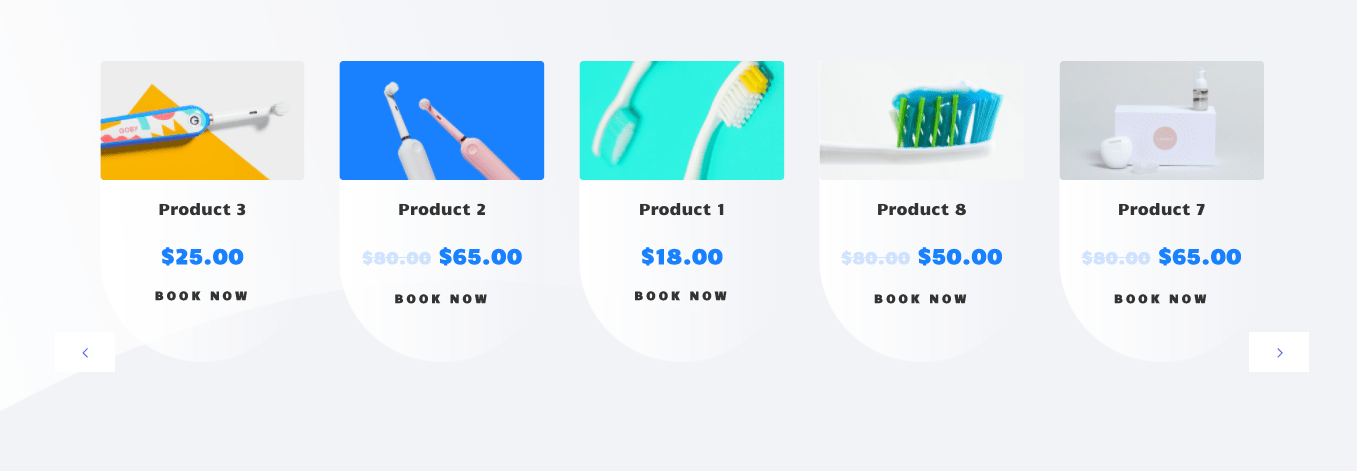
Define the number of columns in your carousel. You can choose a different value for desktop, tablet, and mobile. Example of one column slider carousel:
Example of five column slider carousel:
Slide by number of slide(s)
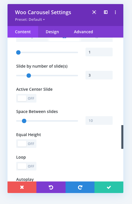
Define the number of products to slide on each slide rotation.
Active Center Slider
Center the active slide.
Space Between Slides
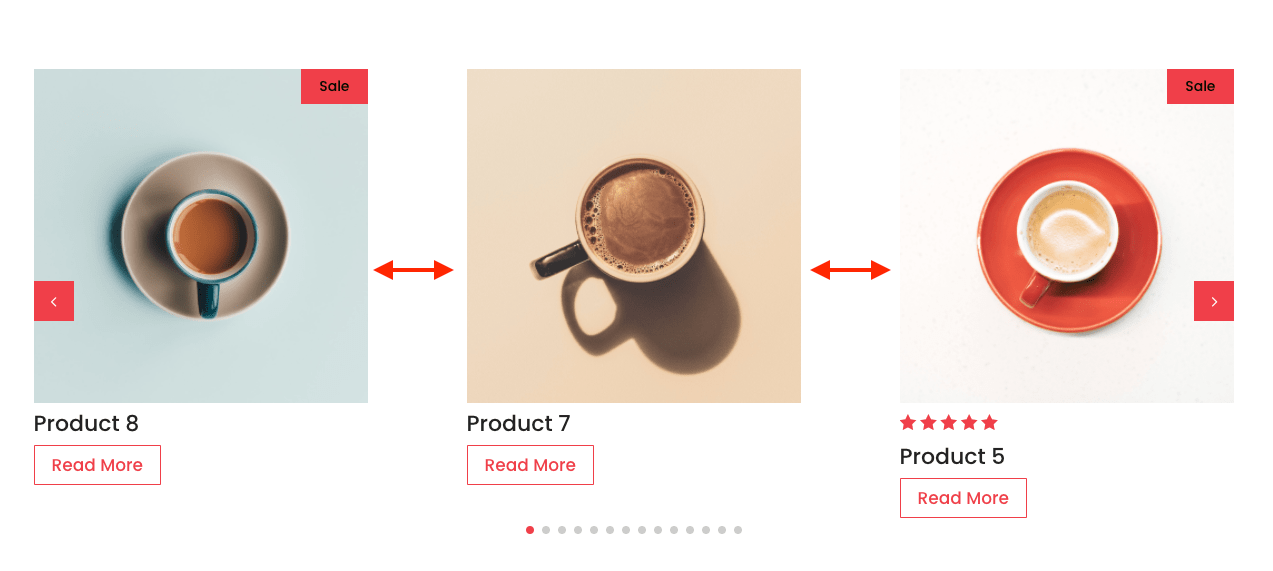
Define the space between slides in px
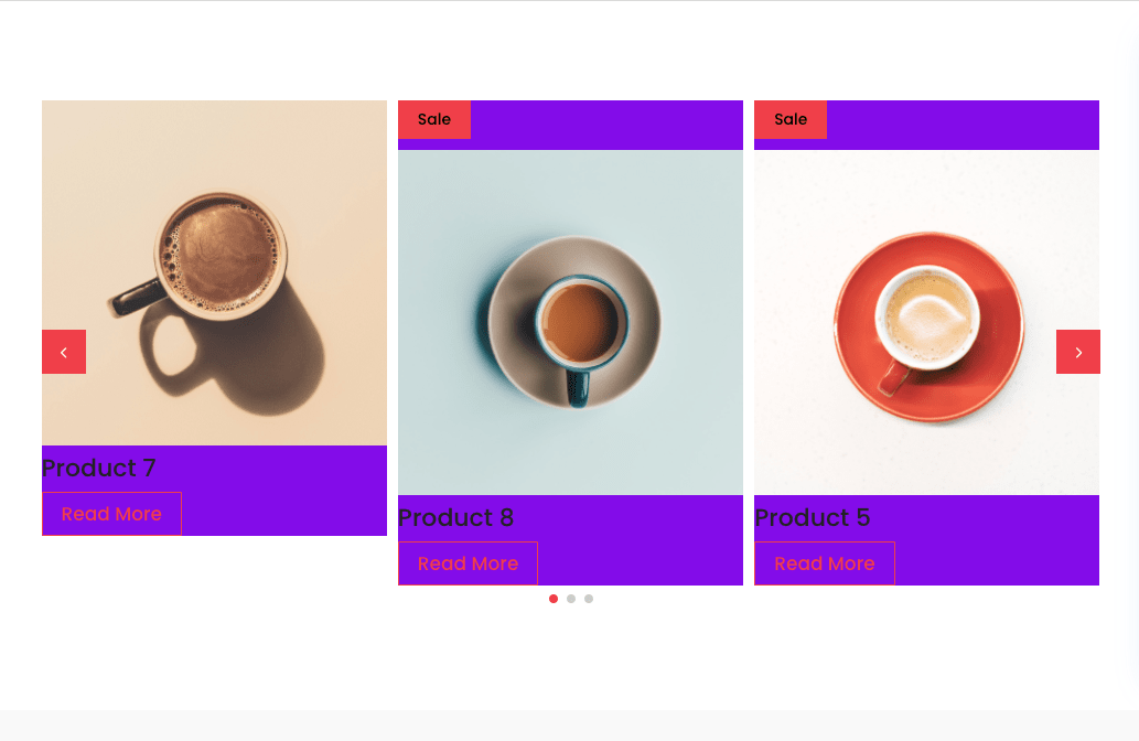
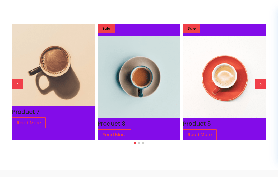
Equal Height
Equalizing column heights will force all columns to assume the height of the tallest column in the row. All columns will have the same height, keeping their appearance uniform.
Disabled:
Enabled:
Loop
Duplicate last and first items to get loop illusion
Autoplay
With this option you can make your sliders switch automatically without user interaction after a given time. Autoplay speed: The amount of time the slider will spend on each slide before switching away. Note: Autoplay for the carousel is disabled from default.
Pause Slider on Mouse Hover
When hover of the slider, autoplay is paused and slide are not changing.
Show Arrow
Show or hide the slider arrows.
Display Out of Stock Products
If checked, the carousel will display also products that are out of stock.
Show Controls/Pagination
Show or hide the bottom controls pagination
Button Text
Change the Product Button text to your custom.
Link Target
Change the target of the product link. Open the product page in the new tab or in the same window.
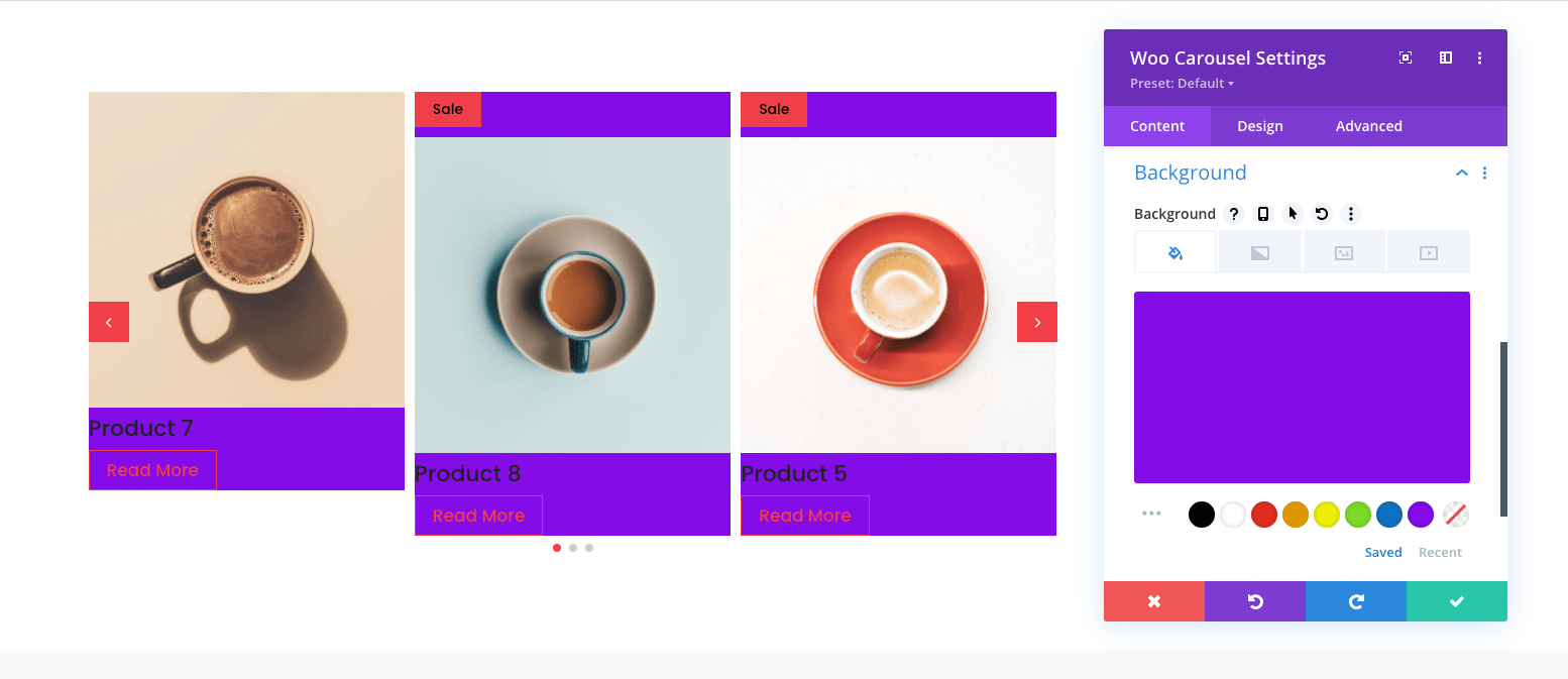
Background Color
Change the slide background color:
Design Options
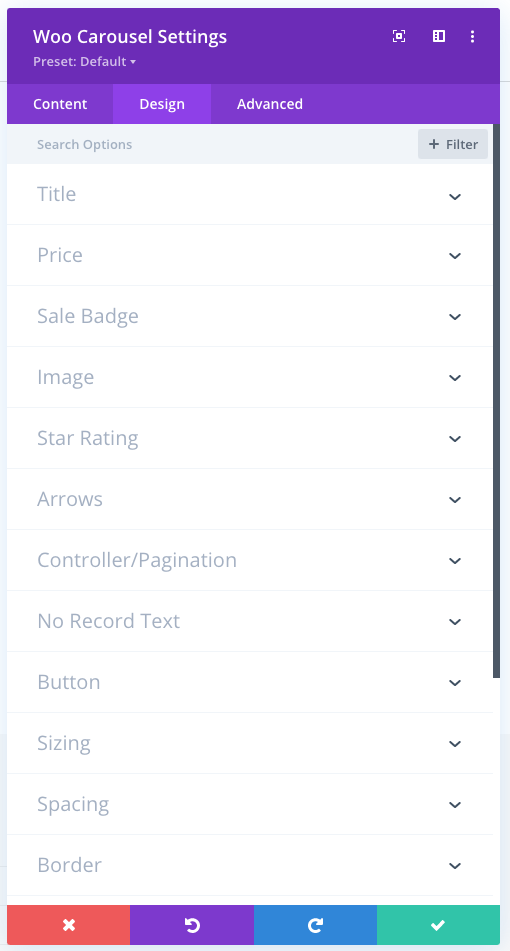
Title
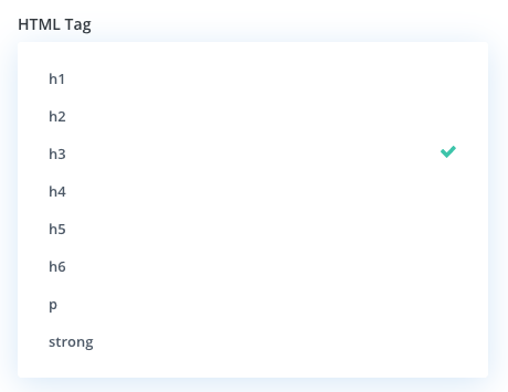
Change the HTML Tag for the title between h1, h2, h3, h4, h5, h6, p and strong.
Product 8
Title Design Options
- Padding
- Margin
- Font
- Font weight
- Font style
- Text alignment
- Text color
- Text size
- Letter spacing
- Line height
- Text shadow
Price
- Padding
- Margin
- Font
- Font weight
- Font style
- Text alignment
- Text color
- Text size
- Letter spacing
- Line height
- Text shadow
Sale badge
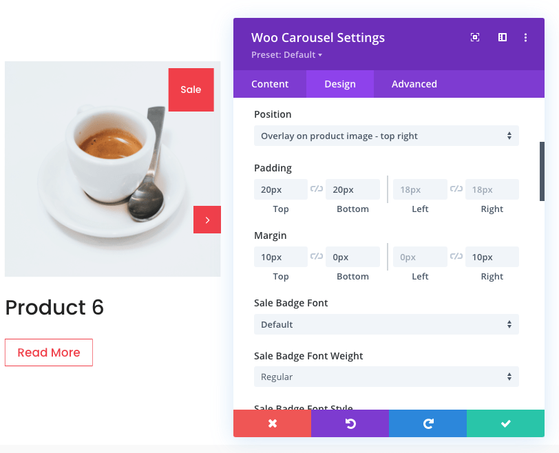
Position:
- Don't overlay on product image
- Overlay on product image - top left
- Overlay on product image - top right
- Overlay on product image - bottom left
- Overlay on product image - bottom right
-
Padding
-
Margin
-
Font
-
Font weight
-
Font style
-
Text alignment
-
Text color
-
Text size
-
Letter spacing
-
Line height
-
Text shadow
Image
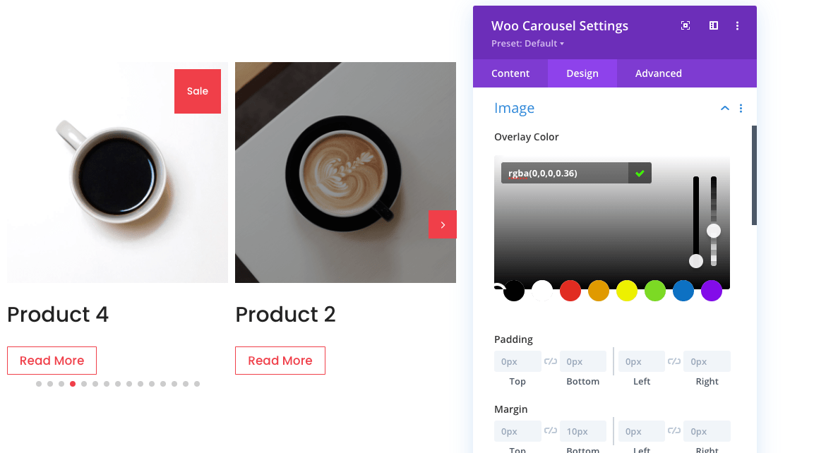
- Overlay color on hover
- Padding
- Margin
- Rounded corners
- Border styles
- Border width
- Border color
- Box Shadow
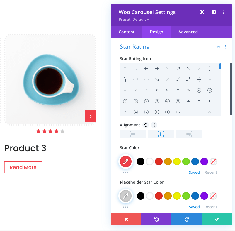
Star Rating
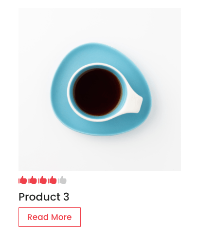
- Star Rating Icon Set a custom icon for rating:
- Alignment (left/center/right)
- Star Color
- Placeholder Star Color
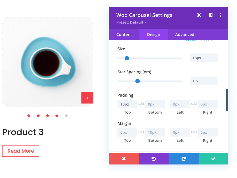
- Review Icon Size
- Star Spacing
- Padding
- Margin
Arrows
- Icon Size
- Custom Previous Icon
- Custom Next Icon
- Icon Color
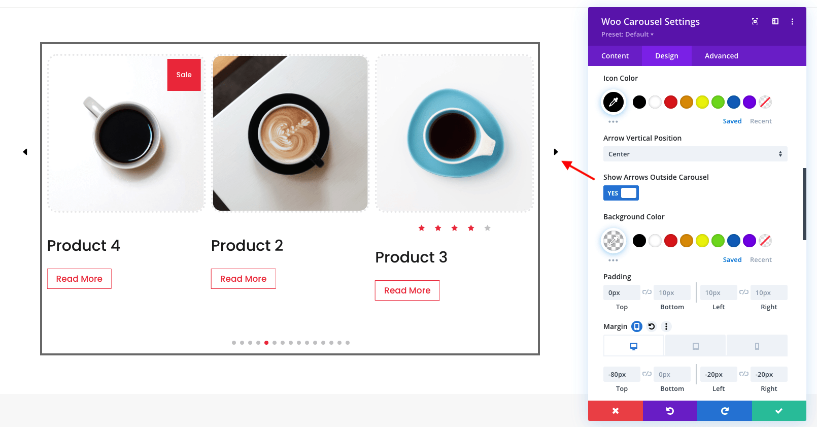
- Arrow Vertical Position: Center / Bottom
- Show Arrow Outside Carousel
- Background Color
- Padding
- Margin
- Rounded Corners
Custom Previous and Next Icons:
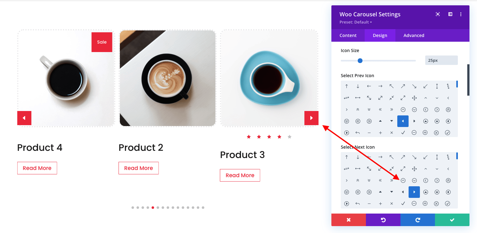
Arrow Vertical Position: Center and Show Arrow Outside Carousel
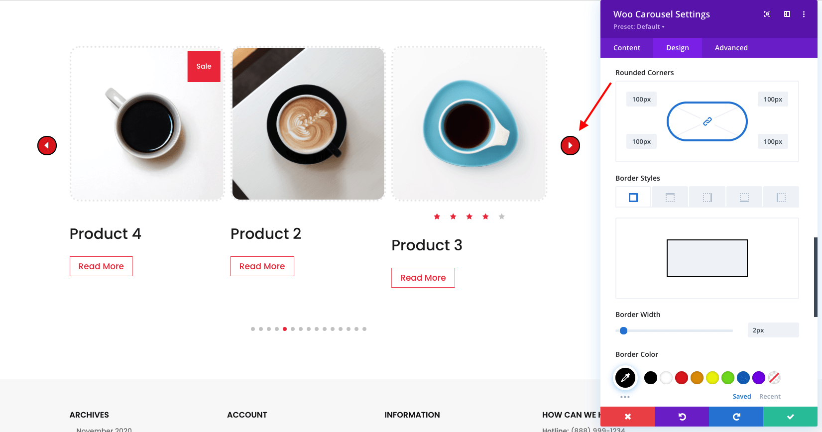
Custom rounded corners and borders.
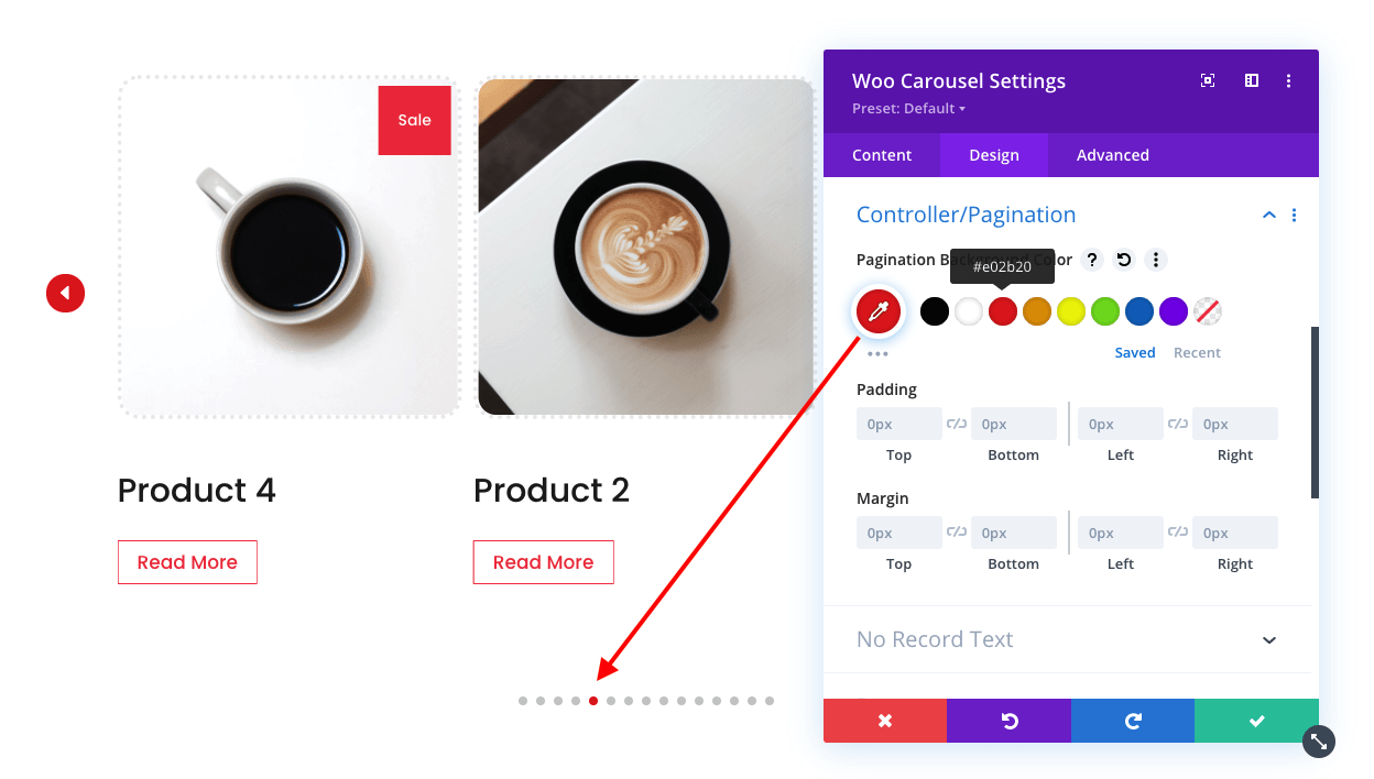
Control Pagination
- Pagination Background Color
- Padding
- Margin
No Record Text
Customize the "No Record Text" that will be displayed when no products are matching display conditions.
-
Font
-
Font weight
-
Font style
-
Text alignment
-
Text color
-
Text size
-
Letter spacing
-
Line height
-
Text shadow
Button
- Text size
- Text color
- Background
- Border width
- Border color
- Border radius
- Letter spacing
- Font
- Font weight
- Font style
- Show icon
- Icon
- Icon Color
- Icon placement
- Only show the icon on hover
- Alignment (left/center/right)
- Text Shadow
- Margin
- Button
Advanced Settings: Custom CSS
In the Design tab, we have created many options so that you can do just about anything that can be done with CSS (without touching a line of code). If you are a developer, however, you might prefer to write your own code instead of using our custom design controls. In this case you can use the Advanced tab, which can be found right next to the Design tab in the modal settings window for modules, rows and sections. Here we have broken down all of the structural elements of the module, and given you text area fields where you can type in your own CSS. Using this panel you can apply CSS to individual parts of the module. For example, you could apply custom CSS directly to a pagination, or create your own :after pseudo element.
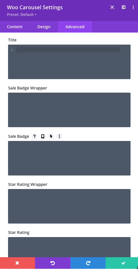
You can also target any element using the following selectors
/*Title Wrapper*/
.dswc_item_wrapper

/* Title */
.dswc_item_wrapper .dswc_title a

/* Sale Badge Wrapper */
.sale_badge

/* Sale Badge  */
.sale_badge span

/* Star Rating Wrapper  */
.star_rating_module_wrapper

/* Star Rating  */
.star_rating_module_wrapper .star-rating

/* Price Wrapper  */
.dswc_price

/* Price Amount  */
.dswc_price .amount

/* Price Regular  */
.dswc_price del

/* Price Sale  */
.dswc_price ins

/* Price Symbol  */
.dswc_price .amount

/* Featured Image Before */
 .swiper-slide.dswc_item_wrapper .dswc-featured-image img:before

/* Featured Image */
 .swiper-slide.dswc_item_wrapper .dswc-featured-image img

/* Featured Image Wrapper */
 .swiper-slide.dswc_item_wrapper .dswc-featured-image

/* Button Wrapper */
 .et_pb_button_module_wrapper

/* Button  */
.et_pb_button_module_wrapper a.et_bt_add_to_cart

/* Button Hover  */
.et_pb_button_module_wrapper a.et_bt_add_to_cart:hover

/* Slides  */
.swiper-slide.dswc_item_wrapper

/* Arrow Navigation  */
.prev_icon, .next_icon

/* Arrow Prev Navigation */
.prev_icon

/* Arrow Next Navigation  */
.next_icon

/* Controller/Pagination Bullet  */
.swiper-pagination .swiper-pagination-bullet
Import Demo Layouts
Product Carousel for Divi and WooCommerce comes with free 9 premade carousel layouts. You can find them on the plugin demo page: http://productcarousel.aspengrovestudio.com/ Here is a step by step instruction on how to use them on your site:
- Download layouts: here
- Log into your WordPress website
- Navigate to Divi > Divi Library
- Click on ‘Import & Export’
- Select ‘Import’ from the ‘Portability’ pop up
- Click ‘Choose File’ and select the JSON file from your computer
- Once the JSON layout is selected, click ‘Import Divi Builder Layouts’ and wait for the import process to complete. Layouts are exported as sections. To import them from Divi Library, insert a new section, and choose load layout from your Divi Library. Choose the layout and click import. If you have any problems, contact our support.