Customize Number Of Columns In WooCommerce Shop
Last modified Sep 21, 2021
Difficulty
Beginner
Language CSS
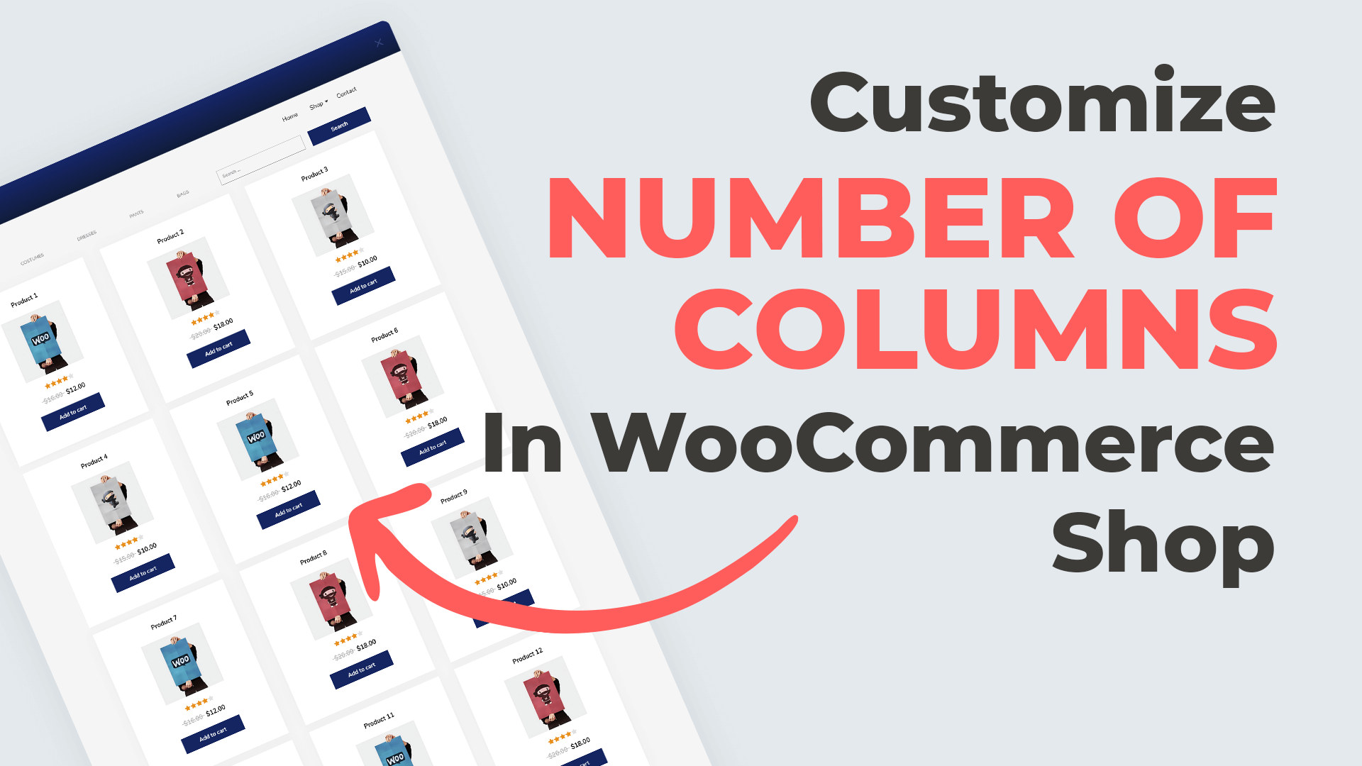
Below you’ll find a quick Divi snippet that will help you customize the number of columns in your WooCommerce shop. Before beginning, we recommend making a backup of your site and make sure you have a child theme set up and running.
This feature, of changing the WooComerce column structure, as well as countless others, is also available in our plugin, Divi Shop Builder. If you’re looking for an easier way to customize your WooCommerce shop without touching a line of code, visit our store and purchase the Divi Shop Builder plugin.
CSS
/* 1 columns on all devices  */

[class*=woocommerce] ul.products li.product, [class*=woocommerce] ul.products li.product:nth-child(n) {
    width: 100%!important;
    margin-right: 0!important;
}


/* 1 columns on desktop  */
@media all and (min-width:1024px) {
  [class*=woocommerce] ul.products li.product, [class*=woocommerce] ul.products li.product:nth-child(n) {
      width: 100%!important;
      margin-right: 0!important;
  }
}

/* 1 columns on tablet  */
@media all and (min-width: 768px) and (max-width: 1024px) {
  [class*=woocommerce] ul.products li.product, [class*=woocommerce] ul.products li.product:nth-child(n) {
      width: 100%!important;
      margin-right: 0!important;
  }
}

/* 1 columns on mobile  */

@media all and (max-width: 768px) {
  [class*=woocommerce] ul.products li.product, [class*=woocommerce] ul.products li.product:nth-child(n) {
      width: 100%!important;
      margin-right: 0!important;
  }
}


/* 2 columns on desktop */
@media all and (min-width:1024px) {
  [class*=woocommerce] ul.products li.product {
      width: 48%!important;
      margin: 0 3.8% 2.992em 0!important;
      clear: none!important;
  }

  [class*=woocommerce] ul.products li.product:nth-child(2n) {
    margin-right:0px!important;
  }

  [class*=woocommerce] ul.products li.product:nth-child(2n+1) {
    clear: both!important;
  }
}

/* 2 columns on tablet */
@media all and (min-width: 768px) and (max-width: 1024px) {
  [class*=woocommerce] ul.products li.product:nth-child(n) {
      width: 48%!important;
      margin: 0 3.8% 2.992em 0!important;
      clear: none!important;
  }

  .woocommerce ul.products li.product:nth-child(2n) {
    margin-right:0px!important;
  }

  .woocommerce ul.products li.product:nth-child(2n+1) {
    clear: both!important;
  }

}


/* 2 columns on mobile */
@media all and (max-width: 768px) {
  [class*=woocommerce] ul.products li.product:nth-child(n) {
      width: 48%!important;
      margin: 0 3.8% 2.992em 0!important;
      clear: none!important;
  }

  .woocommerce ul.products li.product:nth-child(2n) {
    margin-right:0px!important;
  }

  .woocommerce ul.products li.product:nth-child(2n+1) {
    clear: both!important;
  }
}

/* 3 columns on desktop */
@media all and (min-width:1024px) {
  [class*=woocommerce] ul.products li.product {
      width: 30.6%!important;
      margin: 0 3.8% 2.992em 0!important;
      clear: none!important;
  }

  [class*=woocommerce] ul.products li.product:nth-child(3n) {
    margin-right:0px!important;
  }

  [class*=woocommerce] ul.products li.product:nth-child(3n+1) {
    clear: both!important;
  }
}

/* 3 columns on tablet  */
@media all and (min-width: 768px) and (max-width: 1024px) {
  [class*=woocommerce] ul.products li.product:nth-child(n) {
      width: 30.6%!important;
      margin: 0 3.8% 2.992em 0!important;
      clear: none!important;
  }

  [class*=woocommerce] ul.products li.product:nth-child(3n) {
    margin-right:0px!important;
  }

  [class*=woocommerce] ul.products li.product:nth-child(3n+1) {
    clear: both!important;
  }
}


/* 3 columns on mobile  */
@media all and (max-width: 768px) {
  [class*=woocommerce] ul.products li.product:nth-child(n) {
      width: 30.6%!important;
      margin: 0 3.8% 2.992em 0!important;
      clear: none!important;
  }

  [class*=woocommerce] ul.products[class*=columns-] li.product:nth-child(2n) {
    float:left!important;
  }

  [class*=woocommerce] ul.products li.product:nth-child(3n) {
    margin-right:0px!important;
  }

  [class*=woocommerce] ul.products[class*=columns-] li.product:nth-child(3n+1) {
    clear: both!important;
  }
}

/* 4 columns on desktop */
@media all and (min-width:1024px) {
  [class*=woocommerce] ul.products li.product {
      width: 22.1%!important;
      margin: 0 3.8% 2.992em 0!important;
      clear: none!important;
  }

  [class*=woocommerce] ul.products li.product:nth-child(4n) {
    margin-right:0px!important;
  }

  [class*=woocommerce] ul.products li.product:nth-child(4n+1) {
    clear: both!important;
  }
}

/* 4 columns on tablet  */
@media all and (min-width: 768px) and (max-width: 1024px) {
  [class*=woocommerce] ul.products li.product:nth-child(n) {
      width: 22.1%!important;
      margin: 0 3.8% 2.992em 0!important;
      clear: none!important;
  }

  [class*=woocommerce] ul.products li.product:nth-child(4n) {
    margin-right:0px!important;
  }

  [class*=woocommerce] ul.products li.product:nth-child(4n+1) {
    clear: both!important;
  }
}


/* 5 columns on desktop */
@media all and (min-width:1024px) {
  [class*=woocommerce] ul.products li.product {
      width: 16.96%!important;
      margin: 0 3.8% 2.992em 0!important;
      clear: none!important;
  }

  [class*=woocommerce] ul.products li.product:nth-child(5n) {
    margin-right:0px!important;
  }

  [class*=woocommerce] ul.products li.product:nth-child(5n+1) {
    clear: both!important;
  }
}

/* 5 columns on tablet  */
@media all and (min-width: 768px) and (max-width: 1024px) {
  [class*=woocommerce] ul.products li.product:nth-child(n) {
      width: 16.96%!important;
      margin: 0 3.8% 2.992em 0!important;
      clear: none!important;
  }

  [class*=woocommerce] ul.products li.product:nth-child(5n) {
    margin-right:0px!important;
  }

  [class*=woocommerce] ul.products li.product:nth-child(5n+1) {
    clear: both!important;
  }
}


/* 6 columns on desktop */
@media all and (min-width:1024px) {
  [class*=woocommerce] ul.products li.product {
      width: 13.5%!important;
      margin: 0 3.8% 2.992em 0!important;
      clear: none!important;
  }

  [class*=woocommerce] ul.products li.product:nth-child(6n) {
    margin-right:0px!important;
  }

  [class*=woocommerce] ul.products li.product:nth-child(6n+1) {
    clear: both!important;
  }
}

/* 6 columns on tablet  */
@media all and (min-width: 768px) and (max-width: 1024px) {
  [class*=woocommerce] ul.products li.product:nth-child(n) {
      width: 14.75%!important;
      margin: 0 2.3% 2.992em 0!important;
      clear: none!important;
  }

  [class*=woocommerce] ul.products li.product:nth-child(6n) {
    margin-right:0px!important;
  }

  [class*=woocommerce] ul.products li.product:nth-child(6n+1) {
    clear: both!important;
  }
}


/* 7 columns on desktop */
@media all and (min-width:1024px) {
  [class*=woocommerce] ul.products li.product {
      width: 12.57%!important;
      margin: 0 2% 2.992em 0!important;
      clear: none!important;
  }

  [class*=woocommerce] ul.products li.product:nth-child(7n) {
    margin-right:0px!important;
  }

  [class*=woocommerce] ul.products li.product:nth-child(7n+1) {
    clear: both!important;
  }
}
Does this snippet (still) work?
Please let us know in the comments if everything worked as expected. We have tested this code with the Version: 4.3.4 of the Divi Theme, the version: 3.9.3 of the Woocommerce plugin and Divi friendly hosting with PHP 7+.
If you think this code saved you time, we will be happy to receive a comment! ?
And subscribe to our youtube channel because there’s more to come!
License: This snippet contains code from the Divi Theme, copyright https://elegantthemes.com, and Woocommerce Plugin by Automatic modified by Divi Space, March 4, 2020. Licensed under the GNU General Public License, no warranty; click here for details.




That was super useful, many thanks! Been looking for this to solve that by not affecting product grid! (Others I’ve tested did affect.) Many thanks! 🙂
Worked like a charm.. Thanks
I pasted the 1 column snippet to my child theme style.css and it works great on the frontpage.
But on the shop page and product category page (designed in the Divi Builder) it’s still 2 column default.
I even saved my frontpage section to the library and tried that on my templates – still 2 column default.
Any suggestions?
Hello, it’s working on my end, I can check what’s happening on your site if you can send me a link.
But if the page is designed with Divi Builder, you can also try to change the number of columns in the module settings.
This is really helpful. It works perfectly.
So, what do you put in the .css file if all you want is two columns on all devices?
and, is that the only file that gets adjusted?
Use 2 columns snippet without media queries
 [class*=woocommerce] ul.products li.product:nth-child(n) {
      width: 48%!important;
      margin: 0 3.8% 2.992em 0!important;
      clear: none!important;
  }
  .woocommerce ul.products li.product:nth-child(2n) {
    margin-right:0px!important;
  }
  .woocommerce ul.products li.product:nth-child(2n+1) {
    clear: both!important;
}