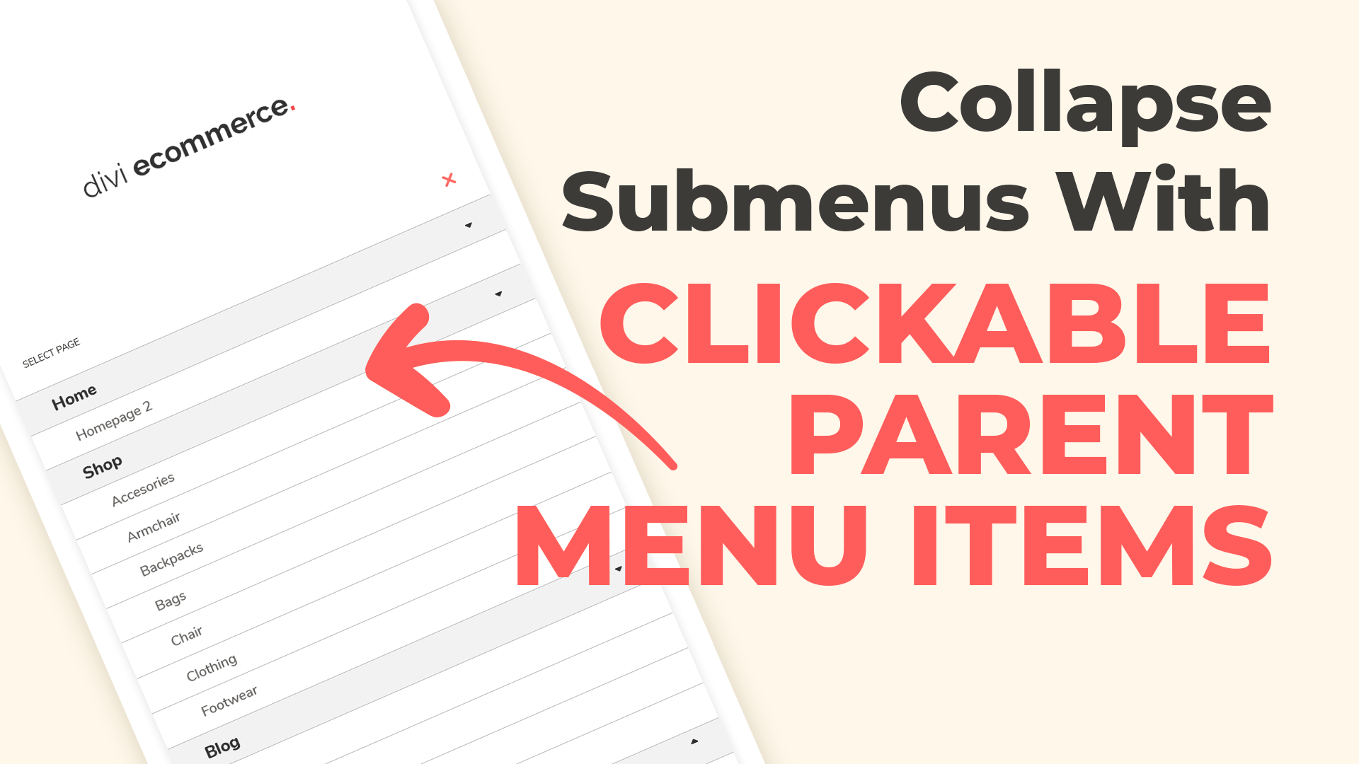
Great website navigation is key for a simple and clean site navigation experience. A collapse submenus can be a perfectly reasonable solution if your menu includes parent items. They keep the menu organized, showing site hierarchy without removing any menu items – exactly what really matters on the smallest screens.
In this example, we will use the site with Divi Ecommerce child theme installed. Just paste the Javascript and CSS to your site!
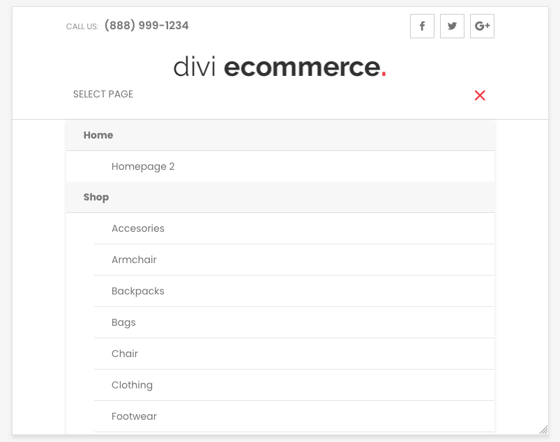
Before
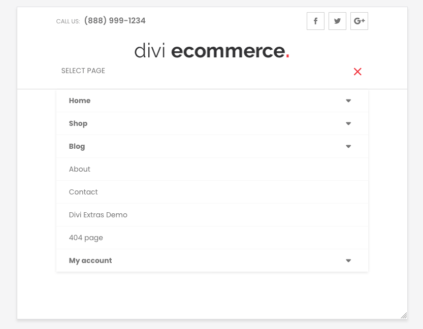
After
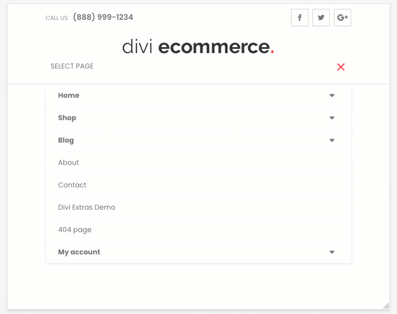
In action:
Alternative Method
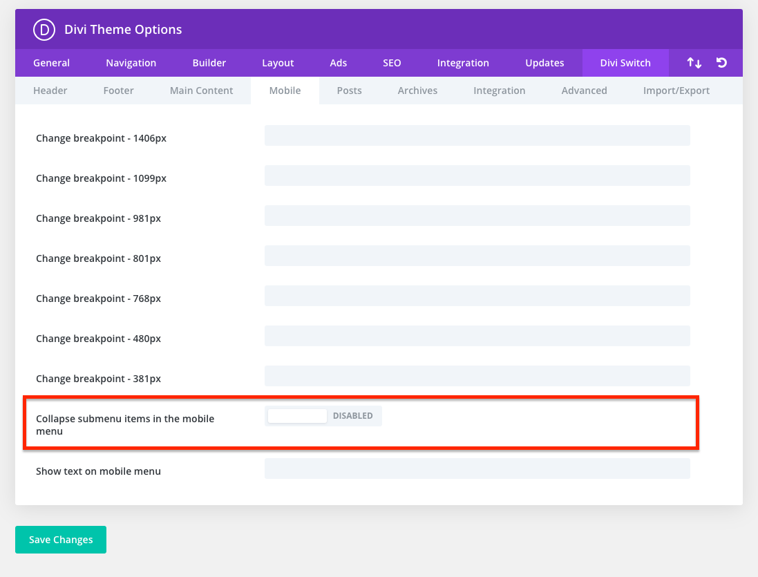
Collapse Submenus make it easier for users to navigate your website. If you are looking for the plugin method for beginners (no coding), check out our Divi Switch Plugin. You can create collapse submenu items inside burger menu on mobile with one click of the switch. The coding method is for more advanced users.
Please let us know in the comments if everything worked as expected. We have tested this code with the Version: 4.9.4 of the Divi Theme and Divi friendly hosting with PHP 7+.
If you think this code saved you time, we will be happy to receive a comment and would motivate us to create more! ?
Don't forget to subscribe to our youtube channel because there’s more to come!
License: This snippet contains code from the Divi Theme, copyright https://elegantthemes.com modified by Divi Space, May 7th, 2021. Licensed under the GNU General Public License v3, no warranty; click here for details.
Hi, I am using your Photography Theme and need to collapse the mobile menu submenus. With all the current changes going on with Divi, would it be better to use the plugin or just add the code? Thanks.
Hello! I asked an earlier comment but figured out why the expand icon was not displayed; it is because my header changed color on scroll, so it is only visible when stickied. How can I get the icon to change color with the header text?
Hello! The code works great, except the expand icon does not show on mobile, but it is still clickable. My webpage link is bradleybreen.com. How can I fix this?
Your icon color has the same color as the background. If find some of your icons are missing (usually letters are displaying instead of icons) it may be possible to fix the issue by disabling dynamic icons feature.
mauro
on July 29, 2022 at 6:52 am
Hello,
i’m re-building a huge archive-site for a customer with over 900 Sites.
But the snippet doesn’t work. I’m a total noob so I couldn’t figure it out by myself.
Could someone please check the Site for me and tell me what’s wrong?
Thanks a lot!
This functionality is working for me, but it creates a few quirks.
1. The parent page to all of the submenu items is no longer clickable on mobile like it is on the desktop menu. On the site I’m working on, the parent page is a separate page from all of the submenu items, not just text for the dropdown. What would you recommend to allow for a collapsable submenu in this scenario? The text would need to link, while the toggle icon could open/collapse the submenu.
2. The parent page text can no longer have an active state applied to it (or at least it doesn’t for me).
3. The submenu items are all set to the active state styling when I’m on the parent page.
Hi! I noticed an issue that once these codes are added, a gap appears below the header (both on desktop and mobile) that creates a bar of whitespace between the header and the main page content. Here is the site: https://staging.newageindustrial.com/
Hello good day. The code works perfectly for me. But, in the chrome element inspector, I get the error:
custom.js: 4619 Uncaught TypeError: Cannot read property ‘slice’ of undefined
at HTMLDivElement. (custom.js: 4619)
at HTMLDivElement.dispatch (jquery.js: 3)
at HTMLDivElement.r.handle (jquery.js: 3)
By clicking on the icons to display the submenus. How could we correct it? Thank you so much for everything.
This is absolutely brilliant thanks so much! I had initially found the one without the top level page still clickable, this is a perfect solution to a large menu functioning fantastically on mobile, really appreciate it!
Hi.
This only works only you when press ‘+’ toggle. When click on parent menu item the menu closes. Is there a fix for this?
Thanks!
Albena Abigail Karaivanova
on April 23, 2021 at 2:00 am
Hi, this works like magic, but there is a little problem 🙂 When I am on a regular page, let’s say Blog, and open the menu it looks fine, all submenu items are closed, but when I am on a WooCommerce category page and open the menu all submenu items are opened like the default Divi menu. Please, help me resolve this issue!
XoXo, Albena
I’ve got the same problem. On the main page this works fine, but if you click on a Woocommerce category all menu entries are expanded.
The problem is, that on a category page the normally hidden menu entry () has this as css style attached to it:
.et-db #et-boc .et-l #main-header .et_mobile_menu li ul, .et-db #et-boc .et-l .et_pb_fullwidth_menu .et_mobile_menu li ul, .et-db #et-boc .et-l .et_pb_menu .et_mobile_menu li ul {
visibility: visible!important;
display: block!important;
padding-left: 10px;
}
I have the same problem and I kinda know why but can’t find a way to fix it. I can’t post the reason why here, because the comment will get deleted again (I’m only posting css as text in here but it deletes my comment right at the bat…).
Could you (Anna Kurowska) take a look at this?
Anna Kurowska
on August 6, 2021 at 9:12 am
Hi Michael, we don’t delete comments, but it may take a while to approve them.
Can you send link to the website with issue?
sorry for the late reply. The homepage in question is: https://www.metalmotte.de
On the main page everything works fine, but if you go to a Woocommerce category like “Stoffe” you will see that all of the sub-menus are open by default.
Anna Kurowska
on September 6, 2021 at 11:07 am
Hi Micheal, try adding this CSS code and let me know if that fixes the issue:
.et-db #et-boc .et-l #main-header .et_mobile_menu li ul.menu-hide, .et-db #et-boc .et-l .et_pb_fullwidth_menu .et_mobile_menu li ul.menu-hide, .et-db #et-boc .et-l .et_pb_menu .et_mobile_menu li ul.menu-hide {
display : none !important;
}
Well, it only happens when I click on a page en then open the menu. It seems to happen to every Iphone I tried, different versions…
Anna Kurowska
on March 3, 2021 at 9:05 am
I am not able to replicate this issue, so it’s difficult to say so what can be the reason
1. Is the same issue appearing on this site for you: https://tutorials.aspengrovestudio.com/ ?
2. Can you check if there are any errors in the console log? (It may require to install app on your phone.)
Christian Mayer
on March 4, 2021 at 10:12 am
Hey there! I have the same issue as Frank (with my iPhone 8) – On Homepage the Menu works perfectly fine but on all other sub pages the dropdown symbols are not displayed. There’s no caching activated. I don’t seem to have the same issue on the link you provided to frank. Hope we can get this fixed! 🙂
Anna Kurowska
on March 4, 2021 at 11:13 am
Can you send me the link to the page that the issue occurs?
Anna Kurowska
on February 21, 2021 at 5:25 pm
Hi Jud, we tested code with Firefox and everything seems to be working. Can you describe the issue or send a link..?
Hi,
Not sure why I am having this issue. It works for the homepage and the pages with the drop-downs but it isn’t showing for the other pages. Very strange. Is there an easy solution for this issue?
Hi Jose, we are using Elegant Themes fonts to display arrows. You can change the “arrow_triangle-down” icon to plus by changing the 6th line in the JavaScript to\\
Child themes are incredibly important for the overall look, feel, and navigation of your website, so we encourage you to take the time to get to know the content. This will help your web design and development processes tremendously. That’s why we’ve made it super easy to build a child theme for Divi or Extra in seconds!
There are four ways you can add JavaScript or jQuery to a Divi website: use the code module, the Divi Theme Options console, enqueue scripts using the functions.php file, or using a plugin.
Divi users can choose between five different methods to add custom CSS to their websites. Read more about these various methods you can use to add custom CSS to your Divi theme, as well as better understand the pros and cons of each method.

Hi, I am using your Photography Theme and need to collapse the mobile menu submenus. With all the current changes going on with Divi, would it be better to use the plugin or just add the code? Thanks.
Code worked perfectly! I wonder why this is not standard for DIVI – it’s such a basic and necessary function. Thank you very much!
Hello! I asked an earlier comment but figured out why the expand icon was not displayed; it is because my header changed color on scroll, so it is only visible when stickied. How can I get the icon to change color with the header text?
Thank you!
https://bradleybreen.com
You can add this selector to your CSS: .has_et_pb_sticky
Where would I attach the *.has_et_pb_sticky* into the code? Could you send a small snippet example?
Try this:
#main-header .et_pb_sticky .et_mobile_menu span.menu-closed:before, .et_pb_sticky .et_pb_fullwidth_menu .et_mobile_menu span.menu-closed:before, .et_pb_sticky .et_pb_menu .et_mobile_menu span.menu-closed:before { color: red; }Hello! The code works great, except the expand icon does not show on mobile, but it is still clickable. My webpage link is bradleybreen.com. How can I fix this?
Thank you,
Bradley Breen
Your icon color has the same color as the background. If find some of your icons are missing (usually letters are displaying instead of icons) it may be possible to fix the issue by disabling dynamic icons feature.
Hello,
i’m re-building a huge archive-site for a customer with over 900 Sites.
But the snippet doesn’t work. I’m a total noob so I couldn’t figure it out by myself.
Could someone please check the Site for me and tell me what’s wrong?
Thanks a lot!
http://wordpress.p366570.webspaceconfig.de
Hello! Please try replacing “menu-item-has-children” with “page_item_has_children” in CSS and JavaScript
Hello,
I add this codes but, my problem is the menu want open.
I have menu with “+” but it is not clickable.
Can you help me please?
Thanks 🙂
Hi, can you share link to your site?
This functionality is working for me, but it creates a few quirks.
1. The parent page to all of the submenu items is no longer clickable on mobile like it is on the desktop menu. On the site I’m working on, the parent page is a separate page from all of the submenu items, not just text for the dropdown. What would you recommend to allow for a collapsable submenu in this scenario? The text would need to link, while the toggle icon could open/collapse the submenu.
2. The parent page text can no longer have an active state applied to it (or at least it doesn’t for me).
3. The submenu items are all set to the active state styling when I’m on the parent page.
Hello, can you share a link so I can test it and understand it better?
Thanks a lot! Works perfect for me with removing the “#main-header” from selectors.
In case anyone finds this useful, I added a couple of lines to only have one open submenu at a time.
jQuery(document).ready(function($){function ds_setup_collapsible_submenus() {
var $menu = $('.et_mobile_menu'),
top_level_link = '.et_mobile_menu .menu-item-has-children > a',
top_level_link_clear = '.menu-item-has-children';
$menu.find('a').each(function() {
$(this).off('click');
if ( $(this).is(top_level_link) ) {
$(this).attr('href', '#');
}
if ( ! $(this).siblings('.sub-menu').length ) {
$(this).on('click', function(event) {
$(this).parents('.mobile_nav').trigger('click');
});
}
else {
$(this).on('click', function(event) {
event.preventDefault();
$(top_level_link_clear).removeClass('visible');
$(this).parent().toggleClass('visible');
});
}
});
}
setTimeout(function() {
ds_setup_collapsible_submenus();
}, 700);
});
Hi! I noticed an issue that once these codes are added, a gap appears below the header (both on desktop and mobile) that creates a bar of whitespace between the header and the main page content. Here is the site: https://staging.newageindustrial.com/
Hi, link doesn’t work for me and I couldn’t replicate on my site. Send us updated link if the issue still persist, we will take a look.
Hello good day. The code works perfectly for me. But, in the chrome element inspector, I get the error:
custom.js: 4619 Uncaught TypeError: Cannot read property ‘slice’ of undefined
at HTMLDivElement. (custom.js: 4619)
at HTMLDivElement.dispatch (jquery.js: 3)
at HTMLDivElement.r.handle (jquery.js: 3)
By clicking on the icons to display the submenus. How could we correct it? Thank you so much for everything.
Hi, this error isn’t related to the code from this snippet,
Thank you! This is exactly what I was looking & hoping for! Works perfectly too
Awesome!
Is there any way that by clicking on the name of parent item open the link and by clicking on the “+” just open the subitems?
Yes, you can achieve it with this snippet 🙂
This is absolutely brilliant thanks so much! I had initially found the one without the top level page still clickable, this is a perfect solution to a large menu functioning fantastically on mobile, really appreciate it!
Thank you 🙂
Hi.
Thanks for code, but for me it works only when press ‘+’ and when press on parent menu – closing.
How to fix it?
Thanks!
Hello! Can you share a link to your site?
Hi.
This only works only you when press ‘+’ toggle. When click on parent menu item the menu closes. Is there a fix for this?
Thanks!
Hi, this works like magic, but there is a little problem 🙂 When I am on a regular page, let’s say Blog, and open the menu it looks fine, all submenu items are closed, but when I am on a WooCommerce category page and open the menu all submenu items are opened like the default Divi menu. Please, help me resolve this issue!
XoXo, Albena
Hi, can you send link to the website?
I’ve got the same problem. On the main page this works fine, but if you click on a Woocommerce category all menu entries are expanded.
The problem is, that on a category page the normally hidden menu entry () has this as css style attached to it:
.et-db #et-boc .et-l #main-header .et_mobile_menu li ul, .et-db #et-boc .et-l .et_pb_fullwidth_menu .et_mobile_menu li ul, .et-db #et-boc .et-l .et_pb_menu .et_mobile_menu li ul {
visibility: visible!important;
display: block!important;
padding-left: 10px;
}
The problem is the display attribute.
Hm, my other comment got deleted -.-
I have the same problem and I kinda know why but can’t find a way to fix it. I can’t post the reason why here, because the comment will get deleted again (I’m only posting css as text in here but it deletes my comment right at the bat…).
Could you (Anna Kurowska) take a look at this?
Hi Michael, we don’t delete comments, but it may take a while to approve them.
Can you send link to the website with issue?
Hi Anna,
sorry for the late reply. The homepage in question is: https://www.metalmotte.de
On the main page everything works fine, but if you go to a Woocommerce category like “Stoffe” you will see that all of the sub-menus are open by default.
Hi Micheal, try adding this CSS code and let me know if that fixes the issue:
.et-db #et-boc .et-l #main-header .et_mobile_menu li ul.menu-hide, .et-db #et-boc .et-l .et_pb_fullwidth_menu .et_mobile_menu li ul.menu-hide, .et-db #et-boc .et-l .et_pb_menu .et_mobile_menu li ul.menu-hide { display : none !important; }When I use the code it doenst work on some pages… The icon dissapears. This probleem only seems to apear on a Iphone. Can you please help me?
Hi Frank, I tested it on the iPhone and it works for me. What model of the iPhone are you using and what browser ?
Well, it only happens when I click on a page en then open the menu. It seems to happen to every Iphone I tried, different versions…
I am not able to replicate this issue, so it’s difficult to say so what can be the reason
1. Is the same issue appearing on this site for you: https://tutorials.aspengrovestudio.com/ ?
2. Can you check if there are any errors in the console log? (It may require to install app on your phone.)
Hey there! I have the same issue as Frank (with my iPhone 8) – On Homepage the Menu works perfectly fine but on all other sub pages the dropdown symbols are not displayed. There’s no caching activated. I don’t seem to have the same issue on the link you provided to frank. Hope we can get this fixed! 🙂
Can you send me the link to the page that the issue occurs?
Hi Jud, we tested code with Firefox and everything seems to be working. Can you describe the issue or send a link..?
Hi,
Not sure why I am having this issue. It works for the homepage and the pages with the drop-downs but it isn’t showing for the other pages. Very strange. Is there an easy solution for this issue?
Hi Simon, Can you share link to your website? Cheers!
I just added your code and it’s working but not on all pages of my website… Please help?!
Hi Rick, can you share a link to your website?
Hi all, when I click on a parent menu item, I don’t see the icons to expand the parent menu items afterwards. Do you have any idea?
I am Using Divi 4.7.7 and WP 5.6
It works great, but how can i change the arrow to a + and – signs?
Hi Jose, we are using Elegant Themes fonts to display arrows. You can change the “arrow_triangle-down” icon to plus by changing the 6th line in the JavaScript to\\
Hello, does it work with theme builder menu ? thx
Yes 🙂
Hello,
I use the “Divi Switch” plugin on a site because the sub menus are very long and the presentation on mobile is really much better!