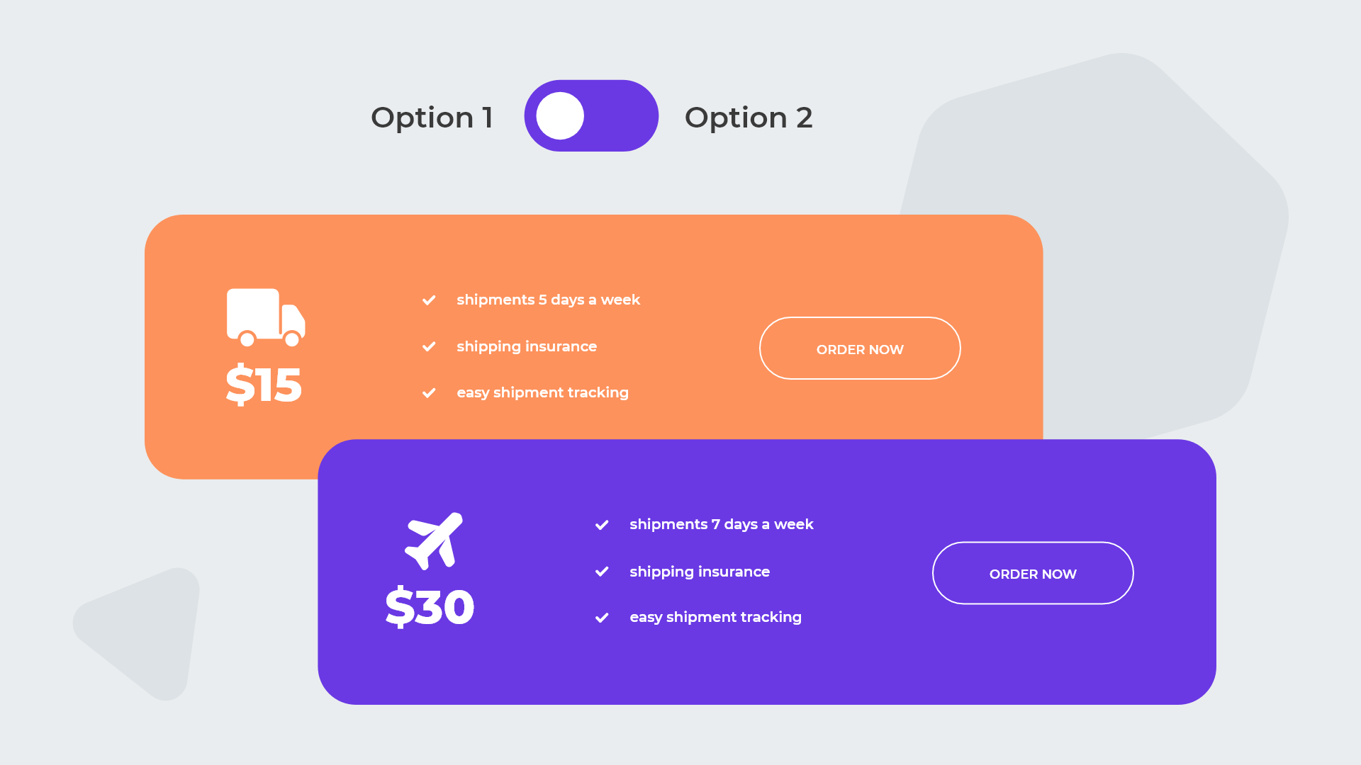
Toggles are a great way to add a bit of interactivity to your Divi page or post. They are useful for presenting two alternative blocks of content, such as two sets of pricing options (monthly vs. annual or member vs. non-member), two restaurant menus (lunch vs. dinner), or two versions of a product (standard vs. deluxe). Our Divi Advanced Content Toggle Module (free for active WP Zone members and available for non-members to purchase) provides a Divi module based approach to building toggle content with lots of customization options. However, this tutorial will demonstrate a different way to create a toggle in the Divi builder using two Divi sections and no additional plugins – all you need is the Divi or Extra theme, or the Divi builder plugin!
Court Rentals
$15
/hr
- Sed ut perspiciatis unde
- Proin eget tortor risus. Quisque velit nisi, pretium ut lsit voluptatem accus
- Antium doloremque
Court Rentals
$49
/hr
- Sed ut perspiciatis unde
- Proin eget tortor risus. Quisque velit nisi, pretium ut lsit voluptatem accus
- Antium doloremque
Court Rentals
$79
/hr
- Sed ut perspiciatis unde
- Proin eget tortor risus. Quisque velit nisi, pretium ut lsit voluptatem accus
- Antium doloremque
Court Rentals
$99
/hr
- Sed ut perspiciatis unde
- Proin eget tortor risus. Quisque velit nisi, pretium ut lsit voluptatem accus
- Antium doloremque
Step 1: Create Or Add Your Content
The first step to building your custom Divi content toggle is to create the content that will be shown for each state of the toggle switch.
- Download the Divi Layout and save it to your computer.
- Unzip the file you downloaded.
- import it to a page or post using the portability feature in the Divi Builder.
- Open the section settings dialog by hovering over the section and clicking the gear icon near the top left of the section.
- In the section settings dialog, go to the Advanced tab, open the CSS ID & Classes section, and add the following in the CSS Class field so that the toggle JavaScript code (which we will add later) recognizes this as the first toggle section:
ds_toggle__content_1 - Repeat steps 1 and 2 to add the second toggle section, but use this for the CSS Class field instead:
ds_toggle__content_2 ds_toggle__inactive
In the first section the content that will be shown by default when the toggle is in the left position. In the second section, the content that will be hidden by default and will replace the first section when the toggle is toggled to the right.
In our example above we have given you a predesigned layout feel free to use this as a starting point for your needs or use it as a learning or educational tool!
Step 2: Add the Toggle
Next, add a new section in your Divi builder content to contain the toggle element – this section should be immediately above your first toggle content section. Add a Code module to this section and insert the following code, which contains the HTML to render the toggle as well as the JavaScript that implements the interactive functionality and the CSS required for styling.
Code
<div class="ds_toggle__switch_wrapper">
    <div class="ds_toggle__switch_wrapper_inner">
        <div class="ds_toggle__label ds_toggle__label_primary">
      Option 1
    </div>
        <div class="ds_toggle__switch">
            <input type="checkbox" name="ds_toggle" id="ds_toggle" class="ds_toggle__switch_checkbox">
            <label for="ds_toggle"></label>
        </div>
    <div class="ds_toggle__label ds_toggle__label_secondary">
      Option 2
    </div>
  </div>
</div>
<style>

/*  toggle background colors */
.ds_toggle__switch > input:checked + label {
  background : #fd935c;
}

.ds_toggle__switch label {
  background         : #6a39e4;
}

/* toggle switch color */
.ds_toggle__switch label::after {
  background         : #ffffff;
}


.ds_toggle__switch_wrapper {
  display         : -webkit-box;
  display         : -ms-flexbox;
  display         : flex;
  align-items     : center;
  justify-content : center;
  margin-bottom   : 20px;
}
.ds_toggle__switch_wrapper_inner {
  display     : -webkit-box;
  display     : -ms-flexbox;
  display     : flex;
  align-items : center;
}
.ds_toggle__switch {
  position       : relative;
  display        : inline-block;
  vertical-align : middle;
  margin         : 0 30px;
  cursor         : pointer;
}
.ds_toggle__switch input[type="checkbox"] {
  position           : relative;
  width              : 100%;
  height             : 100%;
  padding            : 0;
  margin             : 0;
  opacity            : 0;
  z-index            : 3;
  display            : none;
  -webkit-appearance : none;
}
.ds_toggle__label {
  line-height : 1.7em;
}
.ds_toggle__switch {
  width  : 50px;
  height : 30px;
}
.ds_toggle__switch label {
  cursor             : pointer;
  top                : 0;
  left               : 0;
  right              : 0;
  bottom             : 0;
  width              : 100%;
  height             : 100%;
  position           : absolute;
  -webkit-transition : all 0.3s ease;
  -o-transition      : all 0.3s ease;
  transition         : all 0.3s ease;
  border-radius      : 20px;
}
.ds_toggle__switch label::after {
  position           : absolute;
  -webkit-transition : all 0.3s ease;
  -o-transition      : all 0.3s ease;
  transition         : all 0.3s ease;

  top                : 50%;
  -webkit-transform  : translateY(-50%);
  transform          : translateY(-50%);

  content            : "";
  height             : 20px;
  width              : 20px;
  left               : 5px;
  bottom             : 5px;
  border-width       : 0;
  border-radius      : 50%;
}

.ds_toggle__switch > input:checked + label::after {
  -webkit-transform : translate(20px, -50%);
  transform         : translate(20px, -50%);
}

.ds_toggle__inactive { display: none !important; }

</style>
<script>
jQuery(document).ready(function ($) {
    $(document.body).on('change', '.ds_toggle__switch_checkbox', function() {
    var isChecked = $(this).prop('checked');
    $('.ds_toggle__content_1').toggleClass('ds_toggle__inactive', isChecked);
    $('.ds_toggle__content_2').toggleClass('ds_toggle__inactive', !isChecked);
  })
})
</script>
You’ll want to rename “Option 1” and “Option 2” in the above HTML code to reflect the labels that you want to use for the left (default) and right toggle states, respectively.
If you are using the Divi Visual Builder to edit your page or post, you may notice that your second toggle content section disappears after adding the above code. That is because the CSS portion of the code hides the second toggle section by default. If you need to edit the content in the second section, you can switch the builder into Wireframe mode using the view controls at the bottom left of the screen. This will show you the two sections without the CSS hiding applied. If you want to use the visual builder to edit the content, you can temporarily remove the ds_toggle__inactive class from the second section (Advanced tab > CSS ID & Classes > CSS Class) which will make both sections visible in the Visual Builder – just don’t forget to add the class back before you save your page or post!
Step 3: Customize!
To make your toggle match your site’s look and feel, you can edit the CSS in the <style> element in your toggle’s code to customize colors and more! If you aren’t familiar with using CSS to customize the frontend appearance of your site, we’ve got you covered with recommended resources for learning CSS for Divi, a list of sites you can check out for more CSS help, and our very own course on transforming Divi with CSS and jQuery.
No Code Option: Use Divi Advanced Content Toggle Module Plugin
If you prefer working with Divi modules rather than HTML and CSS code, our Divi Advanced Content Toggle Module is the perfect solution for you – it’s already included in your membership if you are a WP Zone annual or lifetime member, or you can purchase it here. This plugin, which requires no coding, comes with pre-made toggle Divi layouts and offers five different styles of toggle switches, as well as options to animate content and customize labels. You can also use favorite icons, change the position, colors, and more.

How would I change the code to have Option 2 be checked first?
You can add “checked” to the input, like in this example:
Very nice – thanks. I had some trouble with the toggle resizing in mobile but a min-width fixed it:
.ds_toggle__switch {
width : 50px;
height : 30px;
min-width: 50px;
}
Awesome! Exactly what I need 🙏🤩
Hi
I followed the tutorial, but I have a sentence that appears “Thank you for reading this post, don’t forget to subscribe!” that I can’t find. Can you tell me how to remove it please?
Hi, does it appear in the toggle? Can you send the link to your page?