Creating a masonry gallery with the Divi theme using only the built-in features and native Divi modules is a highly requested feature among Divi users. However, the Divi theme alone cannot achieve a masonry gallery layout without the use of additional plugins or custom code. In this tutorial, we will explore one method of implementing a masonry layout for the Divi theme that involves implementing custom CSS Divi code snippet. Although it requires custom coding, it’s as simple as copying and pasting, and the end result will be stunning!
What Is A Masonry Layout?
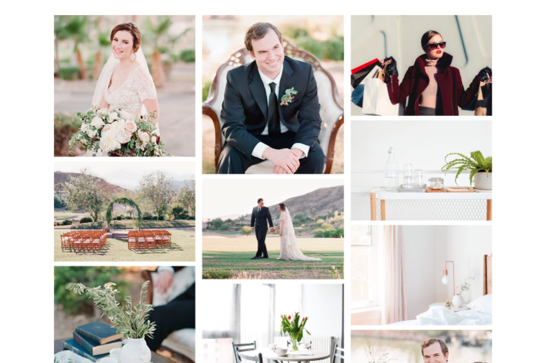
A masonry gallery is a popular layout style for displaying elements, such as images, on a website. It is characterized by a grid-like structure where each item is positioned closely together, creating an organized and visually appealing arrangement. Unlike traditional grid layouts where all items have a fixed width and height, a masonry gallery allows for varying heights of items within a row. This results in a dynamic and fluid layout, with items aligning vertically based on their content’s height. The overall effect is a visually interesting and harmonious display of images or content that breaks away from the rigid structure of traditional grid layouts.
Step 1: Add the Divi Gallery Module
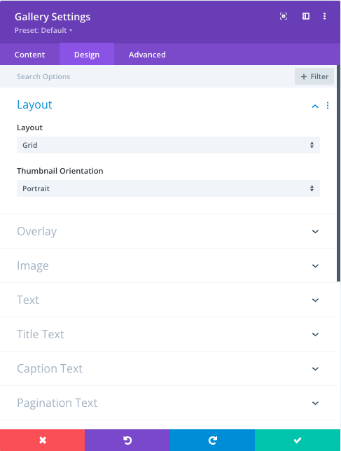
Insert the Divi Gallery module into your page. You can upload your images and configure the gallery settings using the module’s options. Make sure to select “Grid” under Design -> Layout.
Step 2: Insert the CSS Code
Next, add the provided CSS code to your site. This CSS code adjusts the column count and spacing based on different screen sizes.
There are several methods to add Divi custom CSS to their websites. These methods include:
- Custom CSS Box in the Divi Theme Options dashboard
- Advanced options tab of the sections, rows and individual modules
- Divi Builder Page Settings of an individual page
- Divi child theme style.css file – create one for free with our Divi Child theme generator
- CSS with WordPress plugins ( Divi Module Custom CSS Selectors, Custom CSS and JavaScript Developer Edition )
Learn all methods from this article >>
To add CSS to page settings, from the front-end Divi visual builder, click on the Divi + icon to reveal the full menu selection. Click on the gear icon and you’ll reveal the Divi Page Settings. Within the Divi Builder Page Settings, go to Advanced Tab and paste the provided CSS into the Custom CSS box.
Customize the CSS to adjust the column count and spacing if needed – see the CSS comments for reference.
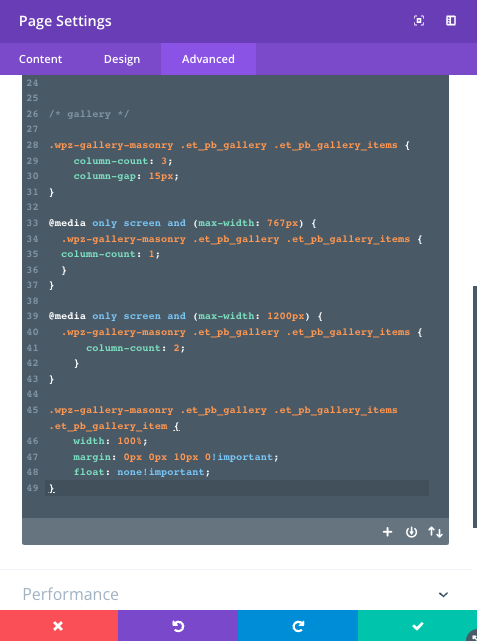
/*
Masonry Gallery by WP Zone
https://wpzone.co/wordpress-and-divi-code-snippets/
*/

.wpz-gallery-masonry .et_pb_gallery .et_pb_gallery_items {
    column-count: 3; /* number of columns for desktop */
    column-gap: 15px;  /* column spacing */
}

@media only screen and (max-width: 1200px) {
.wpz-gallery-masonry .et_pb_gallery .et_pb_gallery_items {
    column-count: 2;  /* number of columns for tablet devices */
}
}
@media only screen and (max-width: 767px) {
  .wpz-gallery-masonry .et_pb_gallery .et_pb_gallery_items {
    column-count: 1;  /* number of columns for mobile devices */
  }
}

.wpz-gallery-masonry .et_pb_gallery .et_pb_gallery_items .et_pb_gallery_item {
    width: 100%;
    margin: 0px 0px 10px 0!important; /* replace 10px to change row spacing */
    float: none!important;
}
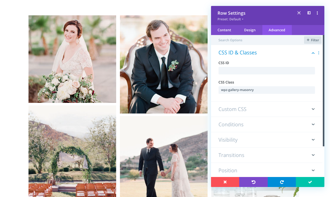
Step 3: Add the Custom CSS Class
To apply the masonry layout to your gallery, you need to add a custom CSS class “wpz-gallery-masonry” to the section or row that contains the Divi Gallery module. Edit the section or row, navigate to the Advanced tab, and find the CSS Class option. Enter “wpz-gallery-masonry” as the custom CSS class and save your changes.
Save your page and preview it to see the Divi masonry gallery layout in action!
Watch the video below:
Step 4: If the Snippet doesn’t work
In some instances, if images are too large or are displayed with incorrect aspect ratios, you will need additionally to add this PHP. By default, it will run for all gallery modules on the site.
These filters are designed to specify the width and height of images within a gallery module. By setting these values, you can control the display size of images in gallery layouts, ensuring they fit well within the design of your website and maintain a consistent appearance across different devices and screen sizes.
add_filter( 'et_pb_gallery_image_width', 'wpz_gallery_image_width' );
add_filter( 'et_pb_gallery_image_height', 'wpz_gallery_image_height' );

function wpz_gallery_image_width() {
    return '1080';
}


function wpz_gallery_image_height() {
    return '9999';
}

Is there a way to rearrange the order?
Just installed this code and it still works. The mistake I made in the past was adding the code through the page settings as opposed to the row or section settings.
Is there anyway to keep all the images on the same screen? I have five images but only four display in 2×2 rows. The last one ends up on page 2.
Hi, I tried to add the php snippet but the grid still remains horizzontally or vertically set. May you please help?
Good morning,
I have a problem with this gallery. My problem is that with your tutorial, I cannot choose the order of my images. When I set the CSS CLASS, my images align from top to bottom and not from left to right.
Do you know how I can modify this?
Thank you so much !
In some instances, if images are too large or are displayed with incorrect aspect ratios, you will need additionally to add this PHP. By default, it will run for all gallery modules on the site.
Disregard my previous request for support. I ended up solving the problem by using a jquery code snippet from peeayecreative.com to hide image titles and then added an additional bit of code to show the image alt information in place of the title or blank title if and when it exists. On the site I reference, you can see that the image titles are not displaying, the slideshows work (both the hidden on the projects2 page and the gallery masonry layout) AND when I’ve added specific alt text (like on the projects2 page), that DOES show for the user. I think I had faulty jquery code before and now that I’m using the new version, everything works great! Thanks for all you do and instruction you provide!!!
Thank you for a great bit of code! I just have one issue … the lightbox when clicking on the images is not appearing. I have added the css to the page, the css class to the row containing the gallery and it all looks great but the lightbox won’t open.
After further investigation, I found it was the code (any code – css, javascript, jquery, php, etc) that hides or prevents the image title from displaying on mouseover/hover was also causing the lightbox to not open. For now I’ve deleted all the image titles from the database (although some titles are still displaying in the site).
Is there a way to have the lightbox work WITH the hiding of image titles reliably? Web gallery is at https://lionheartdevelopments.com/gallery/.
Thanks Anna for this great tip. Spent so much time looking for a simple solution and here it is.
A little advice for those, like me 😁, who tend to go too fast: do exactly as specified and where specified, especially step 4, and it works perfectly 🤓
Will this work with posts? I want to setup custom posts for news items – headline, date, image, and short text – using the Divi posts module and display them in a masonry grid if they match the category.
Thanks for building this!
Hi Anna, is it possible to keep the order of the images in the gallery? Currently this works as a random.
Thanx Serge
Hey, thanks for this code but unfortunately is not working for me.
I added the css code, the class and also the function php 🙁
https://estudioonline.pt/portfolio/ can you help me please, I appreciate so much!
best regards,
Duarte G
How can i make the same with a filterable portfolio module?
Is there any way to set the order of the images? I know it has to do some rearranging, but when I put the code in it entirely reordered the gallery. Thanks
Hey WP Zone,
I’ve followed the tutorial and added the additional PHP Script, but my images are still in the standard portrait mode. Running Divi 4.24.3. Any assistance would be appreciated as it looks like this CSS Snippet would work great for my use case.
No instruction is given on how to perform step 4! (It is still beyond me why something as simple as a masonry gallery isn’t a one-click option in DIVI!!!)
Hi Anna!
Thanks for a nice tutorial. Do you know why the image text appears in the wrong column. Please see the text “Headline”, Text here, it supposed to be at the bottom of row 1, mot at the top of row 2.
Helo, I have inserted the filters into the function.php of the child theme. But it still doesn’t work. https://lehmann.photos/ein-tag-in-venedig/ The images are all scaled.
Hi, it looks like you are not using the Divi gallery module.
Hi thanks for this snippet.
It seems to work, but I do not get the masonry effect because my divi gallery is already displaying differently to yours.
Thumbnails aspect ratio (Portait or Landscape) are overruled by the Thumbnail orientation setting in the module settings.
Your gallery has a mix of landscape and portrait pictures , mine, even containing land. + port. pictures, the shown thumbnails have all the same format as set in Thumbnail Orientation.
So how do you get different formats of pictures in your normal divi gallery module?
Please check the Step 4 from this tutorial, adding this code snippet and adjusting the height and width should resolve the issue.
works beautifully. thumbnail title and caption sometimes goes to top of next column, so not under the thumbnail at bottom of previous column. will try to figure it out.
This worked for me! Thank you so much.
Hi,
The advice is working for me but the issue that I have is that the photos of the gallery all have the same ratio : if I select portrait all my photos will be shown as portrait no matter their original size. So I end un with just a grid of photos all the same size. Can you help me ?
Thank you !
Same for me
The solution for this is provided in Step 4 in this tutorial
Thanks a lot for all your work 🙂
Unfortunatly, it doesn’t work for me with the css code. Could you please explain how to add the php code?
Thanks
Hello,
I have tried out the settings for myself. Unfortunately, the images are only displayed in the backend. In the frontend, the images are only displayed cropped with stripes. I have not yet inserted the PHP code because I am not quite sure where it should be inserted in Divi. Thanks for a quick help
PHP may be neccesary in your case. You can add PHP to your child theme functions.php file or via the plugin, for example https://wordpress.org/plugins/code-snippets/
I got it to work using the PHP code but it is affecting all of the galley-items on my site. Is it possible to let the PHP code only work on this particular gallery?
Yes, add if block like in this example to add adjustment for certain pages. You can replace ‘page-slug’ with page id.
public static function wpz_gallery_image_width( $width ) { if ( is_page( 'page-slug' ) ) { return 480; } else { return $width; } }Yep, PHP code worked. Thanks
Hi Chris,
How would one use this for the blog posts instead of just having a grid change it to this type of layout?
Hi!
thank you for the tutorial! I am happy with how you instruct.
I am not sure why the image sizes are uniform. is there a way to fix this?
Each gallery on this page is comprised of images in landscape and portrait .
here is the link to the work i am doing : https://klmcondotel.com/executive-twin-room/
thank you
Hello! Can you try adding PHP from Step 4 of the tutorial? I just added it.
Hello, I have tried as the tutorial says and it does not work, the images are very small and not as the tutorial says
Hello, send us a link to the page and we will check it 🙂
If you are getting small images, apply this:
width: 100% !important;
Like so:
.wpz-gallery-masonry .et_pb_gallery .et_pb_gallery_items .et_pb_gallery_item {
width: 100% !important;
margin: 0px 0px 10px 0!important; /* replace 10px to change row spacing */
float: none!important;
}
This will force the settings to overwrite anything the theme gives it.
Hi Bart, I haven’t tested the snippet with small images, but I will do it for sure!
Works ok for me still with all latest version…
However, is there an option to align the pictures to the center of you are display 2 or 1 columns as well. They are now left aligned and that does look that great on smaller devices, certainly if you also have a kind of border around the images ?
Images should be centered by default, can you send the link to your module?
site is not only, can I send you some screenshots?
I would need to inspect the code, screenshot may not be enough.
Hi there. I have a similar problem as folks above, the masonry effect isn’t working. I have the css inserted in the row not the section as instructed. https://soniclodge.co.uk/gallery-test/
Hello! Can you try adding PHP from Step 4 of the tutorial? I just added it.
Thanks for the code. Looks to not be working 100% for me. Possibly something to do with pagination?
stirrups.co.za/gallery
Fixed. I expected the ‘Image count’ setting to be the images per row.
Thus, working as expected.. Thanks!
Hello! Make sure to add “wpz-gallery-masonry” class to the row, not the module. If that doesn’t fix the issue, send us the link to the page, and we will figure out why it isn’t working on your end 🙂
I’ve been looking for a way to do this on my painting website, thanks for posting and sharing.
The code does remove the spacing between the gallery items and “tile” them, but the images are cropped to either the selected thumbnail orientation (portrait or landscape) in the Module/Design/Layout Thumbnail Orientation section so I’m not seeing the full images. Any suggestions?
Note – I do have several gallery related plugins on the site but none are applied to this page.
Hi! The spacing can be customized by changing values in the CSS – take a look at the comments, there is a different selector for column and row spacing. The link you posted gives “No Results Found”, so I am not able to look at the issue with the aspect ratio. It is controlled by Divi, so Elegant Themes support should be able to help with that.
Unfortunately I can not make it work. The aspect ratio if the images are kept the same. No masonry effect. Also once I click an image to see them individually, when I go back the gallery is gone.
Any ideas how to fix this?
Hello! Make sure to add “wpz-gallery-masonry” class to the row, not the module. If that doesn’t fix the issue, send us the link to the page, and we will figure out why it isn’t working on your end 🙂
What a great tip …. ideal to have different layouts