Creating new and unique site designs is essential for catching your site visitors off guard. When they see something original, they’ll pay more attention and are more likely to engage with the site. One often overlooked area in a Divi website is the Divi mobile menu.
Website menus are often underutilized, even more so on mobile. They have such a direct and to the point function of providing site navigation, that most developers leave this element alone. However, with a bit of creativity and imagination, the navigation menu can become a great vehicle for facilitating conversions.
In this post, you’ll learn how to turn your Divi mobile menu into an eye-catching, conversion-optimized asset. This tutorial will include a bit of CSS and JavaScript.
If you are a developer or intermediate user, feel free to skip to the bottom for the copy-and-past code. For beginners looking for instruction continue reading.
What is a call to action?
A call to action is a statement, sentence, word, or phrase that is used to entice a customer toward making a decision. Calls to action generally have a singular focus and encourage readers, listeners, or viewers of an advert to move ahead with a single task. Often, this is something like ‘Buy now,’ ‘Click here to learn more,’ ‘Contact our team for more information’ or similar.
In web design, calls to action often take the form of a button. Buttons are great web elements as they allow for swift action, include a hyperlink, and can be styled and designed in just about any way. Buttons can be any size, can be round or square, can take any color, including a drop shadow, and accommodate any font for the button text.
If you’re using the Divi theme, you’ll know that adding buttons is easy. A popular trend for web developers is to transform the menu items of the navigation menu into a button and use this web element as a call to action.
With a bit of CSS, developers can transform a standard navigation menu from this…
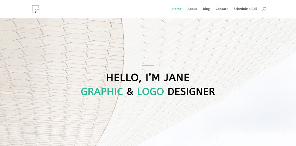
An example of a standard Divi website’s navigation menu
… into a conversion-focused, eye-catching web element like this…
Here you’ll find that the last menu item in the Divi menu has been styled to display as a button. This visual element is quite common now as the trend has been around for a while, so it’s time to try something new!
In a previous tutorial, we showed you how to achieve this look and feel; of a Divi navigation menu with a stand-out call to action button.
In this tutorial, we’ll show you how to shake the format by adding a button into the Divi header so that the call to action button displays underneath the hamburger icon of the Divi mobile menu.
Here’s an example of the CTA in the header of the Divi mobile menu:
An example of a button added to the Divi mobile menu, displaying below the hamburger menu
Tips for designing a call to action button
Here are some tips for making your call-to-action button stand out:
- Using bold fonts and vivid colors is a great way to grab someone’s attention. If your call to action button is bright and bold in color it’ll stand out from the rest of your page design.
- Make sure your copy is short, to the point, and only offers one option of action. By limiting options and giving your site visitor a direct command, they’ll have no time to second guess what they need to do. Using copy, such as “Join Now”, “Contact Us”, or “Try For Free” is effective, particularly if you’re planning on adding this to the Divi mobile menu.
Create a unique Divi mobile header with a call to action button
In this tutorial, we’ll be working with Javascript and CSS. Both are easy to add to a Divi site. Before you begin, we recommend making a backup of your site. Here’s a helpful guide if you need it.
This tutorial is in two parts:
• First, you will add Javascript to the Divi Theme Options section to create the button in the Divi mobile menu
• Then, using CSS, you will style the button to fit your brand colors and style guide
Let’s begin!
Step 1: Add Javascript to the Divi Theme Options
Navigate to the Divi Theme Options > Integration tab and look for the text area titled Add code to the < head > of your blog.
Copy the following code and paste it into the text area.
<script>

jQuery( document ).ready(function() {
jQuery('#main-header').append('<div class="header_button"><a class="et_pb_button" href="#">New Button</a></div>');
})
</script>
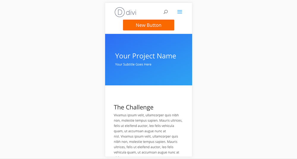
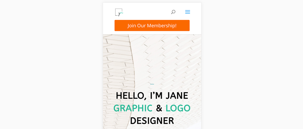
This code will add a standard, unstyled button to the mobile menu of your Divi site. It’ll take on the default Divi button look and feel.
After you’ve added the Javascript code, the Divi mobile menu will look like this
To edit the button:
- To update the button text, change the text in the Javascript code from New Button to something custom.
- To make the button send to a custom URL, change the # in the href code to a URL. Remember to include the https:// declaration and enter the link between the “ “ inverted commas.
For example, the following code …
<script>
jQuery( document ).ready(function() {
jQuery('#main-header').append('<div class="header_button"><a class="et_pb_button" href="https://wpzone.co/membership/">Join Our Membership!</a></div>');
})
</script>
… will create a button stating “Join Our Membership!” and, once clicked, will send to the Divi Space membership page.
Step 2: Style the button using CSS
Now for the fun part, CSS styling. While there are several ways to add CSS to your Divi site, we recommend the stylesheet method. This requires you to have a Divi child theme installed and running. If you need a refresher in understanding child themes, read our guide. If you need a child theme, you can download a free Divi child theme here.
Once your child theme is set up and ready to go, open your stylesheet and paste in the following code:
@media only screen and ( max-width: 980px )  {
  .header_button {
    display: block;
    position: relative;
    clear: both;
    text-align: center; /* Can be set as right or left */
    padding-bottom: 20px; /* Change the space below button */
  }

  .header_button .et_pb_button {
    background-color: #ff6900;  /* Change the button background color */
    color: #fff; /* Change the button text color */
    border: none;  /* Border set to not display */
    padding: 10px 55px;  /* Change the button padding */
  }
}

@media only screen and ( min-width: 980px )  {
  .header_button {
    display: none; /* Don't display button for devices above 980px (tablet and desktop) */
  }
}
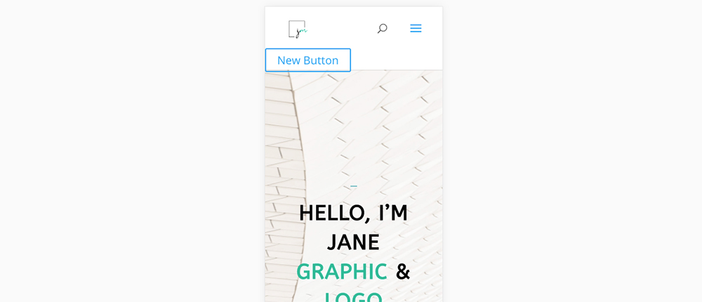
This will produce the following effect:
Once you’ve added CSS code, the button will display as such
To edit the look of the button, revisit the code above, and enter the appropriate hex codes, font styling, and button styling for your brand identity.
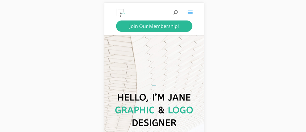
You can use CSS code to style the button to fit your brand colors
Ending thoughts
If you follow this short tutorial, you’ll have a striking CTA in the header of your Divi mobile menu. Your site visitors will have a clear direction to follow and, as this call to action is in your mobile menu, they’ll always see it.
We hope that you enjoyed this tutorial and that it’s helped you create a striking new web element for your site. If you have any more Divi tutorials or snippet requests, let us know in the comments below!

Hi! Is it possible to make this button with a clickable phone number? I tried to replace the URL in your example using ‘tel:’ attribute (href=”tel:″ ) but it’s not working.
Hi! Adding
should work 🙂
I get an error message on the text-align line. I have already installed the all devices snippet. Any suggestions?
Your content is great
Hi Else, what’s the error message?
Is this for mobile only?
Yes, for all devices check this snippet https://wpzone.co/divi-tutorials/how-to-create-a-call-to-action-button-in-the-divi-menu/ 🙂