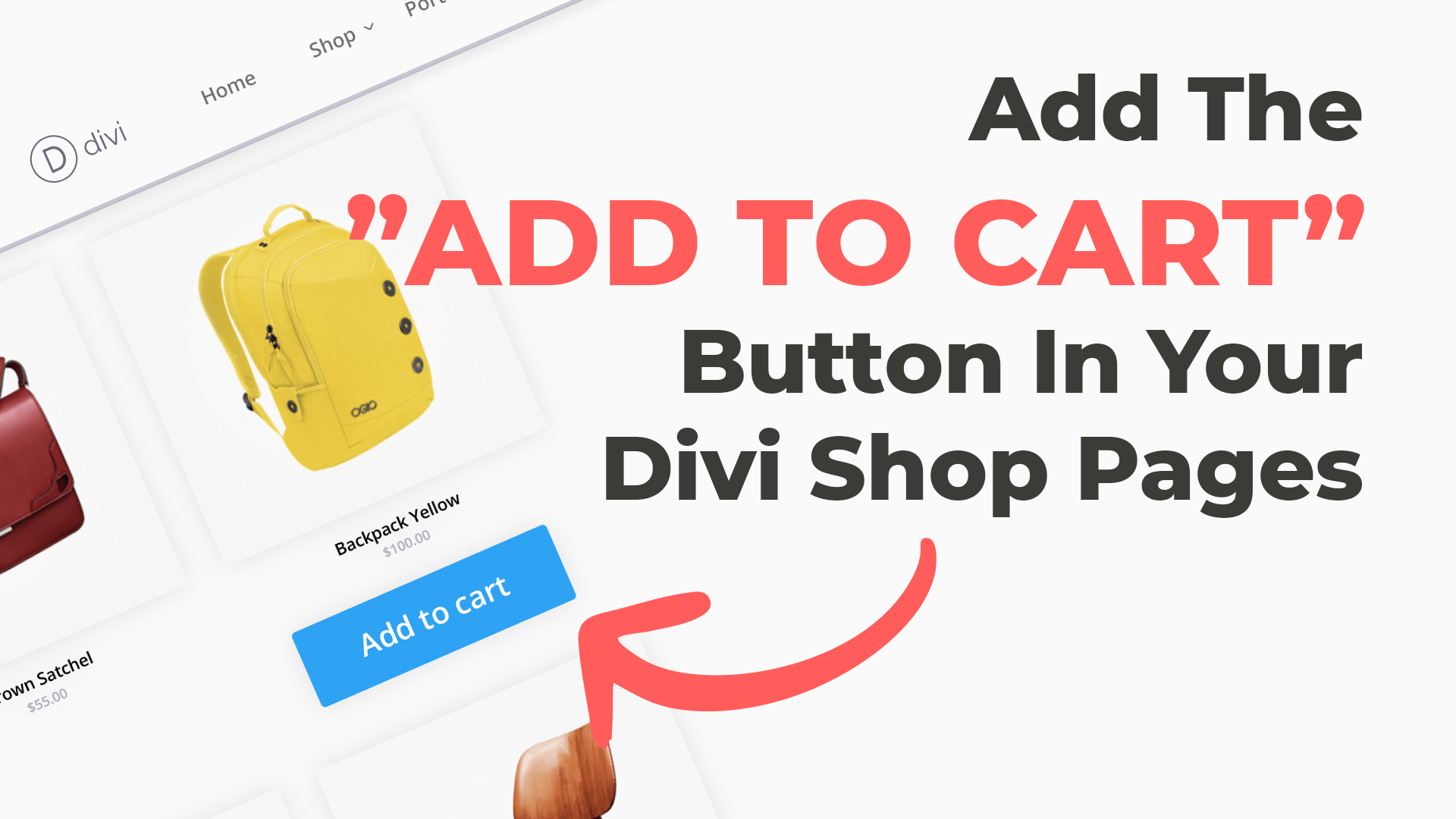
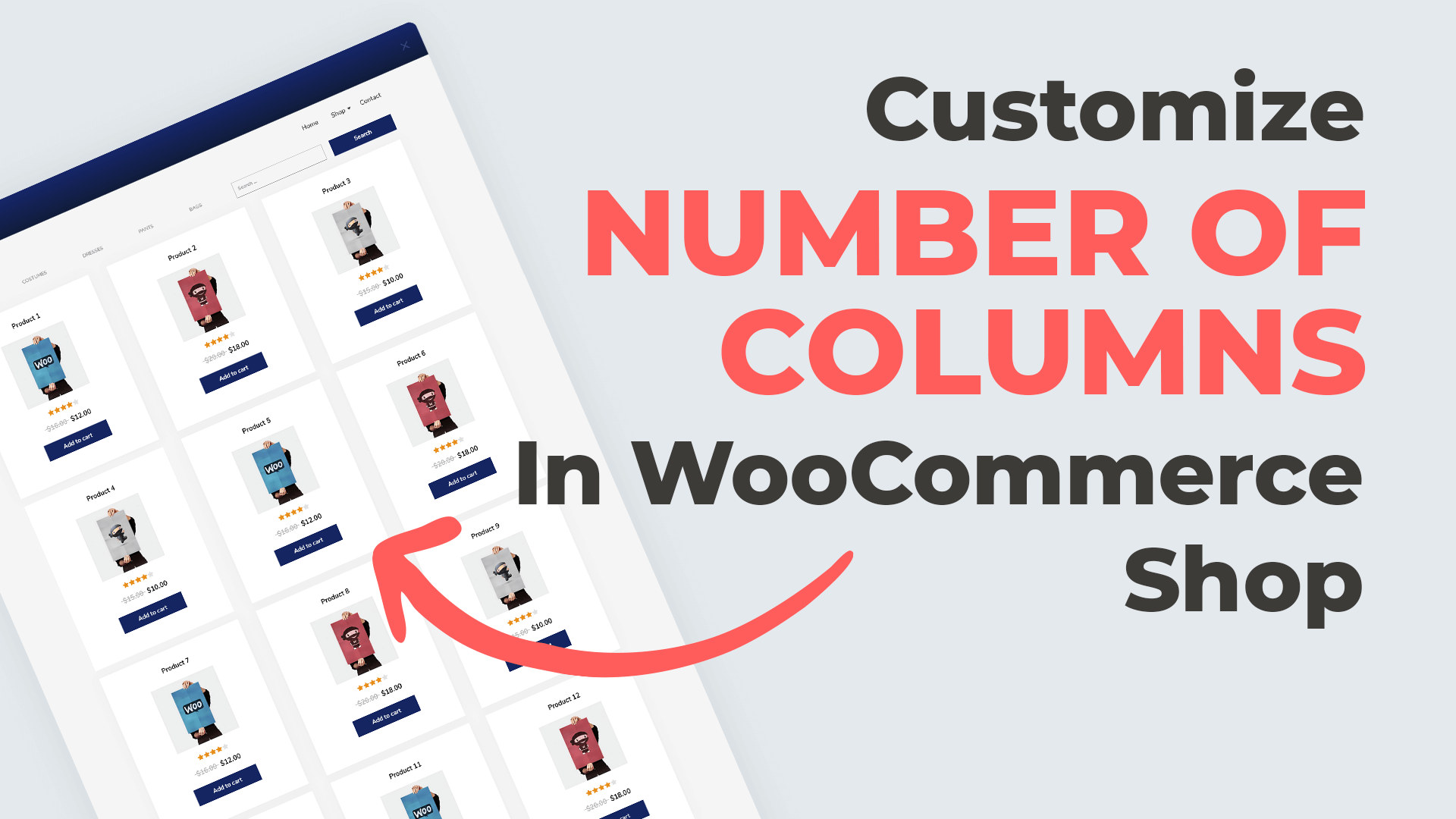
Once a WooCommerce store is on its way, and a selection of products are added to the back end, the shop page will, by default, display the products listed in two columns. This can be frustrating as the product title and featured image end up looking rather small on mobile devices.
While there’s no back-end plugin setting for creating a single-column layout for your WooCommerce shop, thankfully, a bit of CSS will do the trick. If you want to change WooCommerce and make a single product page with one column, this tutorial is for you!
Today, you’ll learn how to use a few CSS lines to edit the Divi shop module so that it displays a single column on mobile devices.
Want to skip the step-by-step tutorial and grab the code? Jump straight ahead to the code library and copy the code.
This feature is also available in our plugin, Divi Shop Builder. With the plugin, you can customize our WooCommerce store’s cart, checkout, thank you page and more using the Divi Builder, not code. Check out the Divi Builder plugin.
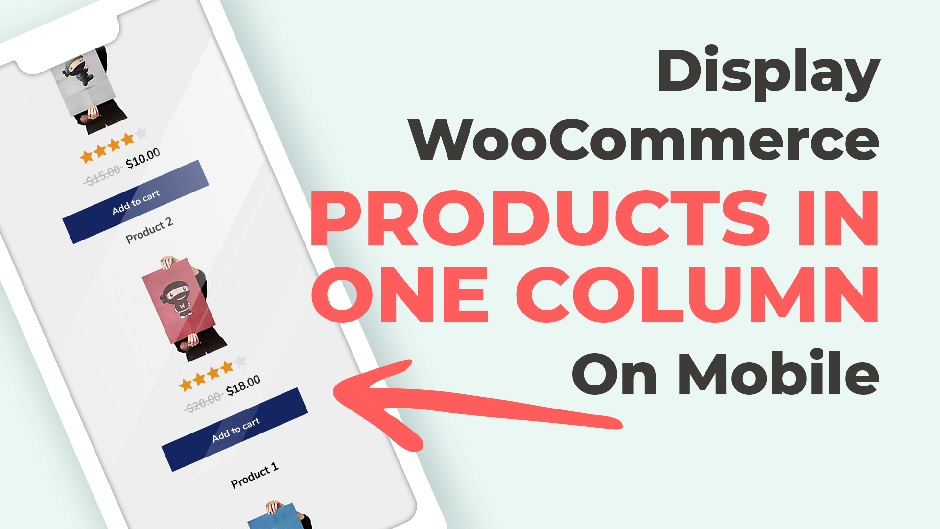
Showcase Your WooCommerce Products in a Single Column on Mobile Devices
By default, WooCommerce products presented via the Divi Shop module will display in two columns on mobile devices. This can make for a crowded look and feel on mobile. Also graphic details of featured images will be lost as they’ll display at a small size.
In this tutorial, we’ll be working with CSS adding media queries into the Advanced tab of the Divi Shop module. Media queries, sometimes referred to as @medias are lines of CSS that take care of responsiveness for various device sizes and orientations.
Often, websites are designed with desktop or laptop widths and heights in mind. When the same web layout is displayed on a mobile or tablet, the design will likely distort. To remedy this, lines of CSS code called media queries are added to the stylesheet of the child theme. These media queries will target a specific web element and instruct it on how it should display at a particular breakpoint.
Between mobiles and tablets in both portrait and landscape orientation, there are countless combinations of device widths and heights that need to be taken into account.
In this tutorial, you’ll be targeting mobile devices (screen sizes with a maximum width of 767 pixels), and instructing select web elements to display in a certain way.
If you haven’t set up a child theme yet, you can download a free one from the Divi Space site. If you need a refresher on what child themes are and why they’re important, read our guide.
Step 1: Add a Shop Module to a Page Layout
Begin by adding a Divi Shop module to a new page. On desktop, the layout will display as such:
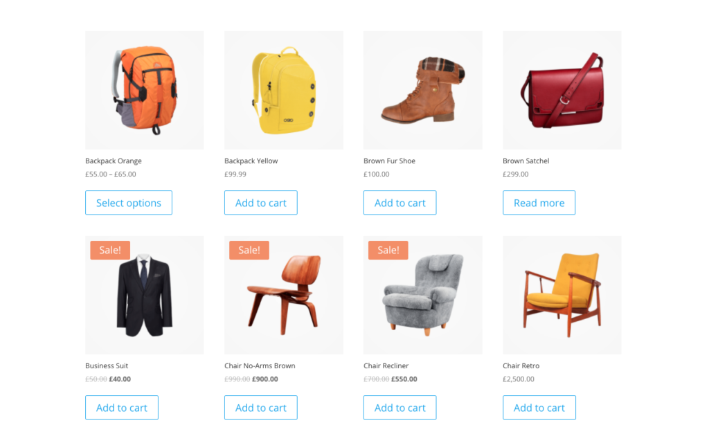
We’ve added a Divi shop module of eight products in four columns to a Shop page
On mobile, the same layout will display as follows:
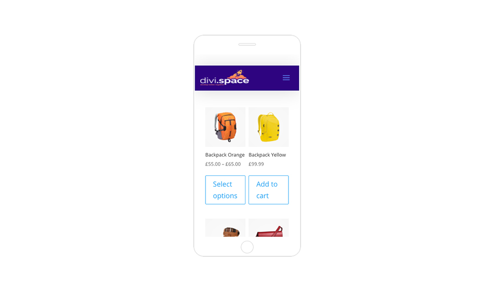
By default, the Divi Shop module will display two columns
To change this to a single column, open the Divi Shop module and add the CSS code to the Advanced tab > Custom CSS box/
As soon as the code is added, the Divi Shop module will display in a single column on mobile:
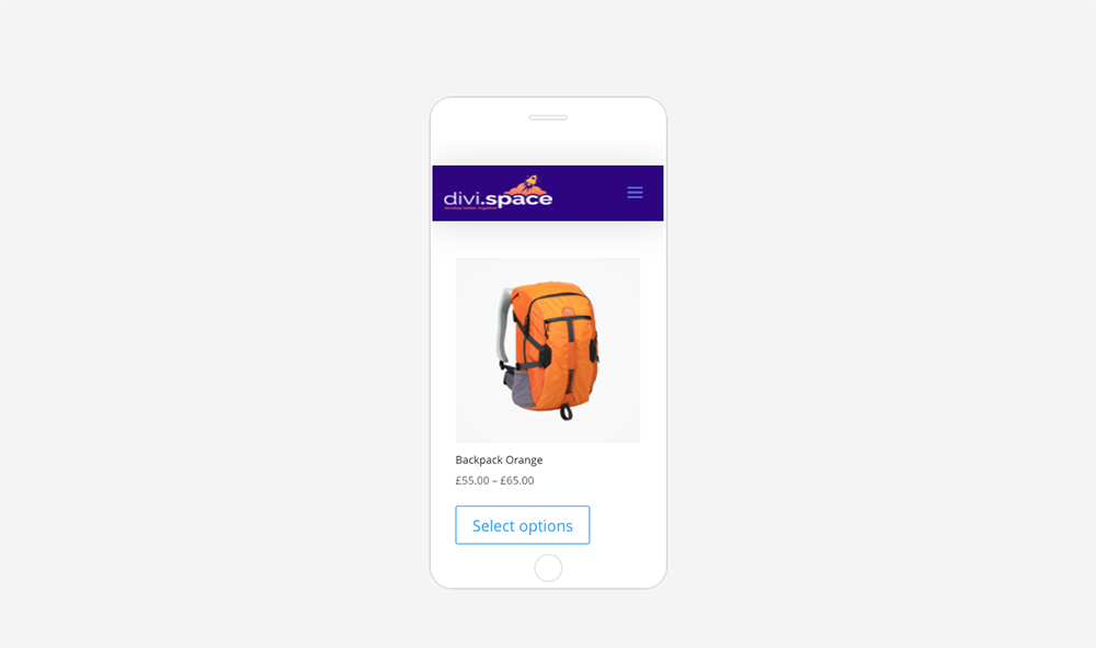
Once the CSS is added to the Divi Shop module, the mobile display will show a single column
In just a few seconds, you would have fully transformed the mobile experience of your WooCommerce store. Now, your customers can see clearly which products you’re selling as they browse through your products.
Our Divi Shop Builder plugin helps you set the column count for your Divi and WooCommerce store without using code. Instead of working with lines of code you can simply set the number of columns you’d like for desktop, tablet and mobile using the Divi builder’s settings. Head to the Divi Space store to purchase the plugin.
Did you enjoy this Divi tutorial? Let us know which snippets you’d like us to create! Comment your snippet wish list below!

Still working, thanks!
same. size woo-commerce products css code
Worked like a charm! Thanks
It works great!
Is there similar css to do the same to categories which also show 2 columns on cell?
Thanks
Excellent thank you! Still working and I just added it to Divi Customizer > Custom css as someone else mentioned doing, then works site wide without having to add to each shop module.
It works! Thanks guys!
This is just great! Worked perfectly for me. Thanks a lot!!
It still works. But now I wish to delete the code, but it does not change back to to products pr line? Why is this?
Hello, make sure to clear your cache after making changes.
Yep it works. Awesome. I’ve spend almost a whole day banging my head on the keyboard. Great work guys. Gave you a plug in Dive Theme Users FB. Saved my b utt.
Cheers
appreciated !
Hi,
it does not work for me.
Greetz!
Hi! Can you provide more information so we can help you? Link to the site would be helpful…
It’s rare that I comment on these types of sites but I had to say it DID work! I just applied this CSS to the Additional CSS area of the “Customizer” and it works without issue. And I am using a custom theme which had me worried. Thank you very much!
Thanks for letting us know! Glad it worked for you.
Wow. I don’t usually leave comments but this code worked a treat. THANK YOU
2021 April – works great
Yo ! Still working on 4.8.1. Thks guys !