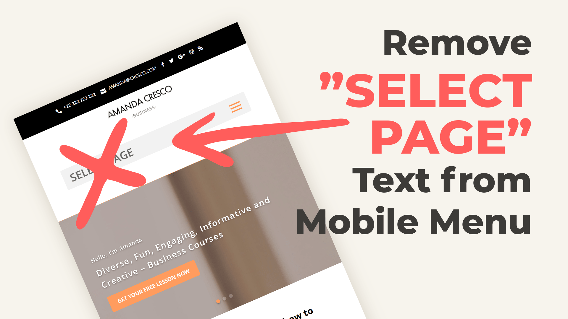
If you set your Divi Menu centered, you will see on your Mobile by default “Select Page” before your menu bar. Use this CSS snippet to hide it.

If you set your Divi Menu centered, you will see on your Mobile by default “Select Page” before your menu bar. Use this CSS snippet to hide it.
#et_mobile_nav_menu span.select_page {
    display:none;
}
Please let us know in the comments if everything worked as expected. We have tested this code with the Version: 4.0.5 of the Divi Theme.
If you think this code saved you time, we will be happy to receive a comment!
____
License: This snippet contains code from the Divi Theme, copyright https://elegantthemes.com, modified by Divi Space, November 7, 2019. Licensed under the GNU General Public License, no warranty; click here for details.
Still works for me! Thanks!
I didn’t like the menu icon beneath the main logo either, it looks way better in-line with it, so I also added this CSS:
. et_header_style_split #et_mobile_nav_menu {
margin-top: -40px;
margin-bottom: 5px;
}
Here’s my site for reference: https://www.housefiremag.com/
Hi when I do this it leaves a grey bar in the place of “Select Page”. I have tried a couple different lines of code and had no luck…Anyone able to help fix?
Thanks
Perfect…. thank you!! I spend ages trying to get rid of that 🙂
Glad we could help 🙂
Great code, thanks! I had issues with my hamburger menu being at the very bottom of my header, so added this code to put a bit of space:
div#et_mobile_nav_menu {
padding-bottom: 10px;
}
Thanks so much for this code! It removed “Select Page” perfectly, but it made the hamburger menu REALLY close to the bottom of my header. How would I increase the padding there by 5px or so?
Anna’s suggestion was very helpful, though it left the hamburger menu showing, So I also added this CSS:
#et_mobile_nav_menu span.mobile_menu_bar {
display:none;
}
Hi, thanks for the snippet.
-> Probably an oversight, but this should be marked as CSS, not Javascript.
Fixed 🙂 thank you!
The phrase “SELECT PAGE” is removed; however, the grey background that was behind that phrase is still visible and unsightly.
Any way to remove this too?
Try adding this CSS:
@media (max-width: 980px) { .et_header_style_centered #main-header .mobile_nav { background-color: transparent!important; } }Muchas gracias!!!
Excellent! It Works. Thank You So much