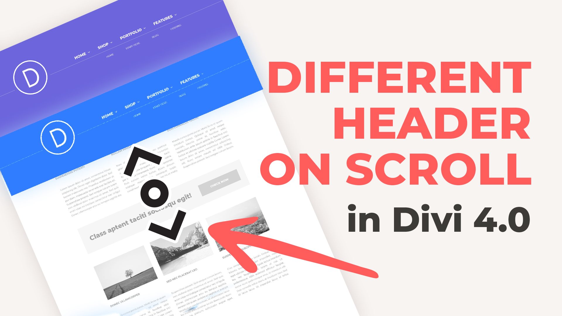
We have already shown in a previous snippet how to make the Divi header fixed in Divi 4.0. This snippet is a bit different – because you can set a totally new header upon scroll. That means you can change the logo on scroll, set different navigation, and more!
See the demo below:
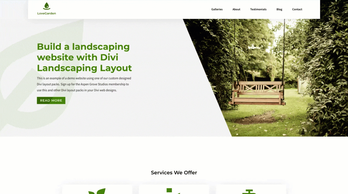
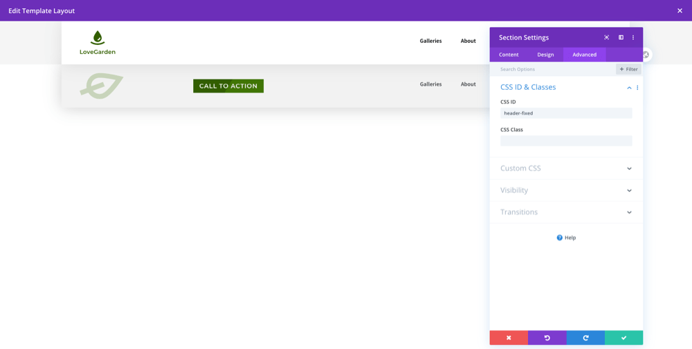
1. Create two header sections.
Add a custom ID “header-fixed” to the header you want to display on the scroll.
2. Add the CSS and Javascript code to your website.
If you want to display fixed header on the specific pages, use Divi 4.0 conditional logic and insert the divi code module below the menu module and paste the JavaScript snippet. You can do that too with CSS by wrapping the code in the style tags or simply paste it into the Custom CSS tab.
3. Will this work on mobile devices?
Usually, you don’t want a fixed header on the mobile, as they can take up too much space unnecessarily on already space-challenged mobile screens.
The code below does affect only devices with a minimum of 480px width. That can be easily changed in the CSS code. In the line “@media only screen and ( min-width: 480px )” change the value to anything you want or simply delete the wrapping media query.
CSS
.header-f-wrapper {
opacity:0;
}

@media only screen and ( min-width: 480px )  { /* fixed only for deviced > 480px, feel free to change the value */
.header-f-wrapper {
z-index: 999; /* display at the top */
position: fixed;
width:100%;
top: 0;
-webkit-transition: all 0.75s ease-out;
-moz-transition: all 0.75s ease-out;
-ms-transition: all 0.75s ease-out;
-o-transition: all 0.75s ease-out;
transition: all 0.75s ease-out;
}

.header-f-wrapper.header-show {
opacity:1;
}}

@media only screen and ( min-width: 782px )  {
.admin-bar #header-fixed{
  top: 32px;
}}
Please let us know in the comments if everything worked as expected. We have tested this code with the Version: 4.0.2 of the Divi Theme and Divi Friendly Hosting with PHP 7.3.
If you think this code saved you time, we will be happy to receive a comment!
____
License: This snippet contains code from the Divi Theme, copyright https://elegantthemes.com, modified by Divi Space, October 22, 2019. Licensed under the GNU General Public License, no warranty; click here for details.
The code seems to work fine on my site, http://www.ip3action.org, but not on the mobile menu. Is there a way for it to show on newer versions of Divi on mobile? Also, is there a way to add padding between the color CAT and the WooCommerce cart button?
Hi. I am having one problem, the initial header/navigation is not clickable. When I scroll, the swapped menu works perfectly, but the initial menu does not work.
Hi, you can do this by adjusting the height in JavaScript, by changing the 20 px or by assigning a fixed number to the height variable
var height = jQuery(".et-l--header").height()+(20);
var height = jQuery(".et-l--header").height()+(10);
var height = 10;
David
on October 27, 2021 at 12:09 pm
After following the steps, I have an issue whereby the fixed header only shows if I scroll down the page and refresh it. It will show, but then it gets replaced by the regular header once I scroll either up or down. If I slowly scroll down from the top of the page, I see the fixed header get revealed, but once I continue past the height it occupies, the other regular header returns. The news site isn’t live yet… Any ideas what I need to do to fix it? Thank you.
Hi, thanks for the help with making this menu sticky. Unfortunately it makes my top menu (the one on far left at the top of the website AND social icons on the right) not clickable at all. Cam you help me with that? https://greatdee.pl/
Hi Ash, JavaScript is not loading. Try first to fix other issues on the site: you have mixed SSL content and JavaScript errors, not related to our tutorial. Check the console log for more information.
Cat
on October 21, 2020 at 10:43 am
Hi,
Thanks for the tutorial. Could I ask one question? I have a button in the Header with rollover colour change. However the effect does not work in the first header, only the fixed header.
Hi there,
Great tutorial/script!
I am wondering… how can I add:
1 – an additional header slide-in effect on scroll down
2 – an additional ease-out fade effect when scrolling back to top
Hi Jasper, we updated snippet and now it includes transition when scrolling down and to top. You can customize it by changing transition property values in the CSS code.
Tristen Arnold
on September 13, 2020 at 1:00 am
This is great thanks! Only question is it’s not working on mobile??
Hi, by default it won’t work on mobile devices, but it can be easily changed.
You can find instructions in the section “3. Will this work on mobile devices?”
Great. But if I do not want it global I should use ‘conditional logic’ huh?
Should I make a template ‘for a specific page’ and another template for another specific page, at the template builder you mean?
That’s a great job! I’ve tried some others solutions, but not so nice like that.
In fact, I faced just one little problem: the “header-fixed” header, works fine. Perfect. But the another one, “fail” sometimes, in the submenu’s clics. (both are identic, except, of course, the logo and colors)
Thank you for sharing this tutorial, but I have something to ask. Do you have any code to make the transition when the header back to the first header (on top)?
I want to make the transition from fixed-header to first header and tried to add fade animation in .header-f-wrapper.header-show CSS but it doesn’t work.
Hi anna ! I have some issues with this tutorial… After creating my fixed header in global header and giving him the right custom ID as you said, I’ve tried to fix it in the top of the screen but it doesn’t work… Both with the Java module below my fixed menu in global header, and with CSS into the Custom CSS tab of my page… Have you any idea to make this work ? Thank you 🙂
PS: Sorry if I’m not clear, I’m a beginner in WordPress, and I’m using Divi 4.0.2
That’s because the image is loading first, after that CSS with the display:none;
There are many ways to fix it. Please contact me via [email protected] and I will try to have it solved for you.
Thank you. This code does affect only devices with a minimum of 480px width. That can be easily changed in the CSS code. In the line “@media only screen and ( min-width: 480px )” change the value to anything you want or simply delete the wrapping media query. I updated the snippet description to help future readers.
Hi, Great tutorial! We are having issues having this appear on mobile. Is there any way to have this entire module appear on mobile or even just have one of the headers sticky on mobile?
Hi Shiran, in this snippet we are using media queries, @media only screen and ( min-width: 480px )
Header will be fixed only for screens above 480px. Just change this value 🙂
Bas
on January 9, 2020 at 9:57 am
Hi Anna, I’m using this to display a simplified menu on scroll, with a menu with only logo and hamburger. If I would replace the standard mobile menu with my own menu, would that be possible (in combination with the scroll functionality)? What code would I need to do that?
Maybe I wasn’t clear enough: I want the second menu to be visible on scroll but also in screensizes below 780px. Is this possible?
Thanks.
Anna Kurowska
on January 10, 2020 at 5:10 am
Thanks for the comment! Sure it is possible!
We are already using media query in the CSS code
@media only screen and ( min-width: 480px )
so just make sure you change the value to whatever fits you 🙂
Were you able to find out what code would need to be added to this to enable a smooth fadeout when scrolling back to the top? I’ve tried several combinations and I can’t seem to be able to accomplish it.
Marc
on April 21, 2020 at 11:07 am
Hi, very nice tutorial and classy effect! The only missing part is the fade out transition, everything else is so refined, that abrupt fade out is killing it :p Is there a way to have the same fadein transition for fade out? Thank you!
Thank you!!
This is a wonderful solution.
I have another problem to throw at you.
I created a semi-transparent header with a video slider that runs behind it. When the user scrolls down, I wanted the nav bar to become solid. Your CSS and JS did just that. Yeah! The only problem is that it seems that the new code has pushed the video slider down so it no longer appears under the semi-transparent nav bar. I tried to see if there was something in the CSS you prescribed that might be altered to fix it, but I haven’t found it.
Child themes are incredibly important for the overall look, feel, and navigation of your website, so we encourage you to take the time to get to know the content. This will help your web design and development processes tremendously. That’s why we’ve made it super easy to build a child theme for Divi or Extra in seconds!
There are four ways you can add JavaScript or jQuery to a Divi website: use the code module, the Divi Theme Options console, enqueue scripts using the functions.php file, or using a plugin.
Divi users can choose between five different methods to add custom CSS to their websites. Read more about these various methods you can use to add custom CSS to your Divi theme, as well as better understand the pros and cons of each method.

The code seems to work fine on my site, http://www.ip3action.org, but not on the mobile menu. Is there a way for it to show on newer versions of Divi on mobile? Also, is there a way to add padding between the color CAT and the WooCommerce cart button?
Please read the section “3. Will this work on mobile devices?”
Hi. I am having one problem, the initial header/navigation is not clickable. When I scroll, the swapped menu works perfectly, but the initial menu does not work.
Hi, can you share a link?
Hi i would like the menu to change as soon as scroll is activated please can you tell me how to adjust this
Hi, you can do this by adjusting the height in JavaScript, by changing the 20 px or by assigning a fixed number to the height variable
var height = jQuery(".et-l--header").height()+(20);var height = jQuery(".et-l--header").height()+(10);After following the steps, I have an issue whereby the fixed header only shows if I scroll down the page and refresh it. It will show, but then it gets replaced by the regular header once I scroll either up or down. If I slowly scroll down from the top of the page, I see the fixed header get revealed, but once I continue past the height it occupies, the other regular header returns. The news site isn’t live yet… Any ideas what I need to do to fix it? Thank you.
Hi, please send a link to your site
Hi, thanks for the help with making this menu sticky. Unfortunately it makes my top menu (the one on far left at the top of the website AND social icons on the right) not clickable at all. Cam you help me with that? https://greatdee.pl/
Hi Dorota, links are clickable for me, have you already figured it out or is it specific browser issue maybe?
Hi, Thanks for the tutorial. Im stuck!
Double checked everything, the fixed menu does not show on scroll. Can you let me know where i’ve gone wrong.
https://mercy.brandstimulant.com/
Thanks
Hi Ash, JavaScript is not loading. Try first to fix other issues on the site: you have mixed SSL content and JavaScript errors, not related to our tutorial. Check the console log for more information.
Hi,
Thanks for the tutorial. Could I ask one question? I have a button in the Header with rollover colour change. However the effect does not work in the first header, only the fixed header.
Do you know why that would be?
Thanks.
Hi Cat, I would need to investigate the code on the site, you can send a link to the page.
Hi Anna,
The website is in development. Can I send a DM with a link?
Sure 🙂 [email protected]
Hi there,
Great tutorial/script!
I am wondering… how can I add:
1 – an additional header slide-in effect on scroll down
2 – an additional ease-out fade effect when scrolling back to top
Hi Jasper, we updated snippet and now it includes transition when scrolling down and to top. You can customize it by changing transition property values in the CSS code.
This is great thanks! Only question is it’s not working on mobile??
Hi, by default it won’t work on mobile devices, but it can be easily changed.
You can find instructions in the section “3. Will this work on mobile devices?”
You saved my life, this worked perfect. thank you thank you thank you!!!!
So glad this little snippet could help. Cheers!
Great. But if I do not want it global I should use ‘conditional logic’ huh?
Should I make a template ‘for a specific page’ and another template for another specific page, at the template builder you mean?
That’s a great job! I’ve tried some others solutions, but not so nice like that.
In fact, I faced just one little problem: the “header-fixed” header, works fine. Perfect. But the another one, “fail” sometimes, in the submenu’s clics. (both are identic, except, of course, the logo and colors)
Could you help me, please?
Hi Anna!
Thank you for sharing this tutorial, but I have something to ask. Do you have any code to make the transition when the header back to the first header (on top)?
I want to make the transition from fixed-header to first header and tried to add fade animation in .header-f-wrapper.header-show CSS but it doesn’t work.
Thank you!
Good day! It’s really awesome tutorial! Thank you so much!
One more question, how do I implement fadeOut function?
Thank you so much!
Hello! Love this tutorial. I am having an issue though on mobile where the dropdown menu is being cut off. Any ide on why this would be?
http://staging.ludeman-productions.mysites.io/home/
Thank you!
Hi, first of all, your menu is not being displayed, because of the code
.et_pb_menu_0_tb_header {display: none!important;
}
Hi anna ! I have some issues with this tutorial… After creating my fixed header in global header and giving him the right custom ID as you said, I’ve tried to fix it in the top of the screen but it doesn’t work… Both with the Java module below my fixed menu in global header, and with CSS into the Custom CSS tab of my page… Have you any idea to make this work ? Thank you 🙂
PS: Sorry if I’m not clear, I’m a beginner in WordPress, and I’m using Divi 4.0.2
Just understood how to make it works ! And it’s pretty cool ! Thank you !
you see the page in the first comment! use chrome! I’ll try firefox and safari
https://www.sticca.it/new/workshop/
That’s because the image is loading first, after that CSS with the display:none;
There are many ways to fix it. Please contact me via [email protected] and I will try to have it solved for you.
https://imageshack.com/i/poi1HSs8j
sorry i forget the screen!
Thanks for using our snippet, can I have a link to live example of the issue?
hello! I have a problem 🙁 when loading page the logo appears like in the screenshot!
any suggestion?
thanks!
Thank you. This code does affect only devices with a minimum of 480px width. That can be easily changed in the CSS code. In the line “@media only screen and ( min-width: 480px )” change the value to anything you want or simply delete the wrapping media query. I updated the snippet description to help future readers.
Hi, Great tutorial! We are having issues having this appear on mobile. Is there any way to have this entire module appear on mobile or even just have one of the headers sticky on mobile?
Hi Anna,
This works well with desktop, but doesn’t show on mobile. im using an android phone. Any idea why?
Hi Shiran, in this snippet we are using media queries, @media only screen and ( min-width: 480px )
Header will be fixed only for screens above 480px. Just change this value 🙂
Hi Anna, I’m using this to display a simplified menu on scroll, with a menu with only logo and hamburger. If I would replace the standard mobile menu with my own menu, would that be possible (in combination with the scroll functionality)? What code would I need to do that?
Thanks for your help!
Maybe I wasn’t clear enough: I want the second menu to be visible on scroll but also in screensizes below 780px. Is this possible?
Thanks.
Thanks for the comment! Sure it is possible!
We are already using media query in the CSS code
@media only screen and ( min-width: 480px )
so just make sure you change the value to whatever fits you 🙂
More about media queries: https://wpzone.co/divi-tutorials/divi-media-queries/
Hi! THANK YOU for this!!!
The fade in is so smooth but the fade out is abrupt. Do you have code to make that smooth as well?
THANKS!!
Hi Shelley 🙂 Do you mind sharing a link? I will see what can be done 🙂
You can always modify animation style and time
webkit-animation: fadein 0.5s ease-in;
-moz-animation: fadein 0.5s ease-in;
animation: fadein 0.5s ease-in;
Were you able to find out what code would need to be added to this to enable a smooth fadeout when scrolling back to the top? I’ve tried several combinations and I can’t seem to be able to accomplish it.
Hi, very nice tutorial and classy effect! The only missing part is the fade out transition, everything else is so refined, that abrupt fade out is killing it :p Is there a way to have the same fadein transition for fade out? Thank you!
it is not working for me, could you please give me the template to import in divi theme builder so i can see what i did wrong. thanks! br thomas
Worked like a charm thanks so much!
I just added a code module in the first menu and pasted the code there and that seemed to work.
Small note: Just wanted to let you know that at step 1, you say add as a custom Class but it should be custom css ID (on the image it is right:) )
Thank you! 🙂
Dear, Great! I love it.
Is it possible to fix it later in the page? So after longer scrolling?
Yes, change the height value, for example
var height = jQuery(“.et-l–header”).height()+(20);
var height = jQuery(“.et-l–header”).height()+(1000);
var height = 1000;
Thank you!!
This is a wonderful solution.
I have another problem to throw at you.
I created a semi-transparent header with a video slider that runs behind it. When the user scrolls down, I wanted the nav bar to become solid. Your CSS and JS did just that. Yeah! The only problem is that it seems that the new code has pushed the video slider down so it no longer appears under the semi-transparent nav bar. I tried to see if there was something in the CSS you prescribed that might be altered to fix it, but I haven’t found it.
Any help would be appreciated.
Again, thank you for all your help.
Hello Steve, please try adding the following code to the first section (with semi-transparent header). Let me know if that works for you!
position: absolute;
top:0px;
width: 100%;
Thank you! Super helpful tutorial, I’ve been looking for a solution like this!