Creating a transparent header on your website is a smooth little design styling trick for seamlessly layering your logo and menu items over a hero image or mega slider. But as of Divi 4.0, doing this with the default Divi header controls takes a few additional steps and some settings finagling.
In this tutorial, you’ll learn both the default Divi option and how to skip a few steps with single switch control of the transparent header option with Divi Switch.
Divi Switch is an expansion pack plugin with +50 handy switches for adding one-click style changes and extending the functionality of the Divi theme and builder. Speed up development time, spend less time working through lines of code, and more time growing your business.
Divi Switch 4.0 a bunch of new options includes two new switches for making your header and menu background transparent:
- Transparent header for the homepage
- And, transparent header for all pages
If you haven’t download the latest version of Divi Switch, it’s time to upgrade. Already a member or Switch user? Upgrade for free!
Transparent Header With Divi Configuration Options
If you’re not wanting all the extra goodies, are just learning, have the extra time, and are wondering how to accomplish this with the Divi defaults, here is a step-by-step guide. Jump down to the Divi Switch home and other page instructions if you are looking for the fastest method.
By default, the Divi theme background color for the header is white. You can change this to a different color, or even make it transparent from the Theme Customizer. But making the background transparent does not properly position your header and menu over the body element. This section covers the three-step process for doing this with the built-in Divi configuration settings.
1. Set The Header to Transparent
The first step is to remove the background from the Section and all the elements in the Header. To do this, in the Divi menu select the Theme Builder. To apply your changes across all your pages use the Global option. Create a new template if you want to apply the transparent header option to a specific page or groups of pages conditionally.
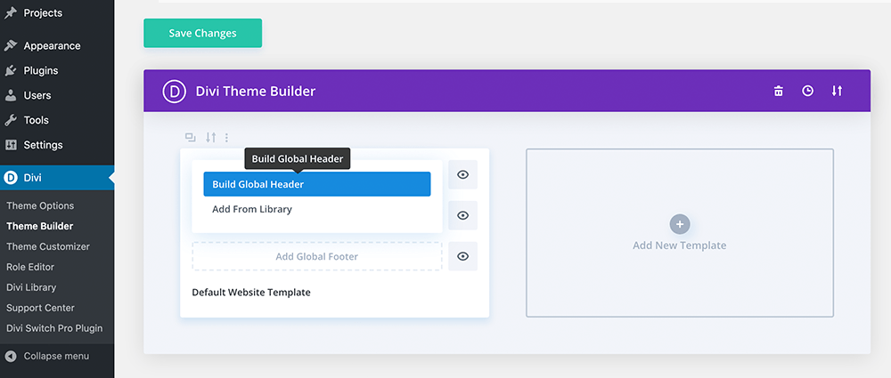
Use the Global Header option to apply changes across your whole site
Click either the “Add global header” or “Add custom header” option for a new template and select “Build Custom Header”. From here, choose “Build from scratch” or pull in a layout you have saved.
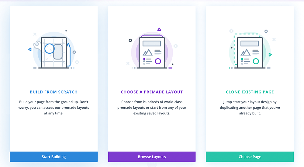
Use the “Build From Scratch” option if you do not have a template created
Use the Divi builder to add your menu items. For this example, we’ll just add the primary menu and set a logo with Menu module.
Set all the Sections and module backgrounds to Transparent and save.
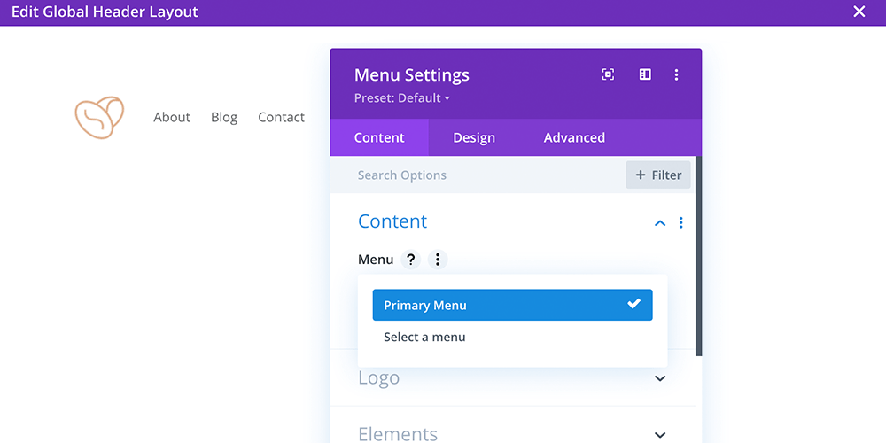
Choose your menu and set a logo in the Menu module
Now when you visit a page the header and all the elements should appear white. This is because the header has not been positioned over the body.

New global menu is applied but still appears white
2. Position the Header Over the First Section in the Body
Back in the Theme Builders Header editor, under the Section settings > Advanced option, change the position from Relative to Absolute.
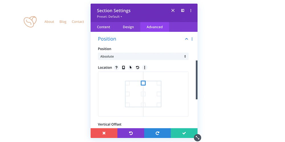
Set the Section position to Absolute in the Advanced tab
This will float the header over the first section on the body of the page. Now you’re almost there.
3. Adjust Padding & Styling
Now that your menu is floating over your image, you may notice there is not enough space between your menu and the headline, text, CTA, or other elements layered over your hero image. Use padding to reposition your elements on the page. If your hero background image is light, you will need to go back to the Theme builder to make the text and link colors of your menu readable. If you are using Transparent Headers as a global setting with both light and dark images, you may need to adjust the menu and logo colors for each page.

Here is your final product
It is not the fastest option, and you may find editing difficult when the position set to Absolute, but if you have a fairly static page or do not want to use the plugin method, you can use this option to add a transparent header with Divi.
Now let’s look at how Divi Switch can save you time by letting you do the same thing with a toggle.
Home Page Transparent Header
With Divi Switch you can change up your header aesthetic and set its transparency at the flick of a switch for:
- The home page
- Other pages
- Or both the home page and all other pages
For this tutorial, I’ve set up a demo site with one of the free layout packs from Elegant Themes installed. I’ve loaded the respective layouts onto the Home, About, Blog, and Contact pages, and have kept the default header settings of the Divi theme. I have also assigned the homepage display to be the static page of Home in the Settings > Reading panel.
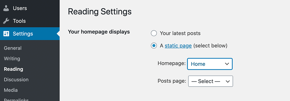
This is how you set a static home page in WordPress
If you take a look at the front end of the site, with the default Divi header, you can see that the header has a background color of white.
Scrolling through the pages of the site, the menu has the same standard white background. Boring 😉
To make the Background Transparent and float it into position with Divi Switch, navigate to the back end of your website, hover over the Divi menu and click the Divi Switch tab.
Once you’ve accessed the Divi Switch panel, you should, by default, arrive on the first tab – Header. Here you’ll find all of the customizations related to the header.
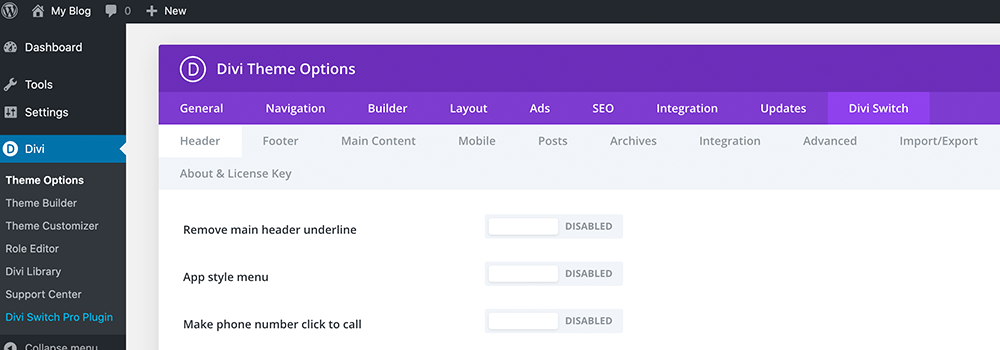
Click the Divi Switch option in the Divi menu to open the header tab
Scroll down to the “Transparent header for the homepage” switch, click to enable, and save.
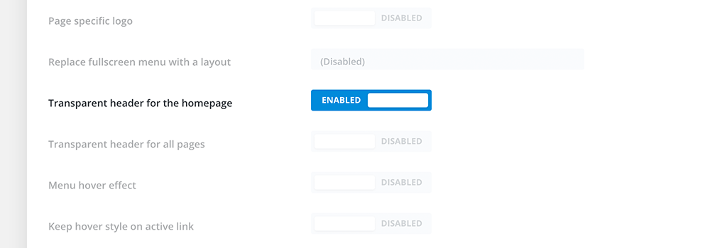
Toggle the transparency of the homepage
Now, when your return to the front end of your website and refresh the page you’ll see that the header is fully transparent and positioned over your hero image. It’s that easy.

Here is our example now, without a background-color
Remember, to adjust the menu text color to improve the readability for light and dark backgrounds.
I’ve changed the text color of the menu items so that you can see the effect in action. This switch only sets transparency for the home page, so the rest of the site pages remain as is, with a white background color, if your home page image is dark you may want to consider changing the background color of your default menu.
You can do this from Customizer by selecting the primary menu and changing the background color.
Transparent Header All Pages
If you want the header to be transparent on all your pages, toggle the Transparent header for all pages on as well. Remember to click Save Changes before returning to the front end and refreshing your site.
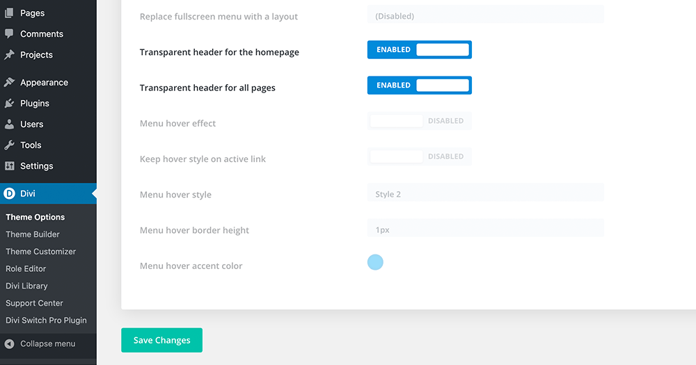
Simple toggle controls – don’t forget to click save 🙂
Now, when you go to the other pages on the front end of your site, you’ll see that they have the same transparent header that is on the home page.
Thanks to these two awesome switches, you can quickly and easily create visually engaging effects for your Divi header. Plus, you’ll have access to the complete collection of Divi switches including built-in hover animations for your menu, additional header styles, and added functionality like making your phone number click-to-call.
Whether you set transparency for either the home page or alternate pages or both, you’ll certainly create some interesting aesthetics for your site.
If you haven’t already added Divi Switch, it’s your time to upgrade and speed up development. Don’t forget to check out our other Switch tutorials, like how to lower your bounce rate with a custom 404 page.
As always, we want to hear from you. if have any questions, feature requests, or have used Divi Switch and just want to sing its praises, share it in the comments below.
Enjoy!


If using Divi Switch, is it still difficult to edit the page when the header is transparent? Thx.
Cool, no example. Thanks a lot!
Example is included in the tutorial.
Thanks for the tutorial. I’d like the menu to be transparent when you’re above the fold, but would like it to stick the top on scroll, and have the background turn white. Can you tell me how to do that?
Hi I am having some trouble, I made the section transparent and it is overlayed, but there is still an outline of the header. It is set to transparent but it seems lighter than the photo underneath. I would appreciate any help!
Hi Sienna, can you send a link to you your website?
Hello, I have exactly the same problem as Sienna…
Floastix, I will be happy to help, I would just need to see the issue 🙂
Thanks for this tutorial! Where is this setting “Remember, to adjust the menu text color to improve the readability for light and dark backgrounds.”?
Just change the color of the menu text, in the Divi module open the Divi Menu module -> Design -> Menu Text -> Menu Text Color.
I still havent found the answer to having a transparent header but when you scroll it sticks to the top but then switches to have a different colour background and menu items. It seems you cant have stick to top and absolute options selected and this work? Does the plugin resolve this?
Hi Simon, this snippet may be helpful in your case https://wpzone.co/wordpress-and-divi-code-snippets/different-header-on-scroll-in-divi-4-0/
Great addition to Divi Switch – thanks so much..
It would be great to have the option of a transparent header for selected pages – an option available on each page (or post).
Might this be possible?
Thanks for reading and the feedback Neal. That would be a great addition. I have passed the suggestion on to our development team. In the meantime, for targeting specific pages I would suggest using the Divi method and creating a custom template. You can use the conditional logic to set it to a specific page. This obviously takes a few extra steps, but it will get the job done. Cheers!