
Centering or aligning text on the vertical axis (up and down) has always been difficult to achieve.
There are a number of solutions to this, including the use of CSS floats or Javascript. It’s probably fair to say that all solutions have their drawbacks and the one proposed in this article is no different in that regard.
The following post aims to give you a vertical alignment solution using Flexbox.
What is Flexbox?
Introduced in CSS3, the Flexible Box model, better known as Flexbox, is a layout mode intended to accommodate different screen sizes.
For many applications, it is easier than the block model because it does not use floats, which tend to over-ride any pre-existing block rules.
However, when Flexbox is used in a mature theme such as Divi, the user will need to be aware that some of the other CSS rules may no longer work. For example, certain objects may not respond to different viewport sizes (screen dimensions), so when using Flexbox, be prepared to use @media queries!
Now I’m not a CSS expert by a long shot. I dislike tables, but know they have a practical application and have to use them sometimes. I also wrestle with floats but manage to get by.
Flexbox is not a replacement for these solutions but rather another way of doing things that can, in some cases, be more robust and may break less.
In the following example, I’ll show you how you can vertically align elements in Divi using Flexbox.
We’ll write a bit of code and a few @media queries to transform a number of Divi modules into a uniform-looking layout.
How to Vertically Align Divi Elements with Flexbox
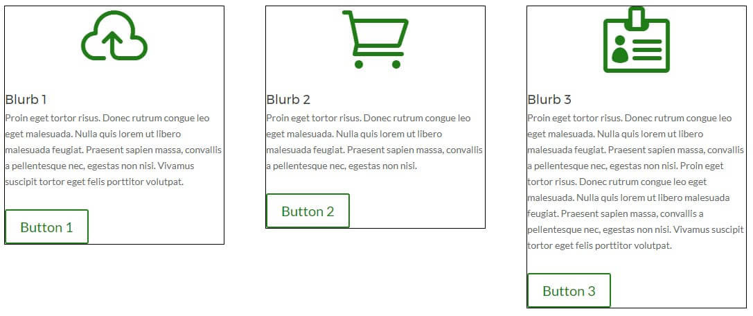
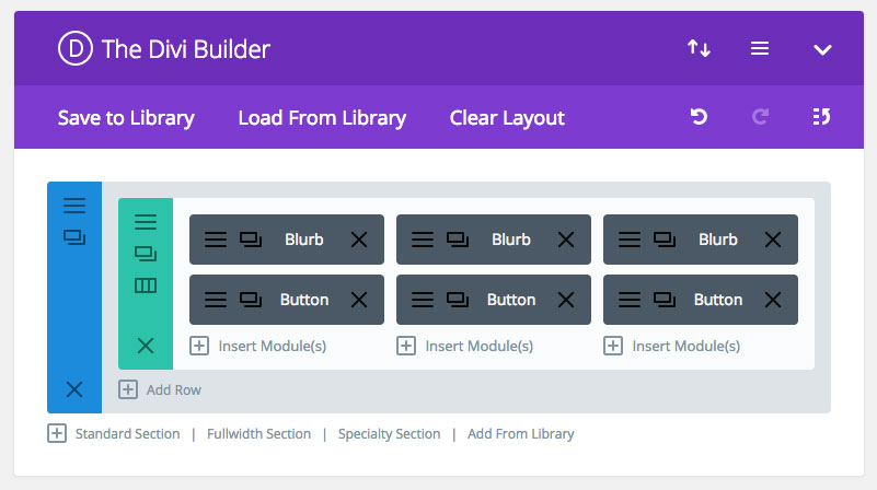
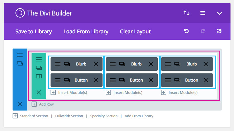
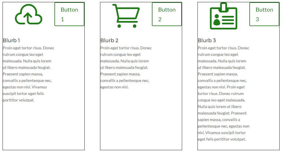
To begin, create a new page or post and use the Divi Builder to set up a section, with a single row and 3 columns.
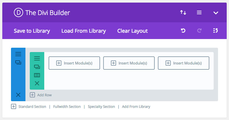
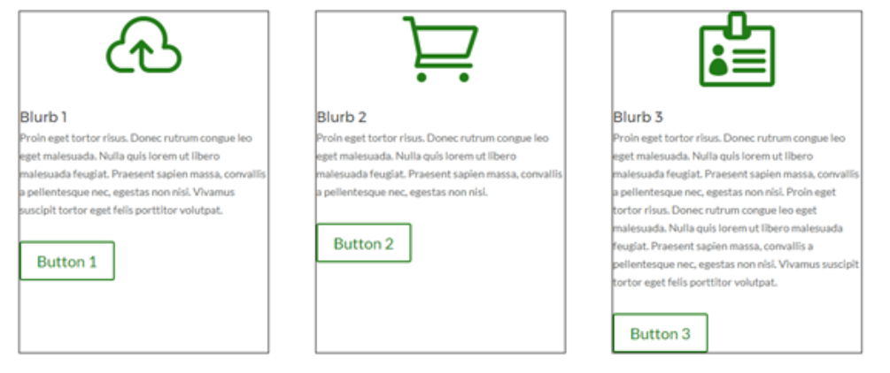
Then, add three blurb modules and three button modules below them.
Next, add some dummy content to the modules and hit Preview. The front end should look similar to the image below:
Note: For this demonstration, I’ve added a border around each column to show where the borders are. It’s important to make the distinction early on that for this article we are only dealing with 2 modules per column.
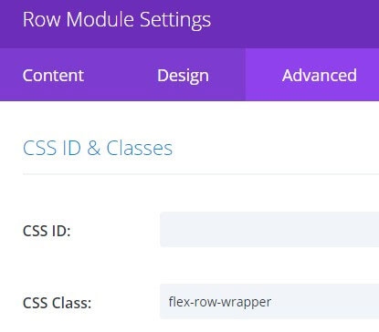
Add a CSS Class name to the row (green section) so that we can target it and the 3 columns. To do this, click on the hamburger menu of the Row, navigate to the Advanced Tab and enter flex-row-wrapper into the CSS Class box.
Next, we’ll write a bit of CSS code to target the element with the class of flex-row-wrapper. Copy the code below and paste it into either:
- The CSS section of your page ie: using Stylebot or the Inspect tool,
- The Custom CSS box in the Divi Theme Options page, or preferably,
- To your child theme stylesheet.
.flex-row-wrapper {
display: flex;
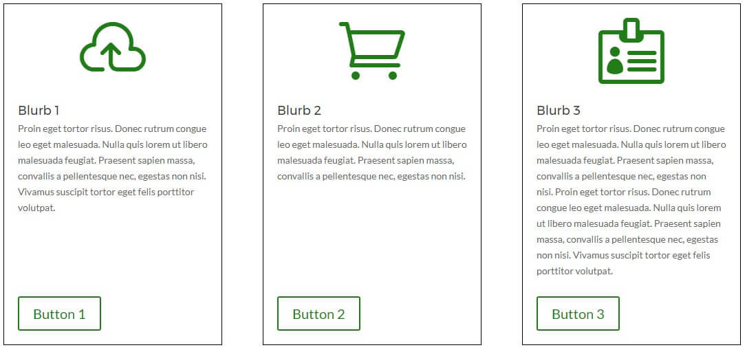
}Once you’ve added the CSS, refresh the page if necessary and see the result.
With just one single line of CSS, you’ve achieved equal row heights and a uniform-looking layout!
At this point, we can add extra CSS to make the design look even better.
In our back-end set up, the Row module is referred to as the parent and the three columns are referred to as the children or Flex items.
Applying the same conventions further, the objects within the children are the grand-children. In this instance, the grandchildren of each column are the blurb module and the button module.
An important rule of Flexbox is that the parent doesn’t apply to its grand-children so the next step is to target each of the children and make them flex as well.
Using your browser’s Developer Tool, inspect the page elements to identify the column class names by right-clicking on the module.
When I target the row with its class name of ‘flex-row-wrapper’ I can see these CSS Class names for each column.
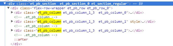
I’m going to choose a class name for each that is the same across all three.
Here, I can choose either .et_pb_column or .et_pb_column_1_3. I’m choosing .et_pb_column because to me it’s more generic and might make it easier to use the same CSS in different modules should I want to repeat this functionality again.
To target these children of the green row I use the following CSS and set the display to ‘flex’. Note I’m using the parent CSS Class name to limit this otherwise we might change columns across the site!
.flex-row-wrapper .et_pb_column{
 display: flex;
}
After adding this CSS to the stylesheet or similar, you should see the following result:
When adding the CSS rule display:flex; it sets the direction to the row by default. To rectify this, we can change the direction of the content to make the children elements display down the column.
To do so, we add another flex command to change the direction. Let’s also add some padding as well.
.flex-row-wrapper .et_pb_column {
 display: flex;
 flex-direction: column;
 padding: 20px;
}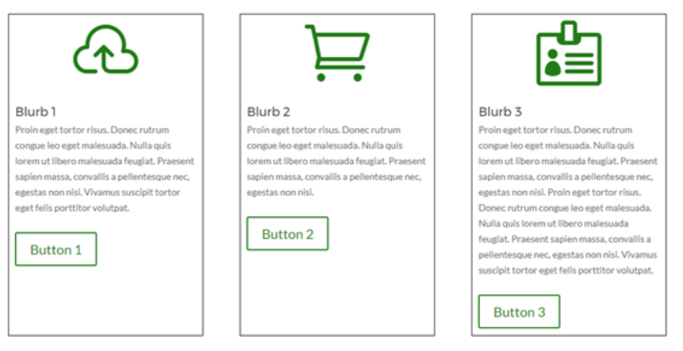
Now, we are back to where we were before, but what’s different?
The children-elements are now flex enabled which means that we can apply additional flex rules to their children (the grand-children elements).
There is one more flex command to add now and it’s the magic ticket: justify-content: space-between;
This command spreads the objects out equally across the axis. It also pushes the first object to the start and the last object to the end.
.flex-row-wrapper .et_pb_column {
 display: flex;
 flex-direction: column;
 padding: 20px;
 justify-content: space-between;
}
And voilà! Like magic, just a few lines of CSS will transform our Divi modules into equal row heights.
The complete code looks like this:
.flex-row-wrapper {
 display: flex;
}

.flex-row-wrapper .et_pb_column {
 display: flex;
 flex-direction: column;
 padding: 20px;
 border: 1px solid black;
 justify-content: space-between;
}
Adding Media Queries to Our Flexbox Example
Earlier in the post, I mentioned that certain flex commands may override other CSS styling and that some flex-enabled elements may require more attention in terms of screen responsiveness.
As in our example, when you add the CSS command of display:flex; you are instructing the DOM to ignore the float status for the parent item and its immediate child.
With this, any pre-existing CSS that changes the style of the item(s) when the viewport (screen size) changes needs to be re-visited. To see this in action, grab the side of your browser and resize the screen to a smaller viewport and look at the flex-enabled elements.
To solve this, we will need to use media queries and add another line of code. Note: You may need to experiment with this or even add more media queries in to adapt to different screen sizes, but this code seems to works for me and is pretty much what DIVI does.
@media screen and (max-width: 981px) {
  .flex-row-wrapper  {
   flex-direction:column;
}
}
Conclusion
With only a few lines of CSS, we’ve successfully employed a flexible solution to the age-old issue of different size containers.
If you’d like to experiment further, I suggest trying the same example with 2 or 4 columns. It should work the same way, just be sure to adjust the browser width and check that it looks ok on smaller screens. Experiment with the @media rules and don’t be afraid to set some more of these as necessary. For more information on using @media queries with Divi, read our blog post. And don’t forget that you can experiment with all of this using Stylebot in your browser.
We want to hear from you!
We hope that you’ve enjoyed reading this blog post on using CSS with Flexbox. If you have any queries or comments, add them below – we love receiving your feedback.
Thanks for reading!

Time to adjust our current pages!
Still works great in 2020, thank you.
Hi, i know ist an older blog articel, but can i use this to geht the blog grid being the same height (also mobile) and Looking good?
1THANK YOU
Thank you so much, It helped me a lot. I was creating blurb’s which should have the same height irrespective of the change in the screen size.
I thank you soooo much!
what if only first and 2nd column i want to add border?
How to make side slider if the long content overflow the box? (I am using Toggle of Divi) Thanks you!
Dear John
i am building an eshop with woocommerce and the problem is :
In the products list on the frontpage all the images are equal except the text that have different sizes depending of each product description. So there doesnt appear equal size boxes. Is there a way to enfold each product image and text into a box so the layout is the same for all products? thanks nick
How did you resolve the issue Nick?
Hi Nick Did You Manage to Achieve what you wanted. I am trying to Achieve Something Similar
I have a challenge, and can’t get my head around it.
Need to create a 3×2 grid with 6 blurbs, that is responsive to fill whole browser viewport for desktops and tablets.
Can this be achieved using flexbox or any other methods within Divi?
great and easy, many thanks !
Finally something that worked ‘out of the box’! 🙂
Been looking for anything to equal the height on my blurbs for a long time and this did the job.
Thank you!
useful info but the article is near impossible to read with the animation constantly shifting the vertical size of the page.
I’d researched various different was of achieving this. All had their flaws. Yours actually worked thought. Thank you.
Thank you! The best article on this subject I found so far. The only thing is that Divi already adds display:flex to the row. You just have to enable it in the Design section. But it’s by no means enough. Following your advice I was able to achieve the look I wanted.
Hello Team,
that works great with a standard section, but it doesn’t work in an spezial sektion. How can I use it there?
Best Michael