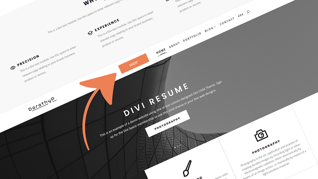
Adding a call-to-action button to the navigation menu leads to more clicks and better conversion rates. So it is important you make it clear to visitors, “this button is meant to be clicked and it is valuable”. A fly-in animation is a great way to draw attention to a button on your website. For a simple ‘fly-in’ action on a header button, a little CSS is all you need.
Check out our complete guide on creating CTA buttons in the header menu, with 5 free button design snippets you can drop-in for quickly setting up your menu CTA.
For this tutorial, you’ll learn a simple bit of CSS for creating adding a fly-in animation to your call-to-action button and setting it to only display on the home page of your site. We will be adding a ‘shop’ button with custom styles. In this example, you can see the button actually appears from stage left as you scroll down the page.
As our top section is dedicated to the shop area of the site, I’ve chosen to only activate this menu item once the user intends to scroll past it. This technique uses WordPress & Divi features to achieve this effect.
Targeting the home page only
Prefix the selector to create with the .home class. This will add your custom styling to whichever page is set as home on your WordPress site.
Animation happening ‘on scroll’
Divi adds a class of .et-fixed-header to the #main-header ID on-scroll. This is how you’re able to use the customizer to make your fixed header behave differently after you’ve scrolled (by default it just shrinks a bit). You can hack this feature to create ‘before-scroll’ and ‘after-scroll’ states for your new CTA button.
Creating Your Button Styles
This code will apply your button styles to the first item in your navigation menu. You can adjust the background color and padding, but be sure to make the negative margin equal to the top padding so as not to offset any other menu items.
#main-header #et-top-navigation nav > ul > li:first-child > a {
 background: #FF9B04;
 padding: 10px 12px;
 border-radius: 4px;
 margin-top: -10px;
}
Before Scroll
This bit of code adds the button to the left and makes it invisible so that when you scroll, it appears to fly-in from the left.
.home #main-header #et-top-navigation nav > ul > li:first-child > a {
 margin-right: 120px;
 transition: 1s ease all;
 opacity: 0;
}
After Scroll
Now use this snippet to make the button visible again by moving it back to the original position. Note the appearance of the ‘.et-fixed-header’ class.
.home #main-header.et-fixed-header #et-top-navigation nav > ul > li:first-child > a {
 margin-right: 0;
 opacity: 1;
}
That’s it! Three cute bits of CSS that create a smooth menu item animation. We’ve used the first-child pseudo-class to target the first item but you could easily use the menu item ID or ‘last-child’ pseudo-class to come in from the right side.
Learn more about CTA buttons on the blog plus get a ton of free CSS styling code snippets from the free Divi Snippets library. Quickly transform the styling of your site with copy and paste code tweaks. It’s pretty great. And as always, don’t forget to shoot us a message in the comments below if you have any comments or questions.
Enjoy! 🙂


Hey Stephen ,
How to link the button to a Bloom popup Newsletter in the same window?
Thank you in advance
This is an awesome tutorial and code drop, SJ! Put it to use for a painting contractor who is my client. http://kopeckpainting.com/
Nice work 🙂 Glad you liked it Jeremy!
This is an awesome tutorial and code drop, SJ! Put it to use for a painting contractor who is my client. http://kopeckpainting.com/
How do you alter this so that it works with Divi’s secondary menu? I tried substituting all instances of: #et-top-navigation with #et-secondary-menu but that didn’t work.
Now this sound pretty cool.
Since I am rather new to webdesign I need to know where to insert all of this code. Please be so nice and help me out step by step.
Thank you very much!
Happy Easter everyone!
This is Great! Thanks!
Thanks a ton, it worked immediately! Both functional and stylish. Keep em comming!
This is very cool I’ve got a few sites in mind for this one.
Thanks,
Mike