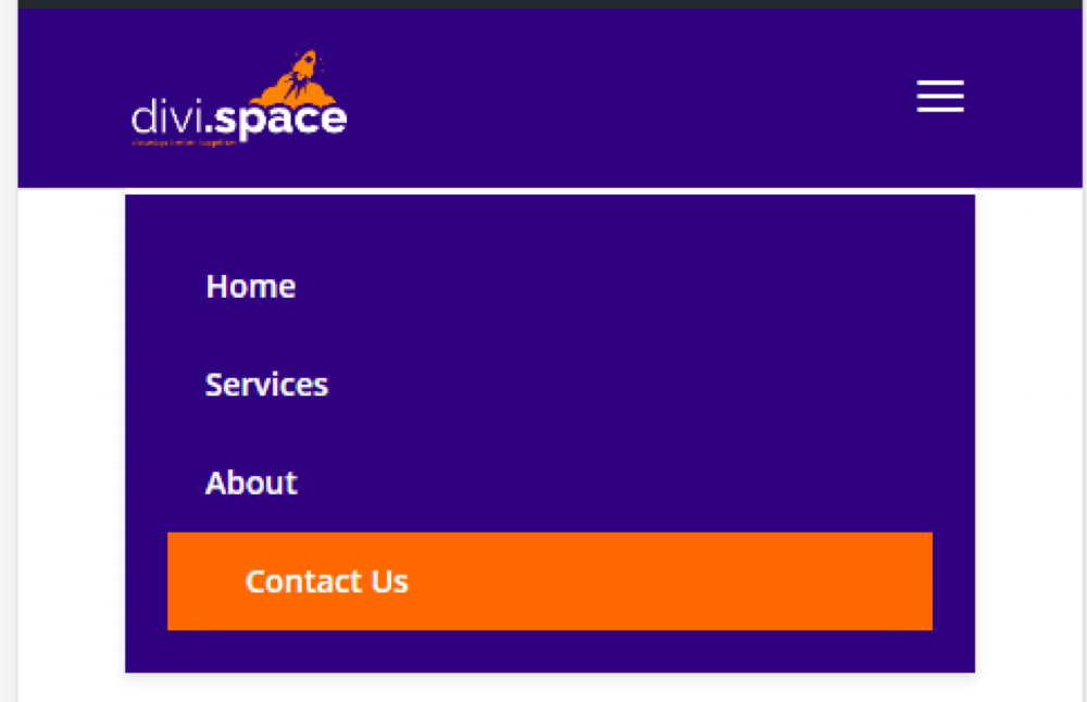
One of the most important pieces of a successful conversion-driven website is the Call to Action button nested in the menu bar.
Menus work like a map for your website to give users the information they are seeking. It’s important to highlight the most important elements you want users to see, whether that’s a call to action with a phone number (if you expect a user to call you directly) or a link to your product page, services, or sign up page.
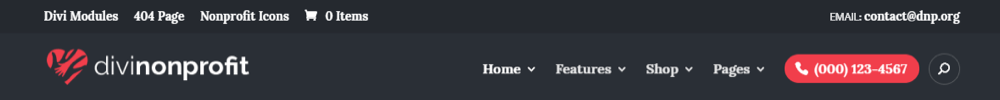
Examples of Call to Action Button in the Menu:


How to Create a Call to Action from a Menu Item
WordPress comes with a navigation menu that makes it quite easy for beginner users. However, if you are brand new with WordPress or need a refresher, read this guide which covers the basics: how to create a menu and menu items.
If you have already set up your menu, follow these steps to create a button for any link in the menu!
1. Add custom class name to a menu item
- Login to the WordPress Dashboard.
- From the ‘Appearance’ menu on the left-hand side of the Dashboard, select the ‘Menus’.
- Locate the menu item that you want to customize
- Add custom class name to your menu item: menu_cta
If you don’t see the box to enter your custom CSS class click on “Screen Options” on the top right of your menu dashboard to enable it.
2. Add custom CSS
At this point, it’s time to add some CSS to your website. CSS can be added in the following three ways:
- Custom CSS console in the Divi Theme Options > General tab
- Custom CSS and JavaScript Developer Edition plugin
- Style.css file in the website’s child theme
If you don’t already have a child theme setup, you can create a blank one using the Divi Space Child Theme Generator. If you need assistance in using the child theme generator, read our blog post that provides easy step by step instructions on How to Use the Divi Space Child Theme Generator.
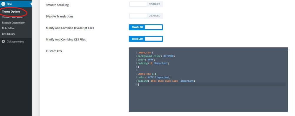
For this tutorial, we’ll be using the Custom CSS box.
To access it:
- Log into your WordPress dashboard.
- Go to “Divi > Theme Options” where you will find the Divi theme options.
- Go to the “General” tab (it should be the current one.)
- Add CSS code to box called “Custom CSS”.
- Click Save
.menu_cta {
background-color: #ff6900;
color: #fff;
padding: 0 !important;
}
.menu_cta a {
color: #fff !important;
padding: 15px 15px 15px 15px !important;
}

3. Adding an Icon
You can optionally add the icon before text for tablet and desktop view.

To do that, use the snippet below:
.menu_cta {
background-color: #ff6900;
color: #fff;
padding: 0 !important;
}
.menu_cta a {
color: #fff !important;
padding: 15px 15px 15px 15px !important;
}
@media (min-width: 980px){
.menu_cta a:before {
content: '\e090';
color: #fff;
font-family: 'ETmodules';
font-size: 16px;
line-height: 1;
position: absolute;
left: 12px;
}
.menu_cta a {
padding: 15px 15px 15px 35px !important;
}
}
You can change the icon by changing the content value in the code above.
content: ‘\e090’; stands for phone. If you want to change it, for example, to shop icon, follow these steps:
- Head over to the Elegant Themes icon list and search for the icon you would like to use.
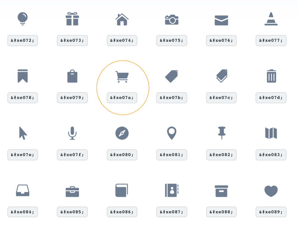
2. The four digits that follow &#x in the html codes are the same last four digits you will need for typing out unicodes (if there only two digits after &#x, type 00 before the two digits).
3. Find the Unicode number, in the example above for the cart icon it will be: e07a
4. Replace the unicode number in the snippet above with the new one, taking care to leave the quotes and slash intact.
4. Be sure to check how buttons look on mobile devices
Mobile view:
You can turn off styling for mobile devices. Insert the chosen snippet code inside of the media query.
@media (min-width: 980px) { }
You can learn more about using media queries in the article “Divi Media Queries”
.menu_cta {
display: none;
}
}
You can customize the call to action to fit your current website design. Here are some other CSS values you can play with
- padding
- color
- background-color
- border radius
- font-size
- font-family
- font-weight
- border
- letter-spacing
- box-shadow
- …and hover statements 🙂
If you are using a fixed Header, you may have to use a different color value for the button color to overwrite default settings in the Divi Theme Customizer.
To do that, use .et-fixed-nav #top-menu selector. To learn more, read our The Divi CSS and Child Theme Guide.
.et-fixed-header #top-menu .menu_cta a, .et-fixed-header #top-menu li.current-menu-item>a {
color: #fff!important;
}
5. Snippets 🙂

.menu_cta {
padding: 0!important;
border-radius: 30px;
border: solid 2px #fff;
transition: 0.3s;
}
.menu_cta a{
color: #fff!important;
padding: 15px 30px 15px 30px!important;
}
#top-menu-nav .menu_cta a:hover {
opacity: 1;
}
.menu_cta:hover {
border: solid 2px #fe8400;
background: #fe8400;
}
}

.menu_cta {
background-color: #f2f2f2;
background-image: linear-gradient(to bottom, #f2f2f2, #f2f2f2);
border: 1px solid #bfbfbf;
box-shadow: inset 0 1px 0 white, inset 0 -1px 0 #d9d9d9, inset 0 0 0 1px #f2f2f2, 0 2px 4px rgba(0, 0, 0, 0.2);
color: #8c8c8c;
text-shadow: 0 1px 0 rgba(255, 255, 255, 0.5);
border-radius: 3px;
font-family: Verdana, sans-serif;
transition: all 20ms ease-out;
}
.menu_cta:hover {
background: #f2f2f2;
border-color: #8c8c8c;
box-shadow: inset 0 1px 0 white, inset 0 -1px 0 #d9d9d9, inset 0 0 0 1px #f2f2f2;
}
.menu_cta a{
color: #23282d!important;
padding: 12px 30px 12px!important;
}
}
#top-menu-nav .menu_cta a:hover {
opacity: 1;
}

.menu_cta {
width: 160px;
height: 46px;
background: linear-gradient(to bottom, #4eb5e5 0%,#389ed5 100%);
border-radius: 5px;
border-bottom: 4px solid #2b8bc6;
color: #fbfbfb;
font-weight: 600;
text-indent: 5px;
cursor: pointer;
}
.menu_cta:active {
box-shadow: 0px 2px 0px 0px rgba(0,0,0,.2);
top: 1px;
}
.menu_cta:after {
content: '';
width: 0;
height: 0;
display: block;
border-top: 22px solid #187dbc;
border-bottom: 22px solid #187dbc;
border-left: 16px solid transparent;
border-right: 20px solid #187dbc;
position: absolute;
opacity: 0.6;
right: 0;
top: 0;
border-radius: 0 5px 5px 0;
}
.menu_cta a{
color: #fbfbfb;
font-family: 'Open Sans', sans-serif;
text-shadow: 1px 1px 1px rgba(0,0,0,.4);
text-align: left;
padding: 15px 30px 15px 12px;
}
}
#top-menu-nav .menu_cta a:hover {
opacity: 1;
}
.menu_cta {
background-color: #ff6900;
color: #fff;
padding: 0 !important;
}
.menu_cta a {
color: #fff !important;
padding: 10px 15px 10px 35px !important;
}
.menu_cta a:before {
content: '\e090';
color: #fff;
font-family: 'ETmodules';
font-size: 16px;
line-height: 1;
position: absolute;
left: 12px;
}
}
.menu_cta {
background-color: #ff6900;
color: #fff;
padding: 0 !important;
}
.menu_cta a {
color: #fff !important;
padding: 15px 15px 15px 15px !important;
}

The button breaks when I disable/delete the hover code, is there a way to disable the hover without breaking the button?
My issue is that when I hover over the button the text disappears and hover color doesn’t work. Please advise.
You should be able to remove the hover code and change .menu_cta to .menu_cta, .menu_cta:hover , so the button looks the same for both
If you go to the page where the cta is linked to, none of the different css variations here work for the cta text color.
This Divi css overrules it:
.et-fixed-header #top-menu li.current-menu-ancestor>a, .et-fixed-header #top-menu li.current-menu-item>a, .et-fixed-header #top-menu li.current_page_item>a {
color: #00457a!important;
}
Can’t find a way around it… I can only make it so that it changes all the active links color but i would need to change only the color of the cta.
Found a way around it, value inherit takes the color from it’s parent class:
#main-header #top-menu li.current-menu-item > a {
color: inherit !important;
}
Thanks you Anna for the post and thanks Tatu for your solution – I read through the comments and could see that I was having the same problem as quite a few others here. With the code:
color: #fff!important;
On a fixed header, the other dropdown menu items become invisible on scroll due to it turning all the text white. If you have a white background, this is a problem.
Your solution of changing it to:
color: inherit !important;
fixed it for me. 🙂
This was super helpful, thanks!
Hi, my primary menu cta color is black and fixed header has been changed. How can I also make the primary menu color also white?
Hi all, needing some help from the CSS experts on here.
I used this CSS to add a CTA button to my menu and it worked fine. Then after we got the new Divi Theme builder I decided to create a new Divi header for my site and ran into a problem.
My site is https://translocal.com.au
As you can see there might be a small issue with vertical alignment of the whole menu and button but at least the menu text and the text in the button line up.
Recently I decided to create a new header using the theme builder and wanted to keep the same menu with the same “get a quote” button. Reason being, I like having the “get a quote” button in the expanding menu on smaller screen sizes rather than using a seperate button module.
Problem is, when I add this menu to the theme builder the menu text alignes with the top of the button and not with the text in the button. I’ve tried some vertical alignment tricks in the row or column settings to no avail.
Thanks in advance.
Hi, can you send a link to the page with the alignment issue?
Hi Anna,
Thanks for the guide!
I have one issue with the CSS…
When I visit the page to which CTA links and scroll down, the text color on orange CTA changes to the active link color of the header which is also orange, making the text on the CTA invisible.
I have tried the CSS snippets you included in the guide and the comments, but they did not work. Some made the CTA active link color white, at the same time making the active link color of the header menu also white, which made that submenu text invisible.
Do you know how to solve this issue?
Thanks! 🙂
For anyone that was having trouble with code not overwriting the theme customizer for a fixed header – I think Divi might have changed the code. I spent some time trying to figure it out and if it happens to someone else… this is what worked for me.
.et-fixed-header #et-top-navigation .menu_cta a {
color: #fff!important;
}
When scrolling down, I want to call to action button text to be white, but the active link also turns white. How would I keep the active link green and the call to action button text white?
Got the same issue! Is it resolved?
You can target the call to action active link with this CSS: .et-fixed-header #top-menu li.menu_cta.current-menu-item>a { color: #fff!important; }
Is it possible to at a floating CTA button in the header of the mobile menu at the place where normally the logo is shown?
So the CTA button on top is still shown when the hamburger menu is closed and when you scroll down?
Hi!
Thanks for the handy tutorial.
After adding the CSS, the CTA is not in the center (height) of the menu. There is more space above the CTA than below it. How can I fix this?
Hi, you can try checking comments below for solution, if neither work, send us link to page with issue. Best!
Here’s a fix for when you scroll down the CTA’s text color changes to its active link color when using a fixed header:
.et-fixed-header #top-menu li#menu-item-391 > a {
color: #000 !important;
}
Don’t forget to change the menu-item ID to your own number (#menu-item-XXX). You can find the ID of your CTA by right click > inspect. This might not be the best solution, because if you want to make a CTA from another link you must change your .css file, but it’s the only solution I found that overwrites Divi’s CSS.
It might not be the best solution because it’s hardcoded and tied to the specific menu item ID, but it’s the only solution I found that overwrites.
Everything depends on the existing CSS on the site, but this should be working too in your case:
.et-fixed-header #top-menu li.menu_cta > a { color: #000 !important; }.et-fixed-header #top-menu .menu_cta a {
color: #fff!important;
}
This code doesn’t change the fixed header text of the CTA 🙂
Use
instead, and if it doesn’t help, send us link to your site 🙂
Hi. Fantastic tutorial, It has really helped this Divi beginner,
One thing – I have added the padding CSS above to raise the button up from sitting on the hero image and it looks good in desktop mode, but when it goes to the hamburger menu, the padding seems to sit under the ‘contact’ menu (looks like there should be another menu item, but there isnt).
http://designoriginal-test.co.uk/Kat/
Any help would really be appriciated 🙂 Thank you in advance x
Hi Kat, remove top: -25px; from your CSS that is applied to li.menu_cta item and adjust your navigation padding. Instead of using 70px top, use 35px top and 35px bottom, your navigation will be centered.
Another way, would be to use media queries.
Hi,
Thanks so much for the tutorial! I think I’m missing something though. The colour blocks around my buttons are way too big.
Ideally, I would like them to be rectangle buttons with 10px border radius.
Would you mind having a look for me, they don’t look like yours 😊
p.s. the site is in rough development still!
http://tgz.0fe.myftpupload.com/
Thanks
Tracy
Hello, Try adding CSS
.et_divi_theme .et_pb_fullwidth_menu .et_pb_menu__menu>nav>ul {align-items: center} .menu_cta a {max-height: 64px;}and let me know if that helped!
I’d like to show the menu in the center, logo on left, and add a CTA with text Contact Us on the right side.
Any idea?
Regards,
Nirmal Singh
I would use theme builder to build header: https://www.elegantthemes.com/blog/divi-resources/free-divi-download-the-divi-header-ui-kit
Help! lol
I have already styled my top header with a button. I’m trying to add a secondary button that reads “Make a Payment” that is in line with the other button(s). Ideally, it’s in the order of “Make a Payment”, “Schedule Inspection”, “Phone number”.
Can you tell me what I’m missing? I’ve gone through various trial and errors and nothing has worked so far.
Hi Ashley, this tutorial will work for any number of buttons. Here is an example: https://tutorials.aspengrovestudio.com/how-to-create-two-call-to-action-buttons-in-the-divi-menu/
Thanks a million! Saved me a lot of time 😉
Check https://helskitchen.nl/online-winkel/ for the result.
Hi, so I’m deifinitely doing something work, but after pasting a snippet of css it doesn’t style my menu-cta item… 🙁
Would appreciate if you find a moment to take a look. Thanks for an article!
Hi Magda, sure 🙂 Send a link to your site!
Thanks for your help. Unfortunately it’s not working 🙁
Unfortunately, it’s hard to help without seeing how the header is set up 🙂 Feel free to send the link when the page is live!
Hello
Same problem as Stellio :
>> Whan browsing the page that the CTA refers to, the primary link text color is the color of my button. So when I scroll down the page the active link of the CTA becomes invisible in the fixed header.
Could you please provide a piece of code for the fixed header when the CTA page is active ?
Thanks in advance. 🙂
PS : the website is still in produciton so I can’t give you a link
Try this:
#top-menu.et-fixed-header li.menu_cta.current-menu-item a { color: #2f0480 !important; }Thank you so much, is there a way to put the cta on mobile outside of the nested menu? (next to the hamburger icon?)
Yes, check our another snippet: https://wpzone.co/wordpress-and-divi-code-snippets/create-call-to-action-button-under-mobile-hamburger-menu/
Thanks for this – very useful.
Did the menu module version ever get written?
I’m also struggling to override the menu module colouring (from grey to white for the button):
Yes: https://wpzone.co/wordpress-and-divi-code-snippets/create-call-to-action-button-under-mobile-hamburger-menu/
Thank you so much
Thank you, Anna. The site, while it is being built, is at this address http://a3y.00c.myftpupload.com
I have removed the CTA code as it wasn’t working but I’ll add it back so you can see what it looks like
You can fix the icon position with
#et_top_search { margin-top: 17px!important; }and customize the menu padding with
.et_header_style_left #et-top-navigation, .et_header_style_split #et-top-navigation { padding-top: 24px!important; }I can’t get this to work – when I implement any button, it moves the button and all of the other links downwards slightly, out of line with the logo and with the search button.
Hi Dee, probably some styling is different or you are using a different header style. Can you share a link to your site?
Border radius affects how rounded the corners of your buttons are. By default, buttons in Divi has a small border radius that rounds the corners by 3 pixels. You can decrease this to 0 to create a square button or increase it significantly to create buttons with circular edges.
Hi Anna– I decided to create a global menu header with three columns, and then the right column I set as the button I need. This is working well so far but thanks for offering to help!
Hi Anna !
Very interesting post, thanks !
I’ve a question, maybe you can help me
I need to add a widget beetween the logo and the menu.
For the moment, I only succeed to add it below the menu bar.
I add my PHP CODE in the header file.
How can I add it between the logo and the menu ?
Many thanks
Hi Zack, you may want to use Divi Hooks: https://wpzone.co/tips-tricks/how-to-use-divis-hooks/
Hi Anna,
is it possible to display the CTA outside the hamburger menu for mobile devices?
Check out our new Divi Snippet: https://wpzone.co/wordpress-and-divi-code-snippets/create-call-to-action-button-under-mobile-hamburger-menu/
Hi there! I started with one of your templates and did some edits to match my site styling, but I wind up with the button & text floating higher than the rest of the menu – do you have any insights? Thank you!!!
Screen cap: https://imgur.com/a/KfVtjc3
An the modified code:
/* Contact Us Button Styling */
@media (min-width: 980px) {
.menu_cta {
margin-top: 40px;
width: 130px;
height: 46px;
background: linear-gradient(to bottom right, #395fa9, #1D3A6B);
border-radius: 0px;
border: 4px solid #D29C40;
color: #fbfbfb;
font-weight: 600;
text-indent: 5px;
cursor: pointer;
}
.menu_cta a{
color: #fbfbfb;
font-family: ‘Open Sans’, sans-serif;
text-align: center !important;
}
}
#top-menu-nav .menu_cta a:hover {
opacity: 1;
}
Hi Camilo, share a link to your site, I will try to help 🙂
Something has changed recently. This was working beautifully on one of my sites, but then I log in today and discover that the button is now shifted downwards. I’ve made no other changes. Any thoughts one what would cause this behavior:
Site: katyabc.org
Not sure what could have happened. Try this:
li.menu_cta {

    position: relative;

    top: -15px;

}
Any thoughts on why the vertical alignment would have suddenly shifted downward? It was working perfectly for weeks until I logged in today and noticed it’s shifted on me. You can see it here: https://katyabc.org/
Hello,
It works great. But I have troubles with implementing another icon.
I use your code:
@media (min-width: 980px) {
.menu_cta {
background-color: #ff6900;
color: #fff;
padding: 0 !important;
}
.menu_cta a {
color: #fff !important;
padding: 10px 15px 10px 35px !important;
}
.menu_cta a:before {
content: ‘\e090’;
color: #fff;
font-family: ‘ETmodules’;
font-size: 16px;
line-height: 1;
position: absolute;
left: 12px;
}
}
But want to change the phone icon to: i or class: icon_documents_alt
How do I change this in the code you provided? If I change the rule content: ‘\e090’; to content: ‘\x69’; it is not working.
Regards,
Fabian
It should be
content: '\69';🙂Very cool. Somehow though when I implement this it works on every page EXCEPT the home page.
https://tdot.community
Please advise. Thanks!
I see it working 🙂
Hello Anna,
Thank you very much for this tutorial.
I would like to use it on the menu of my site: https://le-parrain-boursorama.fr/ but as you can see, there is a problem with the top and bottom margins. I change the values, but it doesn’t work.
I use the Theme Builder, I guess that’s why. Do you know what I can do?
Thank you very much.
Hi Valentin,
By default ul element has
align-items: stretchproperty and fills the container. You can align it to center with the following CSS:.et-l--header .et_pb_menu .et_pb_menu__menu>nav>ul {-webkit-box-align: center;
-ms-flex-align: center;
align-items: center;
}
Great, thank you ! 🙂
Hi Anna …
I’m having an issue with the vertical alignment. How do I go about having equal space between the top and bottom of the button within the menu bar?
Hi Ron,
that depends on the adjustments that were added to the site. Please check if that works for you
@media (min-width: 981px) {#main-header .et-fixed-header #et-top-navigation, #main-header .et-fixed-header #et-top-navigation {
padding-top: 20px;
padding-bottom: 20px;
}
}
#main-header #et-top-navigation, #main-header #et-top-navigation {
padding: 25px 0;
}
#main-header #et-top-navigation nav>ul>li>a, #main-header #et-top-navigation nav>ul>li>a {
padding-bottom: 0px;
}
Yup that works. Thanks! 🙂
Thanks Anna, the tips were much helpful.
I’m struggling with the vertical alignment here:
https://www.philsimon.com/about-phil/privacy-policy/
HI Phil 🙂 Add this CSS to your website:
.et_pb_menu__menu .et-menu .menu-item-has-children>a:first-child:after {position: initial;
}
Hi there,
This worked perfectly, however, I would like my ‘button’ menu item to be slightly more to the left from the rest of my menu, when I increase my right padding however, it increases the background of the button, but I’d like to have more white space between instead, is this possible? Thanks!
Use margin instead 🙂
Very useful! Thank you!
The code isn’t changing the menu text color. The following class has an !important on the menu text color.
.et_pb_menu_0_tb_header.et_pb_menu ul li
Hi Evan, you are probably trying to use this snippet using the Divi Menu module. In this article we are covering only the standard Divi menu.
Hi,
I am using the Divi menu module rather than the regular header menu. The background color around the menu link is the only thing that changes with this code.
Should I enter the code in the CSS fields for this module rather than the site CSS console? If so, which fields? Are there any changes in the steps?
Hi Sharon, this tutorial won’t work 100% with the Divi menu module. We are thinking to create a separate tutorial to cover CTA in the Divi menu module.
Thanks for a great, in-depth article! It has been very helpful for our website. I think everyone wants CTA buttons in menus these days, so it’s good that it’s pretty easy to do. Thanks again 🙂
Hi. So thankful for this post – it is really helpful! I’m wondering if any of the comments above about the text color in fixed menu have been worked out. I added the fixed css, but it doesn’t work for me either:
.et-fixed-header #top-menu .menu_cta a {
color: #ffffff !important;
}
Have I missed something or has someone found a fix? Thanks!
Hi Kristen, send a link to the page and I will take a quick look 🙂
Hi Anna,
Thanks for the great tutorial!
I was wondering if you knew of a way that the menu CTA shows in the top bar on mobile, rather than just in its usual place once the menu drops down. The layout would be “Logo | CTA button | Hamburger Menu”… The logo would be simplified, more like the site icon. Thoughts on how to do that?
Jess, are you using the theme builder or standard Divi menu to build the header?
Check out our new Divi Snippet: https://wpzone.co/wordpress-and-divi-code-snippets/create-call-to-action-button-under-mobile-hamburger-menu/
Anna-
Worked great, thank you so much for your time, really appreciate it!!!
Anna, thanks for the reply. It did not change the search icon location. I have a red X when I added the css. On the line .et_header_style_left #et_top_search {
error message: Expected LBRACE at line 222, col. 1
Hi Jeff, please wrap the media queries in the braces.
@media only screen and (min-width: 981px) {
.et_header_style_left #et_top_search {
top: 65px;
}
}
My search icon shifts towards the top about 5 pixels when I add the css. Any suggestions?
Try this:
@media only screen and (min-width: 981px)
.et_header_style_left #et_top_search {
top: 65px;
}
Very useful! Thanks
Hi ,
Thanks for the great tutorial and samples.
Could you please tell how we can bold or control the text weight?
Thanks alot
Hey, thanks for the tutorial!
I am having an issue with the text colour – this snippet works for the home page;
.et-fixed-header #top-menu .menu_cta a {
color: #fff!important; /* change color value */
}
but when i go to the page of the CTA (e.g Request a quote)
The primary link text colour is the colour of my button. So when i scroll the active link of the CTA is actually now dissapeard as its the same colour a the active link text colour.
Hi Stellio, can you send link to your page?
I want the cta button to be visible on mobile screen, next to the logo. (Logo left, hamburger menu right and cta button in the middle)
please help me how can i do that??
Hi Agha, this snippet may be helpful in some way: https://wpzone.co/wordpress-and-divi-code-snippets/create-call-to-action-button-under-mobile-hamburger-menu/
Ps. I added the
.et-fixed-header #top-menu .menu_cta a {
color: #fff!important;
}
& it didn’t work…
I really need help. While the tutorial created the button, the type won’t show white. The main text in the menu is dark but !important is not having any effect to change the type color for the button whatsoever 🙁
any ideas?
Hi Clara, can you send me link to your website?
Great tutorial. I am a beginner and this was exactly what I was looking for. Thanks!
Extra Theme Issues: Weird padding & margin issues are happening.
Thanks for the comment! These snippets will work only for the Divi Theme.
Brilliant – thank you!!
Thank you for this. That .et-fixed-header #top-menu code snippet is not working for me though, the background and text go grey on hover.
Hi Christine, please provide URL to your website and I will try to help 🙂
Thank you, it’s https://demo.hillaldam.co.za/
Check this code 🙂
.nav > li.menu_cta > a:hover, #top-menu-nav .nav > li.menu_cta > a:hover {background-color: #162632;
opacity: 1;
}
Very nice tutorial on menu cta, as I have already used it on africafoodsafety.com
Have a look as I also added a border radius
Love it!
This is great! My only issue is that the text color changes to a grey when the menu is fixed. How can I fix this so it stays white?
Hi Nina, this is part of the tutorial 🙂 , you have to use that snippet code: .et-fixed-header #top-menu .menu_cta a {
color: #fff!important; /* change color value */
}
Usnig fixed nav – on scroll how can I make the text change colour?
Hi David, we mentioned about this in the tutorial 🙂
.et-fixed-header #top-menu .menu_cta a {
color: #fff!important;
}
Hi, I am confused on what css class to use on the menu page. Do I add the snippet code?
Dawn, you need to use “menu_cta” class 🙂 Follow the video: https://wpzone.co/wp-content/uploads/2019/05/menu-css.mp4
Thank you, Anna! Amazing tutorial!
Great! Thanks!
Now I only would like the button visible on mobile screen, next to the logo. (Logo left, hamburger menu right and cta button in the middle)
Do you have extra code for that as well?
This is EXACTLY what I’m trying to do. Did you find a solution?
I am definitely going to write a blog post about it!
Frank, Donley, are you using Theme Builder and Divi Modules to build the menu or the standard menu? 🙂
i need this too!
Check out our new Divi Snippet: https://wpzone.co/wordpress-and-divi-code-snippets/create-call-to-action-button-under-mobile-hamburger-menu/
In the ‘Roofing Services’ image you show these in the secondary header as opposed to the primary menu, can you share the css for these too please?
@Ian Roofing Services is our premium child theme and we don’t plan to include it in the tutorial. You can find it here: https://wpzone.co/product/roofing-theme/ Our goal was to keep designs simple, so they can match every website 😉
Maybe include some more diverse use case options in the snippets, like the roofing example, or maybe examples with hover or animation effects? Other than that ??