Logos come in lots of sizes and shapes. They also come in lots of designs. Some are simple images while others include lots of text. Some look great at any size and on any device, while others don’t look as nice at a smaller size. Fortunately, Divi has some excellent tools to help you customize the logo height. In this article, we’ll look at how to choose the best Divi logo height for your website.
Divi Logo Sizes
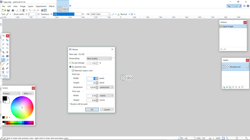
The default Divi logo that comes with Divi is a PNG at 93 x 43 pixels. You can adjust the size of the logo in Divi’s theme customizer, but you can’t adjust it larger than its native pixel size.
Note – PNG is a great choice because they have a small file size and transparent backgrounds.
Around 45-55 pixels is an excellent height for a horizontal, or landscape, logo (meaning that the logo is wider than it is tall, like the Divi logo). This gives the logos enough white space so that it doesn’t look crowded in the header. Logos also benefit from the common white-space design rules.
The width of the header has more room, especially on desktops, so you have more design options for landscape logos. Around 250 pixels wide provides an excellent size so that the logo is visually appealing and is set apart from everything else, and it still looks great on a tablet.
Portrait logos can leave too much vertical space in the header. Landscape or square are typically the best shapes for logos. If you have a portrait logo, it might be possible to turn it into a landscape logo.
For example, if your logo includes two words, you can place them side-by-side rather than stacking them. Another possibility is a logo with an icon on top and text on the bottom. You might be able to move the icon to the left of the text. Another option is to use only the text or the icon rather than both.
For this reason, many companies create two versions of their logo- one that looks great in a portrait layout that can be used on stationary, business cards, in ads, etc., and one that looks great in a landscape layout that can be used on websites.
Overall, you want the logo to be around 45 x 250 on your website, but I recommend creating the logo larger than this and use the Divi theme customizer controls to create the perfect size. Somewhere around 90 x 500 is an excellent size to give you room for adjustments. The higher resolution also keeps the logo sharp for Retina devices.
Adjusting the Divi Logo Height in the Theme Customizer

The Divi logo height settings in the theme customizer range from 30 to 100 pixels. The menu height ranges from 30 to 300. The default is 54 for the logo height and 66 for the menu height.

This one has both the menu and the logo set to 30. In this case, it’s so small it’s hardly noticeable.

This one shows the menu height at the minimum, but the logo is at maximum. It takes the full height of the menu. It looks a little uncomfortable.
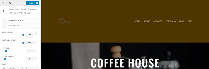
And this one has both at maximum. It has far too much whitespace in the header. It would work fine if it had a call to action, social buttons, a patterned background, etc. to help balance the design, but the logo would need to be larger to help create the balance.
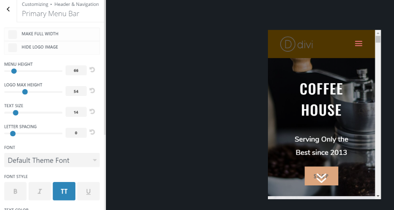
Here are the default settings on mobile. The menu height doesn’t change on mobile. Due to the logo’s original file size, this is also the maximum size.
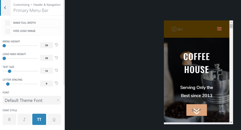
Here’s the minimum logo height on mobile.

For the fixed menu, the logo height is automatically adjusted to fit with the menu height. The default menu height is 40.

The minimum is 30.

The maximum is 300. It’s limited by the original size.

As you can tell from these examples, the perfect logo height is affected by the menu height as well as the font size of your menu. With this in mind, it’s a good idea to play around with the controls for all three until you get something that gives you the right whitespace and balance.
The key is balance. You don’t want the text to stand out so much that it overpowers the logo, or the header to have so much whitespace that everything looks lonely, or the logo so large that it looks crowded. Of course, colors will also play a role in determining what looks balanced. The typical good design would have the text of the logo a little larger than the text of the menu.
If you do need to use a taller logo and you do need to use more vertical pixels, then consider either a vertical menu, a larger header design, or overlapping the logo.
Divi Logo Examples
One of my favorite methods to get ideas about logo sizes is to compare with websites with logos similar to what I’m working with. An easy way to do this is to use Google Chrome Developer Tools and see the logo image sizes. This is also a good way to get logo design ideas.
Right click on the logo and select Inspect. This opens the Developer Tools and highlights the logo. Hover over the logo link in the tools to see a popup with the size as it appears on the screen and the natural size of the logo (the size of the original file). A popup over the image itself with provide the exact size to multiple decimal points.
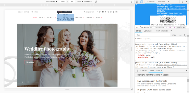
This one is from Divi Photography. It’s a good example of a stacked logo. In this responsive screen, it’s resized to 178 x 75 from a natural size of 400 x 170.
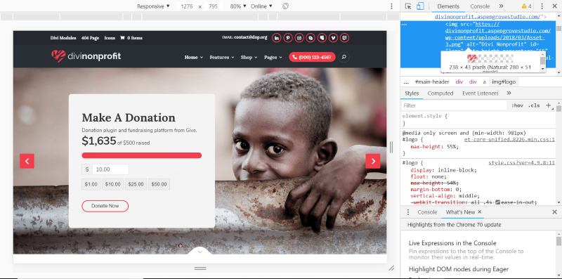
This one is from Divi Nonprofit. It’s an excellent example of a horizontal, or landscape, logo. It’s resized to 238 x 43. The natural size is 280 x 51.
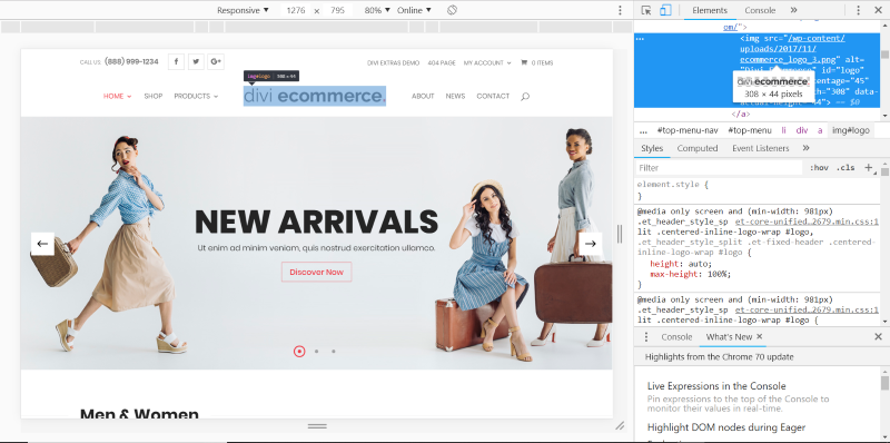
This one is Divi eCommerce. It’s another good example of a horizontal logo. This one is 308 x 44. This is its natural size, so this one wasn’t resized.
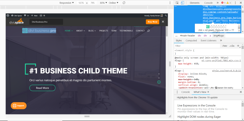
This one is Divi Business Pro. It’s another great example of a horizontal logo. It’s sized at 266 x 42 with a natural size of 500 x 77.
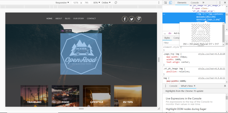
This is Open Road. It uses a square, and large, logo. It handles the problem of a large logo differently. Rather than make the logo smaller, it takes it out of the header and places it in the hero section. This opens up a lot of design possibilities. The resized version is 350 x 350, while the natural size is 517 x 517.
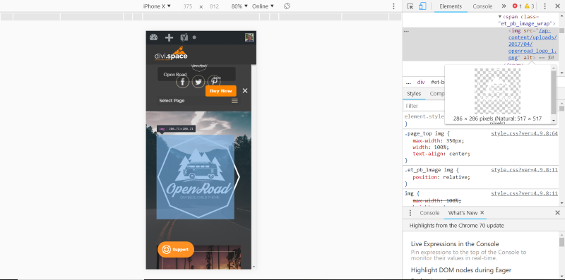
Here’s the iPhone x version, which resizes to 286 x 286. Notice the smaller logo that has now appeared in the header.
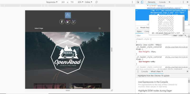
Once the width of the page hits 860 pixels, a new logo appears in the header. This is the same logo as in the hero section, but now it’s resized to 60 x 60.
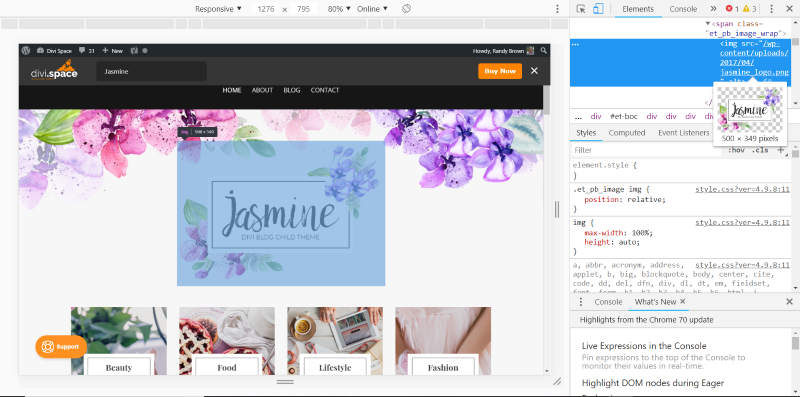
This one is Jasmine. It breaks the mold completely, but it does it with a style that works. It’s an oversized rectangular, close to square, logo that takes up a lot of the screen. It’s 500 x 349. This is its natural size. This is a great example of a tall logo that wouldn’t really fit into a standard header design.
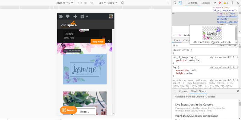
When you see it on a mobile device it resizes to 318 x 222. Larger logos look great when they’re designed for the space they use along with everything around them.
Ending Thoughts
That’s our look at how to choose the best Divi logo height for your website. Most of the time it’s best to keep the logo small as large logos can be a distraction. Of course, if you do want to use a large logo you’ll have better results if you work it into the design of the site as we saw in some of the examples.
Make sure the logo looks good against an all-white and an all-black background. Be sure to check your logo on the desktop, tablet, and phone screen sizes in the theme customizer. Play around with the adjustments of your header including the menu height, Divi logo height, and menu fonts until you get a great balance that’s pleasing to the eye.
What is your favorite logo height for your Divi website? Let us know in the comments.

Hey,
I am trying to create logo. But it’s not looking good. Any Help.
Here is the links https://hgpaacademy.com
Try first to remove the empty space from your logo https://hgpaacademy.com/wp-content/uploads/2020/11/HGPA.png
Hey Randy. Nicely written. Thanks.
I do similar, with a logo of double the divi dimensions in height so it’s good on hi-res places.
I had a logo developed by a professional graphic artist. My problem is that at the small size Divi uses the logo looks washed out. How can I increase the legibility? See http://www.growthstrategyinc.com
Thanks. I have read a bunch of Divi how-to. Best one that I’ve read so far is yours. But i still have one qestion. Does this allow the logo to extend below the header, or is the logos height limited by the header bar height?
Pushing the advantages of a landscape logo makes sense as a general rule in logo design, but I would advise the opposite for Divi. I have nothing but trouble with wide logos being overlapped by menu items at intermediate resolutions and end up having to hack the CSS.
I concur. It’s a real pain especially if you have more than 5 menu items and don’t want the font to be 10pt. It’s usually a pain on screens size 1440 and below. And it’s a pain when you get everything looking good and you client has that old monitor and says my logo is jumbled. Only way I’ve found to fix it is make the width full size or make it larger than the 1080px default so it pushes the margins out.
I prefer working with SVG. Because it’s a vector based image it will be razor sharp on any resolution. But SVG won’t upload by default, for that a plugin is needed called “SVG support”.