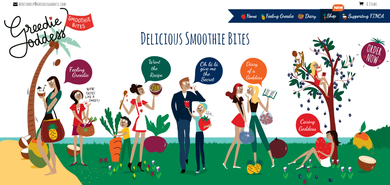
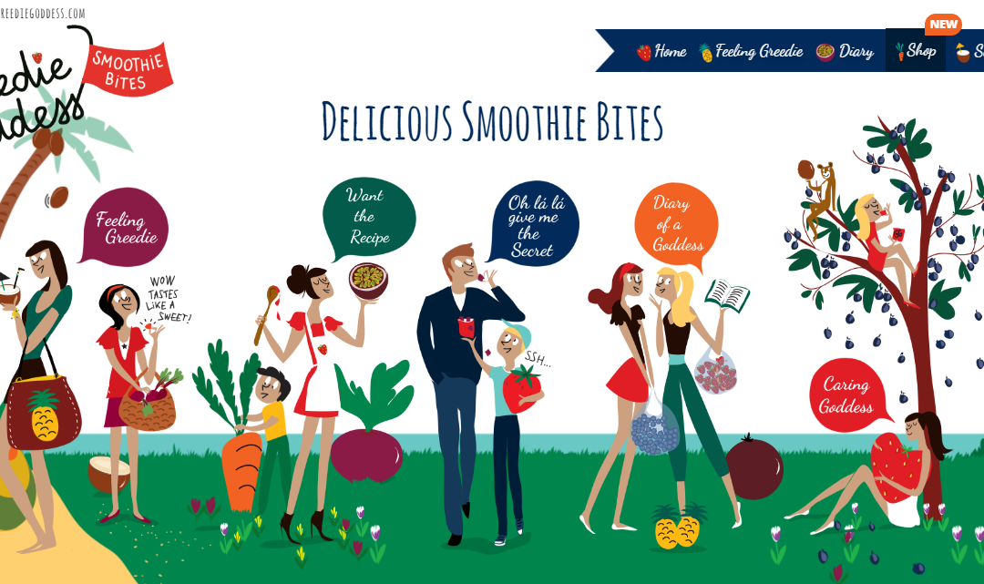
Last year I built a site for my client ‘Greedie Goddess‘, a provider of Smoothie Bites, a healthier snacking alternative to crisps and sweets. Though various changes have been made to the site since we sent it into the wild, the feature that gets commented on the most has remained pretty much the same: The hero navigation section.

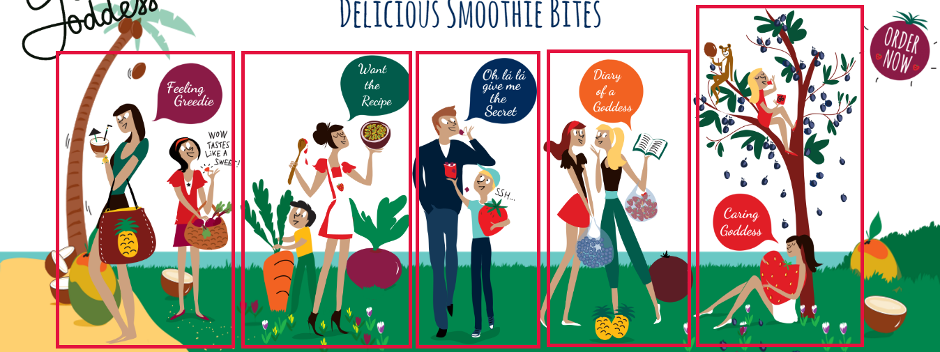
The hero navigation section is comprised of 5 separate images that respond by growing and shrinking as they are hovered over. They are responsive too, to a point. As devices get smaller we’ve swapped out the 5 images for a single images and reverted to navigation by the standard Divi mobile menu.
There are two things you have to get right to make a section like this for yourselves. All references to CSS in this article should be placed in a child theme or CSS box in your theme options. Here’ how to do it:
Make the images fit

Add all of your images to a full-width text box and give each image a unique ID. You can do this by swapping to the ‘text’ editor view and adding the ID to the image tags like this ” <img id=”image-one”…”. While you’re there, give the row an ID too. Something like “hero-menu”…
If you’re going to be using the images as links you can just use the WYSIWIG editor to add those in too.
Now, to get all of you images to fit onto one line you need to limit their widths. You could say that five images to fit into 100%, just do;
#hero-menu img {
    width: 20%;
}
The issue that I came across is that my images look funky if I tried to make them all the same size, some are naturally wider than others. That’s where our individual image ID’s come in handy. Instead we can use;
#image-one { width: 22% }
#image-two { width: 21% }
#image-three { width: 16% }
#image-four { width: 17% }
#image-five { width: 24% }
You can adjust these numbers dependant on how many images you’re using and how big they are compared to the images next to them. As long as the total is 100%, they all sit and scale nicely on one line. Bear in mind, as I did that at some point the images will likely be too small to be useful. You have two options at this point; hide the section and use a different one (Divi’s ‘hide on mobile’ section features come in handy here) or use fewer images and adjust the allocation of space.
Making them respond to hover
As you’ll most likely want the images to all respond in the same way when hovered over, you can use the broader CSS selector in this case. The following code will make the images grow as they are hovered over and then sink gently back into place as the user moves on. It’s a small change but it improves the user experience and encourages the user to spend time exploring the page.
#hero-menu img {
  -ms-transition: all 0.3s ease-out;
  -webkit-transition: all 0.3s ease-out;
  transition: all 0.3s ease-out;
}
#hero-menu img:hover {
  -ms-transform: scale(1.05);
  -webkit-transform: scale(1.05);
  transform: scale(1.05);
}
The scale reference uses an origin of ‘1.0’. If you set it to that then it would just keep its size. Make the number larger to grow and smaller to shrink.
That’s pretty much all there is to creating a navigation section. I hope you found this helpful 🙂


The link for Geedie Goddess goes to Edmunds.com car website.
Hi Nelson thanks for the message but it seems to be on the Greedie Goddess website side. We have sent them a message.
Cool article!
I thought I would share that I had a similar task to achieve with the hexagonal social links in the footer of http://mrbillstunes.com/
I ended up writing a WordPress plugin (SVG Support – https://wordpress.org/plugins/svg-support/) to achieve it using a single SVG image that I embedded links in using illustrator.
The vector SVG file now has the links in the exact shapes of the sections you need to link, acting like “hotspots”. But WordPress by default (after activating my plugin) will render the SVG in an IMG tag so the links won’t work… If you add the class “style-svg” to the IMG, then it will be automatically swapped out for the inline SVG/XML code, which keeps the links intact and also allows css targeting of elements within the SVG for animation or any other style purpose.
Just thought I would share how I dealt with a very similar problem 🙂
Hi love the design, how would you go about having those images carousel in mobile only?
Thanks for the tutorial.
How is the responsive part of the menu handled where it collapses to just one image?
Awesome mate, thanks for sharing. Would never have imagined it would be this easy
Freaking awesome! SJ
For the work on Greedie Goddess site and sharing how you did it.
Cheers’
Thanks! This is really great. I will give it a try!
I’d also like to see how you created the top menu too!
I am completely blown away by how easy this is! I am so inspired that I’m going to try this tutorial on a client’s site right now… Brilliant and thanks for sharing SJ:)
Wau! Great idea, I’ll try to repeat on one new clients site. I hope for good result.
Please let me know how you get on and thanks for reading 🙂
Thanks for that! Lovely site you created!
Thank you Will 🙂
I loved that when l first saw it, thank you so much for sharing. Love that the WP community is so generous!
Thanks Cath! It was a fun site to work on, glad you like it 🙂
Great write up SJ, love it! I’ve gone ahead and shared it around 🙂
Thanks Nathan 🙂 Much appreciated