During a recent conversation, a client of mine asked me how you can create a section with an animated ‘color changing’ background. I thought the solution to this request could be useful for other Divi users, so have put together this post outlining the steps.
In this tutorial, you’ll discover how to create an animated background color and how to customize it.
If you are curious to see the result of this tutorial then you can check out the preview here.
Creating a color-changing background
#1. Method
This is the easiest method, and makes use of the linear-gradient CSS property for the palette of colors and the angle, and an animation set to infinite to create a loop of colors.
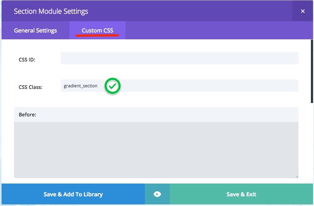
Ok, now all you need to do is add the custom class ‘gradient_section’ to the section you want to apply the background to. Then you will need to copy and paste the following code in your child theme or options panel.
/*------------------ #1 Method -------------------*/
.gradient_section {
 background: linear-gradient(90deg, #18f0b8, #18a2f0, #db5640);
 background-size: 600% 600%;
 -webkit-animation: Colorand 60s ease infinite;
 -moz-animation: Colorand 60s ease infinite;
 animation: Colorand 60s ease infinite;
}
 @-webkit-keyframes Colorand {
 0%{background-position:0% 50%}
 50%{background-position:100% 50%}
 100%{background-position:0% 50%}
 }
 @-moz-keyframes Colorand {
 0%{background-position:0% 50%}
 50%{background-position:100% 50%}
 100%{background-position:0% 50%}
 }
 @keyframes Colorand {
 0%{background-position:0% 50%}
 50%{background-position:100% 50%}
 100%{background-position:0% 50%}
 }
Customize the background
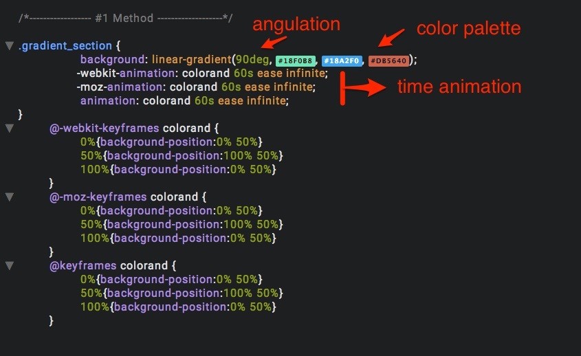
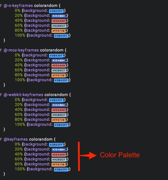
To customize the background, just add the color code you want in the section Color Palette (see image), you can also customize the angle of the colors, and how much time elapses between each color change.
In this example, alternate only 3 colors, but you can also add others.
#2. Method
The second method uses the :after pseudo class to add our custom background after the content. In our case we apply a background to the entire section.
Perhaps this method is a little bit complicated for beginners but it allows you to get a better result for a perfect color animation and a greater flexibility of use.
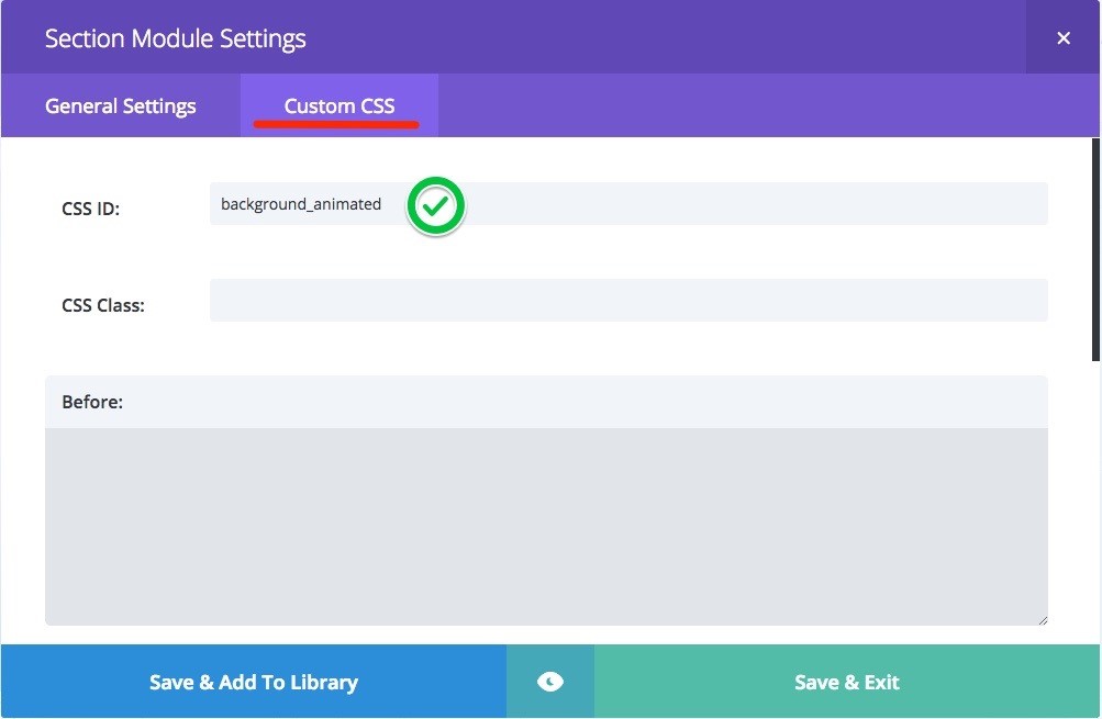
To use the second method, you need to add the section the ID background_animated and copy and paste the CSS code in your options panel or child theme, just like before.
/*------------------ #2 Method -------------------*/
#background_animated {
 -webkit-box-sizing: initial;
 -moz-box-sizing: initial;
 box-sizing: initial;
}
#background_animated .et_pb_row {
 z-index: 1;
}
#background_animated:after{
content: "";
 position: absolute;
 top: 0; left: 0; bottom: 0; right: 0;
 -o-animation: colorandom 15s infinite;
 -moz-animation: colorandom 15s infinite;
 -webkit-animation: colorandom 15s infinite;
 animation: colorandom 15s infinite;
 filter: alpha(opacity=75);
 -moz-opacity: 0.75;
 -khtml-opacity: 0.75;
 opacity: 0.75;
}
@-o-keyframes colorandom {
 0% {background: #3ba3ff;}
 20% {background: #2e48b4;}
 40% {background: #ee6a68;}
 60% {background: #92bdcf;}
 80% {background: #ff973b;}
 100% {background: #3ba3ff;}
}
@-moz-keyframes colorandom {
 0% {background: #3ba3ff;}
 20% {background: #2e48b4;}
 40% {background: #ee6a68;}
 60% {background: #92bdcf;}
 80% {background: #ff973b;}
 100% {background: #3ba3ff;}
}
@-webkit-keyframes colorandom {
 0% {background: #3ba3ff;}
 20% {background: #2e48b4;}
 40% {background: #ee6a68;}
 60% {background: #92bdcf;}
 80% {background: #ff973b;}
 100% {background: #3ba3ff;}
}
@keyframes colorandom {
 0% {background: #3ba3ff;}
 20% {background: #2e48b4;}
 40% {background: #ee6a68;}
 60% {background: #92bdcf;}
 80% {background: #ff973b;}
 100% {background: #3ba3ff;}
}
Customize the background
In this image I highlighted a part of code that allows you to customize the animation time and the background opacity.
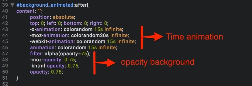
Here you can see the five colors in the example shown, and I specified 5 colors and not 6 because if you look carefully the animation starts with the color #3BA3FF and ends with the same color to start a new loop.
Conclusion:
This is all. Now all you have to do is get creative! If you liked this tutorial or plan to use it, please leave a comment 🙂

Hi, thank you for this tutorial. I was wondering how I can change the color of the page/section background when scrolling. Do you have a tutorial on this subject as well?
This is awesome mate!!! I’ve implemented it on my site: http://www.simplymyhair.com and I love it!
Question: If I add more colors, do I only have to put in the hex color values or do I have to do more with the code? I have used method 1.
Very cool tutorial!
Could you please make a tutorial on how to achieve this – https://www.dropbox.com/
By scrolling down section by section changing Divi’s Main & Secondary Menu
logo color
background color
text color (active link + hover)
Thanks,
Sandris
You can achieve it with this snippet: https://wpzone.co/wordpress-and-divi-code-snippets/different-header-on-scroll-in-divi-4-0/
Interesting tutorial. Many many thanks for sharing with us.
outstanding feature
Well, I really appreciate this post however sadly I can’t get it to work on my Divi Site. Any updates to this post for the current Divi version would be awesome or a little more clarity as to where to add the CSS, I have tried the obvious as suggested in the post instructions ( Child theme Custom CSS) and also tried Theme options Custom CSS with no luck to either. I have also named the Section Class gradient_section.
It would be good if Steven the post author would be kind enough to respond with clarification 🙂
Could you tell me how this effect could be applied to the full site background (using a boxed layout), rather than to a module or section?
Please and thank you!!
Hi!
Really nice trick!
I can apply the method 2 over and image but i can’t use the gradient one… 🙁
Do you know how to use it? The gradient color over a fullscreen image/slider?
Thanks in advance for your time!
X
Really great, thanks for sharing this. Just an additional question, is there also a similar way to have filters for images on a website, like a blur or greystyle effect etc.? Within a Divi theme?
Thanks a lot in advance for short feedback.
Cheers
Tom
where i put the css code?
No way. 🙂 6 hours ago I was daydreaming about a section of a website with colours automatically changing. I’ve never seen it before, and I promptly forgot about the idea. Then – I stumble on this. Jaw on floor. Thanks for this great tutorial!!!
Thanks! Really easy to apply and good effect to create a subtle difference 😉
and is it fair to say that you could use the CSS generated here to set your colours easily?
https://www.gradient-animator.com/
Hi! I love this idea, thanks! I would really like to use it, but I’m new to CSS and I’m having trouble finding out where exactly I need to paste the code :S… I tried adding it to the style.css sheet, at the bottom, but that doesn’t seem right. Any help would be much appreciated! Thanks in advance 🙂
Never mind, found the ‘Custom CSS’ panel 🙂 – thanks again for the idea and the tutorial, Fabio!
Hi, total newbie here, this looks like a great idea, I am trying to make it work on a full-width divi header. Where do I put the actual CSS? In the Before: Main Element: Or After: ?
Any guidance would be greatly appreciated. Thanks 🙂
Great job! Thanks a lot for this idea. Was just looking for some new inspiration and…got it 🙂
Best from Germany, Bettina
Great tutorial, just to say this is an amazing background and thanks to share the
knowledge!
Tks from Brazil
Definitely complex, but there are CSS lessons in there that you won’t generally find. Thanks