One of the best ways to know how to improve your website is to run an a/b test. An a/b test can help reduce your bounce rates, show you how to get higher click-through rates, and help you increase sales. This is why the best websites are always testing. Many have asked what is a/b testing and why you should consider it for your Divi website? Let’s look and see…
What is A/B Testing
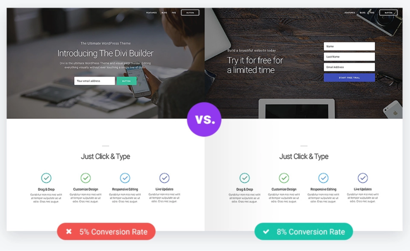
An a/b test, also known as a split test, is a way of gathering data to help you make improvements to your website. It lets you create two or more options for a design and then the page itself shows different options to different members of the audience. The audience is chosen at random and it ensures that the options are shown to the same percentage of the audience. You can then analyze the tests and see which of the two options had the best results.
Once the test was complete, you would ideally create a new one and run the test again until you got the best results possible. This helps you not only choose the best between two or more options but also helps you to continuously improve your website. You could run a different test on every page or post at once and test virtually every element of your website.
For example, if you want to improve the click-through rate on a call to action you can experiment with color, button size, location, font style, images, etc., you could create two different versions of the call to action. You’d then run the a/b test until you got enough traffic to create a large enough sample, analyze the data, and then choose which CTA performed the best. You’d then create another CTA and run the test again and again until you were convinced that you were getting the performance you wanted, and then move on to another test.
Another example would be improving the click rate of an email opt-in form. You could choose the best colors, layout design, and location within your layout to improve the number of new visitors that sign up.
Another example could be reducing your bounce rate. You might start this text by looking at the colors on your landing page. You could create a series of hero sections with different colors and see which had the lowest bounce rate.
It’s easy to see that the possibilities are endless.
Why Use A/B Testing on Your Divi Website
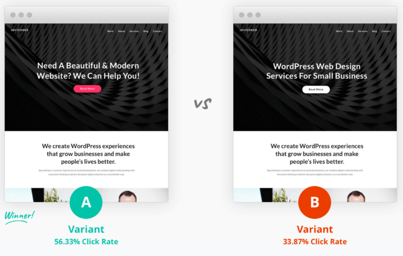
You should always be testing in order to improve your designs. Fortunately, Divi not only has a/b (split) testing built-in (called Divi Leads), but it’s also easy to use. Divi has built-in tools to run your own a/b tests for the sections, rows, and modules within your layouts. This is great for creating optimized landing pages, modules that you sale, layouts and child themes, client’s websites, and your own website.
You can test unlimited variations in a single test. It does only run one text per page, but you’re not limited to the number of alternate options within the test. Also, you can run a different test on every page or post. Anything in the Divi Builder can be tested and anything can be used as the goal.
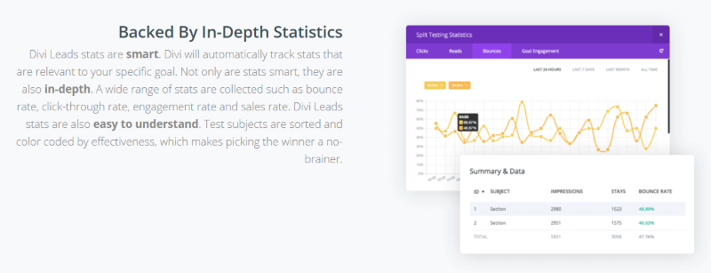
A/b testing helps you optimize your conversion rates based on statistics that you can gather from your current audience. It takes away the guess-work so you can make informed decisions about your designs. It shows the number of clicks, reads, bounces, and the goal engagement for each item you’re testing on a set of graphs so you can compare and get detailed information about each one. The stats are based on the goal, so they’re always relevant to your needs. They’re color-coded, so there’s no question of which is the clear winner.
How to Set up an A/B Test with Divi
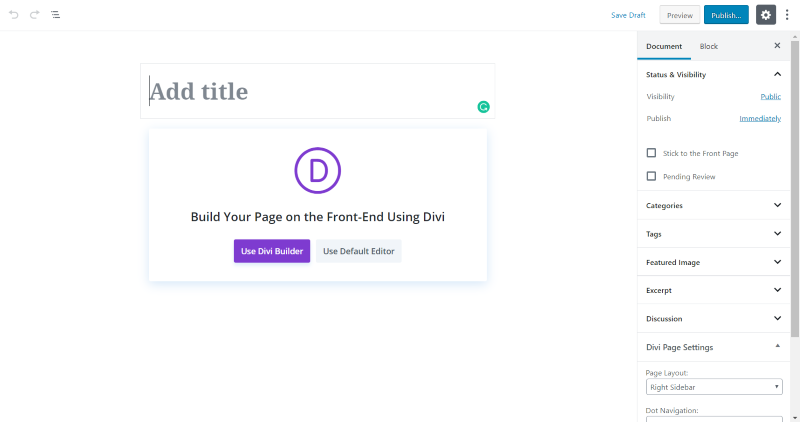
One of the advantages of using Divi over the Gutenberg editor to create your pages and posts is the built-in a/b testing features. When you create a new page or post, select Use Divi Builder.
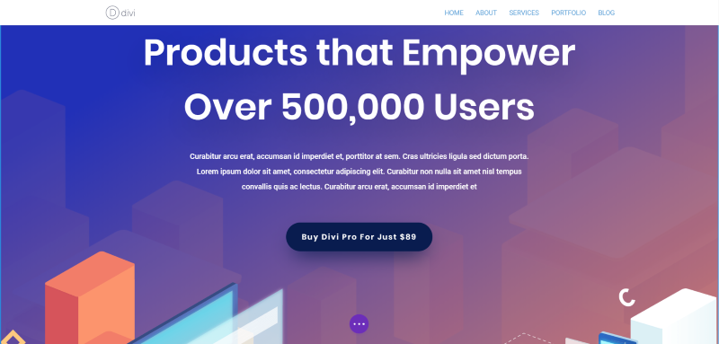
For this landing page example, I want to see which of two button designs would have better results. This is the original button.

Open the menu (the circle with three dots in the bottom center of the layout if you’re using the Visual Builder) and select Page Settings.
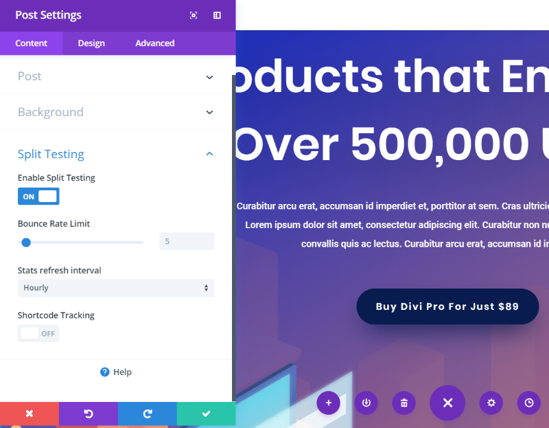
In the post settings screen, scroll down and open Split Testing and select Enable Split Testing. Choose your bounce rate limit, stats refresh interval, and enable shortcode tracking if you want to use it. Click Help for more information about the split test.
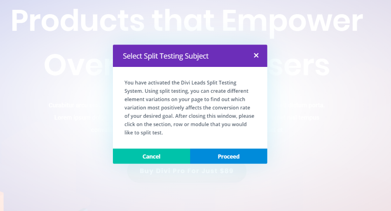
Once you click Save Changes you’ll see the information about choosing a split testing subject. Click Proceed and select the section, row, or module you want to split test. This lets your test be as detailed as you want it to be. In other words, you could test just the buttons, or you could create and test a brand new hero section for the landing page.
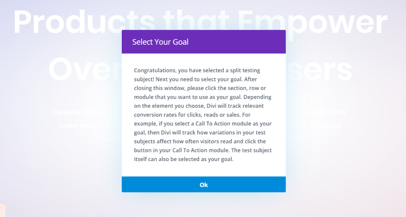
I clicked on the button as my subject. Next, I’ll select the goal.
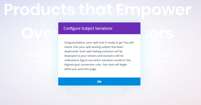
I selected the button again because I want to track button clicks.

It will now create a new button for me to customize. You’ll see it here in wireframe mode. The one labeled 1 is the original. The one labeled 2 will have a new design. No matter what you’re testing, it creates a clone of the original so you won’t have to start from scratch. My second button looks like my first button until I make changes to it.
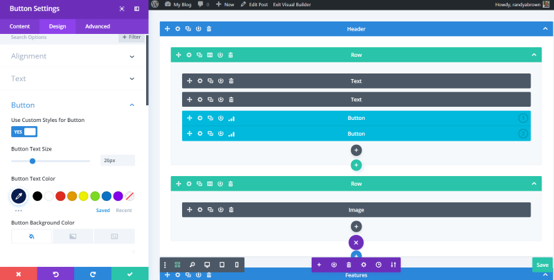
I increased the size of the font and swapped the font and background colors. It doesn’t show the second variation in the visual view, but you can see it in the wireframe view.
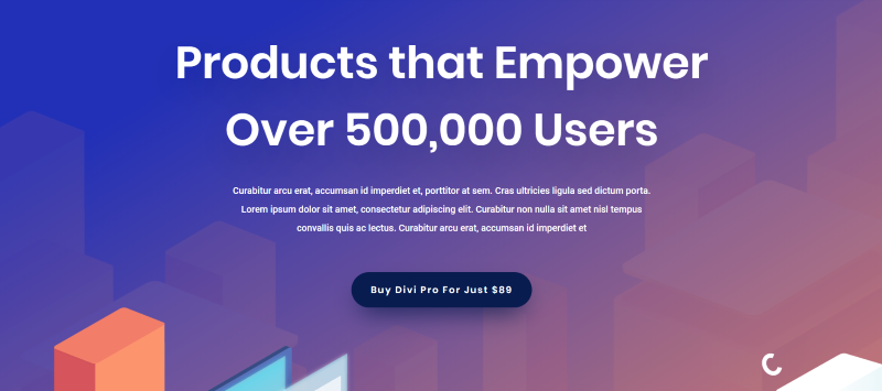
Now half of my audience will see the original design.

The other half will see the new button design.

After just a few minutes my top secret test site that no one knows exists had enough data to see the results. It shows the percentage of clicks each button received from those that had seen that button. Of those that saw button 1, 83.33% clicked on the button. Of those that saw button 2, 100% clicked on the button. I can now choose to use button 2 and start a new test. Click on one of the chart icons that indicates that the a/b test is running.
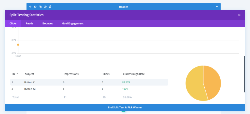
It opens the screen where you can view the stats if you want. You can also end the test and choose a winner. You can see the clicks, reads, bounces, and goal engagement. Select to see the data for the past 24 hours, 7 days, last month, or all time. Of course, this is just an example. Ideally, you’d have hundreds of impressions before making a decision. Basically, the more the better.
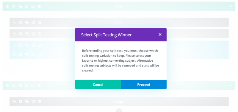
Before ending the test, it shows that it will keep the one you choose and the other option will be removed and the stats will be cleared.
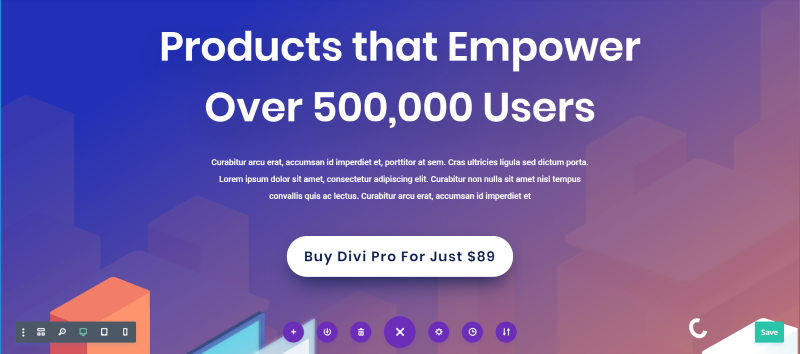
My layout now has my new button.
Ending Thoughts
One of the most important things you can do to improve your website’s overall design, increase sales, optimize your click-through rates, and reduce your bounce rate is to run a/b tests. It’s the best way to improve your conversions because it removes the guesswork. Improving your conversions can be as simple as changing a color, but that’s hard to know without testing it.
Divi is great for testing because it’s easy to use, you can run unlimited tests (with one per page or post at a time), you can test unlimited options within a single test, and it provides solid statistics so you can make informed decisions. Always be testing. And, of course, do it with Divi.
Do you use a/b testing with your Divi websites? Let us know about your experience in the comments below.


Recent Comments