A positive user experience (UX) is crucial to the success of any website. A bad user experience can send your audience running to your nearest competition, never to return. A great user experience can keep your audience engaged, returning for more, and sharing your content with their friends.
Fortunately, Divi is an excellent WordPress theme for creating a great user experience. There are a few things you can do to make it even better. In this article, we’ll look at ten ways to improve the user experience of your Divi website.
1. Test Loading Speed
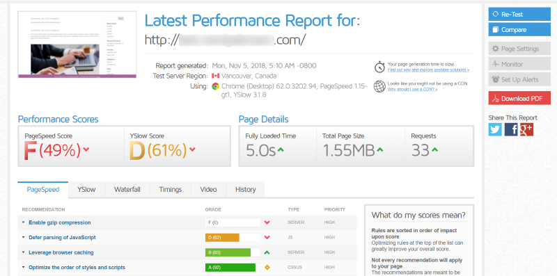
Website speed is a major part of the user experience. The speed that your website loads will help determine if your visitors read your content and how long they stay on your website. If it loads too slowly they will move on to another site. As Neil Patel explains, 40% of users will leave a site if it takes more than 3 seconds to load. It’s crucial to test your site’s loading time and make performance adjustments.
Page Speed Insights, GTmetrix, and YSlow are excellent websites for testing the speed of your website. I like GTmetrix because it provides results from Page Speed Insights and YSlow at the same time. It includes an overall score and a list of recommendations for improving your loading time from both tests. This is excellent for quickly seeing the greatest loading issues with your website and getting information on how to solve them.
2. Test Your Website’s Mobile-Friendliness
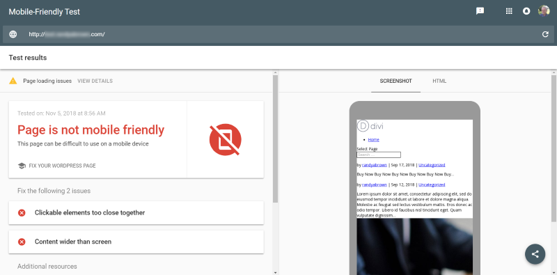
According to StatCounter’s global stats, the web is viewed more on mobile devices and browsers than on desktop. This means that no matter how awesome our websites look on desktops, they must be mobile friendly. Google’s Page Speed Insights does test for mobile page speed, but a more complete test is Google’s Mobile-Friendly Test.
This test shows how easy your website is to use on a mobile device. It also provides usage tips. Once you run a test it highlights issues to fix and provides a list of additional resources where you can learn more about the errors you’re getting, mobile design tips, a discussion forum, and more.
3. Compress Images

Not only can large image files slow down your website’s loading time and push your visitor’s on to another website, but they can also take excessive storage space on your server. For this reason, you’ll want to compress the images.
Images can be compressed in many different ways using many different tools, including tools for your desktop, websites to upload the images to and then download from, or plugins for your WordPress website that will compress the images on upload.
There are many plugins to choose from. WP Squish is a free plugin that lets you set the image resolution size limit and compression level of JPEG images. The images are resized and compressed on upload.
4. Streamline Your Navigation
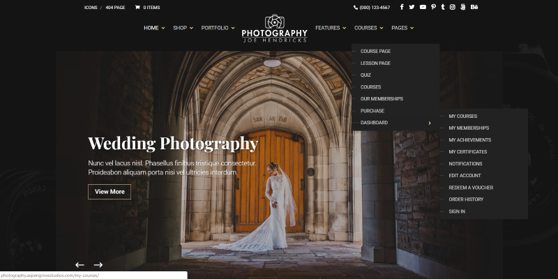
It’s okay to have a lot of information within your navigational menus, but it’s crucial to make your content as easy to find as possible. Navigation can especially become confusing when the site has a lot of content and a lot of categories. The above example shows streamlined navigation from the Divi Photography child theme.
Break the categories into as few topics as possible and then streamline them with secondary menus if you need more navigation options. This means having smart categories and placing them within the navigation structure where it makes the most sense. You don’t want your visitors to have to search too hard or to look in places that they wouldn’t expect to find it.
5. Add Breadcrumbs
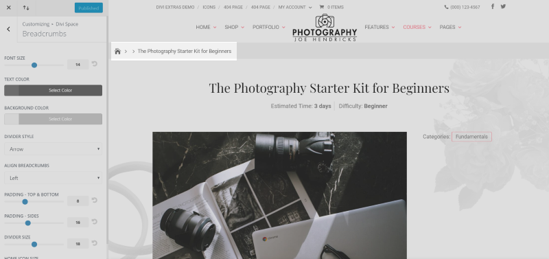
Breadcrumbs let the visitor easily see where they are within the navigation structure. Breadcrumbs leave a trail that your visitors can follow to get back to any layer within your navigation structure. They’re clickable, which it can improve the way they interact with your website.
This example uses the Divi Breadcrumbs plugin. It requires no setup, but you can style it with the Theme Customizer so that it fits within your website’s branding, which also helps to improve the user experience.
6. Use Post Navigation
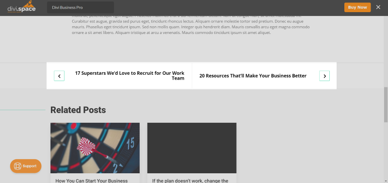
One of the interesting things about building a blog layout with the Divi Builder is the post navigation module. Post navigation makes it easy for the visitor to navigate through your posts without having to go back to the blog page. The example above is from the Divi Business Pro child theme.
With the Divi post navigation module, you can add previous and next text, choose the category, show the previous link, and show the next link. Just like most Divi modules, you can add a background, customize the text, add shadows, customize the border, add CSS, etc.
This is especially helpful if you have content in different categories and you want to make it easier to stay within one category. This means they can find posts quickly that might become buried within your blog. Even if posts are published months apart, you can link them by simply selecting the category.
7. Use the Divi Builder on WooCommerce Product Pages
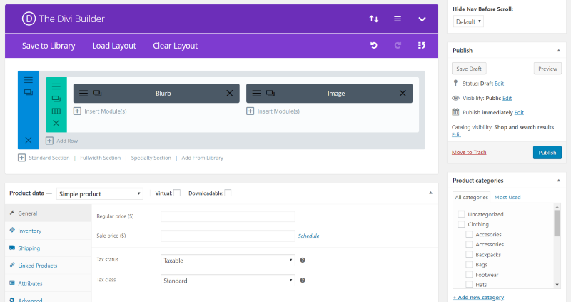
One amazing advantage of Divi is the ability to customize your WooCommerce product pages using the Divi Builder. Create your product page layout using your favorite Divi modules and style them to blend perfectly within your website’s branding. This keeps your styling consistent so it doesn’t seem to the customer that they’ve left your website when they view your products.
8. Use More Whitespace in Your Layout
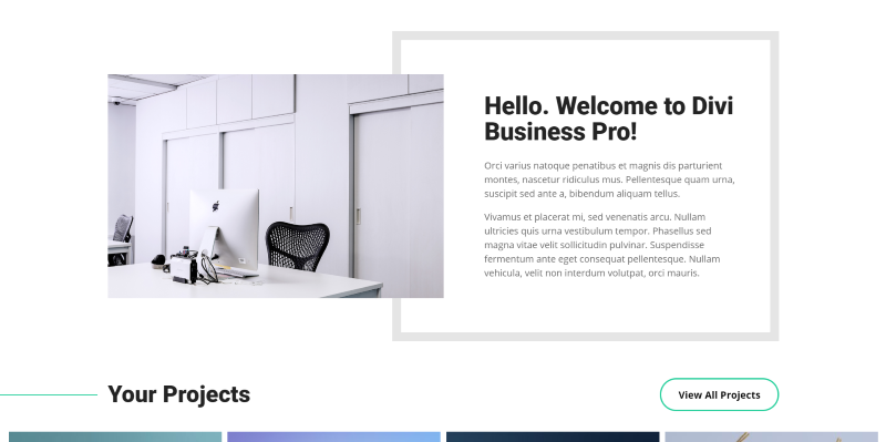
By white-space, I don’t actually mean the color. I’m referring to the space around the elements of your website. In other words, add some space so nothing is crowded. Elements that are crowded take extra effort to see (where’s Waldo?). Adding white space removes the clutter and allows them to see what you want them to see. They won’t have to figure out what they are supposed to focus on.
Use more white space around text, images, navigation, sign-up forms, videos, and your calls to action. Simplify your sidebars if you decide to use them. Remove all of the distractions that are fighting for attention. Simpler is better. The easier something is to see the more likely they are to engage with it. The above example is from the Divi Business child theme.
9. Simplify Your Forms
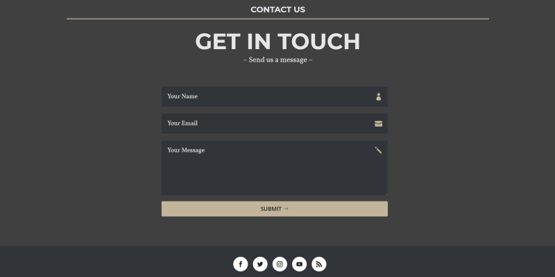
Visitors are more likely to use your forms if they are simple. Don’t ask for too much information on your forms. Break the information down to the most crucial elements. Be sure to ask for the type of information that is appropriate to the type of form.
For example, you’ll need more information from someone that is asking for a price about a project than you will from someone that’s just asking a question. For an email list you probably just need the email address. You might even ask for a first name, but you won’t need their date of birth or the state they live in. This example is from the Open Road child theme.
10. Keep Your Calls to Action Clear
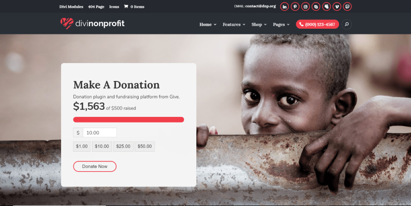
The goal of most websites is to move the visitor through to their call to action. Your calls to action should be easy to see and understand. It should be simple- not filled with so much information that the visitor can’t make heads or tails of what it is.
You want the process to be natural. You want them to want to move through the process, and you want it to be effortless. Strip out all of the information that isn’t necessary. This example is from the Divi Nonprofit child theme.
Ending Thoughts
A great UX is one of the most important things to consider when designing or refining your Divi website. Visitors will remember a bad experience with your website and it can be more difficult to get them to return for a second try than it was to get them to your site to begin with. These ten ways to improve the user experience of your Divi website will help ensure that your visitors walk away with a good experience.
It’s always a good idea to run a/b tests to find improvement points. You can test almost all of these design elements to constantly make your website better and improve your website’s user experience. Be consistent in your design and branding. Good UX both looks and works great. Your visitors will appreciate the effort you put into giving them a great user experience.
Do you use these ten ways to improve the user experience of your Divi website? Let us know about it in the comments.

I’m trying to improve my site speed but one issue is the call for https://connect.facebook.net/en_US/sdk.js – is there a way to disable this within the DIVI theme? thanks!
Excellent post Randy! This one is going in my bookmark bar for certain! All great points, especially #8 for those clients that think they need to clutter up their pages with backgrounds and screen colors.