No one likes to wait on a website to load. The slower your website loads the more likely your visitors will move on to the next website. This means your speed and load-time is crucial to the success of your website. Fortunately, there are lots of ways to test your website and get insights to solve the problem areas. In this article, we’ll look at some of the best tools and see how to measure your Divi website speed and load times.
Tools
There are lots of good tools to measure your Divi website speed and load times. Here’s a list of some of the best tools:
Most are online tools. Some of the tools are extensions that can be added to your browser. They measure the speeds of the frontend of your website. The types of information they provide include the time to first byte, fully loaded time, page size, file sizes and speeds, number of requests, etc. They identify the files you should fix and provide information in charts. Your test will be affected by the test location.
In this article, I’ll look at GTmetrix and Pingdom. GTmetrix provides details from multiple speed tests (Google’s PageSpeed Insights and YSlow) and provides lots of information with interactive charts that are easy to use. Pingdom provides the same sort of information, but it’s even simpler to use because it’s their own test. For my examples, I’m testing the website for WordPress.org.
GTmetrix
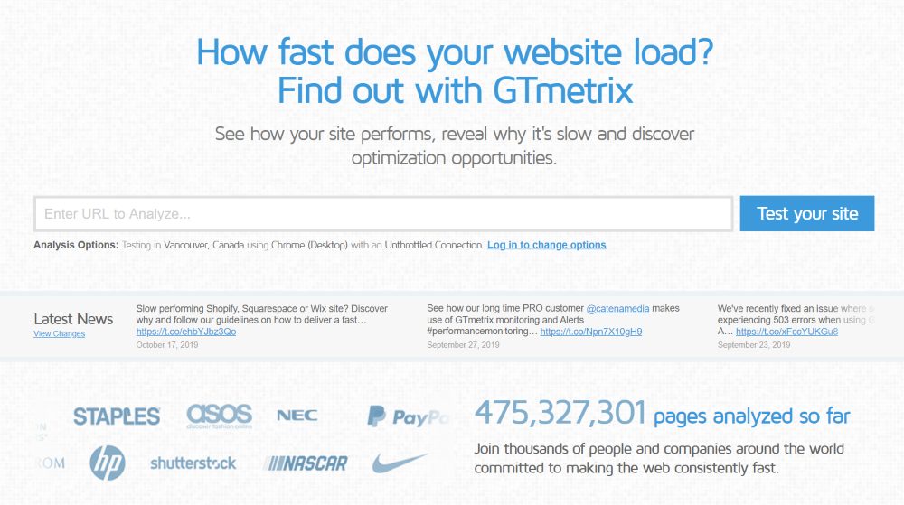
GTmetrix analyzes the site with YSlow and PageSpeed and provides lots of information about each of the test results. It gives you both the loading time and the fully loaded time. See the results in multiple types of charts and analyze the data for insights on where to make improvements. Monitor pages to get a historical trend and set up alerts based on the conditions you set. Enter your URL and click Test your site.
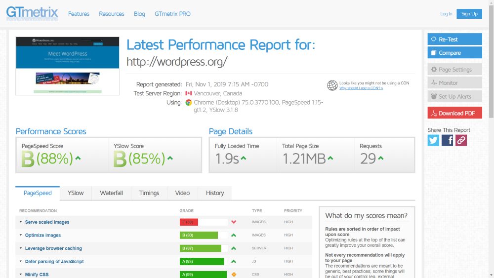
Once the test is completed it shows information about the test including when the report was generated, the test server region, the browser, IP address, and PageSpeed and YSlow scores. It also provides you with the performance grades and scores from PageSpeed and YSlow, and page details that include the fully loaded time, total page size, and the number of requests.
A symbol shows the condition when compared to the average. A red down arrow means it’s lower than average. A yellow diamond is close to average. A green up arrow is a considerable amount above average. Hovering over the symbol next to the score shows the average recommended score. These same symbols are used in the PageSpeed and YSlow results.
On the far right, you’ll see tools to re-test, compare to other web pages based on your settings, adjust the page settings to get the best test possible, monitor your page on a routine basis, set up alerts based on conditions you choose, and download as a PDF.
GTmetrix PageSpeed Results
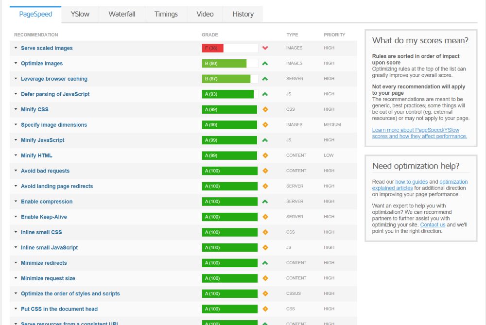
The next section provides tabs to show details of the tests with insights on what the problems are and advice on solving them. It also has a few sections that explain what the scores mean and how to get help optimizing your website. The first tab shows the details of the PageSpeed results. It includes the recommendation, grade, type, and priority. Go through the list and fix problems according to grade and priority.
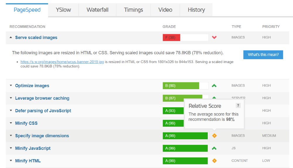
Click on any one of the items to see the details. The results are color-coded to show their condition. It also provides a grade and a score. Red is a low grade and score. Yellow is next. Green is good. The darker the green the better.
In this example, Serve scaled images gets a low score and is red. Clicking it shows the problem and it informs you of how much space or speed you can save by fixing it. If it’s a specific file, it will provide a link to that file.
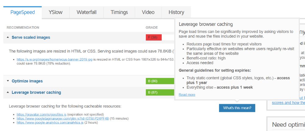
It also provides a button to get more information about the type of problem and fixing it. Hover over the button to see the information.
GTmetrix YSlow Results
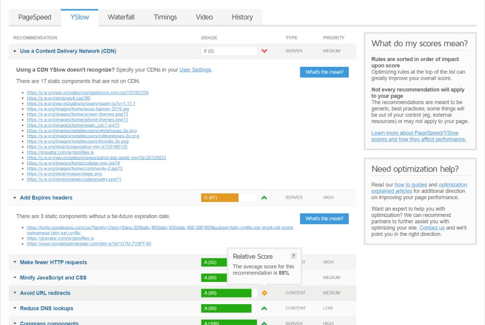
The YSlow tab provides the same kind of information with a focus on things that stand out to the YSlow test. It also provides the grade, score, color, symbol, and information about the problems with links to the important files.
Waterfall
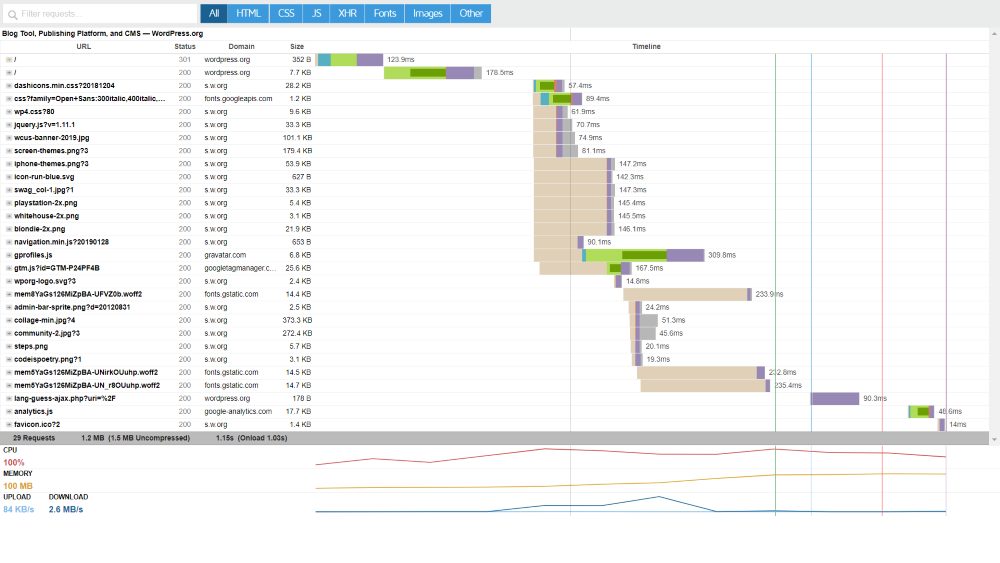
The Waterfall tab provides a waterfall chart that you can interact with or download. This shows a request-by-request visualization of your page loading. The CPU and memory usage, upload, and download sizes are shown in a graph at the bottom of the waterfall chart. This chart can be used to see the loading time and size of each element so you know where to focus your efforts.
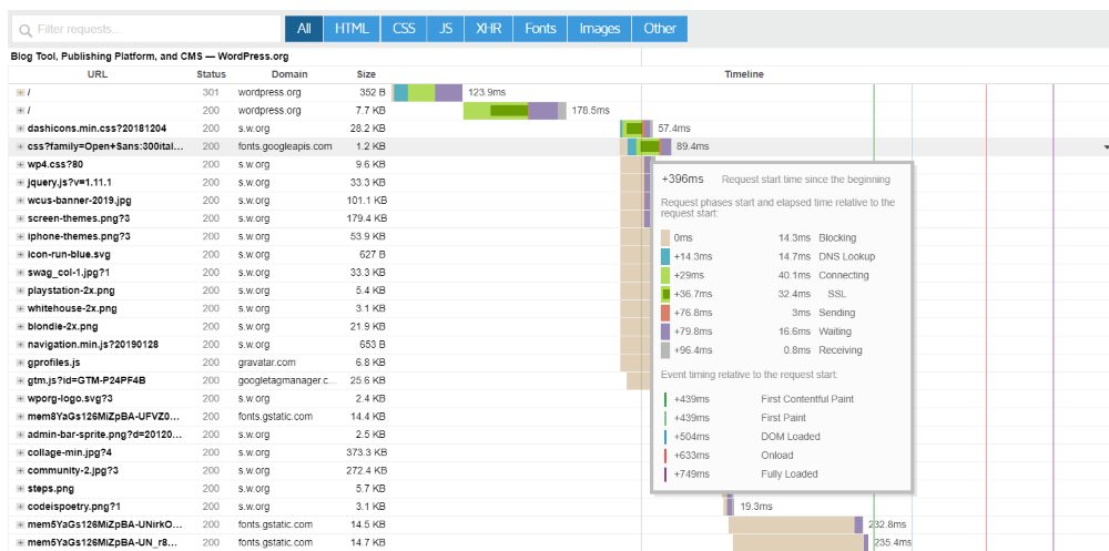
It breaks the timing down into fractions of a second to show what takes the most time to load. It shows the URL, status, domain, size, and a timeline. Highlight any of those elements to see detailed information.
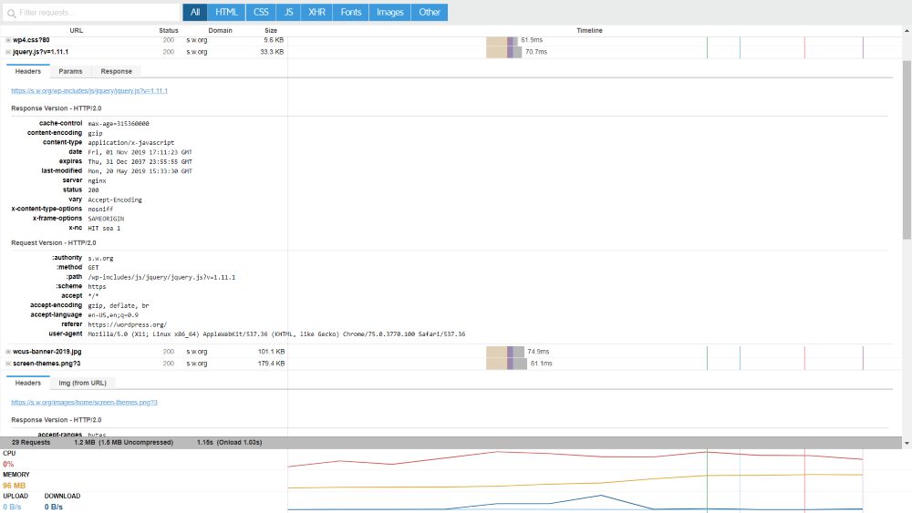
Click to open each element to see even more information about the headers, response, and other data.

You can filter the requests by all, HTML, CSS, JS, XHR, fonts, images, or other. See one at a time or select several to combine them. You can also search the chart for specific elements.
Timings
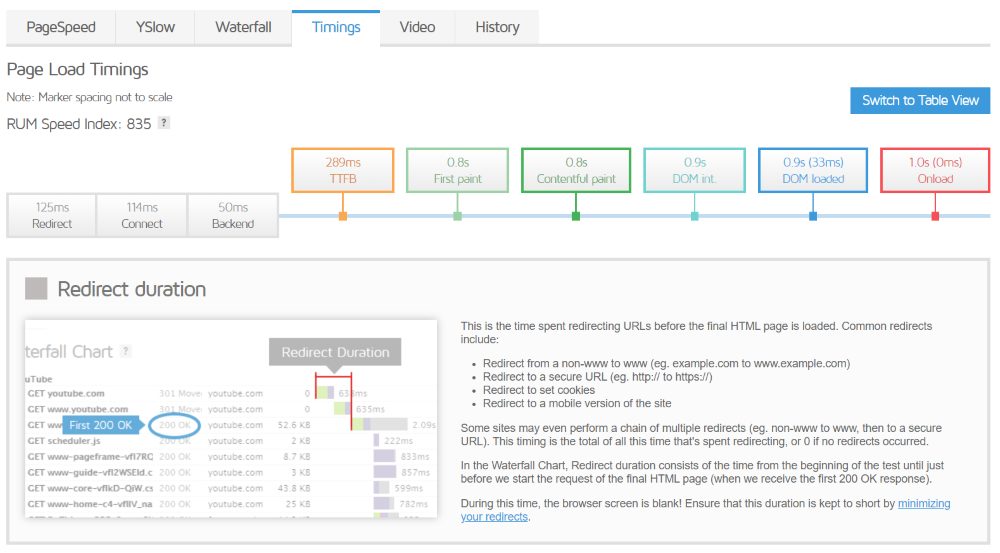
Timings has a couple of charts that show the timings of your page load. This view shows a new metric (currently in beta) called the RUM Speed Index, which is the total time it took for the page to be visibly populated. The lower the number the better. It also includes the redirect, connect, backend, Time to First Byte, first paint time, First Contentful Paint time, DOM interactive time, DOM content loaded time, and onload time. This is another way to see where problem areas are in your page-loading process.
It has two views. The first view shows the elements within a marker on a line. The blocks in the line contain the timing information. Hovering over any of the blocks reveals a detailed explanation about each one. The example above is the marker view.
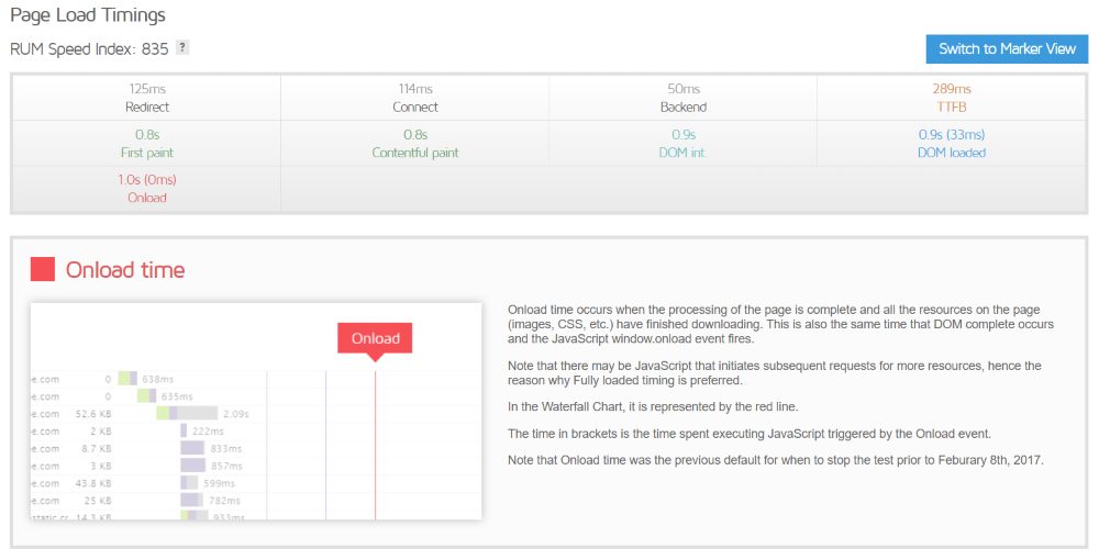
The button in the upper right corner lets you switch to the table view. This shows the same information, but within a table rather than on a line.
Video
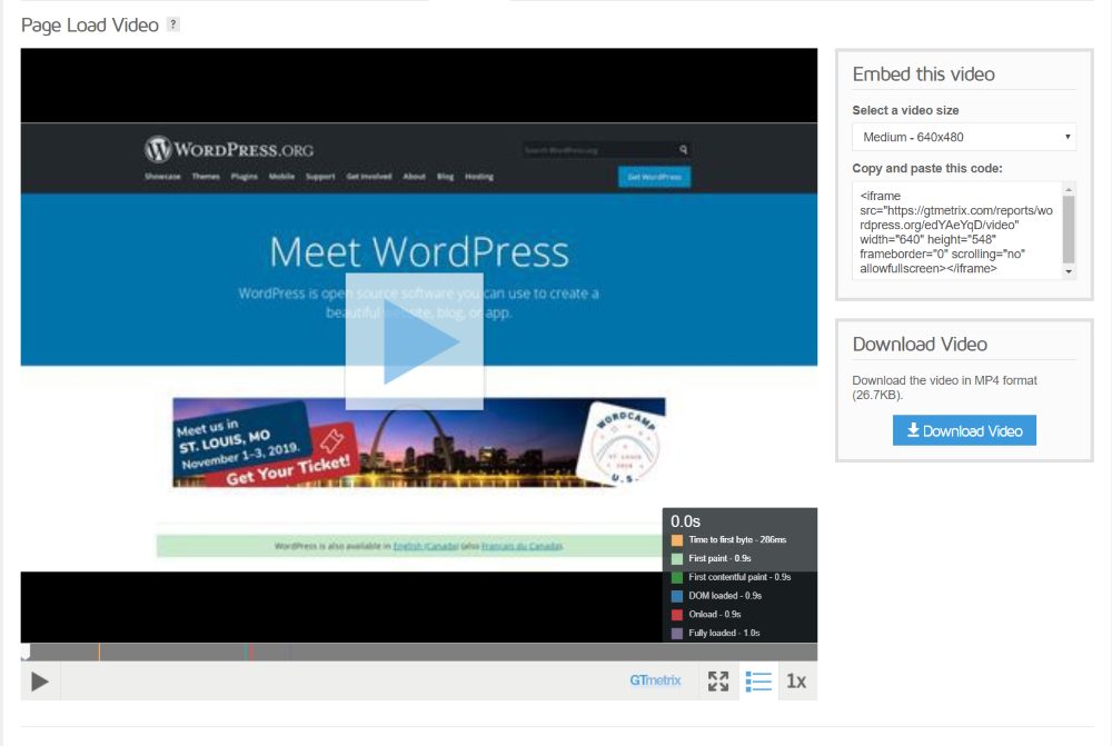
The Video tab creates a video of the page-loading process and marks on the timeline where each point in the process begins. A chart shows what the colors represent. You can also embed the video (in 320 px or 640 px) with the supplied code, and download the video in MP4 format. You can watch the video at normal speed, half speed, and quarter speed. This is helpful for seeing exactly how the page loads so you can spot problem areas.
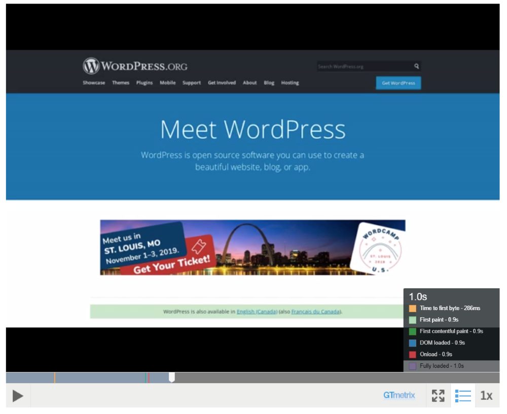
Clicking one of the elements takes you to that element in the video. In this example, I’ve clicked on Fully Loaded.
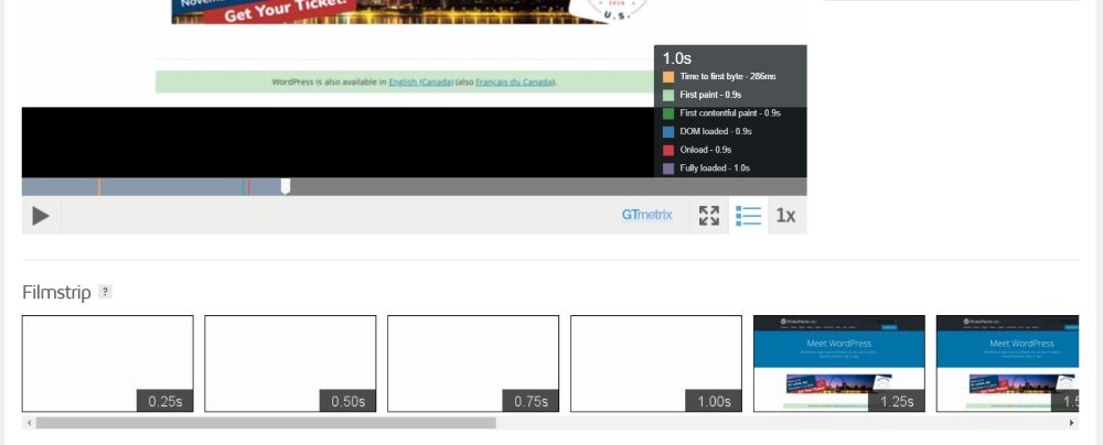
Under the video is a filmstrip feature where you can see the frames as thumbnails for every .25 seconds to get an alternate view of how the page loads.
History
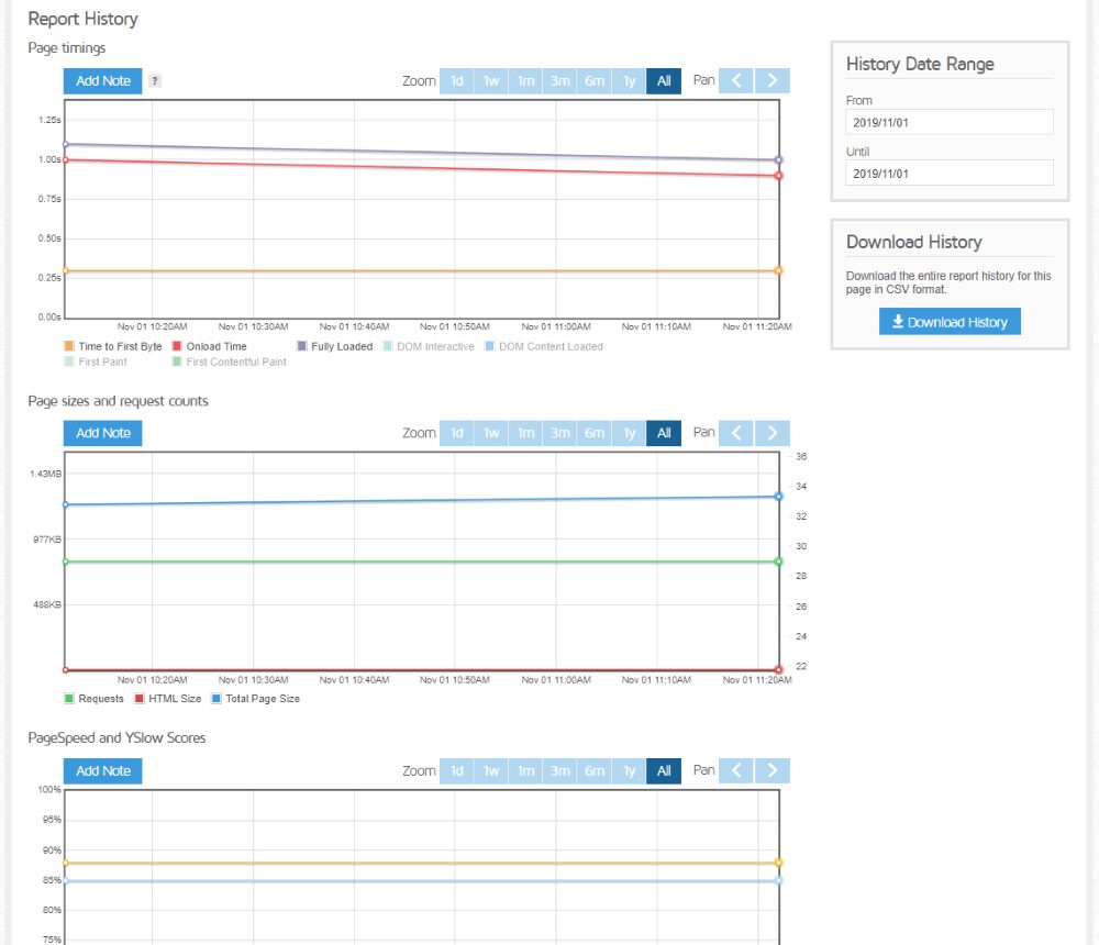
History shows the test results over a period of time. This is useful for seeing before and after improvements. It provides several charts based on the date-ranges you set, so you can see the effects of specific improvements. It shows page timings, page sizes and request counts, and PageSpeed and YSlow scores. You can add notes to the charts, zoom to see days, months, or a year, and pan. Download this as a report in a CSV file.
Pingdom
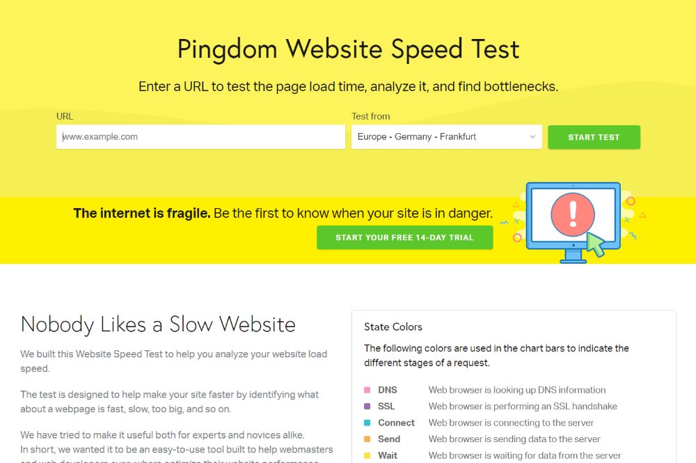
Pingdom is another excellent tool for testing your website speed. It’s simpler to use but still provides a lot of good information. Enter the URL, choose where you want to test from, and click Start Test.
Pingdom Results
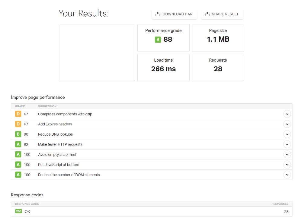
It will provide a screenshot of the site, a performance grade, and give information about your page size, load time, and the number of requests. It also provides a list of areas where you can improve your performance and shows the response codes. They’re listed according to how much improvement they need and include a color code, grade, and score.
Improve Page Performance
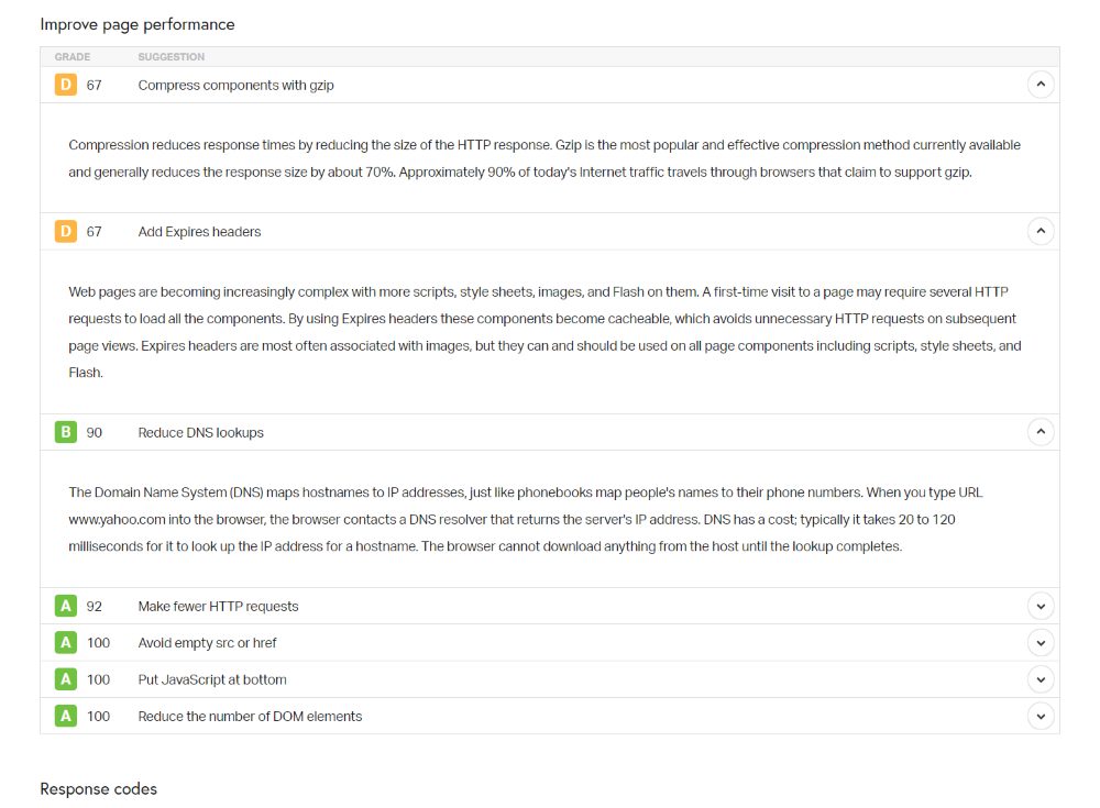
Clicking to open them reveals more information so you’ll have an idea of where to focus your attention. It doesn’t include links to the actual files, but the advice is helpful.
Content Size
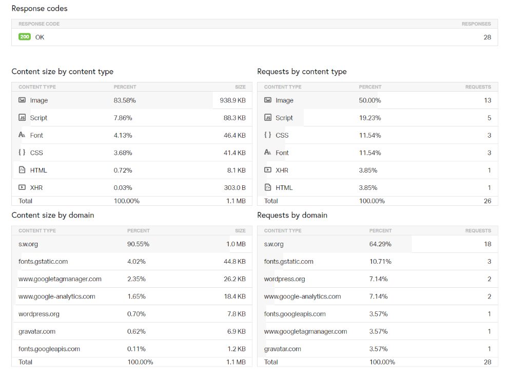
The content size provides a list by content type and by domain, and the number of requests by type and domain.
File Requests
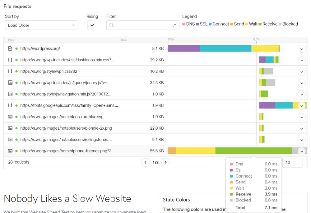
File requests are provided in an interactive chart. You can sort them in 15 different ways and hover over any element to see the speed details according to type. See requests that are rising or filter them.
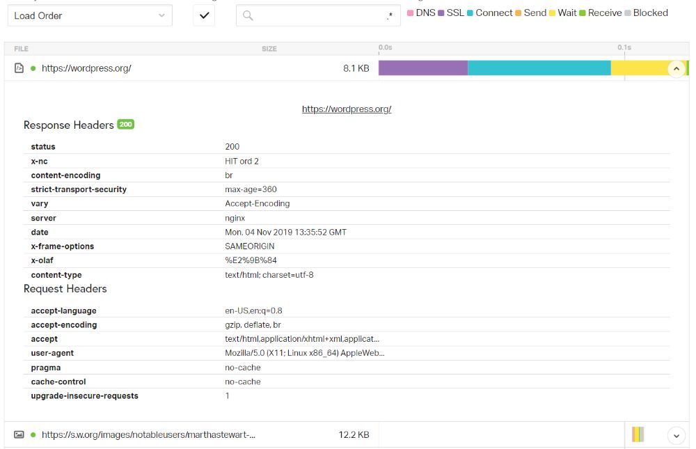
Click to open it to see the detailed information. All of this information can help you identify problem areas and what you need to do to solve them.
Ending Thoughts
That’s our look at how to measure your Divi Website speed and load times. There are lots of good tools available. GTmetrix is one of the best as it provides insights on both PageSpeed and YSlow. Pingdom is also a good choice.
This article focused on measuring your website speed, but there is a lot you can do to speed up your Divi website. For more information about making your Divi website run faster, see the article How To Make Divi Run Faster.
One of the most important factors of site speed is making sure you choose a good hosting service provider for your website. We highly suggest opting for managed WordPress hosting such as Divi Space Hosting as the host itself adds far more complex features for security, speed and performance from the host side. Another key factor is caching. Once your site is set up and running, we recommend adding a caching plugin like Divi Rocket to speed up your site’s performance.
To keep up to date with all of the hosting news and information, and to help solve your hosting problems, be sure to join the Divi and WordPress – Hosting and Domain Support Group on Facebook.
We want to hear from you. What are your favorite tools and methods for measuring your Divi website speed and load times? Let us know in the comments below.


so what is the deal when GT shows a score of 92 ..89 on ySlow, yet the page speed is 3.5 seconds, and the load is 1.2 MB??