**Please Note: This tutorial was tested with Divi 2.7. **
In this post we’re going to share a JQuery hack that makes vertically aligning content super easy. But first off, why do you need it?
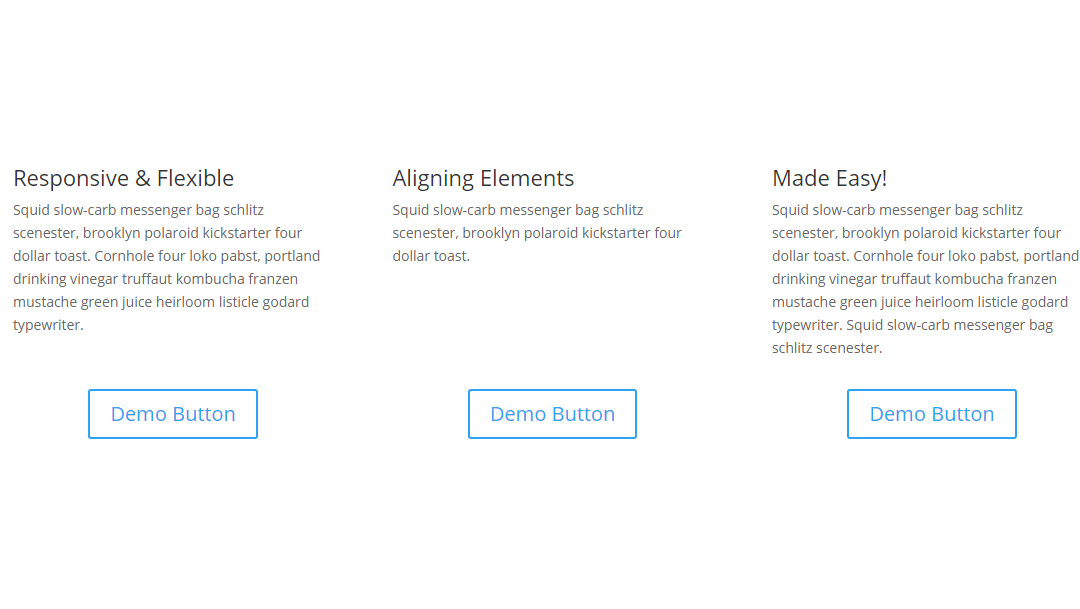
The call-to-action example
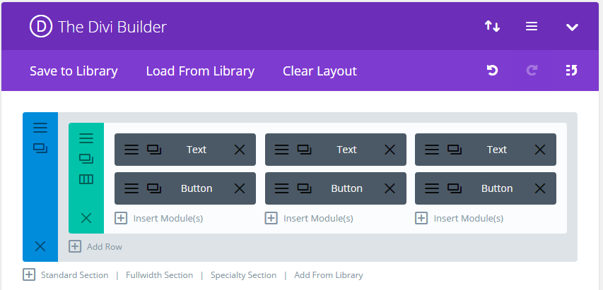
Let’s say you have three pieces of text based content with a button underneath each. Here’s how you’ll want to have that in the builder:
The problem with this set up is that unless the text is the exact same length for each button, the result is this…
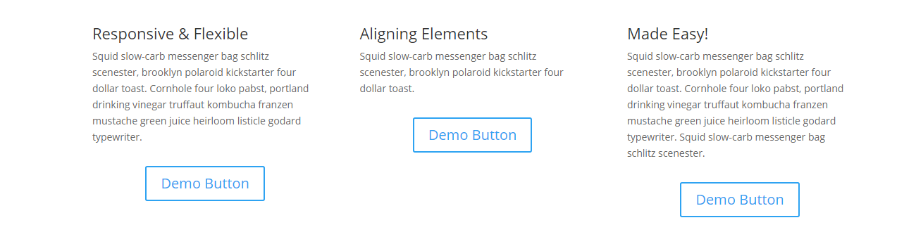
Not exactly pretty is it? Ideally those buttons would be aligned. You could place the buttons in their own row but then all three buttons would stack underneath all three text blocks which is a UI nightmare. So the solution is to ensure that the text boxes are of equal height, even if some have less text. That way the buttons will align underneath them and still stack properly on mobile devices.
Our jQuery hack ensures that the text boxes are the same height. Here’s how it works.
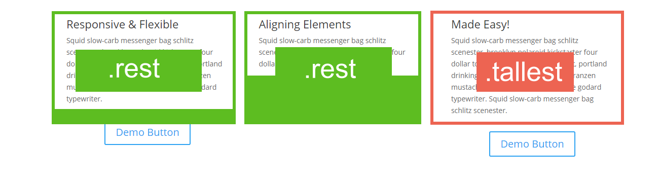
We identify the largest text area, in this case it’s the third column. We use the Divi advanced module options to add a CSS class of ‘.tallest’. We then add a ‘.rest’ class to the other text boxes we want to manipulate.
Our jQuery takes the height of the module with the .tallest class and apply it to any modules with the .rest class. Cool right?
Here’s what that look’s like:
<script>
 var mq = window.matchMedia( "(min-width: 980px)" ); // Identify a minimum width for jQuery

 if (mq.matches) { // Only apply jQuery if viewport = 980px or more

 jQuery(document).ready(function() {
 var height = Math.max(jQuery(".tallest").height(), jQuery(".rest").height());
 jQuery(".tallest").height(height);
 jQuery(".rest").height(height);
 });

 }
</script>
You can just add this directly to the head section under Divi > Theme Options > Integrations.
We’ve also added a condition that says the jQuery only executes if the view port is over 980px wide, which is the point where Divi stacks the columns and vertical aligning becomes redundant.
Here’s what it look’s like now –
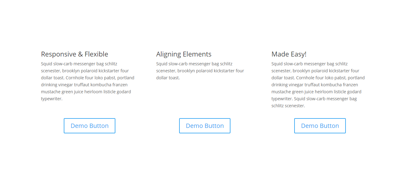
And there you have it. Vertical aligning made easy.
NOTE: We know in some cases you can use flex-box CSS or displaying info in a table. We wanted to provide a more rugged solution and feel that this is it. We hope you like it! 🙂

Question… Obviously this is a great solution if you have a row where there is a clear taller area. Moreover if you have a situation like this on more then one page having the jquery in the site wide css area obviously this will be super easy to add that css class to the various areas that need the equal heights. My question though: If I have this situation in more then one place on the same page will this work, as in if I have a row with 3 columns say text/button like shown and then later I have blurbs or testimonials that also require the same treatment will it work if there are 2 or more .tallest tags.
I like it, I’ve been using flex-box but I’ll save this and might try it sometime.
Does DIVI Switch have a switch for this? I’m trying to figure out what Switch would do for me. I love this tip but do I just “steal” your code or buy Switch?
Most of Divi Switch’s features are freely available through my tuts but its worth grabbing if you want to speed up your workflow.
Hi Stephen,
Thank you so much for the solutions. Before knowing this method, I usually use 2 row: 1 for text and 1 for button 😀
This is not working for me. Nothing happens when I try.
I take it the vertical alignment would work with images as well?
How would you go about vertical alignment with blurb and testimonial modules that have different heights for images and different text?
Oh wow, this is amazing! Thanks so much.
Is it at all possible to use this more than once on the same page? I tried using it in two separate sections but obviously it’s only able to set one “tallest” figure.
I don’t know much (anything!) about jquery but I was wondering if it’s possible to duplicate the code with e.g. tallest-2 and rest-2, like you could with CSS for example?
Ta!
Nice work. Saves a lot of friggin around and adding code that messes up the mobile layouts.
Cheers,
Thanks for your helpful article. This page is getting bookmarked for future use.
Hi Stephen,
Ive tried this a few times and still cant get it to function how it is shown above. Would you mind letting me know where ive possibly gone wrong
Hi, thanks for this it looks great! I’ve tried using it on the blurb module but it doesn’t seem to work. Can it be used for this? Thanks, Steve
Hi Stephen,
I tried the above but could get it to work? Im guessing ive gone wrong somewhere
Any chance that you could do a tutorial, video or step by step instructions for the numpties – i.e. me 🙂
This is just friggin amazing – for so long now I have struggled as this used to make designs look so messy. Thank you SJ, i just love your tutorials.
This is just friggin amazing – for so long now I have struggled as this used to make designs look so messy. Thank you SJ, i just love your tutorials.
Just what I’ve been looking for. Thanks.
Hi Stephen,
I tried this on my homepage with blurb sections and a call to action button but it doesnt seem to be working. Should i change the blurbs to text boxes?
This is not working for me. Can you clarify where the code is placed? I have it:
Divi Theme Options>Integration>
Enable Header code
Place the script in “Add code to the of your blog”
Awesome piece of script!
I’m finding that although it looks good when the page initially loads, resizing the window breaks the layout as the text attempts to adapt to the narrower/wider window, but the height of the blurb cannot adapt and the button placement is off.
Awesome, thank you so much
This will come very handy when I’m overhauling my personal website.
Seriously? You just couldn’t bring yourself to add another row and adjust the margins/padding? You must be having a love affair with jQuery? I might add this to my snippets and try it a couple times to see if it is worth the hassle. It might turn our faster if all I have to do is copy and paste?
If you add another row then the text would stack on top of eachother and then the buttons instead of text/button/text/button etc as you’d want it to.