Divi Extras is a plugin that adds the Category Builder modules from Extra to the Divi Builder, allowing you to use them on any page or post. In this article we’ll look at what Divi Extras does, why you might need it, and look at five ways to use Divi Extras.
For information about installing a WordPress plugin, see the article How to Install a WordPress Plugin (Step by Step Guide for Beginners).
What is Divi Extras?
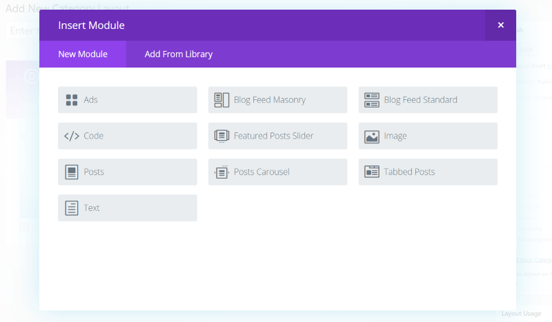
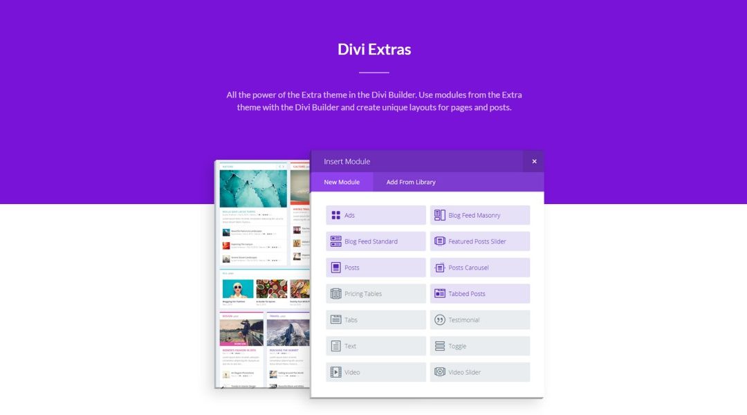
Elegant Themes’ Extra is a magazine and blogging theme that uses the Divi Builder. One of the things that sets it apart from Divi is a homepage building system called the Category Builder, which has 7 modules that are not available to Divi or the Divi Builder.
The Category Builder lets you build layouts that highlight articles, tags, and categories to create a specialized publishing platform. Those 7 modules allow you to display:
- ads
- blog feeds in a masonry or standard layout
- a featured post slider with unique styling
- a posts module that shows posts in two columns with the latest in the left column and the others in the right column to create a magazine-style design
- a posts carousel that displays posts horizontally that automatically slides
- tabbed posts that displays posts similar to the posts module but with tabs
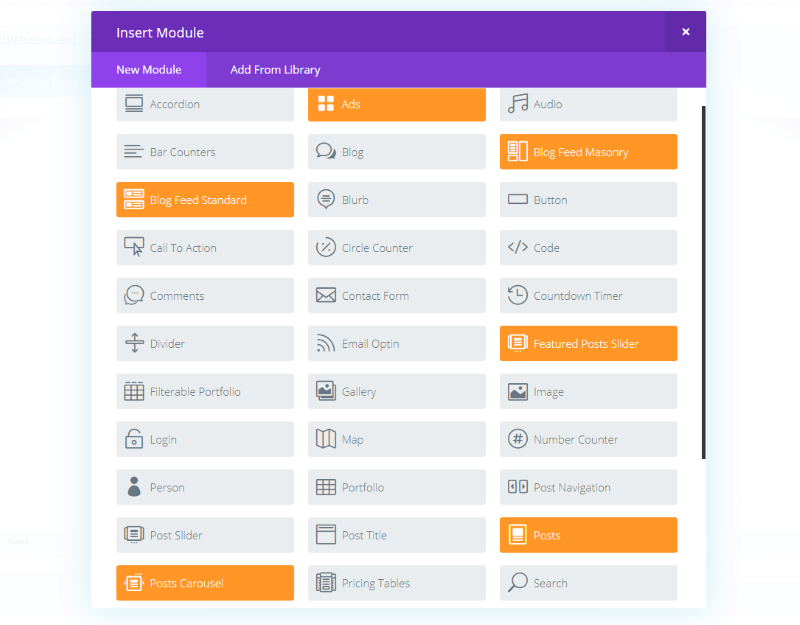
Divi Extras brings those 7 Extra Category Builder modules to the Divi Builder, making them available to use on any page or post. They’re highlighted in orange so they stand out from the standard Divi Builder modules.
This is great for those who prefer to use Divi but still want the advantage of those modules. This is ideal for online magazines or websites with lots of content in multiple categories.
This also solves a development problem. Extra and its Category Builder doesn’t allow you to preview a layout before going live. Since Divi Extras works with the standard Divi Builder you can create your layouts and tweak them instead of building them in the Category Builder.
Divi Extras Examples and How to Create Theme
One of the advantages of Divi Extras is the ability to use Extra’s Category modules within Divi layouts. Here’s a look at a few examples.
1. Blog Section in Landing Page
For this one I want to replace the blog section of a landing page. First, here’s the original design:
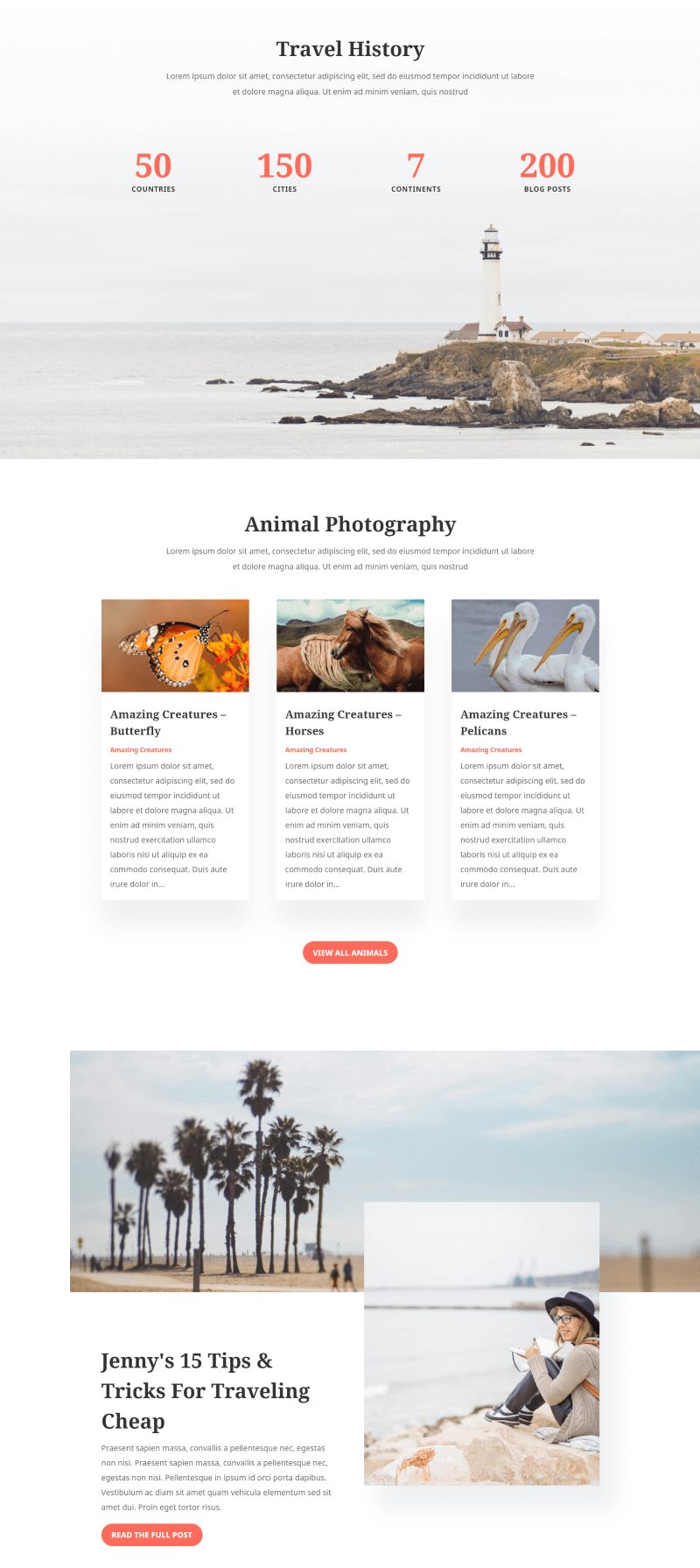
This is the regular blog section of the landing page of Divi’s Travel layout. I’ve replaced the text to match my topic of animal photography while traveling (simply because I chose animal photos from Unsplash).
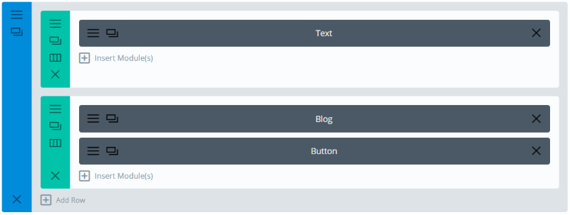
It uses three modules: a header, blog feed, and button to navigate to the blog.
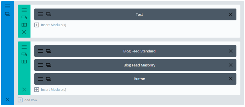
I’ve replaced the blog module with two Category modules: a Blog Feed Standard, which will show one post, and a Blog Feed Masonry, which will show three posts. I’ve set the Blog Feed Masonry to ignore posts that already appear on the page.
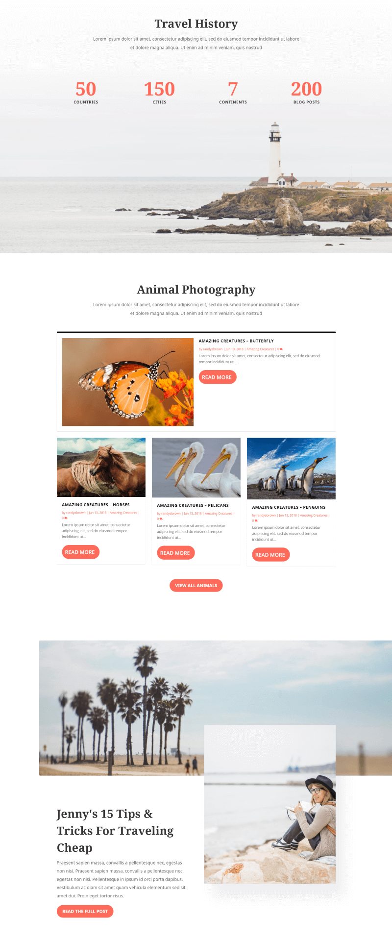
Here’s the layout with the Category Building modules. I set the meta text to orange, the read more text color to white, the button background color to orange, and the button radius to 100. This creates a unique blog element within a standard layout.
2. Blog Page
I also wanted to customize the blog page to add some category features.

The blog portion of the Travel layout’s blog page shows a header and two posts in full-width and navigation to see older entries. It also includes a section with popular posts.
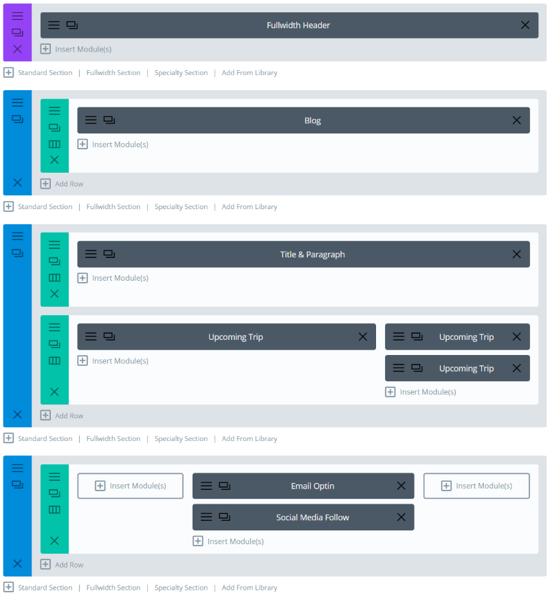
It uses a Fullwidth Header and Blog module for the blog and Text modules to create a popular posts section. I want to recreate the blog and replace the popular posts with Category modules.
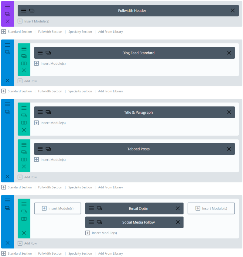
I replaced the Blog module with Blog Feed Standard and set it to display 2 posts. I replaced the Text modules with Tabbed Posts, which I set to display 8 posts.
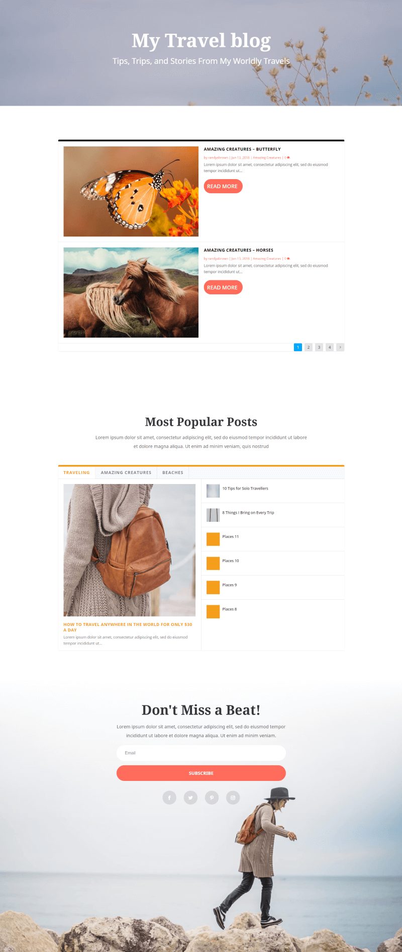
The blog page now has more of a magazine design. I used tabbed posts in order to display popular posts from multiple categories.
3. Magazine Layout
For this one I’m using the home page of the Travel layout to create a magazine. I’ll keep most of the content intact and add a magazine layout to it.
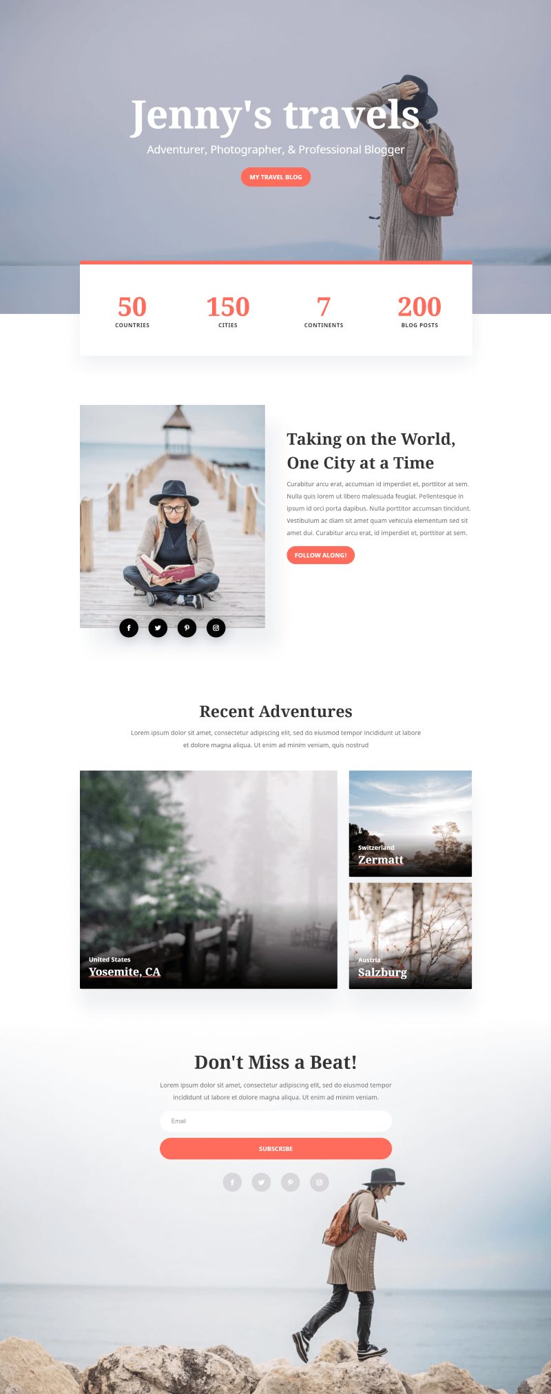
Here’s how it looks on the frontend.
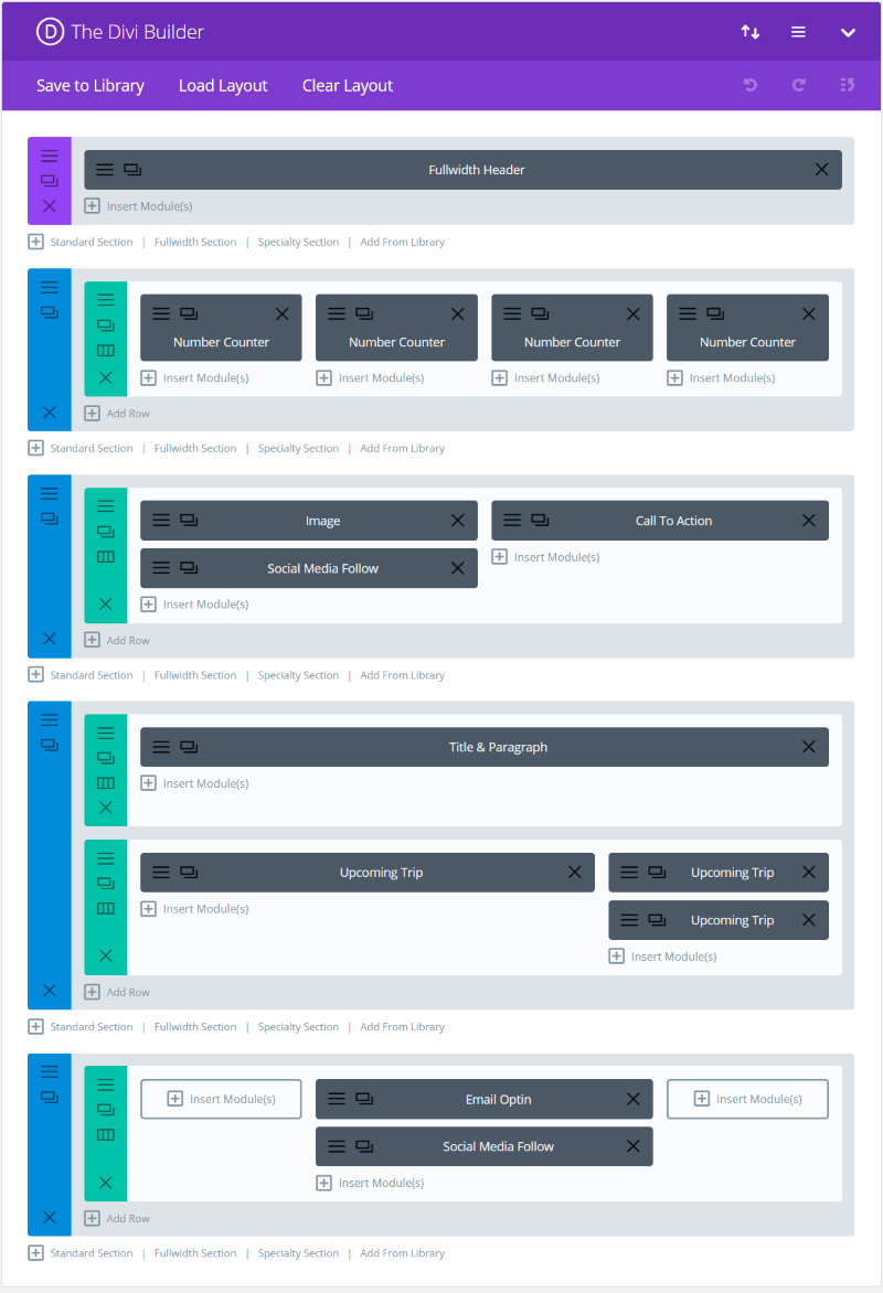
Here’s the original layout from the backend.
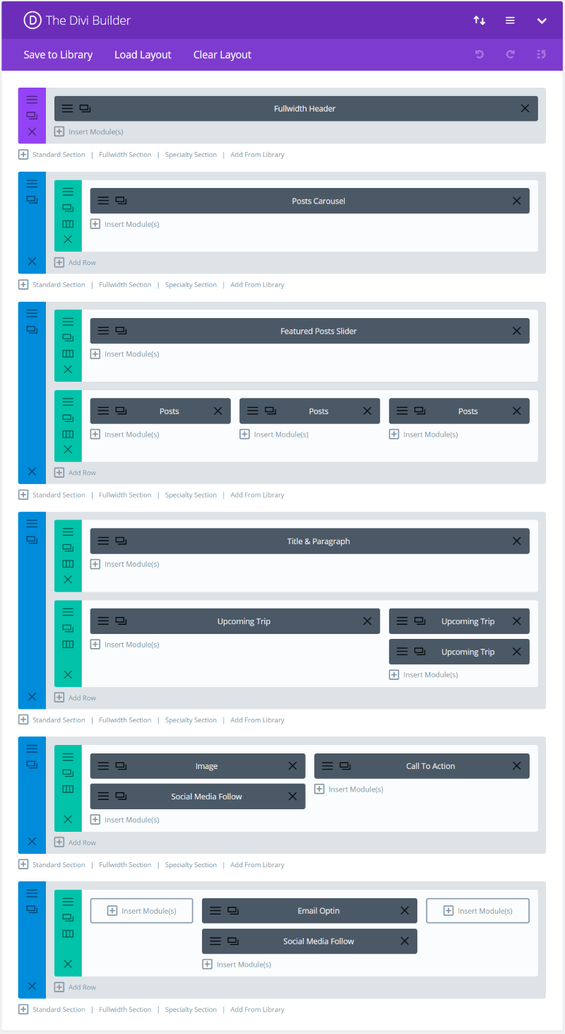
I replaced the number counters with a Post Carousel module and added a new section with a Post Slider and 3 Posts modules that will display the latest posts from three different categories. I moved the social follow and CTA to the bottom, just above the email opt-in.

Here’s the brand new magazine made from the Travel layout’s homepage. I liked the default styling of the modules, so I left them as they were, but it would be a good idea to match, or pair, the fonts to the layout.
4. Restaurant Menu
Restaurants and eCommerce websites need to call attention to sales and specials. One way to do this is with a Post Carousel. In this example I’ll add the Post Carousel module to the Restaurant layout’s homepage.
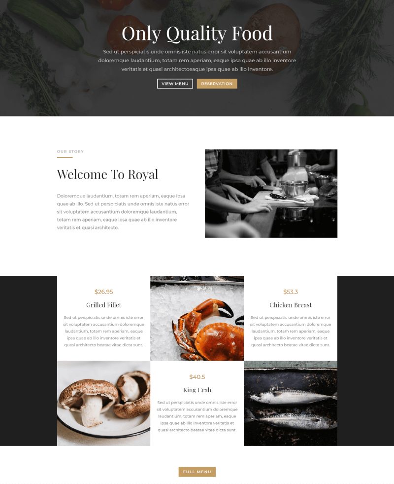
This is the homepage before I add anything to it. It does have a section with food and a link to the menu. I want to add the module under the header.
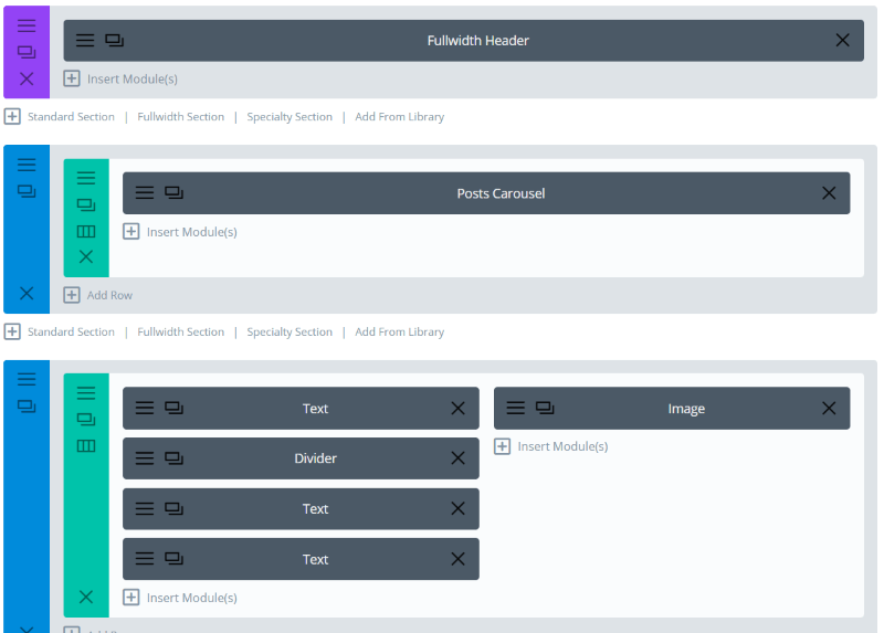
I’ve inserted a Posts Carousel module under the Fullwidth Header.
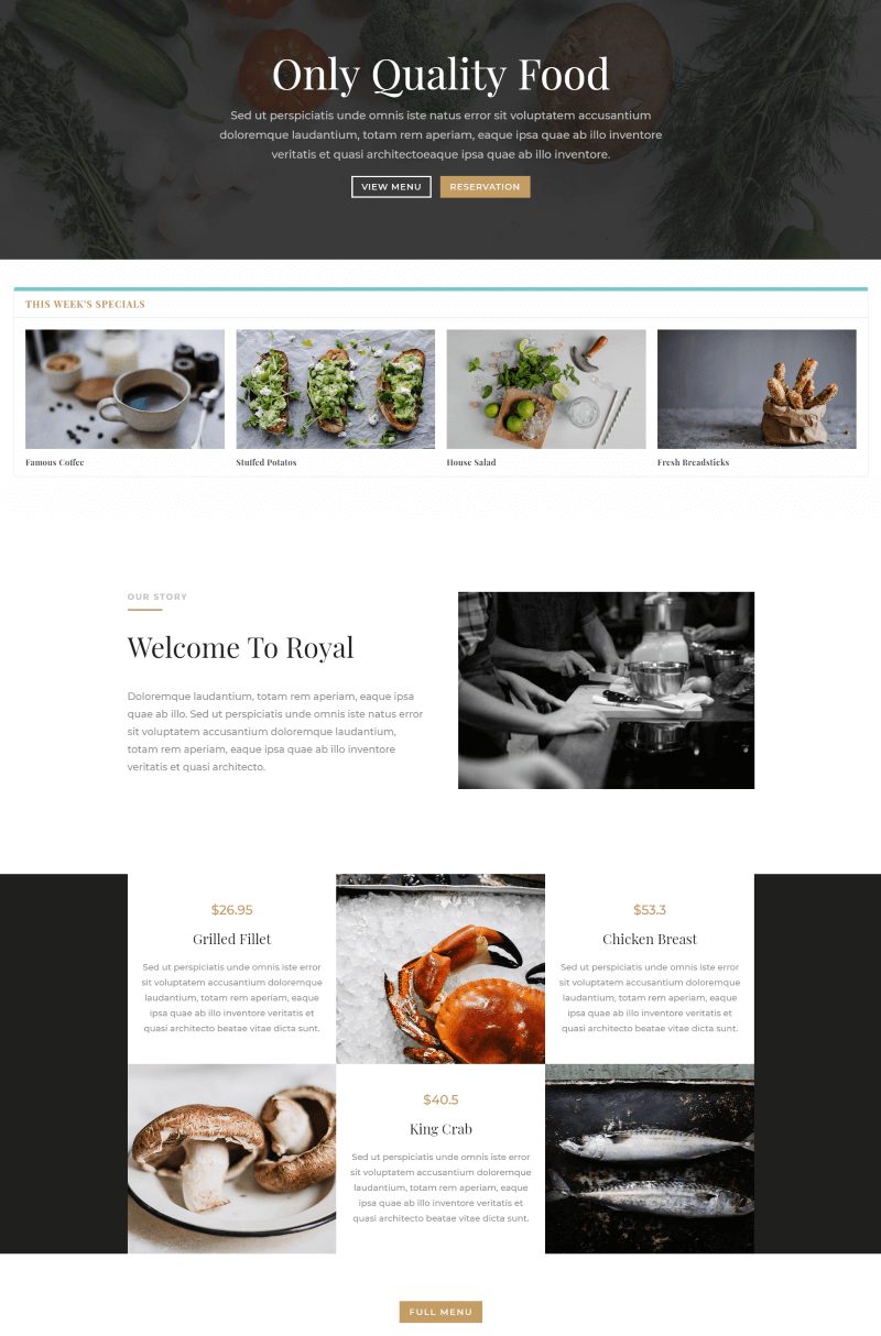
Here’s the layout with the Posts Carousel module. I’ve adjusted the font style and color to match the layout’s design and disabled the meta from the posts. I’ve changed the header text, color, and style as well. It’s a slider, so it will draw attention as the visitor loads the page.
5. Image-Based Magazine Layout with Shop
For this one I’m creating my own layout – an image-based magazine with a shop.
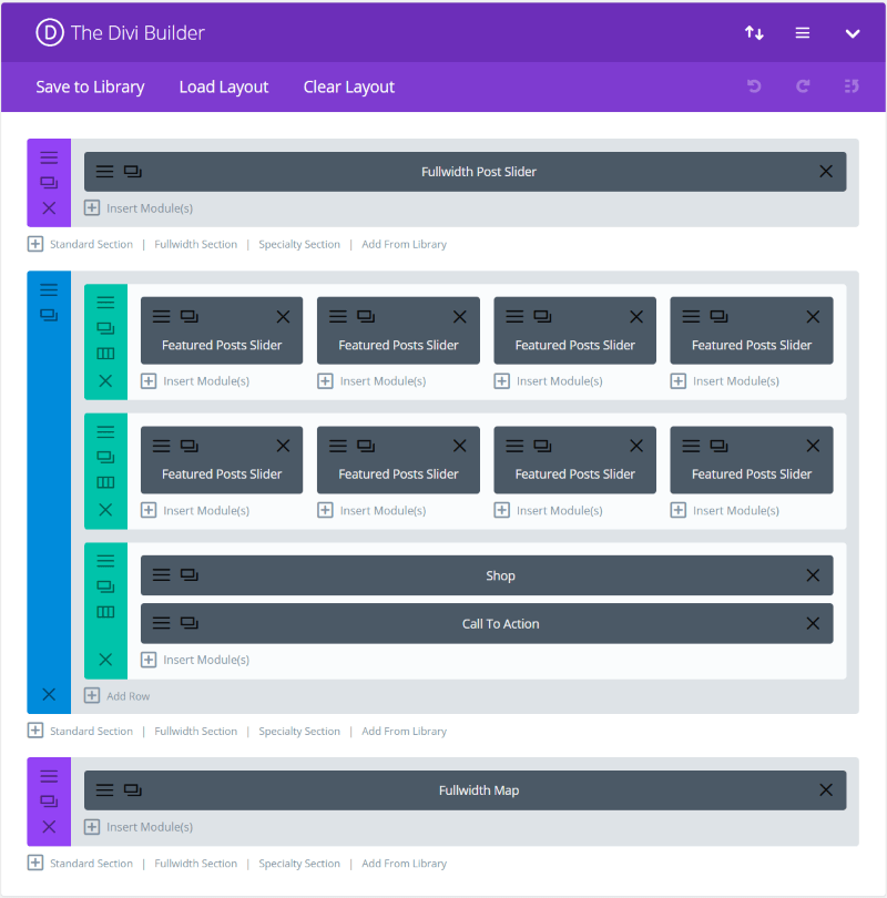
I want to show categories within individual sliders, and show the first post with a Fullwidth Blog module, add a shop module, bring in a CTA, and show a fullwidth map.
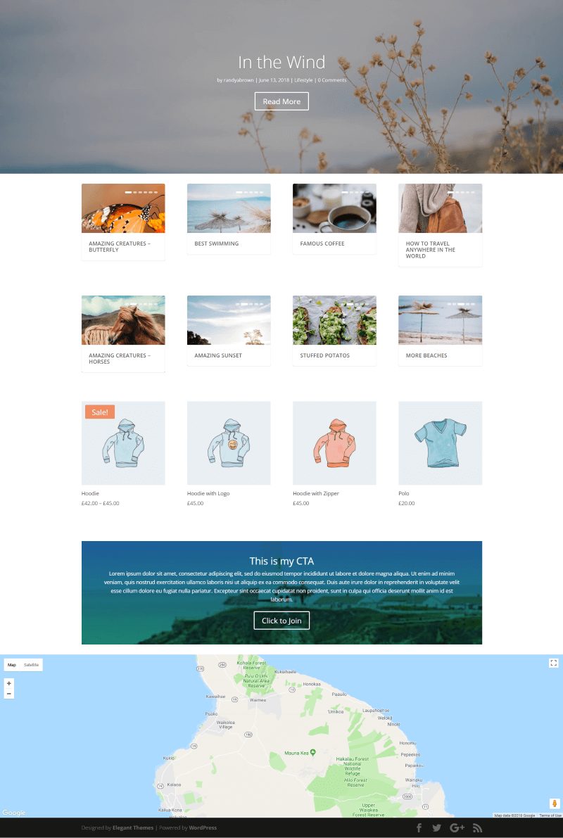
Everything except for the Featured Post Sliders are standard Divi Builder modules. Although I didn’t style anything beyond the default, it’s easy to see how the Category modules and regular Divi Builder modules work well together to create some interesting layouts.
Ending Thoughts
Divi Extras is a powerful plugin when it comes to design. Category Builder modules are one of the main reasons designers like Extra and adding the Category Builder modules to Divi opens a world of design possibilities. These five examples are just scratching the surface, but it’s easy to imagine what can be done when Category Builder modules are available in the Divi Builder.
- You can purchase Divi Extras right here at the Divi Space shop.
We want to hear from you. Have you tried Divi Extras? Let us know about your experience in the comments.

Thanks Randy
i think this is one of the most powerful features on this platform and this article has helped me understand it better.
I’m trying to figure out whether to use Divi with Divi Extras plugin as shown in this article, or just use Extra with the Divi Builder for my static pages, then set those pages to fullwidth. What are the pros and cons of each?
Hi Randy. One of the most powerful features of Extra is the ability to build category layouts, that are distinct and work apart from regular pages & posts. I’m not sure whether that’s part of Divi Extras, or whether instead it is providing the ability to use Extra-like modules on regular Pages & Posts ?
Dini Extra is a fantastic tool which is important for any website because of it presents the following features such as: magazines and blogging themes very viable for my website.
Truly thanks for my website progressing.
Thanks Randy
Do you perhaps have these layouts available as a .json file?