How To Customize The Password Protected Page
The ability to password protect pages and posts in WordPress is a useful feature. You can make pages available only to certain users, or share the password to premium content in your marketing emails as an added incentive to join your mailing list. The user cases are limited only by your imagination. Unfortunately, it’s not a feature that gets a lot of love in the theming/design department. In this post, we’re going to show you how to use some simple CSS to make sure your password protected pages match the rest of your brand.
If you’re going to use this tutorial to make changes to your website then please ensure you’re familiar with where to add your custom CSS. Later in the post, we’ll be learning how to customize the WordPress loop to remove password protected pages from places we don’t want them appearing. If you’re using Divi, then you’ll need a child theme or functionality plugin set up to run that code.
Designing For Default Posts And Pages
The password protected feature is handled slightly differently on pages and posts that have been built using the standard editor, as opposed to content built with Divi. For the most part, this doesn’t change our approach too much. It just means that to follow on with this part of the tutorial, be sure you’re applying your CSS to a password protected page or post that has been built with the default ‘Gutenberg’ editor, and NOT with Divi.
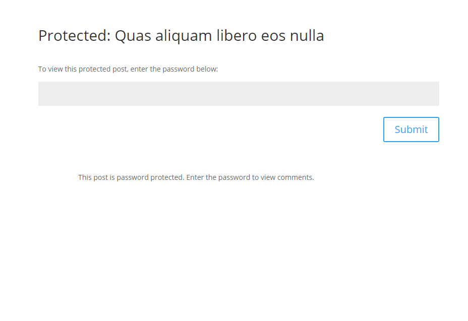
So let’s look at the default styling. We have a title, a paragraph prompting us to enter a password, a password input field and a submit button. We also have a line of text asking us to enter our password to view comments, but only on posts. Why? Because the source of comments on posts is not the same as post content, so WordPress is checking if we have access to view the post, and when we don’t it outputs this weird line instead of the standard comments template, we’re going to get rid of it.
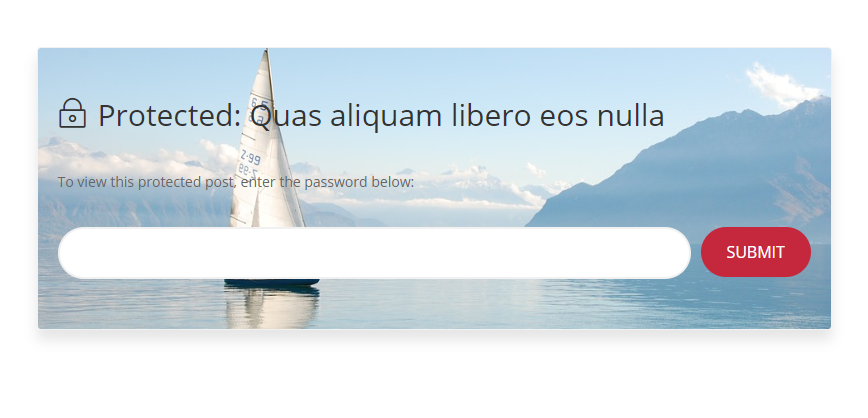
Here’s how it’ll look once we apply our CSS. If you just want the code, you can scroll down and grab it. If you want to follow along with how we’re styling the password protected in this way, read on.
We can see all of the elements we want to style by right-clicking on the password protected block of content and inspecting them.
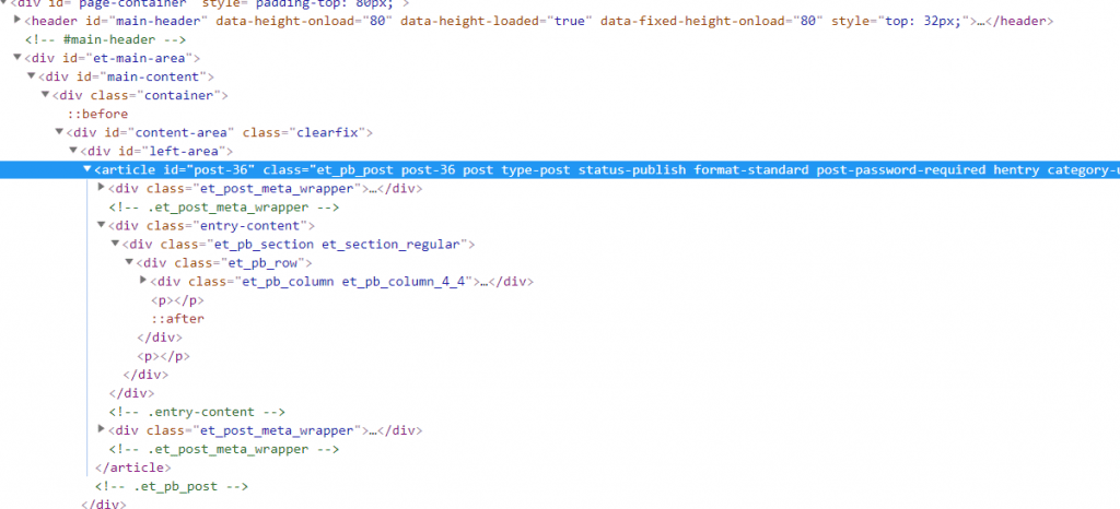
Here we can see that everything we want to style is happening inside an <article> element with a class of ‘post-password-protected’. We know everything we need to style is a child of this element, so we can use this class first when we build our CSS selectors to ensure we don’t accidentally overreach with our styles. You can learn more about how CSS selectors work here.
The CSS
.post-password-required { /* Our parent item */
    border: 1px solid #f1f1f1;
    box-shadow: 0 10px 20px rgba(0,0,0,0.10); /* material style drop shadow */
    padding: 50px 20px;
    border-radius: 4px; /* rounded edges */
    background-image: url('/wp-content/uploads/2019/02/background-image.jpg'); /* upload your own image and copy path here */
    background-size: cover;
    background-position: center;
}

.post-password-required .et_pb_section {
    background-color: transparent; /* it's white by default */
}

.post-password-required .et_pb_button {
    background-color: #C5283D;
    border: none;
    color: #fff;
    text-transform: uppercase;
    font-size: 16px;
    width: 110px;
    margin-top: -14px;
    height: 50px;
    border-radius: 32px; /* rounded buttons */
    transition: .6s ease all; /* color change speed on hover */
}

.post-password-required .et_pb_button:hover {
    background-color: #481D24;
}

.post-password-required .et_pb_button:after {
    display: none;
}

.post-password-required .et_password_protected_form p input {
    width: calc(100% - 120px);
    float: left;
    border-radius: 32px;
    background-color: #fff;
    border: 2px solid #f1f1f1;
    transition: .6s ease all;
}

.post-password-required .et_password_protected_form p input:focus {
    border: 2px solid #481D24; /* thick outline when typing */
}

.single-post .post-password-required .et_post_meta_wrapper:last-child {
    display: none; /* remove weird comments text */
}

.post-password-required .entry-title:before {
    content: "\7e"; /* set padlock icon */
    font-family: 'etModules'; /* set icon font */
    margin-right: 10px;
}

.et_password_protected_form > p {
    margin-bottom: 20px;
}

.page #main-content .post-password-required, .post #main-content .post-password-required {
    max-width: 980px;
    width: 90%;
    margin: 13vw auto;
}
The code has been commented throughout, so you can see exactly what it does. You’ll see that we’ve used the :before pseudo class to add a padlock icon to the title. We’ve also set the line about viewing comments to no longer display on protected posts.
The next thing we need to do is make sure this looks good on protected pages that have been built using the Divi Builder.
Customizing Password Protected Divi Pages And Posts
When we use the default editor, the <article> element we mentioned earlier appears within the left-area div element, which already has width, padding and margin styles attributed to it. This means that our password protected box looks pretty good. When the Divi Builder is used, the <article> tag is added directly inside of the main-content div, which is set to be full width with minimal styles, because it is expecting a Divi layout, not a password form.

As our form is the only thing on the page, it looks like this…

Not ideal. Our styles are still being applied to it, but it looks odd having our small styled section sandwiched between the header and footer. What we need to do is give it some space. We’ll use margins and a fixed maximum width to do so. As the #main-content ID is only used on Divi powered pages, we can add that in front of our selector to ensure it only affects the pages we want it to.
.page #main-content .post-password-required, .post #main-content .post-password-required {
     max-width: 980px;
     width: 90%;
     margin: 10vw auto;
}
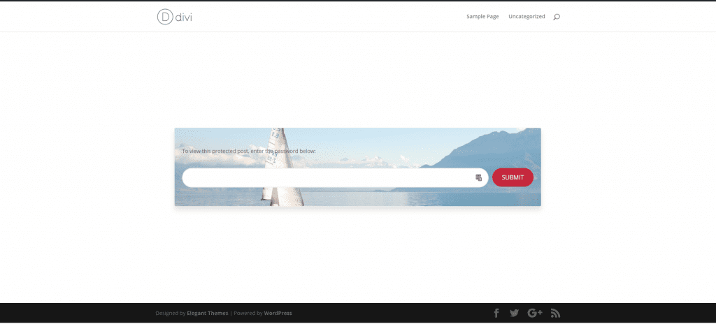
That’s better.
Removing Password Protected Pages From Archives And Sidebars
Our password protected pages and posts now look pretty good. One thing you may still wish to change however, is that the password protected pages still show up in archive and category pages, as well as in post lists in the sidebar and other places.
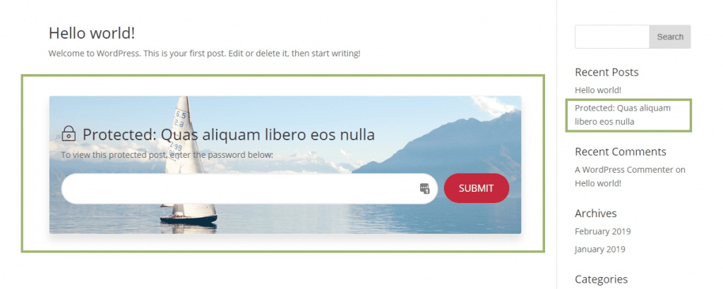
This is because, by default, they are still being pulled into the WP loop. If you’re using protected pages in a way that you’d prefer they were not being displayed in this way then we can use WordPress’s ‘posts_where’ filter to remove them.
Add the following to either a functionality plugin, or your child theme’s php file. Be careful when editing PHP as any mistakes can white screen your site. Make sure you’re testing edits in a development environment beforehand.
function remove_ppp_filter( $where = '' ) {

     // only visible to admins and those who have permission to edit private posts...

     if (!is_single() && !current_user_can('edit_private_posts') && !is_admin()) {

             $where .= " AND post_password = ''";

     }

     return $where;

}

add_filter( 'posts_where', 'remove_ppp_filter' );
The protected posts will still be visible to those who have editing or admin privileges, but will be removed on the front end to site visitors.
Hopefully this post gives you some idea about how you can improve the design of the password protected pages, whether you’re using Divi or the default Gutenberg editor to build out your content. Be sure to let us know in the comments if you have any question regarding any of the instructions above.

Hi, just found your site with the CSS code to be used with the password-protected page option.
I have pasted the CSS code in WordPress Customizer’s Additional CSS area and published it. But, it does not change anything.
I am not familiar with CSS, so I just copied and pasted the provided CSS code into the Customizers additional CSS area. Would you please help me with this in order to get this working on my site? Thank you!
Thanks for sharing this post, it was exactly what I was looking for 👍
Great post.
wow thanks so much sir, this really worked
Following on from Jen’s post,
Jen McConaghie
on August 15, 2019 at 11:16 pm
Thank you so much for this post!! It worked perfectly. My only problem is on mobile. The input field is tiny and the button is big in comparison. How can I make it mobile friendly? Thank you!
I have the same problem. How do you make sure it works on a mobile phone.
Thank you so much for this post!! It worked perfectly. My only problem is on mobile. The input field is tiny and the button is big in comparison. How can I make it mobile friendly? Thank you!
Thanks for your useful post. I have a question: do you have any solutions to customize password protected pages that don’t require coding? I’m not really familiar with technical stuff like this.
How do I change the ‘Enter’ or ‘Submit’ text on the button? Thanks in advance. Greetings, Arjan
Have you already got an anwser? If so, I would also love to know how!
.post-password-required .et_password_protected_form p input {
width: calc(100% – 120px) !important;
float: left;
border-radius: 32px;
background-color: #fff;
border: 2px solid #f1f1f1;
transition: .6s ease all;
}
I was facing the problem with the width of the input field. (It was going behind the button)
So adding the !important after width fixed it.
Thanks Stephen! I’ve implemented it straight away!
How can I change the text “To view this protected post, enter the password below:” and the text on the submit button? I need it in a different language.
And WHERE do we place this CSS? Because if I copy/paste the CSS in WordPress’ Customizer’s Additional CSS textarea and publish, I don’t see any different result than a default unstyled password form.
Once I’ve published a page, is there an option to make it private – after the publication? This is the shittest site I’ve ever had to use… Nothing makes sense, it’s completely unnatural and counter intuitive
Thank you so much for sharing valuable post.