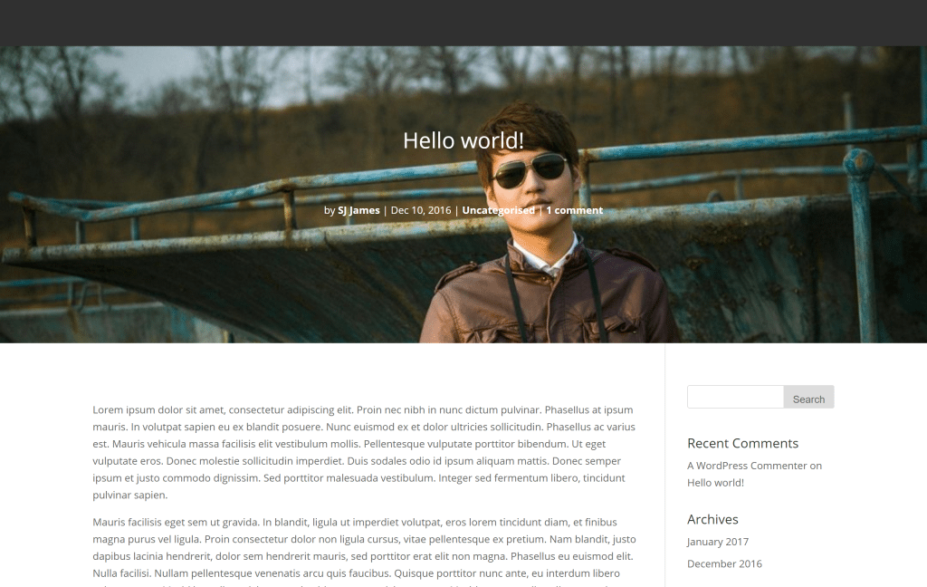
I recently had a request to add the featured image, title and meta of a post before the rest of the content (left area and sidebar). As you can see in the image below it actually looks quite cool.
You can do this type of layout with the page builder on posts but that limits you to new posts. It’s one of the reasons we made the default page builder layout for blogs plugin, but for this setup, a plugin might be overkill. So we’re going to use a little bit of jQuery and CSS.
The jQuery
You can add this script to Divi > Theme Options > Integrations > Head.
<script>
jQuery( document ).ready(function($) {
 $(".single-post .et_post_meta_wrapper").first().prependTo(".single-post #main-content");
});
</script>
This script searches for the first instance of the .et_post_meta_wrapper which is used to house the post title, featured image and meta data. When it finds it, it moves it underneath the opening tag of the #main-content div. This pulls it above the left area and sidebar which allows us to make it full width and position it a little better with CSS.
The CSS
You can add this script to ‘Divi > Theme Options > Custom CSS’ OR to your child theme stylesheet.
.single-post .et_post_meta_wrapper:first-child {
 position: relative;
 height: calc(100vh - 180px);
 background: #303030;
 }

.single-post .et_post_meta_wrapper:first-child img {
 position: absolute;
 top: 0;
 height: 100%;
 left: 0;
 width: 100%;
 object-fit: cover;
 object-position: top;
 z-index: 1;
 }

.single-post .entry-title {
 top: calc(50vh - 180px);
 left: 0;
 width: 100%;
 position: absolute;
 text-align: center;
 z-index: 10;
 color: #fff;
 }

.single-post p.post-meta {
 position: absolute;
 width: 100%;
 z-index: 10;
 top: calc(50vh - 80px);
 text-align: center;
 color: #fff;
 }

.single-post p.post-meta a {
 color: #fff;
 font-weight: 700;
 }
This CSS makes the featured image full width and a portion of the viewport size which encourages users to scroll to the post content. It also places the title and the meta data into the center of the featured image, though the values could be adjusted to place it wherever you like. By default the image will cover the text so we’ve adjusted the z-indexing a bit. We’ve set the fall back colour of the new section to #303030 but you could replace this with a default background image if you wanted to.
And that’s all you need to create a beautiful blog layout. I hope you’ve enjoyed reading this post and look forward to seeing what you do with it 🙂


Hello,
Is it possible to make the image with parallax effect?
Hi Guys,
I got this working. But looks the image is spreading too much with hight. Can we cut some height of the image.
HI, I’ve made somethign similar, but the js delays too much in loading and the effect does not look very nice, How can I make the js to load before?
My web is http://teixweb.com
Thanks in advance
Curious, but for SEO purposes, wouldn’t removing the from inside the cause confusion with crawling the article?
Hi, I’m looking to do something similar, but with the blog module. I’d like to have the Title and Meta information be overlay on the featured image instead of below it. Any ideas?
To add a dark overlay, here is the code I came up with.
.single-post div.et_post_meta_wrapper:first-child:after {
content: ‘\A’;
position:absolute;
width: 100%;
height: calc(100vh – 180px);
background:rgba(0,0,0,0.4);
z-index:2;
}
This code isn’t working.
Great, Thanks! is there anyway to add an overlay to the header image?? I have text titles on it that are white and not visible… Ideally a dark overlay would be great?
Amazing! Exactly what i needed.
Thank you for this.
Is there a way to add some gentle overlay to the featured image too?
I tried but didn’t succeed.
Just found this – it’s exactly what I needed and worked perfectly on my site. Thanks!
You’re welcome Richard!