If you’re using the standard commenting system that comes with Divi then you may find this CSS snippet useful. It cleans up a few little quirks and adjusts the layout in a few ways:
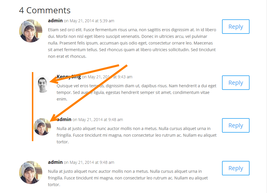
1. Only the first comment will indent from now on, so you won’t end up with the comment text getting crazy thin when conversations happen.

2. Sub-comment avatars are now smaller than standard comments.
3. The avatars are circular, which fits in better with most designs. At least to my eye anyway…
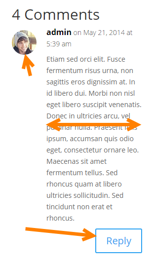
4. The avatars are smaller on mobile devices and the text has more room.

5. The reply button is underneath and out of the way of the text. If you were experiencing the ‘looong reply’ bug, you won’t now.
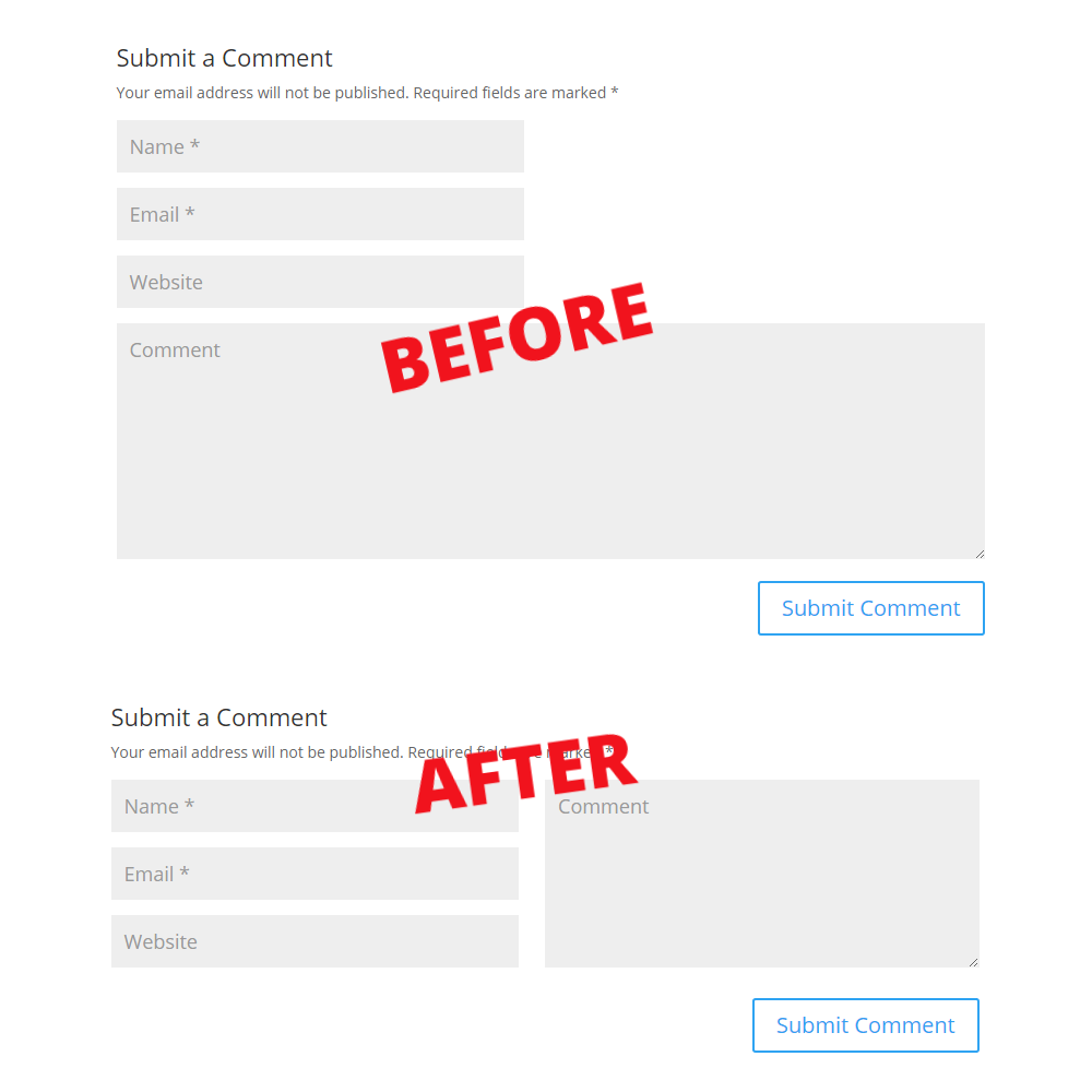
6. The comment submission form has been cleaned up and reduced in size by having the form options next to the comments section.

To use this comment clean-up, just add this CSS to your child theme or epanel.
/*******************************/
/******* CLEANER COMMENTS ******/
/*******************************/

.comment_avatar img { border-radius: 50%; } /** circle images **/

@media (min-width: 768px) { /** The breakpoint for the comments form **/
 body:not(.logged-in) #comment { max-width: 50%; float: right; margin-top: -186px; height: 172px; } /** even form sections **/
 .children .comment.depth-2 { margin-left: 30px;} /** offsets the first child, but no others **/
 .comment .children { margin-left: 0px; } /** offsets the first child, but no others **/
 .comment .children .comment_avatar img { max-width: 60px; } /** make reply avatars smaller **/
 .comment .children .comment_avatar { margin-left: 20px; } /** keep reply avatars left **/

}

@media (max-width: 767px) {
 .comment-reply-link { bottom: -20px !important; top: auto !important; } /**keeps the button off of the text **/
 .comment_area { padding-bottom: 40px; } /**keeps the button off of the text **/
 .comment_avatar { max-width:50px } /** smaller avatar on mobile **/
 .comment_postinfo, .comment-content.clearfix { margin-left: -30px; } /**smaller avatar keeps left **/
}
So there you go! Cleaner comments, a better mobile experience and all with a little CSS. Let us know in the comments what you think or if you plan on using this snippet. 🙂


This is amazing, THANK YOU 🙂 🙏👌
Do you have code on how to delete the Website field without using child theme?
I have a question. How do I move the entire “submit a Comment” section including the input text field, and “submit comment” button to the top of the module?
I ask because no one wants to scroll through a million comments just to get to the input field.
Hi thanks for this post. Only a question, how can not allow spam or links to other websites
You are a lifesaver! I’ve been looking for this, thanks a lot cheers!!
Yes, finally get the stuff which I need. Keep sharing.
This coding appears to be outdated.
Can we get an updated version?
This is really, really useful: thank you!
However the part of the code which makes only the first comment indent isn’t working on mobile – only on desktop (see for example https://www.rsleducational.co.uk/11-plus-english-maths-writing-advice/). Can anybody suggest why this is happening?
Thanks in advance.
Robert
not working for product page
Thanks SJ!! Just used on my site 😀
This is something special. I just found your site and really am digging the more advanced nature of your tutorials!
*found small typo in this line -> (.comment_avatar { max-width:50px } /** smaller avatar on mobile **/)
(.comment_avatar { max-width:50px; } /** smaller avatar on mobile **/)
Thanks!!! Bookmarked your site and will be digging in (and picking up some plug-ins for sure)!
Stephen I’m having a problem with the comment field alignment as you can see in the photo. The comment field moves up under the last comment. Thanks
Screenshot: http://s27.postimg.org/dhlmazmw3/comments.jpg
Yes, me too .. same issue
Just change this:
margin-top: -186px;
to this:
margin-top: 10px;
I had the same issue, it was all about the margin-top set to -186px. Not sure why. I set it 18px and everything’s fixed.
When you check the comment box on this page, margin-top is set to 16px.
I’m having a problem with the alignment of the form elements. As you can see in the image. I did have custom sidebar width, but restored to default, and still have the problem. Can you help? Thanks Stephen
[IMG]http://i65.tinypic.com/i6w30m.jpg[/IMG]
I don’t understand why this code isn’t working on my Divi site. Any ideas?
Hey, me again… I installed this CSS tweak today but there seems to be a bit of an issue with the comment box placement when you are already logged in. It overlaps with the final comment in the thread. Here’s a screenshot -> http://imgur.com/Vz6VraV
Thanks Dan! A little bit of :not CSS fixed that issue 🙂 The post has been updated. Cheers!
Sweet! Thanks Stephen.
Oh my god, this is amazing! THANK YOU. ps. please can you sell some custom templates for better category / tag / search pages? I really want them to look like the blog grid module 🙂
I love this! Just one question… Why don’t you use this for the comments on this page? LOL
Haha! Good Question 🙂 I’m in the middle of a site rebuild so have held off with small fixes for now 😉
Thanks for the build and share.
Ironically, however, the comment box into which I’m now typing is at the bottom, and not at to the right as your tutorial indicates in “6”.
A little bit of happiness in the ol’ DAISNAID. 🙂
Thanks again