Buttons are important. They’re how users navigate around your site and they’re how you encourage all manner of actions, from ‘contact us’ to ‘buy now’. Button design can literally be the difference between a yes and a no from a potential client or customer, so with so much riding on it, it’s not something you want to get wrong.
In this post, we’re going to go over some general tips for designing your own buttons and then give you these 8 ‘CSS Only’ Divi button designs that we’ve put together for you to download for free.

1. Buttons should be buttons
It should be very clear, even from a quick scan, that a button is indeed a button. We’re big fans of quirky and alternative designs, but where you require users to take an action, don’t go too far over the top. Equally, don’t keep things too basic; an underlining or boldening of text may have been an acceptable way to draw attention to something once upon a time, but to paraphrase Shania Twain, that don’t impress us much. At the very least we’re talking about a button being:
- In its own space, separated from the rest of the text.
- Bigger than the text around it.
- Either outlined with a border or a different background color.
2. Buttons should be uniformal
Buttons across your site should follow similar design principles: They don’t necessarily have to be the exact same, but they should be similar enough that they’re recognisable. Using different colors is okay but make sure there’s a reason to do so. For example, using green to denote a step forward in the process and and red to denote a step back. The same for font sizes and weights, make sure that they accent the flow you want the user to take. On a product page, if the ‘buy now’ button isn’t the most obvious call to action on the page, then you may wish to reconsider the design.
3. Buttons should be clear
If you’re not sure what a button does, you won’t use it, right? Your users are the same, so make sure that every button on your site is clear and concise in what it is for. ‘Call Now’ and ‘Buy Item’ are better than ‘you can contact us here’ or ‘get item today’. Anything that isn’t direct, is indirect by default so make sure your button text is straight to the point, there are plenty of other elements of the button where you can unleash your creativity.
4. Buttons should engage the user
Your buttons should provide some kind of visual change. Often referred to as ‘feedback’ or ‘micro-interactions’, it’s more than just a gimmick or fad. This is the design principle that acknowledges the user taking, or about to take an action. Mobile apps often take this one step further and provide haptic(vibration) or audible feedback. This is a nod to your user that the button they just pressed, did what it was supposed to.
Download 8 Free Divi Buttons!
These buttons have been designed with the principles discussed above in mind. They’re clean and easy to install and require no more than a custom CSS class to get started. The pack includes 8 unique designs, each taking advantage of a different way of providing visual feedback to the user clicking on them.
Using Throughout Your Site
The code module included in the layout includes all of the CSS used for the buttons. You can copy and paste this into your child theme stylesheet or into the CSS box in Divi Theme Options. Be sure to remove the <style> tags if you do so.

Downloading And Installing The Divi Button Pack
- Open the 8DiviButtons.zip folder and extract the JSON file.
- Open up a Divi powered page and click on the ↓↑ arrows in the purple page menu.
- Choose Import and install the JSON file when prompted.
- Done.
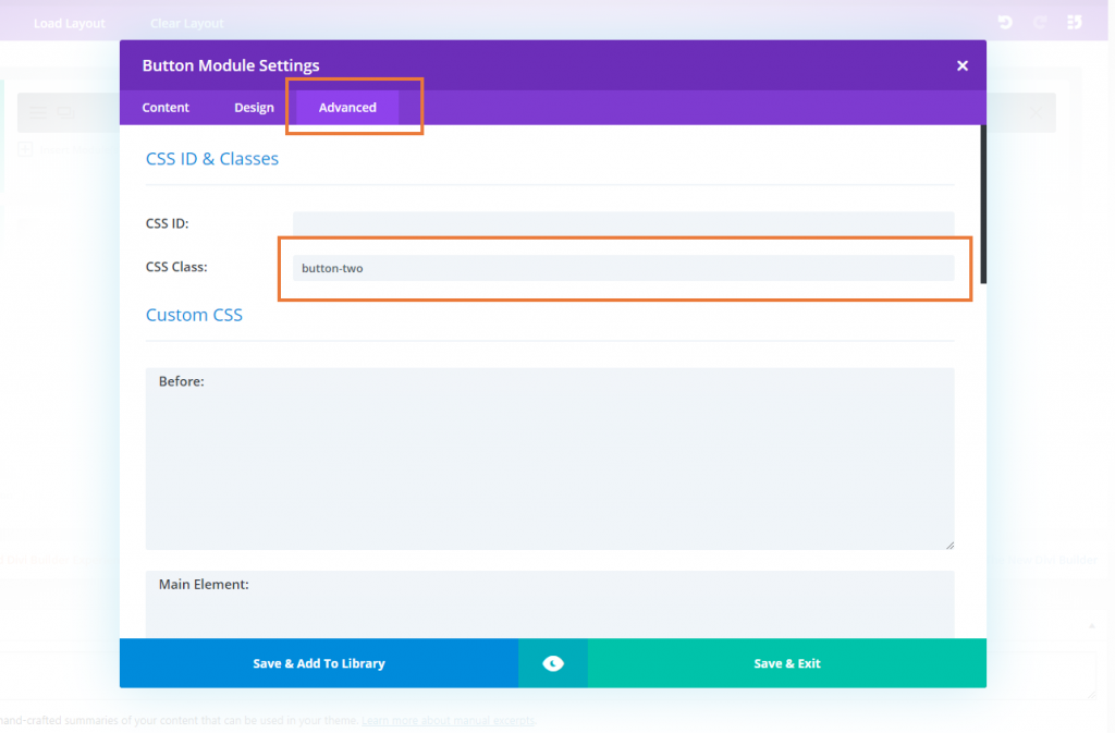
You can then just add the following classes to any button module to use the design:
button-one
button-two
button-three
button-four
button-five
button-six
button-seven
button-eight
There is no requirement to use any of the other button module settings. These CSS powered buttons will work automatically with just the class added. We hope you enjoy using these buttons as a starting point and look forward to hearing about what you’ve put together on the back of this post 🙂


Thanks for the templates.
I couldn’t make it work. I ve tried on an existing page and in a new one and the button is always styled as default no matter what class I put into the box.
The class is applied to the a tag (et_pb_button et_pb_button_0 button-one et_pb_bg_layout_light) bur its not applied.
I’ve put all your CSS in et_divi_options > Custom CSS and it works from there.
What else can I try?
Eduardo, using class “et_pb_button_0” CSS will be applied only to the first button on the page. Don’t include this class and make sure “button-one” class is added to the button. If that doesn’t help, send us a link to the page!
CSS for the first button style that should be added to the Divi Options or your child theme, based on this article is:
#page-container .button-one { background: linear-gradient(135deg,#8300e9 0%,#0c71c3 100%); color: #fff; font-weight: 600; font-size: 16px; border: 0; border-radius: 26px; padding: .7em 2em; text-transform: uppercase; overflow: hidden; } #page-container .button-one:hover { color: transparent; background: linear-gradient(135deg,#8300e9 20%,#0c71c3 100%); padding: .7em 2em; } #page-container .button-one:after { position: absolute; color: #fff; opacity: 1; left: 0%; width: 100%; margin: 0; content: "\e073"; font-size: 24px; bottom: -30px; } #page-container .button-one:hover:after { position: absolute; opacity: 1; left: 0%; width: 100%; margin: 0; content: "\e073"; font-size: 24px; bottom: .5em; } #page-container .button-one:before { content: ""; position: absolute; display: block; top: 0; bottom: 0; left: -20%; width: 20%; background: #fff; opacity: 0.1; transform: skew(-10deg); transition: .8s ease all; } #page-container .button-one:hover:before { width: 140%; }why i import the json file??what is divi powered page?
Thanks for reading. Divi is a theme and page builder for WordPress. These buttons are specifically designed for Divi. If you would like to learn more a good place to start would be our Beginners guide to Divi: https://wpzone.co/divi-guide/
Enjoy!
Thank you for the free code and for the easy installation instructions! Excited to try them on my site!
@John Fejsa, I just clicked on the link and the email came through in seconds, so looks like a problem at your end?
Terry Chadban
Stephen, thank you for these button resources, and for the article with explanation and instructions. This is helpful and instructional.
After I added my name and email and clicked the download button, I received the “Success… Please check your email for the free download!” message but the email never came.
I tried my work email and then I tried my Gmail address on another browser with the same result., the email with download link never came.
Can you please tell me what went wrong.
Thank you.
Hey John, hmm not sure what could have gone wrong for you there. I’ve just double checked on a few addresses and it is working as expected. If it doesn’t work for you on the next attempt, hit the support button and let us know. Thanks for reading 🙂
1 minute, new email … download!
Maybe write something wrong in ur email…
BTW… big thx Stephen!!!