Using a countdown timer on a landing page for a BIG sale like Black Friday is proven to supercharge conversions up to 200%. The sense of urgency created by watching time (and the special offer) slowly tick away, is often the little extra nudge an interested buyer needs to close the sale.
But why, you ask? FOMO!
Fear of missing out, or what marketers call FOMO, is a powerful source of motivation for decision making. Countdown timers are a perfect visual queue that reminds your shoppers the deal isn’t going to last forever, and that waiting could end up costing them later.
While most showed 5% to 10% increased click-through, case studies by OptinMonster and SaleCycle saw some jump by 30% and 50% and increased conversions by as much as 200%. In short, countdown timers are worth working, A/B testing, and reworking to get them right and can result in boosting your sales.
In this tutorial, you will learn how to use the Divi Countdown Timer module to quickly set up a timer on your site or special discount landing page. And as a bonus, we’ll use a new little code snippet from our free copy and paste CSS customizations library to remove an unwanted zero from the “Days” field.
If you haven’t checked out our collection of code snippets for Divi and WordPress, including copy and paste CSS, JavaScript, HTML, and PHP, it’s totally free and makes customizing Divi a breeze. These mini-tutorials are like having a designer or developer BFF you can turn to when you run into a wall customizing your site. There are already more than 20 customizations in the Snippets library and a bunch more being added.
So let’s get your countdown timer set up so you can start bringing in more sales.
Divi Countdown Timer Module
In its simplest form, the countdown module is as simple as adding a title, setting a date for the timer to end on, and choosing a background color.
- The module is actually quite simple and is made up of:
- Title field – tell users what the countdown timer is for
- Numbers – display date and time numerically
- Separator text – colon used between the numbers
- Label text – day(s), hour(s), minute(s), and second(s) bellow the numbers
The built-in styling options, unique to the Countdown Timer module focus primarily on text adjustments including font selection, weight, style, color, size, spacing, line height, and drop shadow controls.
It also includes other Divi controls for changing the sizing and spacing of the module, styling the border, giving the module a shadow, adding a filter, transforming the position, and scroll animation.
These default options are good if you don’t have dreams of introducing a special look or want to customize past floating numbers on the page.
For anything past floating numbers on image backgrounds, you will need to add custom CSS or purchase a plugin with expanded functionality. For example, if you want to give each number field its own background color and border or to remove the first zero from the “Days” field, you will need to add some custom CSS.
Customizing the Divi Countdown Timer With CSS
Now let’s look at how to set up a completely custom look. First, we will use the built-in module for what we can, and then we will push the bounds of Divi with a few little copy and paste CSS snippets created by our design team.
Create a new page and add set the background color to your desired color or add an image. This example uses the default purple included in the Divi selector.
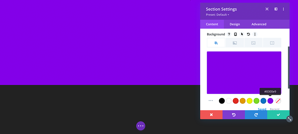
Choose a color or image background for your countdown timer
Add in a new row, add the Countdown Timer module. Give it a compelling title and choose a date that will close out the deal. A longer countdown is less compelling. In our experience, we get the best results and see more activity the closer to the end of the deal it gets. For this example, we are triggering a three-day countdown.
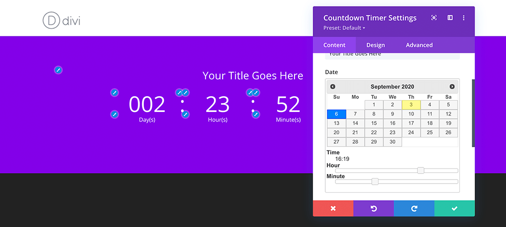
Choose the day you want your deal to end
For the background, we can set it to transparent so the section background shows through.
Set the title and label text to bold and give it a drop shadow. The shadow helps make the title pop. We also made the label text all capital letters.
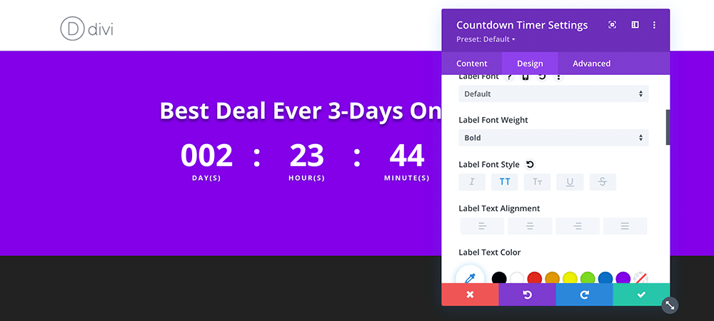
Adjust the font styles to your desired look
For the numbers, we are only going to adjust it to bold because we are adding a box with a reverse shadow later.
Finally, remove the separator colon by setting the font to 0px.

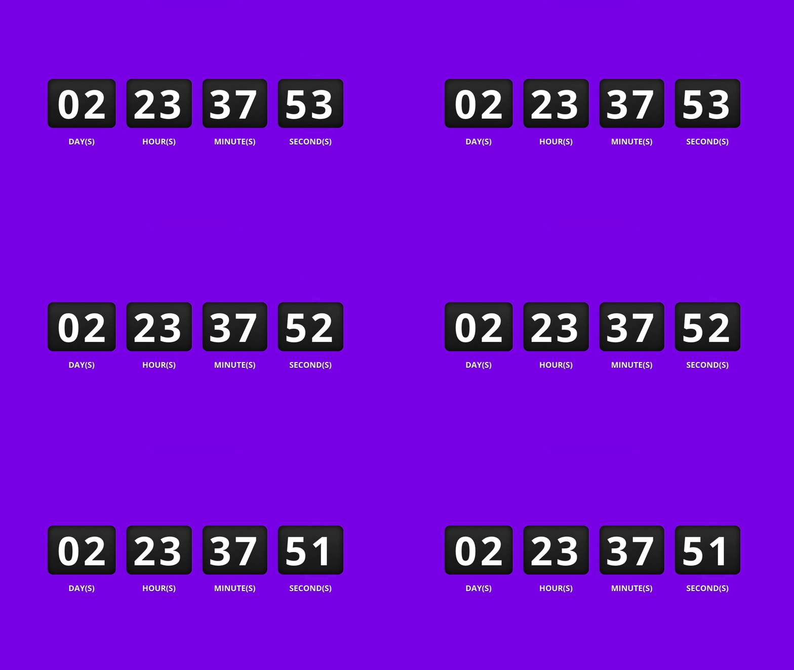
With all the module customizations, this is where we are at
The first zero in the “Days” field seems excessive for a sales countdown; especially a short three-day countdown. You can do this with a jQuery function but it is really easy just to hide it with a little bit of CSS. The CSS can be added to a child theme or directly in the Divi theme options. You can add it directly to the page by clicking on Page Settings > Advanced and pasting it under the Custom CSS module.
.et_pb_countdown_timer .section.days p.value:first-letter {
font-size: 0px;
vertical-align: top
}
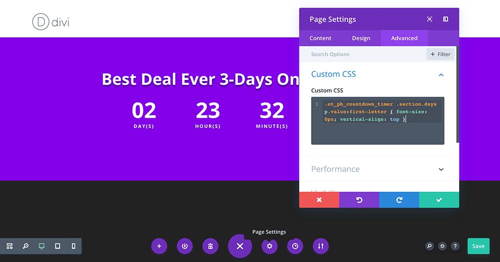
Paste your code into the Custom CSS editor for the page
Bookmark the snippets section for quick access to this and a bunch of other copy and paste customizations.
Finally, paste in the remaining code to add black boxes that help the numbers really stand out and give it a digital alarm clock feel.
.et_pb_countdown_timer .new-value, .et_pb_countdown_timer .value {
 background: #393939; /* Fix for where gradients arent supported */
 -webkit-background: linear-gradient(#393939, #181818);
 -moz-background: linear-gradient(#393939, #181818);
 background: linear-gradient(#393939, #181818);
 color: #fff;
 padding: 10px !important;
 border-radius: 8px;
 -moz-box-shadow: inset 0 0 10px #000000;
 -webkit-box-shadow: inset 0 0 10px #000000;
 box-shadow: inset 0 0 10px #000000;
}

.et_pb_countdown_timer .section.values {
 width: auto;
 margin: 0 8px;
}
Now just add a CTA button, publish, and start making money.
Divi Countdown Module Summary
As you can see, a well-placed countdown timer can be used to create urgency and improve sales during a special promotional period. Divi gives you a lot of options with the built-in module but a little CSS can go along way for customization. And finally, don’t forget to Bookmark the WordPress and Divi Snippets and Tutorial library for access to a bunch of style tweaks. They are totally free and we are adding more all the time.
Enjoy!
What sale or site are you looking to create? With the holiday season fast approaching, are you already thinking about how to boost sales with a discount? Tell us about it in the comments below and if you find this tutorial helpful, sharing is caring! Send it to a friend or show some social love.

Thanks a lot for sharing this! It still works fine but I just had to add:
.et_pb_countdown_timer .sep {
display:none;
}
… to hide the separators (commas) between the numbers.
Awesome.
I’m so happy that it worked perfectly.
Thanks for the CSS codes.
So glad it worked for you. Enjoy!
Hi Joshua,
Thanks for the tutorial.
Is there anything that can be done or triggered when the timer reaches zero?
Is there anything that extends the functionality of the timer? Something that would trigger the message to change to “Sale Has Ended”, or remove the CTA button?
Thanks
Really curious about this as well! Or whether it is possible to link to another page as soon as the timer reaches zero. Would be much appreciate if you come back on this Joshua, we’d love to hear your answer!
Hi Joshua, Brilliant guide thank you for the useful styling for the divi countdown module, I have had little luck finding a good solution for landing pages.. I do however have a question, would you know how I could plug this into ACF time/date field?
I can’t find a solution anywhere but it would be amazing for the client to then enter the numbers without being in Divi.
Many thanks, Ad
Hello Adam! Thanks for reading. I found a solution on the ACF forms. *Disclaimer: I have not tried it yet, but looks like the use case you are looking for.
https://support.advancedcustomfields.com/forums/topic/populate-divi-gallery-module-with-acf/page/2/
It’s in the 3rd comment down (sorry, no direct link but this is the snippet provided)
//populate divi countdown timer with ACF date&timeadd_filter('et_pb_module_shortcode_attributes', 'cd_divi_acf', 20, 3);
function cd_divi_acf($cd_props, $cd_atts, $cd_slug) {
$cd_module_slugs = array('et_pb_countdown_timer');
if (!in_array($cd_slug, $cd_module_slugs)) {
return $cd_props;
}
if ( 'players' == get_post_type() ) {
$cd_props['date_time'] = get_field('date&time', false, false);
return $cd_props;
}
else return $cd_props;
}
We can check it if you run into any issues or you can ask directly on the ACF forms. Cheers!