On Friday the 6th of July, Divi Space hosted the second in their series of Facebook Live webinars about supercharging the Divi modules. This episode focuses on the slider module.
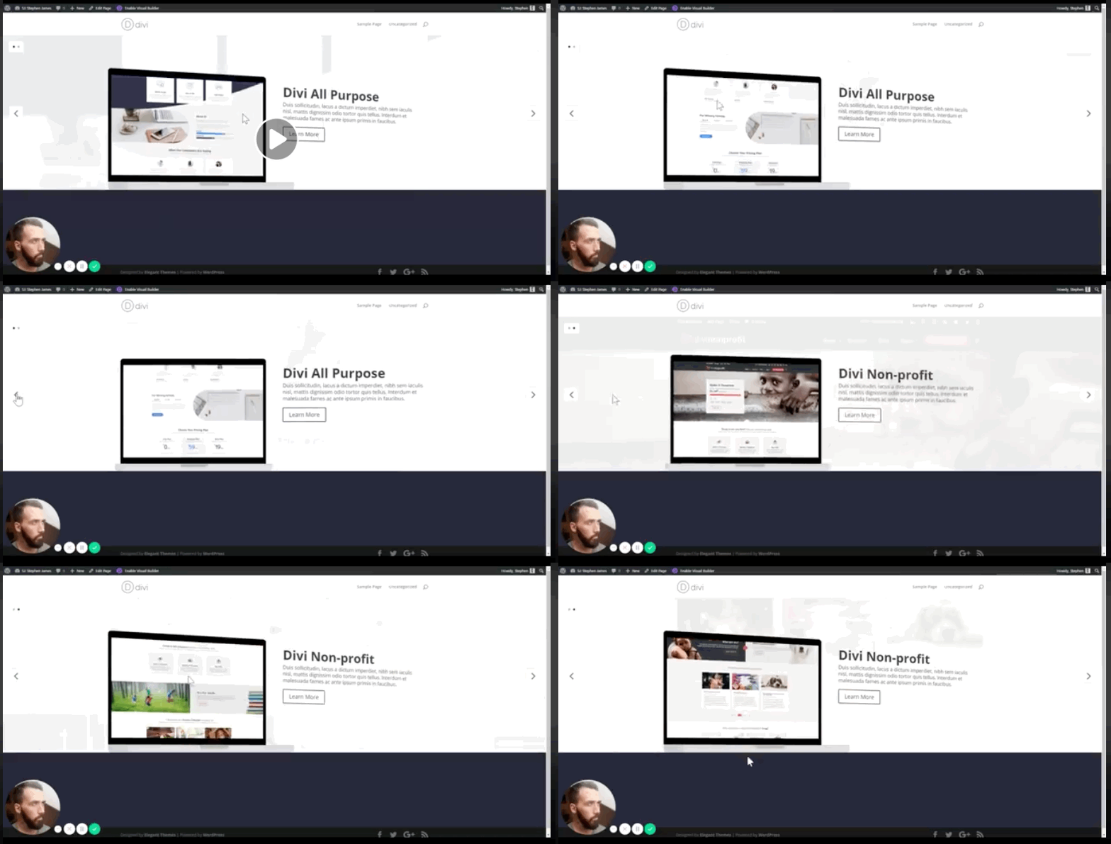
We’ll be building a portfolio slider that displays images on the screen of a laptop graphic. This custom slider not only has parallax scrolling of the background and laptop screen image but a cool shift in perspective on hover as well.
Here is a preview of what we’ll be creating:

Watch the full webinar here:
https://www.facebook.com/wpzoneco/videos/1800811173300348/
David and Sj like providing these live webinars not only to provide all their watchers with lots of great code but to help their viewers learn to troubleshoot when things go wrong and to help people understand exactly what each bit of code’s purpose is.
SJ prepped by adjusting the text to make it easier to see when the page gets busy by making it black and a bit bolder in places. He’s also created a full-width module and given it the class of portfolio slider which will be used to ensure the CSS he’s writing overwrites the Divi defaults in the custom built slider but not on the rest of the install. He’s added a divider beneath to keep the rest of the page out of the way.
Within the module, he’s added 2 screenshots as content and made them slide images, changed the button text, and added a heading. He’s changed the Slide Image Vertical Alignment from center to bottom. He left the background image at default for now because we’ll be adding it with CSS.
We start with navigation. We’ll be changing the styling on the arrows and moving the dot navigation to a top corner. After opening our CSS editor we hunt in the code for the et_pb_slider-arrows and copy the element that controls both into our editor. We can then change the background color and add a border. By inspecting the element for the dot navigation we can find the absolute positioning. By adding its class to our CSS we can adjust it. A few lines of code allows us to move it to the top and change the background and adjust the size of the box around it. Shrinking the box down from full-width automatically moved it to the left corner so SJ adjusted a bit of coding to give it the placement and appearance he wanted.
Next, we deal with the images. By making the images the background image of their containers we will have more control over how they can be manipulated. We’ll accomplish this using a bit of jQuery. We get the image, create a variable out of the image source, and then set that image as the background of the container for the div and the slide itself. After importing the .et_pb_slide_image class be sure to create an “each” function so the program will apply to the images only as needed. Adjusting the code allows us to size and place the image precisely where we want it.
Adding both a hover command and a transition command with time allows the image to scroll from top to bottom as we hover over it. Now we copy our code and alter it to target the background instead of the image that will become our laptop screen. The “this” and .closest commands we added in jQuery will make sure the background always matches the slider image. With both at full opacity reading anything becomes a nightmare. SJ shows how to create an overlay that makes the background show at a much lighter level. We now have the parallax working.
Now it’s time to make our image looks like it’s on a laptop. Going back to the .et_pb_slide_image we create a border. By adjusting the color, styling, and width we can create exactly the look we want. We need to make room for the rest of our laptop image by adjusting the bottom position and our padding. We could create the laptop bottom using CSS before and after classes but we would be much more limited in function so we will switch back over to jQuery to create a laptop-bottom and a laptop-clasp class.
After creating our classes we switch back to CSS and create a rectangle under our image. SJ demonstrates building it so you can see how each adjustment affects the finished product. Rounding the corners, adding a top border, and adjusting colors makes the rectangle we created look more like a laptop. To finish the transformation we need to create a clasp. Entering a few commands including auto centering and a few more rounded corners quickly creates the clasp.
We have all the elements of our finished custom slider but SJ wants to make it a bit more dynamic. We’re going to program in a shift in perspective on the laptop when we hover as well as the scroll we’ve already created.
We use a perspective command of 600 pixels to start to create a 3D effect. We create the code to rotate the image on the y-axis when we hover. We make sure to include a transition and tell it to make the perspective-origin the bottom to give us a clean transition.
We have to code the laptop-bottom to shift separately. We create a laptop-bottom hover command and copy in all of our previous laptop-bottom coding and well as the transition timing of our laptop image perspective change. We eliminate lines of code for everything that will stay the same and figure out the positioning and values that will look best for the transition, adding in an extra gray rectangle to be the side of the laptop bottom we should now be able to see.
All that’s left to do is to turn off a few of Divi’s defaults within the portfolio slider that will make our custom slider work less than optimally.
Here’s the code:
<style>
#portfolio-slider .et_pb_slider_container_inner {
position: relative;
}

#portfolio-slider .et_pb_slide_image {
border-width: 22px 10px;
border-style: solid;
border-color: #010101;
border-radius: 10px 10px 0 0;
overflow: hidden;
padding-top: 30%;
animation: none;
background-size: cover;
background-position: top center;
transition: background-position 8s ease-in-out;
bottom: 26px;
}

#portfolio-slider .et_pb_slide:hover .et_pb_slide_image {
background-position: bottom center;
}

.et_pb_slide_image img {
display: none;
}

#portfolio-slider .laptop-bottom {
display: block;
position: absolute;
width: calc(47.25% + 40px);
height: 26px;
float: left;
left: -20px;
bottom: 0;
background:
;
border-top: 2px solid
;
border-left: 0px solid #CACACA;
border-radius: 4px 4px 10px 10px;
transition: all 1s ease-in-out;
}

#portfolio-slider .et_pb_slide:hover .laptop-bottom {
left: 0px;
width: calc(47.25% + 100px);
border-left: 60px solid #CACACA;
}

#portfolio-slider .laptop-clasp {
display: block;
width: 100px;
height: 10px;
background:
;
margin: 0 auto;
border-radius: 0 0 20px 20px;
}

#portfolio-slider .et_pb_slide:after {
display: block;
content: "";
position: absolute;
left: 0;
top: 0;
height: 100%;
width: 100%;
background:
;
opacity: 0.9;
}

#portfolio-slider .et_pb_slide {
background-position: center top;
transition: background-position 8s ease-in-out;
perspective: 600px;
perspective-origin: bottom;
}

#portfolio-slider .et_pb_slide:hover {
background-position: center bottom;
}

#portfolio-slider .et_pb_slide .et_pb_container {
transform-style: preserve-3d;
transform: rotateY(0deg);
transition: 1s ease all;
}

#portfolio-slider .et_pb_slide:hover .et_pb_container {
transform-style: preserve-3d;
transform: rotateY(5deg);
}

#portfolio-slider .et-pb-controllers {
bottom: auto;
top: 20px;
text-align: left;
background: #fff;
width: auto;
padding: 15px 15px 0 15px;
left: 20px;
border: 1px solid
;
}

#portfolio-slider .et-pb-slider-arrows a {
background: #fff;
border: 1px solid #dedede;
}

@media (max-width: 767px) {
#portfolio-slider .laptop-bottom {
display: none !important;
}
}

</style>

<script>
jQuery('<div class="laptop-bottom"><span class="laptop-clasp"></span></div>').insertAfter('.et_pb_slide_image');

jQuery('.et_pb_slide_image img').each(function () {
image = jQuery(this).attr('src');
jQuery(this).closest('.et_pb_slide_image').css('background-image', 'url('+ image +')');
jQuery(this).closest('.et_pb_slide').css('background-image', 'url('+ image +')');
});
</script>
Everyone will want to take a look at David Blackmon’s announcement at the end of the video. He shared a sneak peek of over 300 custom icons that go with a plugin that will allow you to add the icons to all of Divi’s modules that use icons. Divi.space plans to have them available for download this Wednesday and both the icons and the plugin will be given away for FREE.
Also, take a look at The Divi Business Expert Course From David Blackmon and Tim Strifler at WP Gears. The course will teach you everything you need to know to start a 6 figure web design business with Divi.


How could we move the slider image to the top?
Hello
Thank you for the course. Looks great
I was wondering should we create a child theme and place the code or we can add the code in theme options?
Thanks for the good job, I have to see an earlier example to decide whether it is interesting to me or not. And I think it’s like this for the whole world, or am I wrong?
Thanks guys, that was excellent 🙂