There are lots of ways to use images in Divi including full-screen image and header modules, galleries, project modules, blog modules and blog posts, blurbs, shop modules, and lots more. These modules are typically used in different ways and have their own specific requirements for image sizes.
The size of your images plays an important role in your website’s speed and your user’s experience with your website, so it’s important to understand how to choose the best image sizes for your Divi website.
Divi’s Aspect Ratios
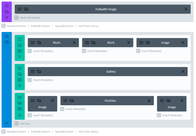
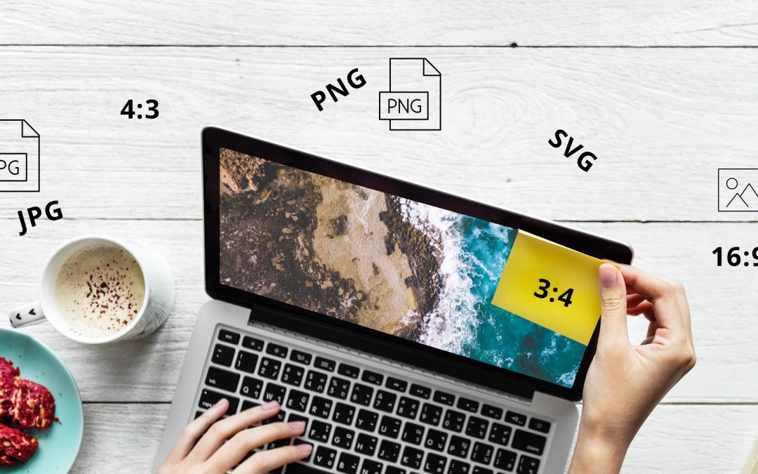
The Divi Builder includes lots of ways to add images to your layouts. Each of these layout locations can use any size image, but a more effective layout would use images that are designed for those locations. Where ever the images are placed within your layouts, keep in mind that Divi is optimized for three different aspect ratios (width:height):
- 16:9 – the standard monitor ratio, widescreen and great for headers.
- 4:3 – the older monitor ratio, almost square and great for most images.
- 3:4 – taller than wide, great for portraits.
The dimensions of your images should follow these ratios. The online Aspect Ratio Calculator is an excellent tool to help you determine the sizes in pixels based on these ratios.
Elegant Themes recommends specific image sizes for each module.
For general use, here are their recommended image sizes for 16 x 9 ratio:
- 1 column: 1080 x 608
- ¾ column: 795 x 447
- ⅔ column: 700 x 394
- ½ column: 510 x 287
- ⅓ column: 320 x 181
- ¼ column: 225 x 128
And these are the image sizes for 4 x 3 ratio:
- 1 column: 1080 x 810
- ¾ column: 795 x 597
- ⅔ column: 700 x 526
- ½ column: 510 x 384
- ⅓ column: 320 x 241
- ¼ column: 225 x 170
Keep in mind that image sizes will be different for the various modules and photo subjects. I recommend using these sizes as a loose guideline and experimenting to see what works best for you.
Also, keep in mind that the number of columns will change on mobile, so you might need a slightly larger image size. For example, a four column layout will change to a two column layout, so you’ll need to plan for two columns instead of four. Again, I recommend experimenting to see what works best.
Why is Image Size Important?

If you’ve loaded one of the many free layouts that are available in the Divi Builder (Elegant Themes provides two new layout packs every week. Thank you Elegant Themes!), you’ve probably noticed that they include free images in a range of sizes. This is on purpose. Let’s look at a few examples from the above layout.

This image is 1280 x 854 with a file size of 55kb.
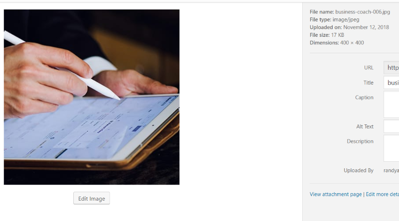
This one is 400 x 400 with a file size of 17kb.

This one is 1707 x 895 with a file size of 143kb.
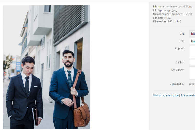
This one is 800 x 1140 with a file size of 614kb.
Each of the sizes for these images is not random. They’re chosen carefully for their location within the layout. There are several reasons for this. Uploading images of the size that you’re going to use them saves storage space on your server and saves bandwidth, which speeds up your website’s loading time.
File Types and File Sizes
Another important thing to consider about Divi image sizes is the file type. There are several file types to choose from and it’s best to use the file type that’s better suited to the type of image you want to display.
- JPEG (or JPG) – these are excellent for photos. They compress well, creating a small file size without much loss of quality, but they do still have fairly large file sizes. They can’t have transparent areas. They’re not ideal for icons because they don’t always have clean edges.
- PNG – these are great for graphics. They have clean edges, making them ideal for logos, icons, etc. They compress well, but the file size can be large if there is a lot of color in the image. They can have transparent areas, making them great for products.
- SVG – these are vectors and can be scaled without losing quality. They’re ideal for graphics such as logos and icons. They’re more difficult to use because they’re not native to WordPress, but you can use them with a plugin.
There are lots of excellent tools for compressing the images. They keep the dimensions the same, but they reduce the size of the file itself while retaining the image quality.
Here are a few good image compression tools to consider:
- TinyPNG – this online tool compresses both PNG’s and JPEG’s using smart lossy compression. It reduces the number of colors, but that reduction is almost non-detectable to the eye.
- Bulk Resize – an online tool that resizes images without having to upload them.
- WP Squish – a plugin that lets you limit the image resolution and compress JPEGs as they upload to your WordPress website.
- Smush – a WordPress plugin that resizes and compresses any image in any directory including NextGEN images, every WordPress plugin and theme package, and images stored in the cloud.
In general, the smaller the file size the better. Try to keep the size under 300kb. Under 200kb is even better.
Move Your Media Library to Cloud Storage
Another good option is to move your media library to the cloud and serve it from a CDN. You can decouple the WordPress uploads directory with the Infinite Uploads plugin and connect it to their cloud service. Infinite Uploads storage and delivery plans are great if you have a media-heavy site that is affecting your performance and are looking to save on hosting costs. Plus, It pairs well with the image optimization plugins mentioned above and makes your site able to scale and deliver huge files without slowing down your site speed.
Choosing the Image Sizes
Match the image size to the space where it will display. If the image will display as a full-screen header it will need to be much larger than if it were an image for a blurb in a 1/6 column. Only use 1920 x 1080 where that size is needed. Most of the time, a 1280 image will work just fine in place of a 1920 image. If the space calls for a 200 x 200, then resize your images to that size.
Divi will also generate multiple image sizes for images as you upload them and it will automatically choose which image to use. This means Divi will use a smaller image for the blog cards than it does for the featured image in the blog post, in galleries, project posts, etc. If the sizes that Divi generates look blurry in a different size module that you originally intended to use the image for, then you might consider uploading a larger size.
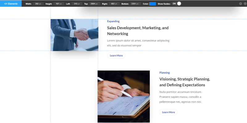
Determine the Divi image size by measuring the pixels with a tool or by adding a placeholder image and then checking the size of the image in Google Chrome Tools.
There are several tools to measure image sizes. Here’s a list of the most popular measuring Chrome extensions:
Optimizing Divi Image Sizes for Retina Screens
Retina screens display 4k images. Images at normal, or lower, resolutions can look pixelated on Retina screens. A good rule of thumb to optimize for these screens is to double the dimensions. So, if the image is 400 x 400, you’d double it to 800 x 800.
Keep in mind that this does quadruple the file-size, and you still should compress the images and try to keep them under 200kb if possible. It might be worth considering if the majority of your audience uses Retina displays.
Ending Thoughts
That’s our look at how to choose the best image sizes for your Divi website. There isn’t a single best size for every layout location or screen size, but playing around with sizing for specific locations within your layout will give you excellent results for your Divi image sizes.
Do you choose the Divi image sizes for your website? Let us know in the comments below.

Thx for a nice article. You should definately include more information about Retina implementation though.
I’m currently working on a new website, my first using the divi theme. We are using a lot of stock images, as you can imagine those have huge resolutions. I’d like to keep the original resolution in the linked image (Lightbox) and obviously use TinyPNG to reduce the size of all images.
My current issue is that I’m looking for a way to add custom images sizes as mentioned on Divi’s website https://www.elegantthemes.com/blog/divi-resources/the-ultimate-guide-to-using-images-within-divi
I know that I may change the settings for the Thumbnail, Medium and Large size but I’d also like to add the formats for 1/2, 1/3, 1/4, 3/4 column width (as mentioned in the article above). I tried using “Simple Image Sizes” plugin, but the created sizes don’t show up in the media dialog when I add an image.
Do you have any idea how I may accomplish that?
Christian Rauchenwald,
I am looking for the same thing… many other (cheaper) themes have a a large range of default sizes and even ways to add custom ones (cropped or not)… and I am desperately trying to find a way to add this to Divi
The article has answered a lot of my questions. Do you make adjustments to the wordpress default media settings?
Thanks, this is a keeper! You should maybe add that parallax background images need to be even bigger. I often use 1920 px wide images for full width parallax images.
This is a super helpful article, Randy, thank you!
I love Divi, but getting those header backtroudn images to work properly always drives me nuts …
very good article.
Great article. Perhaps you can also share how best to add video.
Howdy Randy,
nice article, thanks! But there’s one important item you didn’t address: site owners that do not understand stuff about file sizes, image sizes, resolutions, image compression tools…
Even if I try to give my customers (these site owners) some basic understanding of images, usually I see they still upload images right from their camera. And that’s where a tool like Imagify comes in, where you can resize images on upload, to get those 4 MB images a bit smaller. But – and this is my point – here Divi kicks in as well, on the down side: Divi somehow has a ‘largest thumbnail size’ of 2880px wide… Imagify can’t or won’t resize below this maximum thumbnail size, and I suppose other compression tools have similar settings. Do you know if there’s a way to get that ridiculously large max thumbnail size in Divi a lot smaller? I hardly ever use images wider than 1920 px, so that could save a lot of file size.
Thanks for the nice read!