Responsive design has become a modern day web standard, and with the ever-growing rise in the numbers of smartphones, portable devices and tablets, making sure your website adapts well to various device screen sizes is vital.
If you’re using the Divi theme, you’re a step ahead of the pack as Divi’s default settings come built-in with features that assist in making a website responsive. There may, however, be outliers in your designs that can’t be solved using these built-in features.
To make sure that the elements of your website display favourably across all modern devices of assorted screen sizes, a little bit of styling code called ‘media queries’ are added to the website’s stylesheet.
In the following post, we’ll discuss media queries for Divi, explain Divi’s built-in responsive design features and show you how to set up media queries on your Divi site.
Adding media queries requires a stylesheet and child theme. If you don’t already have a child theme set up and running on your Divi site, read the following post which explains what a child theme is and why you need one.
We recommended testing media queries on a development or testing site. We do not recommend testing code on a live site. Always make a backup of a live site before pushing edits from your staging site.
Responsive Web Design With Divi’s Built-In Features
One of the best features of the Divi theme by Elegant Themes is that the framework comes prepped and ready for responsive web design.
All throughout the site are built-in features that help web designers of all skill levels set their websites up to display well across various devices and screen sizes.
While you’re designing your website, you can toggle between different screen size views; desktop, tablet and mobile; to see how your site will render on each device.
First, you can toggle between the three different device displays in the Theme Customizer. Simply clicking each of the respective icons will indicate what your website will look like, allowing you to create theme customizations early in your development process that will reflect site-wide.
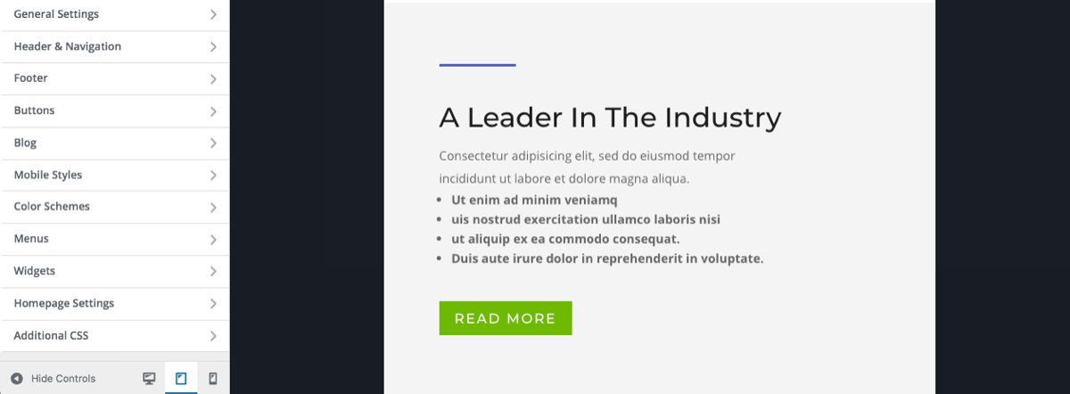
Next, with Divi, you can make sure that each of your website’s layouts will display well across devices while you build them. As you’re busy designing a page, post or project layout, simply click on the device icons to see how the content of each layout will display on each device.
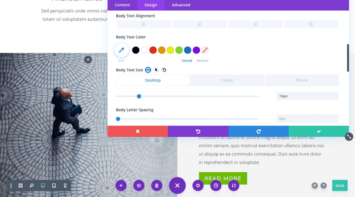
Finally, each module comes with the ability to specify various settings to achieve the most suitable, responsive display for each device. For example, right from the Divi Builder itself, you can set various dimensions for an array of modules, such as setting the font size of text to the padding or margin spacing for modules and much more.
To set these sizes, hover just to the right of the option name and wait for a small mobile icon to display. As you click on the icon, additional entry boxes will be revealed. Here, you can enter different sizes for different devices.
With these options already built into Divi, it’s incredibly easy to build a responsive website. However, even with such a high degree of customization at your fingertips, there may be a few sections, rows or modules that don’t look 100% right on every device.
To solve the display of a few of these graphic outliers, media queries are used.
What Are Media Queries?
Modern day devices; smart phones, tablets and computers; come in an array of sizes. For example, small smart phones have a display width of roughly 400px while desktop computers can have large monitors whose display can begin at around 1400px.
For example, consider a snippet of Heading (H1) text with a font-size set to 80px. This will display nicely on a laptop or large monitor, however, it’ll look terrible on a mobile device, even more so on the smaller sized ones.
As mentioned above, even though Divi’s responsive tools are an incredible help in aiding responsive design, some elements will need special attention. Also, keep in mind, there are a plethora of device sizes so there’s quite a considerable chance that you’ll need to add a few code tweaks here and there to accommodate for these devices.
If you’d like to learn more about using CSS with Divi, find out more about Transforming Divi with CSS & JQuery Course and download The Divi CSS and Child Theme Guide.
How to Add Media Queries to Divi
If you’ve identified an element that you’d like to tweak, you’ll need to add media query code to your stylesheet.
There are three main areas that CSS code can be added to a Divi website:
1. The stylesheet of a child theme
2. The Custom CSS area in the Divi Theme Options console
3. In the Additional CSS area of the Theme Customizer
Here is an example of media query code with no customization added.
/* Smartphones in portrait mode (0-479px) */
@media only screen and ( max-width: 479px ) {
/* your css goes here */
}
In the above code, the media type of screen is targeted, specified further to screens with a size that ranges between 0px and 479px. After the opening brackets, a commented out line indicates where you can add your CSS.
Here, you’d enter the specific CSS to style the element in the way you’d like, for example:
In this example, I’m setting a piece of H1 heading text to display with the font size of 30px on small phones with a width of less than 479px.
The final media query entry for this would look something like:
/* Smartphones in portrait mode (0-479px) */
@media only screen and ( max-width: 479px ) {
h1 { font-size: 30px; }
}
The full list of media queries are:
/* Large screens (1405px upwards) */
@media only screen and ( min-width: 1405px ) {
/* your css goes here */
}
@media only screen and ( min-width: 1100px ) and ( max-width: 1405px) {
/* your css goes here */
}
@media only screen and ( min-width: 981px ) and ( max-width: 1100px ) {
/* your css goes here */
}
@media only screen and ( min-width: 768px ) and ( max-width: 980px ) {
/* your css goes here */
}
/* Smartphones in landscape mode (480-768px) */
@media only screen and ( min-width: 480px ) and ( max-width: 767px ) {
/* your css goes here */
}
/* Smartphones in portrait mode (0-479px) */
@media only screen and ( max-width: 479px ) {
/* your css goes here */
}
September 19, 2015
Media queries can be used to tell your browser what to do at certain screen sizes or resolutions. For example;
It is media queries that decide when the top navigation stops and the mobile menu begins.
On screens 981px or larger…
On screens 980px or smaller…
How it works
A media query is made up of a media type and at least one limitation on the scope of the style sheet. In English, that simply means combining ‘@media’ with something that makes the CSS inside it, more specific.
Let’s look at an example –
@media ( min-width: 981px ) {
#main-header {
Background: #303030;
}
}
In this example, we have used a media query that targets all devices, but only if the window is at least 981px wide.
What if we wanted to target window sizes of at least 981px wide but not larger than 1100px? We would adjust the query like so…
@media ( min-width: 981px ) and ( max-width: 1100px ) {
You’ll sometimes see media queries for Divi expressed like this:
@media only screen and ( min-width: 1100px ) and ( max-width: 1405px) {
This works much the same as our first example with two exceptions:
A media type has been selected (screen).
It targets (only) that media type.
Generally speaking you don’t need either of these additions. ‘screen’ stops styles for other media types (handheld, tv) being loaded and ‘only’ was a necessary specificity before CSS3, but not now.
That’s not to say it’s a bad idea to use the ‘only screen’ version of the selector. As we know, with CSS, specificity wins, so simply having those words will be enough to override conflicting CSS without those words.
Media queries are a great way of stopping your changes having a wider reach than you meant them to. Say you make some changes on desktop and don’t want them to mess up the layout of your site on mobile, you could limit the changes to devices that are larger than 980px (the point where divi changes to the mobile menu) by placing your CSS inside a query like so:
@media ( min-width: 981px ) {
/** Your CSS goes here **/
}
I often use media queries on navigation items so my changes to desktop versions don’t mess up the design on mobile.
Using Media Queries in harmony with Divi breakpoints
Divi already uses media queries to change the way a large number of elements are displayed at different viewports. Where possible you should try and match your own media queries to those breakpoints, as this will help them merge seamlessly with movements already happening within the theme. If you have to use different breakpoints, it’s okay to do so, but remember that lots of different breakpoints gets messy.
Here are the breakpoints used in Divi that you should try and stick to. For reference, you can also find this list in your course resources.
/* Large Monitors*/
@media ( min-width: 1405px ) {
/* your CSS goes here */
}
/* Standard laptops & desktops */
@media ( min-width: 1100px ) and ( max-width: 1404px) {
/* your css goes here */
}
/* landscape Tablets */
@media ( min-width: 981px ) and ( max-width: 1099px ) {
/* your css goes here */
}
/* Portrait Tablets*/
@media ( min-width: 768px ) and ( max-width: 980px ) {
/* your css goes here */
}
/* Landscape Phones */
@media ( min-width: 480px ) and ( max-width: 767px ) {
/* your css goes here */
}
/* Portrait Phones */
@media ( max-width: 479px ) {
/* your css goes here */
}

I want to add an additional media query for screens with more than 1920px. But if I define a different font-size for body, h1 and h2, all other font-definitions change too (eg. font-weight).
Is there any example on how to add a media query for extra-large screens?
Thanks. Super explained! It’s quite easy, I didn’t even know it that way. Your Divi CSS and Child Theme Guide course is mega 🙂 but I see a lot of learning ahead of me ..
What if ‘only screen’ is omitted?
Hi there,
I wanted to take your CSS for Divi course but it says it out of stock? Have you withdrawn the course? Anything similar planned for the future?
ps would love to know the answer to Alicia’s question above…
So, responsiveness is something that still eludes me more often than not, especially with apple products. Say, for example, you remove or alter the padding of a section. Do you then need to apply a media query for every possible screen size to that same CSS to keep it responsive?
This was very well explained. Would love to see more of the ” In English, that simply means…” explanations. Thank you!
Why do some limits overlap (large monitors-desktops and desktops-landscape tablets) and others do not (landscape tablets-portrait tablets, portrait tablets-landscape phones, etc?
Is this a problem or am I being too anal?
They shouldn’t, that was my error, thank you for noticing 🙂 I’ve fixed it now.