The Divi Page Builder is my favourite tool for quickly building web pages. The modules, columns, rows, and sections all have a smorgasbord of settings that make it easy to change almost any aspect of the set-up. One thing that’s missing from those options (at least for now) is the ability to change the way that columns stack on mobile devices. By default everything that sits on the right moves down.
I for one, was keen to change that as sometimes that’s not ideal. For example, if I have two columns with the text on the right and an image on the left, that’s great on desktop, but then I lose the text underneath the image on mobile.
This post concentrates on sections with two columns but there’s no reason the concept couldn’t be carried over to all of the various page layouts. Let me just say now that:
I have absolutely no intention of trying to change the way that columns stack!
I looked at it and just thinking about it made me go cross-eyed, so instead I’m going to cheat. But the results are the same so that’s all that matters, right?
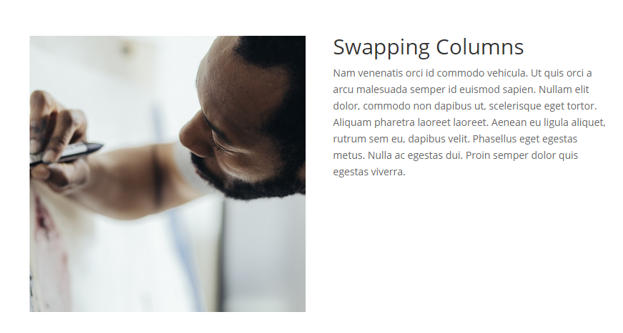
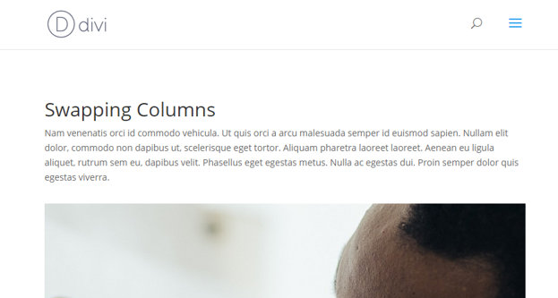
So here’s what we know; when the columns stack, the right side goes down and the left side stays put, so the easiest way to achieve the required result is to swap the columns round on desktop, so then it looks like our left column is on the right and our right column is on the left. If that’s confusing, take a look at these images.

So looking at our builder, we can see that the text is on the left and the picture is on the right, so on mobile devices, our text would stay above the image…

But on the front end of the website, the text appears to be on the right, so when we move onto smaller screens it will appear that our left column is moving under the right column. It isn’t. It’s just CSS voodoo 😉

You see? Magic!
So here’s what we need to do for that to work
1. By default, the margin that keeps our columns separate is applied to the first column on the right, that’s pretty standard for items that are floated to the left. But to change the order we need to float the columns right, so we need to also change the spacing to being applied to the left.
2. By default, the column on the right doesn’t have any margins set as it would usually sit against the right edge of the page, but now it sits on the left so we need to give it a margin right. We can make sure the changes are only applied to the last column using a pseudo element ‘:last-child’.
To make sure this only effects the areas we want it to, I’ve added a section class of ‘column-swap’. Here’s what the CSS looks like:
@media only screen and (min-width: 981px) {
 .column-swap .et_pb_column, .et_pb_row .et_pb_column {
 margin-left: 4.5%;
 }
 .column-swap .et_pb_column {
 float: right;
 }
 .column-swap .et_pb_row .et_pb_column:last-child, .column-swap .et_pb_row_inner .et_pb_column:last-child {
 margin-right: 4.5%;
 margin-left: 0;
 width: 47.25%;
 }
 .column-swap .et_pb_column, .column-swap .et_pb_row .et_pb_column:first-child {
 margin-right: 0;
 width: 47.25%;
 }
}
Now, that’s the fun bit. But how do you make it work for you?
How to implement the column swap
- Make sure you’re only trying this on sections with two columns.
- Add a class of ‘column-swap’ to your section.
- Add the CSS above to your child theme or ePanel.
- Make sure your columns are the wrong way round in your page builder as the code is going to flip them (ie. if you want the text on the right, put it in the left column).
- That’s it!
If you use the code, let us know in the comments 🙂

Excellent solution, thanks.
A question, if instead we have chosen to paginate on 3 columns what could the css be like?
Hi, I did exactly what is instructed above but it did not work at all. Can you please help?
check the link http://7e2.4ea.myftpupload.com/
I added the css class to the second row, and the css code to the css epanel and it did nothing. 🙁
This didn’t work for me at all. I’ve been trying to alter it and make it work but haven’t had any luck. I do have the full-width layout though so maybe that has something to do with it.
great tutorial, it’s working for Desktop, but i need this for mobile and tablet only Portrait.
if i change the @media all and (min-width: 479px) and (max-width: 980px) nothing happens on all devices. what did i wrong?
How do I modify this code so that I have 1/3 of the column (which is the image) on the right and 2/3 of the column (which is the text) on the left? I think this code only works if I have two 1/2 columns.
You could just duplicate the modules and hide half from mobile and half from desktop. Then rearrange to suit.
Is there a solution for full-width columns? As Robert Augi and Carla have pointed out, this solution doesn’t seem to flip the columns at all on full-width rows, such as those on this page: http://elegantthemes.com/preview/Divi/cafe/
@Bill… I had the same issue…
Here’s another workaround I found:
Name the section column-swap and the row my-row… and then add the following to divi custom css field:
@media only screen and (max-width : 980px) {
.column-swap .my-row {
display: -webkit-flex;
display: -ms-flex;
display: flex;
-webkit-flex-direction: column-reverse;
-ms-flex-direction: column-reverse;
flex-direction: column-reverse;
}
}
Thanks. But, How about 3-column layouts? Could you give some hand on that?
Let me know. TIA 🙂
Excellent.. will try this out.
For sections with more than 2 columns.. I’d probably just create a special section that displays only on mobile and manipulate the columns accordingly.
And disable mobile on the desktop layout.
Thanks for another great tutorial!
Hey, this isn’t working for me. My section has 2 columns and they’re set to full width so I changed the percentages to 0% & 50% instead of 4.5% & 47.25%
Here’s the code I have in my child theme:
@media only screen and (min-width: 981px) {
.column-swap .et_pb_column .et_pb_row .et_pb_column {
margin-left: 0% !important;
}
.column-swap .et_pb_column {
float: right !important;
}
.column-swap .et_pb_row .et_pb_column:last-child, .column-swap .et_pb_row_inner .et_pb_column:last-child {
margin-right: 0% !important;
margin-left: 0 !important;
width: 50% !important;
}
.column-swap .et_pb_column, .column-swap .et_pb_row .et_pb_column:first-child {
margin-right: 0 !important;
width: 50% !important;
}
}
Robert – thanks for this version. I have a full width as well so this saved me time making the adjustments for that setting. I did find that once I swapped the columns (per the original instructions), even though this code took care of the adjustment on mobile, my desktop version now renders incorrectly. It shows as it is laid out in the divi builder (which for my middle row is exact opposite of what it should be). Did you have the same issue?
Hi… sorry , didn’t work for me…
Should have added, that I applied the class to my second row..which has two columns
We could use a simpler approach which doesn’t require to specify the width but only the margin’s value.
@media only screen and (min-width: 981px) {
.columns-swap.et_pb_row .et_pb_column {
float: right;
margin-left: 5.5%; // This should be equal to the current gutter value
margin-right: 0 !important;
}
.columns-swap.et_pb_row .et_pb_column:last-child {
margin-left: 0 !important;
}
}
This worked great for me! Just had to change the way that comment was formatted. Instead of // I had to use /* …. */
Is there a fix for a three columns? I need it to switch middle and the right column while the left stay in the first position.
Brilliant, Stephen! Thank you so much for this. Worked great.
I use this in my website! Nice tutorial1 Thanks SJ
Hi SJ,
I couldn’t get this to work. I found that it affected quite a few sections right throughout my site (yes Divi 2.5) even though I only had 1 Row section with a Class of custom-swap.
I really like this idea of being able to swap image/text from left to right depending on screen size and I think you are spot on to identify this as a need.
John.
Hey John,
Thanks very much 🙂 It’s odd that it would effect sections without the class added to them? I have been unable to emulate this issue. Sorry, I wish I could be more help.
@media only screen and (min-width: 981px) {
.column-swap .et_pb_column .et_pb_row .et_pb_column {
margin-left: 4.5%;
}
.column-swap .et_pb_column {
float: right;
}
.column-swap .et_pb_row .et_pb_column:last-child, .column-swap .et_pb_row_inner .et_pb_column:last-child {
margin-right: 4.5%;
margin-left: 0;
width: 47.25%;
}
.column-swap .et_pb_column, .column-swap .et_pb_row .et_pb_column:first-child {
margin-right: 0;
width: 47.25%;
}
}
// on the second line there should NOT be a comma after .et_pb_column
@Bob
Your solution worked. Thanks!
John, use the code that Bob supplied and try flipping the two rows.
I’m working on a site and instead of having text/photo I am using 12 blurbs (6 rows as part of one parallax unit) and they’re stacking all wrong. The blurb on the right, top row, is showing up 4th in mobile.
This is also stacking them in an incorrect order for the board of directors, where as 2 columns in desktop their listing in mobile is screwy. And with the Board, believe me, this matters!
If I need custom CSS, how/where can I find it, or a person to help me? (on deadline….)
Thanks!
Hi Andrea, this is designed for a section containing two columns. If you are using more than one row it will behave curiously for you. If you need help asap I would suggest search for the Divi freelancers for hire group. Lots of talented devs in there
Great tute, clear, easy and useful 🙂
Very nice, this is going to help a lot of the Divi Community 🙂