A few weeks ago, we hosted an incredible webinar where we showed Divi users a number of ways to transform the Divi header using CSS and jQuery.
By default, the Divi header is pretty standard. Even with the customizer settings, there’s very little that a new Divi user can do to differentiate the header. The webinar covered three different tutorials for creating unique Divi headers. For the full webinar video, visit the post on the Divi Space blog, ‘Transforming the Divi Header with CSS and jQuery’, or watch other webinars hosted by Divi Space.
For this tutorial, I’ve set up a local development/testing environment. If you’d also like to set up a testing environment for your website work, follow one of the following tutorials:
- How to Set Up a Local Development Environment Using DesktopServer (Aspen Grove Studios)
- How to Set Up a Local Development Environment Using Local by Flywheel (Divi Space)
- How To Create A Local WordPress Installation On A Mac Using MAMP (Elegant Themes)
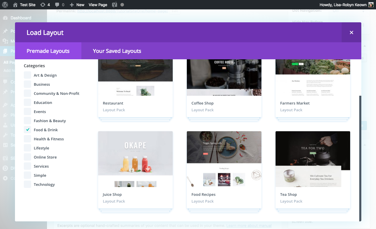
As with the webinar, I’ve used the following free Elegant Themes layout pack, the Fresh Juice Shop Layout, for the tutorials. With the newer versions of Divi, you should be able to find this layout pack directly in the Divi Builder. Click on the Divi Builder Load Layout tab, select Premade Layouts, select the Food & Drink category and select the Juice Shop layout.
Tutorial One
The first tutorial will help you create an awesome colorful menu with an engaging hover effect.
As per the webinar, to set up my testing environment site to match the demo, I’ve gone into the Customizer Settings and set the following:
- Set the standard header transparent (Go to Customizer > Header & Navigation > Primary Menu Bar, Select Background Color and set the color to transparent)
- Made the scroll down color white (Go to Customizer > Header & Navigation > Fixed Navigation Settings, select Primary Menu Background Color and set the color to white)
- Made the menu area full width (Go to Customizer > Header & Navigation > Primary Menu Bar, select Make Full Width)
Then, simply copy and paste the following code into the Custom CSS box in the Divi Theme Options menu.
-menu a:before {
content: "";
position: absolute;
top: -148px;
left: -10px;
width: calc(100% + 20px);
background: red;
z-index: -1;
border-radius: 4px;
height: 120px;
transform: skewY(0deg);
transition: .4s ease-in-out all;
}

#top-menu a:hover:before {
top: -60px;
transform: skewY(20deg);
}

#top-menu a:hover {
color:
;
opacity: 1;
}

#top-menu li:nth-child(1) a:before {
background:
;
}

#top-menu li:nth-child(2) a:before {
background:
;
}

#top-menu li:nth-child(3) a:before {
background:
;
}

#top-menu li:nth-child(4) a:before {
background:
;
}

#top-menu li:nth-child(5) a:before {
background:
;
top: -70px;
transform: skewY(20deg);
}

#top-menu li:nth-child(5) a {
color: #fff;
}
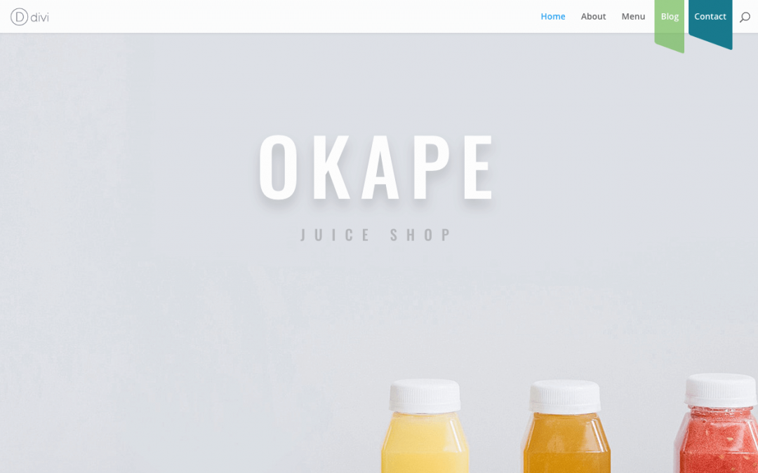
After clicking Save Changes and refreshing your homepage, your new navigation menu will look like this:
The final menu item – named here as Contact – has been given some additional code to make it stand out. This is a great UX trick that highlights a call to action. On scroll, this call to action button looks really attractive and encourages site visitors to make contact with the brand.
If you’d like the menu item to display as the others and not as a call to action, simply change the nth-child(5) code in this way
#top-menu li:nth-child(5) a:before {
background:
;
top: -70px; / delete this line /
transform: skewY(20deg); / delete this line /
}

/* delete this entire section

#top-menu li:nth-child(5) a {
color: #fff;
}

*/
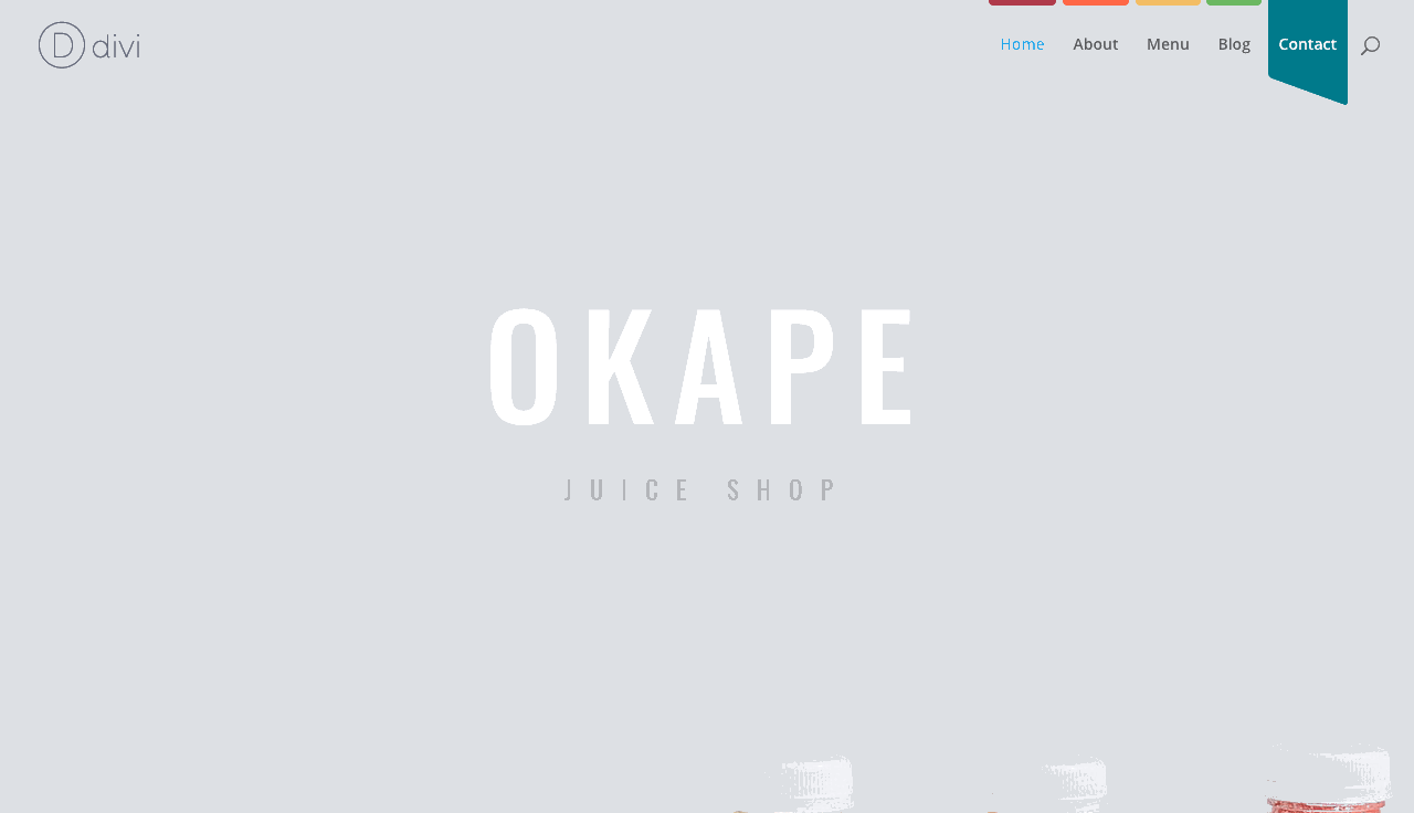
If you choose to remove the additional styling on the nth-child(5), the menu will look like this:
Tutorial Two
The second tutorial will help you to create a clean, more minimalist aesthetic for your Divi website. With just a little bit of CSS, you’ll be able to spruce up the look of the slide in menu to create a really unique layout.
To begin, you’ll need to enter the Customizer Settings and set the menu to always display as a hamburger menu. For this, open the Customizer Settings, navigate to Header & Navigation > Header Format and select Slide In.
By default your navigation menu will look like this:

Also within the Customizer Settings, navigate to Header & Navigation > Header Elements and disable the Show Search Icon.
To create an awesome grid effect for your slide in menu, simply copy the code below and paste it into the stylesheet of your child theme, or into the Divi Theme Options Custom CSS area.
.et_slide_in_menu_container ul#mobile_menu_slide {
background: #fff;
display: grid!important;
height: 100%;
grid-template-areas:
"left right"
"bottomleft bottomright"
"bottom bottom";
grid-gap: 5px;
padding: 5px;
}

.et_slide_in_menu_container ul#mobile_menu_slide li:nth-child(1) {
background: #ac3b4a;
}

.et_slide_in_menu_container ul#mobile_menu_slide li:nth-child(2) {
background: #fc6a3c;
}

.et_slide_in_menu_container ul#mobile_menu_slide li:nth-child(3) {
background: #f1be52;
}

.et_slide_in_menu_container ul#mobile_menu_slide li:nth-child(4) {
background: #71b953;
}

.et_slide_in_menu_container ul#mobile_menu_slide li:nth-child(5) {
background: #2F7DE2;
background-size: cover;
grid-area: bottom;
}

.et_slide_in_menu_container ul#mobile_menu_slide li:nth-child(5) a {
background: #017a8d;
}

.et_slide_in_menu_container ul#mobile_menu_slide li a {
display: flex;
height: 100%;
justify-content: center;
flex-direction: column;
text-align: center;
}
Once complete your Divi menu will look like this:

Tutorial Three
The final tutorial makes use of Divi’s built-in waypoints to create an awesome color change effect for the header on scroll.
At present, the menu is set to Slide In with the hamburger menu displaying. By implementing the code below, the hamburger menu will change or alternate as it scrolls through various sections on the page.
To achieve this effect, copy the following jQuery code, navigate to the Divi Theme Options > Integration tab and paste it into the box that states, “Add code to the < head > of your blog.” If you are using a child theme, you could paste this code into the custom.js file in your child theme.
<script>
$('.et_pb_section:odd').waypoint(function() {
$('#main-header.et-fixed-header').addClass('dark');
});
$('.et_pb_section:even').waypoint(function() {
$('#main-header.et-fixed-header').removeClass('dark');
});
});
</script>
Then, copy the code below, navigate to the Divi Theme Options > General tab and scroll all the way down and paste it into the Custom CSS box. If you are using a child theme, you could paste this code into the style.css file in your child theme.
#main-header.et-fixed-header .mobile_menu_bar:before {
background: #fff;
color: #000
;
}

#main-header.et-fixed-header.dark .mobile_menu_bar:before {
background: #000;
color: #fff;
}
Once changes are saved, your new header will transition as such:

If you’d like to change any of the transitioning colors, simply head to the CSS code and change the hex codes.
We want to hear from you!
We hope that you’ve enjoyed going through these tutorials and that you’re excited to implement these CSS and jQuery hacks into your Divi website to create an awesome, stand out header. I would like to follow along, line by line, click here to watch the full webinar, and also, don’t forget to check out our other webinars on the Divi Space websites.
If you have any questions or queries, feel free to leave them in the comment box below. We love receiving your feedback!
Thanks for reading!

I am having issues with this if there is a submenu items. I was wondering if you could provide insight on how to make it work with it?
Hello!
I am having issues with this if there is a submenu items. I was wondering if you could provide insight on how to make it work with it?
Thanks!
Great tutorial by the way! Works perfectly for my top level menu!
Hello. I am building this website and I am having the issues with sub menu? Can you tell me how to solve the issue?
Hello,
Really nice tutorials.
How to add to 1st tutorial class .current-menu-item for clicked button.
I too like the first example. Thank you so much for taking the time to put this together and making your code available. Is there a way to get this to work with sub-menus?
I tried your example and quickly ran into issues with Sub-Menus.
I love this, thanks! It is worth noting however that when I tried tutorial 1, that the effect broke on menu items with submenus.
Hello,
Thank you for this tutorial.
Works perfectly
The diffrent tools enumerated in your above article are really more performing for my website that are the following ones: local developement Environment using desktopserver, local development Environment using local by flywheel, a local wordpress installation on Mac using MAMP( elegant themes) which are very imporant and performing to give more efficient to my website.
Truly thanks.
Wahou, thank u !! <3
Love this thank you! I wonder if its possible for the skew to be even either side so it forms a triangle in the middle of the rectangle overlay? Please see the shape of the logo from this website to reflect what I’m aiming for. Thanks guys!
Really nice, especially like number 1. Is there any way this will work if a menu item has sub menu items?