Divi and WordPress are great choices for building websites. WordPress is a powerful content management system. Divi is a powerful theme with a drag-and-drop builder that makes it easier to build just about any type of website you can imagine.
One problem, though, is it’s still easy to make mistakes when developing your website. In this article, we’ll look at 16 common Divi and WordPress website mistakes to avoid. The mistakes are in no particular order.
1. Ignoring Updates
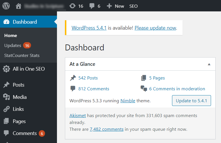
WordPress, themes, and plugin developers update code regularly. Not only do they update the code to improve performance and add new features, but they also improve the code’s security.
It’s important to keep them updated to the latest versions to keep your site and your visitors safe and your website working properly.
2. Not Keeping Current Backups
There are a lot of things that can happen to a website that can be solved with a backup. Websites can get hacked, servers can crash, data can be lost, or you can accidentally delete something important. I’ve even seen hosting companies go out of business.
No matter what the problems are, keeping a fresh backup can help you get your website running as quickly as possible. A good idea is to add a backup plugin such as BackupBuddy (paid) or UpdraftPlus (free) to your site to handle automatic backups. A great idea is to host your website with a managed WordPress hosting solution like Divi Space Hosting. A feature of managed WordPress hosting is automated daily backups. Each day, your website will be automatically backed up, and, if ever you experience a problem, you can restore your website to any of it’s previous save points in the click of a button.
3. Ignoring Security
Thousands of WordPress websites get hacked every day due to poor security. Hackers add malware, conduct brute force attacks, delete content, take over a website, steal data, and ruin reputations. This is easy when you don’t have a good security plugin installed.
This also includes SSL. Not only does having SSL make your site more secure for online purchases, but it’s also better for SEO because Google prefers secure sites.
4. Ignoring User Experience
The user experience is important in getting visitors to come back to your website. There are lots of things that can ruin your user’s experience with your website.
Some of these problems come from not testing the site on multiple screen sizes and browsers. Others come from not visiting your website as a visitor to see how it works when you’re not logged in.
Certain website elements are sometimes ignored, causing the site’s design to be inconsistent. For example, a site can have a beautiful landing page but it can be jarring to the user when the blog layout is stock Divi.
Just using the default Divi settings, such as colors and font sizes, can look bland or even be difficult to read.
The layout can be cluttered if there are too many ads. The site can look unfinished if certain types of content aren’t updated, such as sale banners that are out of date.
Disclosure notices, such as affiliate programs and privacy policies, need to be easy to see.
5. Confusing Navigation
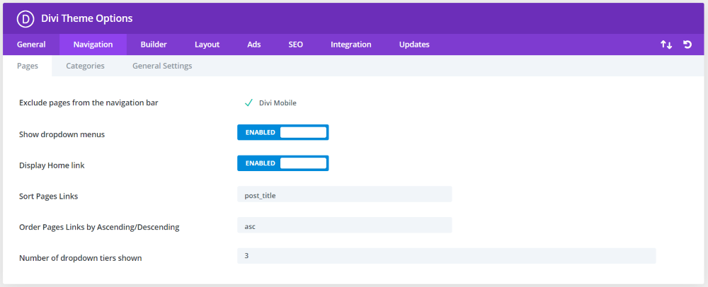
Navigation should make sense and content should be easy to find. Navigation can be confusing when too many things are added to the menu if the menu is placed in an odd location, if menu links have names that don’t match what the visitor expects to see, or if it includes links that don’t work.
WordPress lets you create custom menus and Divi includes lots of ways to present and style them. Make adjustments in the theme customizer, the theme options, and build custom headers with them in the Theme Builder.
6. Not Using Google Analytics
Google Analytics is the best way to understand the performance of your website. It shows where your traffic comes from, what pages and posts they’re looking at, how long they’re spending on your site, the type of devices they’re using to view your site, etc.
All of this information can help you to know where to improve your site, the types of content to provide, the performance of your CTA’s, and even where to spend your marketing dollars.
7. Not Performing A/B Testing
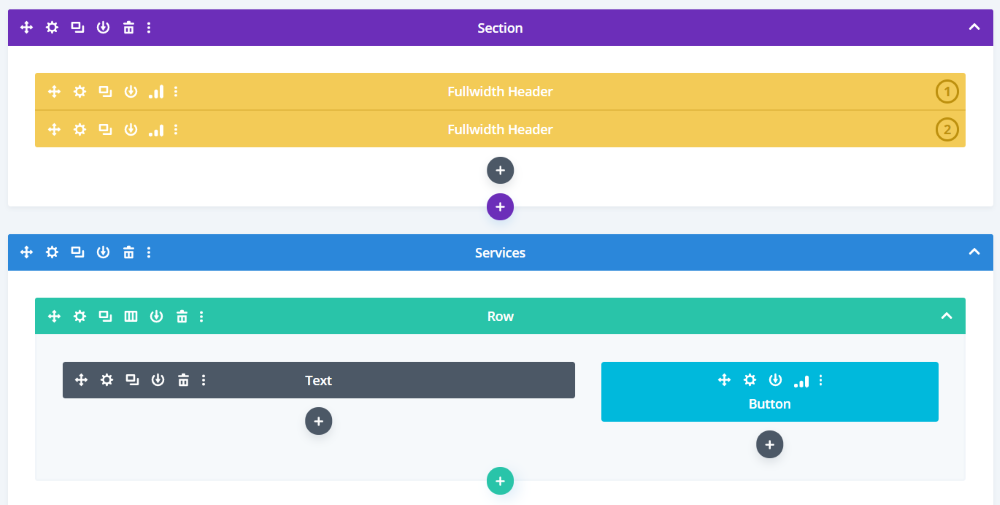
A/B testing lets you know which of the two choices are the most effective. This helps you constantly improve your website by choosing better colors, fonts, element placement, text, and lots more.
Divi has A/B testing built-in. You can test elements on every page and post on your website and get detailed statistics to help you make design decisions.
8. Ignoring Performance
Slow websites often have a large bounce rate. Most visitors won’t wait on a slow site to load. The faster the site loads, the more of it visitors are likely to see. Monitor your website’s speed and optimize the things that make it slow. This includes optimizing image files with tools such as WP Squish, reducing the number of plugins you use, and using higher quality plugins.
9. Not Utilizing SEO
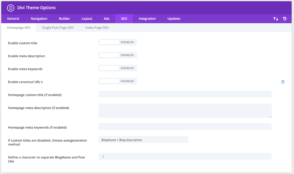
If you don’t optimize your site for search engines, your website may not show up in the search engine results. Considering the amount of competition for the same keywords, utilizing SEO is crucial for organic traffic.
Divi includes an SEO tab in the theme options, making it easy to describe your website and content to search engines. There are lots of plugins, such as Yoast SEO, that go even further and help to make your website as search engine optimized as possible.
10. Ignoring Comments
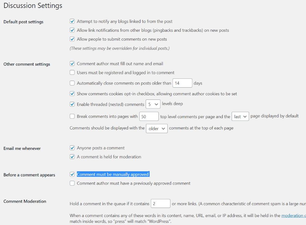
Comments are one of the most popular methods of spreading spam. Not only can it add lots of links to sites you don’t want to link to and reduce the quality of the user experience, but it can also harm your site. WordPress provides several settings to help with reducing spam, such as requiring all comments to be manually approved.
11. Using the Wrong Post Type
Posts, pages, and custom post types are not interchangeable. Pages have a navigation structure while posts have a category archive structure.
Pages are used for timeless content such as content that goes into your navigation structure that you don’t want to appear in your publishing stream. Posts are used for time-based content such as updates and articles.
Use the best post type for each type of post. For example, don’t always use blog posts for your portfolio, events, courses, or products. Create custom post types for each.
12. Misusing Categories and Tags
Categories and tags help organize and identify content, but they’re often used incorrectly. Categories are the general topics, while tags are more specific. You should use both, but you should have a few categories and more tags. For example, blog posts can fall into one category and have several tags.
13. Not Optimized the Call to Action
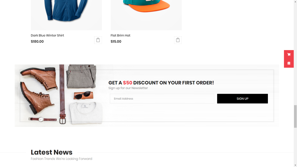
The call to action is often the primary point of the website, but if it’s not clear then it can become ignored. Choose the best location, colors, fonts, images, and messages.
Divi is excellent for creating powerful CTA’s. Place them at the beginning and end of the page. Make them stand out. Make them easy to use on all screen types. The newsletter in the example above (from the Divi eCommerce child theme) stands out and provides a clear message.
14. Not Optimized for Mobile
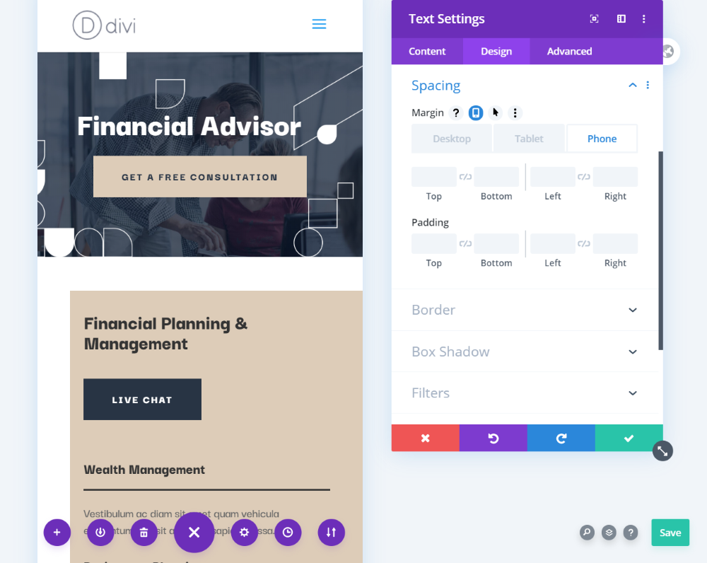
Since 2016, the majority of website visitors are using mobile devices. If sites are not optimized for mobile, fonts can be too difficult to read, titles can wrap in awkward places, images can be too large, and menus and CTA’s can be difficult to use.
Divi has lots of settings just for mobile devices. View the layout on mobile and make adjustments specific to mobile screens. Be sure to test your designs on multiple devices and screen sizes. Make sure elements are responsive and use optimized images.
15. Not Building an Email List
Email is still one of the most important marketing tools. Many visitors never come back to your website, b an email subscriber is someone you can constantly market to. They’ve signed up to your list because they want to hear from you.
16. Not Using a Child Theme
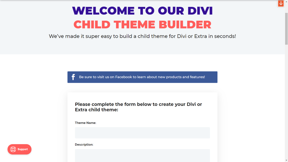
Child themes are a must if you want to make changes in the theme files. Any changes to the Divi code will be overwritten when Divi updates. Child themes allow you to make all the changes you want without losing those changes. Not everyone needs a child theme, but it doesn’t hurt to have one. You can build one for free with the Divi Space Divi and Extra child theme builder.
Ending Thoughts
That’s our look at 16 common Divi and WordPress website mistakes to avoid. There are a lot more we could add, but avoiding these common mistakes will help you follow many of the best practices when it comes to website design.
We want to hear from you. What common mistakes would you add to this list? Let us know in the comments.

Very useful tips, I’ll definitely watch out for these!
Valuable content! I’m going to show it to a couple of people. 🙂
Great article Randy! Very valuable content indeed.
Thank you!
These items should be incorporated into a checklist for every client site. Thank you!