It goes without saying that your website’s layout will have a major impact on all aspects of your business – including bounce rates, conversions, and ultimately your bottom line. It’s therefore crucial that your layout is easy for visitors to navigate, or you risk hemorrhaging traffic.
The good news is that a little know-how, coupled with an easy-to-use theme such as Divi, can provide you with practically all you’ll need to produce a stellar website layout that converts.
Using the bundled features, you’ll be able to create effective headers, navigation, and much more, all from within your WordPress dashboard.
In this post, we’ll first look at what makes for a great layout, then discuss how to plan out your own home page. Finally, we’ll delve into how the Divi Builder can help turn your plan into an actual design, and offer some quality-enhancing tips for getting it right first time. Let’s get started!
What Constitutes a Quality Home Page Layout (And Which Sections Are Important)
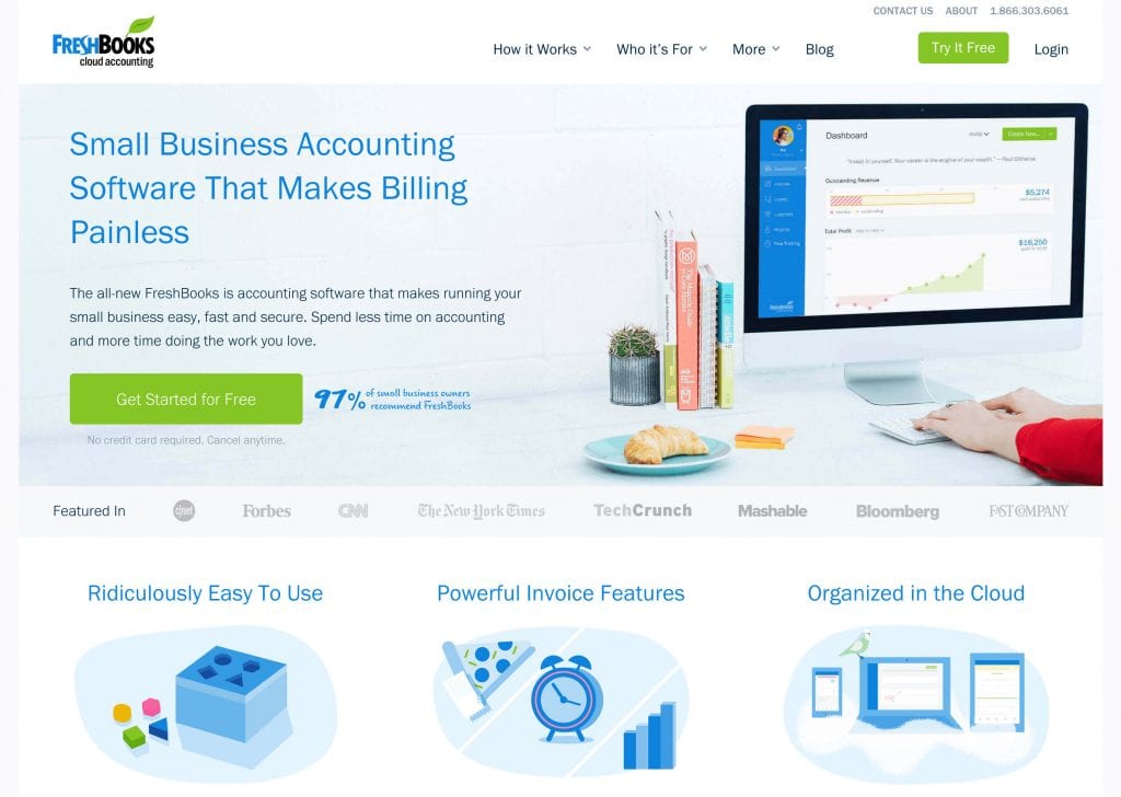
A great layout for your home page can impact every aspect of your visitor’s experience when navigating your website.
When designing their home pages, many beginners focus on creating a visually appealing presentation. However, there’s a much more important consideration – User Experience (UX).
In a nutshell, UX reflects how your design impacts the visitors to your site. If your UX is high-quality, you will see more signups, leads, sales, and whatever else you use to measure your site’s success. However, poor UX can send your conversion metrics into free fall – which could become a situation you spend a while recovering from.
The Most Important Sections to Include on Your Home Page
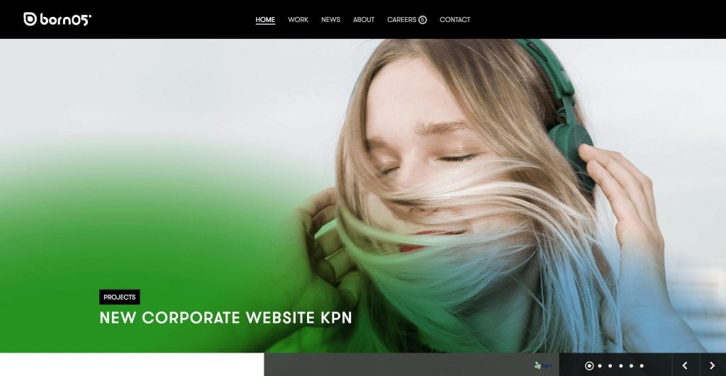
Great UX is key to increasing conversions. Born05 have won awards for theirs!
Great UX is key to increasing conversions. Born05 has won awards for its UX, for example. A strong home page layout takes UX into consideration, and is also optimized to maximize conversions. Of course, visuals are also important, although we’d argue that a functional site is usually preferable to something flashy. In most cases, a ‘good’ layout balances all three of these aspects.
With that said, there are five key areas to pay attention to when designing your own layout:
- Header. This section at the top of your page usually contains your navigational elements. However, it could also consist of a ‘hero section’, or some other conversion element. Keeping this uncluttered is key.
- Navigation. While this is traditionally a horizontal bar at the top of your header, recent years have seen a number of styles employed, such as ‘sticky’ headers and slide-in designs. As with your header, less is more here.
- Body. Of course, this is where your main content resides. As you can imagine, readability is crucial here (i.e. choosing solid typography and colors).
- Sidebar. Having one is optional, but a sidebar can be handy for displaying short author blurbs, newsletter signups, ad content, and much more.
- Footer. We’ve discussed this at length in a previous post. Rather than being a forgotten aspect of your site, the very bottom of your home page is an essential place to attract conversions.
Each of these sections is important, and you’ll want to give them plenty of attention during the design process. Of course, what’s included within those sections is also crucial. Let’s discuss that aspect now.
How to Begin Planning Your Home Page (And What You Should Include)
Before you wade into the design process, you’ll need to lay some groundwork. In our opinion, there’s one major consideration you’ll need to think about first and foremost: having a clear goal for your home page, and for the site as a whole.
This could be getting visitors to sign up to your newsletter, encouraging them to interact with your Call To Action, or any number of other unique objectives. Figuring this out now is essential, since it will inform how you build your home page and what you include.
What Your Home Page’s Layout Should Consist Of
Basing your home page around encouraging conversions means thinking carefully about its ‘flow’. In other words, this is the path you’d like your visitors to follow. You already know the end goal, but getting the visitor there will take some thought.
The main piece of advice we can offer here is to give the visitor as few opportunities for decision-making as possible. This doesn’t mean forcing users into action, but it does mean minimizing their chances to say “No” to what you’re offering, and providing solid arguments for saying “Yes”. You could do this through social proof elements, compelling copy, or something else entirely.
As we’ve already alluded to, there are three primary elements you’ll want to include:
When these simple features are combined, you’ll start to see your home page really taking shape. Also, while you don’t want to cut corners, you do definitely want to consider employing some time-saving tools.
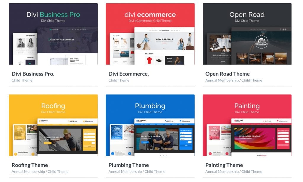
Using a suitable child theme is one of the best things you can do in this regard. In the Divi-sphere, this is a custom WordPress theme that is built on top of a ‘parent’ theme. You can find child themes to fit practically any niche you want, and they will often include functionality and features that are tailored to your needs.
The benefits here are manifold. First, you’ll be able to start on a good footing when designing your website – i.e. some work will have already been done for you. What’s more, you’ll save time creating bespoke functionality, and can get on with the task of developing your website further. Finally, the child theme’s developer will likely be knowledgeable about what your chosen niche requires, so future updates will help to enhance your website further.
How to Use the Divi Builder to Create Your Home Page’s Layout
Once you have a plan in place, you can move onto the fun part – designing your home page’s layout! For this, you’ll need a quality theme. We (of course) recommend Divi, primarily for the powerful built-in Divi Builder:
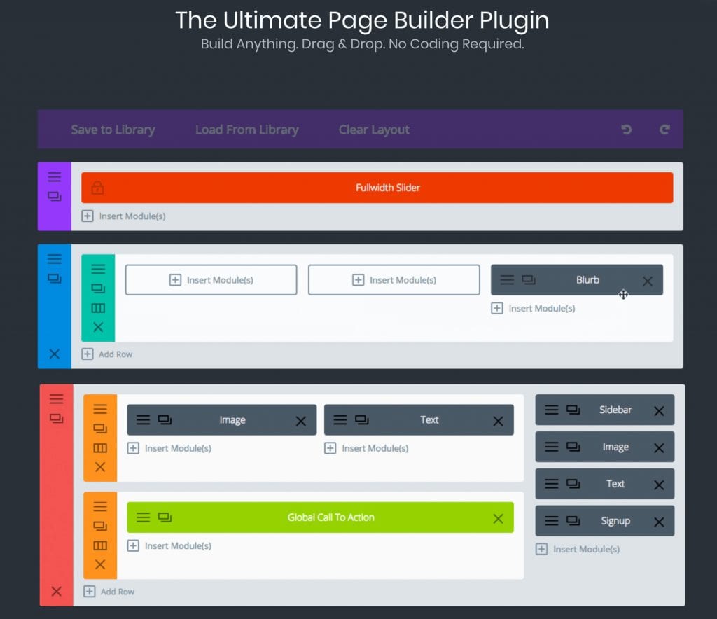
This drag-and-drop page builder enables you to build your layout via ‘modules’, and you can even extend it with some of our third-party plugins. However, the base plugin has much to offer, so let’s delve into how Divi and the Divi Builder can help you.
Your Header and Navigation Options Within Divi
Navigating to Divi > Theme Options in the WordPress dashboard will bring you to a wealth of customization settings. While we want to start from the top down (i.e. with your header), let’s check out the Navigation tab initially:
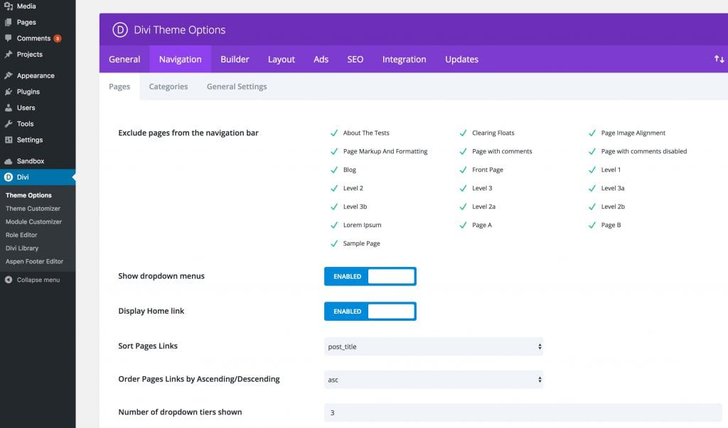
This section enables you to exclude certain pages from your navigation bar, toggle drop-down menus and ‘home’ links, and much more. You’ll find similar options in the Categories sub-tab, and a couple of extra options in the General Settings sub-tab that we recommend leaving disabled for now.
To make more in-depth tweaks to your header and navigation, head to Divi > Theme Customizer within WordPress, which will display your site in the Live Customizer. By clicking on the Header & Navigation section, you’ll be able to micromanage your entire header via various submenus:
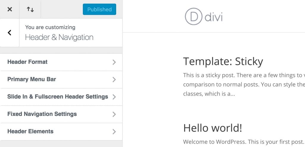
For example, you can choose different options for displaying your header (including a slide-in setting that can be tweaked further to your exact requirements). You can also adjust the height, and display other elements such as social icons and contact details.
As for adding hero elements, this is possible through the Fullwidth Header Module. In fact, the method for adding these is similar to other Divi modules, which will be the way you’ll create your main body layout next.
Creating Your Body, Sidebar, and Footer Layouts
For this you’ll need to fire up the Divi Builder. To do so, head to any post or page and click the Use The Divi Builder button. You’ll see the screen change, and from here you’ll be able to use the modules to create your layout:
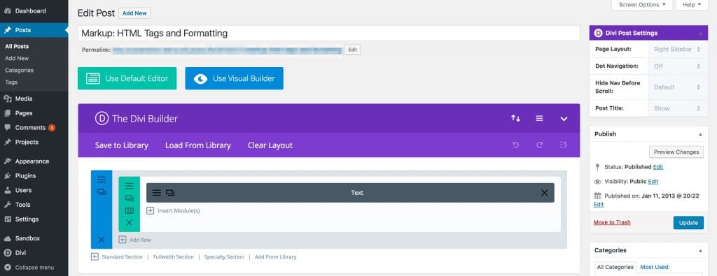
A complete tutorial is beyond the scope of this article, but fortunately we have a great resource for you – the Divi Demo Zone! This will give you a sandbox environment where you can learn all about how to use the Divi Builder like a pro, and create the stylish layout you envisioned initially.
As for your sidebar, Divi’s Theme Options offer you a basic positioning drop-down, and you’ll populate yours the standard WordPress way (i.e. through the Appearance > Widget screen). However, you may not want a sidebar at all. If that’s the case, you won’t find a better tutorial than Elegant Themes’ own take on how to do it!
Finally, rather than repeat ourselves, we’ll simply direct you to our recent piece on creating the ultimate footer – that article will tell you everything you need to know about optimizing the very bottom of your site.
Conclusion
Having a focus for your home page can ultimately enhance traffic numbers, conversion metrics, and overall sales. Therefore, you should spend a considerable amount of time making sure your home page is in tip-top shape, and is ready to receive visitors.
In this article, we’ve discussed what a strong home page design looks like, and what you’ll need to consider before getting to work. Next, we’ve shown you how Divi and Divi Space’s products can help you achieve your aims, all without a line of code or a professional developer.
We want to hear from you!
Do you have any questions about creating a home page layout with Divi? Let us know in the comments section below – we love receiving your feedback!
Thanks for reading

Finally, in explain English. Thanks! BTW your linked piece to footers has broken.
High David
Thanks for this article. I learned a lot from it. Now I understand what I must do to achieve a well-customized Home Page. Do you have tutorials on how to customize other pages and comments?
Hello, it’s an interesting post
I have been following this course https://www.youtube.com/watch?v=mfrEMZw899M about structures or layouts. I think there is something different in the step of “navigation bar”. Is there a model to follow?
Are these instructions valid for themes or for WordPress?
Thanks for the help!