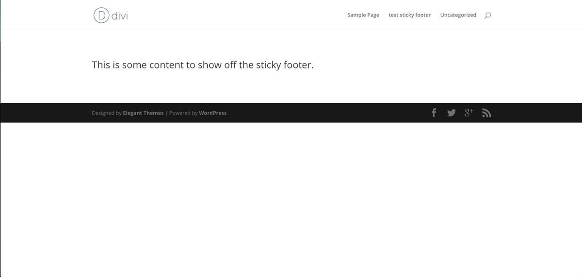
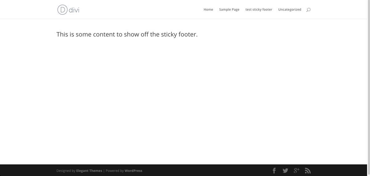
“Content is king” as the saying goes, but sometimes we just don’t have the need to fill up an entire web page full of it. There are many times that we just want to create a page with a paragraph or so of text a small image gallery, or a couple of FAQ’s. This is fine and there is absolutely no problem with it, except your page in Divi can end up looking a little funky and not as professional as you’d like.
The issue is, that without enough content on a page, the bottom of your site will not extend the full height of the computer monitor and will look out of place compared to your other pages.
Now it’s time for the simple solution
Okay so now what I am going to do is provide you with some handy-dandy code to place in your website. After you add this code to the proper section, your footer will extend the full height of the monitor, regardless of how much content you have.
From your dashboard, please navigate to Divi >> Theme Options >> Integration and insert this code in the section marked: “ADD CODE TO THE < BODY > (GOOD FOR TRACKING CODES SUCH AS GOOGLE ANALYTICS)” and Then press ‘SAVE CHANGES’.
Here is the code:
<script>// <![CDATA[var th = jQuery('#top-header').height(); var hh = jQuery('#main-header').height(); var fh = jQuery('#main-footer').height(); var wh = jQuery(window).height(); var ch = wh - (th + hh + fh); jQuery('#main-content').css('min-height', ch);// ]]></script>


Great Article.Works like a Charm
I found a fix that (mostly) worked for me by adding this to my style.css:
#main-footer { height: 275px; }
The actual height of my #main-footer is 300px, but for some reason setting it too close to the actual height still causes the gap. Works in both Chrome and Firefox, desktop and mobile (Android) view for me.
Note though that on IE there’s still a 1px gap on the bottom – better than the large gap before!
… I meant to say, the “CSS-only” solution keeps the footer visible, even on mobile. The original script-solution doesn’t do that, and works much better.
The problem with this solution is that the footer is visible all the time, even on mobile. This can waste a lot of precious screen space. If you implement this solution, be sure to test your site on a mobile device.
Hi Sneader, did you find a solution that works for a large browser on a PC and on a mobile device? When I used this code, content ends up being covered by the sticky footer on a mobile device.
Bluebug, Yes I have built a website with Vertical navigation and even the code didn’t work for me. So, I copy pasted your code, but it didn’t work. Did i miss anything? Is this the complete code or do I need to edit in between those ‘script’ and ‘CDATA’? Sorry, I do not know coding. Thanks.
Naphtali, thanks so much for a quick solution. I had the same trouble with some background showing under footer, but your css solution took care of it. Thanks.
Brilliant!! Thank you.
Just thought I’d add that the sample code doesn’t work for vertical navigation, but it can be modified and then the code is a lot shorter (script and CDATA tags omitted, in case the comments don’t like them) :
var fh = jQuery(‘#main-footer’).height(); var wh = jQuery(window).height(); var ch = wh – fh – 1; jQuery(‘#main-content’).css(‘min-height’, ch);
Don’t ask me why the -1 is necessary, but I found it is…
Awesome solutions, thank you very much!
That works great, thanks! better than the CSS-version (below) where the footer isn’t pushed down on pages with more content.
Thank you, you are Awesome!
Thank you so much! I’ve seen so many solutions for this, but yours was, by far, the easiest and quickest.
Naphtali thank you for the shortest best solution.
Here is a simple CSS-Only solution.
Go to Dashboard > Divi > Theme Options > Custom CSS, and enter this CSS.
#main-footer{
position: fixed;
width: 100%;
bottom: 0;
}
not fixed, but absolute, and put in a code module on the page:
#main-footer {
position: absolute;
bottom: 0;
width: 100%;
}
Works perfectly – and looks much better than trying to anchor with CSS – THANK YOU!
I noticed it didn’t change when resizing the browser, so I made a slight modification. Thanks for sharing!
//
Just saw that the code didn’t paste (makes sense). I put it here: https://codepad.co/snippet/ejwPlIS4
Works great. Just remember to flush/clear cache if you’re using it on your site, for the code to start working 😉
Tnx.
This is exactly what I was looking for. Thanks so much.
Awesome! I was searching for that. Thank you very much.
Hey folks (and Cory), I just found this: https://gist.github.com/CoachBirgit/7980bd2e0d8b34e56dd0 in GitHub and so far it’s working great for me. I followed CoryTrevor’s advice and didn’t set the height.
Great quick fix – thanks
Our pleasure 🙂
I love you!
Hi, this didnt work for me for some reason. Has this been updated for the latest Divi? Thanks
Thank you for this, Cory.
did anyone figure out how to remove the left space at the bottom. (same issue as rcard)
Hi Howard,
We have not looked into that but please post an update here if you find a solution, thanks!
+1 to ‘rcards’ same issue, leaves about 1″ or more below the footer.
This only happens on a handful of sites and I am not sure why… on all of our dev sites the code works perfectly
I added the code as indicated and the footer now sticks closer to the bottom of my screen, but it still leaves some of the background showing towards the bottom of the screen. I am using Aspen Grove’s Cafe Child Theme for Divi – the newest version of WP, WC, DIvi and Cafe child theme. I have tried this using multiple desktop browsers on multiple machines (retina and regular displays) – there always seems to be about an inch of the background showing under the footer now…much better, but how can this footer STICK to the BOTTOM of the browser window, when the page does not fill up the screen?
Hello Randall,
I have responded to your support ticket. I was going to post the solution here as well, but the code is not displaying in the comment field. Will have to figure that out :-/
Excellent quick tip! This is one of my pet peeves in Divi/Extra. Great job on the site revamp too!
Thanks Carlo!