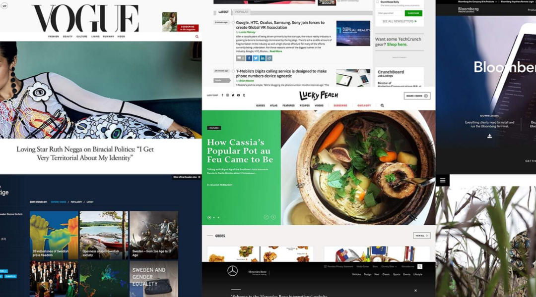
WordPress started as a simple blogging platform. The idea wasn’t to create a website, but instead to create a content management system – a system that would display your content, sorted from newest to oldest, without you having to rebuild the web page every time you published an article. It was a blog- which is short for web log.
Since then, WordPress has grown into a complete website-building platform- both from the features built into the WordPress core and the plugins that expand its functionality. With plugins such as Easy Digital Downloads and WooCommerce you can create an online retail store. With plugins such as LifterLMS you can create an online school. With themes such as Divi or plugins such as Elementor and Beaver Builder you can build any type of layout you want. New features can be added with plugins or code.
There’s no end in sight. Nearly 30% of all websites run on WordPress.
Examples of WordPress Websites
Here are a few examples of amazing WordPress websites that push the boundaries and break the mold when it comes to form and function. Most use custom themes and you wouldn’t know they’re made with WordPress just by looking at them. The websites are in no particular order.
1. The Walt Disney Company

Disney uses WordPress to showcase their brands and to show their various types of content, services, and products. It provides information for investors and job-seekers.
2. The Obama Foundation

The Obama Foundation uses an interesting vertical navigation menu that opens on hover. It includes primary navigation, a donation box, an email opt-in form, social follow icons, and a footer menu- all within the vertical popup menu.
3. Chicago Sun Times

This one uses a simple newspaper layout that’s easy to use and navigate. Although there is a lot of content, it’s easy to follow and isn’t cluttered. Navigation separates the categories, creating a large menu but one that’s easy to use.
4. BBC America

BBC America showcases their video content, separating them into episodes and movies. Navigation opens on click and includes a slider. Shows are displayed within lists with links to watch. Navigate by show or by episodes.
5. Bedford Hotel

The site uses the Reload theme with custom forms to book your stay. It also uses custom post types and custom taxonomies. Each of the primary areas of the site is displayed on the homepage in full-width sections.
6. Bloomberg Professional

This site features a simple and elegant layout that focuses on services. It also displays the latest blog posts with large images and short excerpts. It uses a mega menu and the top and a secondary menu under the hero image.
7. TechCrunch

This one creates an elegant magazine layout with a unique timeline that ties the latest posts together, displaying their time of publication and category. Navigation separates content into major categories.
8. Nicholls State University

This one is a multisite installation that uses other web apps such as SASS, Suzy, and open source software to create the school website. It includes an events calendar, sliders to provide informational videos, and several types of navigation.
9. Brian Smith

This is a photography portfolio site to showcase the various types of photography by Brian Smith. It includes several galleries, blog with sidebar, links to books, a gear guide, itinerary, and more. Even though there’s a lot of content, the site is clean and navigation is simple.
10. Best Buy Stores

Best Buy uses WordPress MU to power over 1050 local store blogs to provide store location information, information about events, announcements, etc. It aggregates store data to feed enterprise apps. They also use Microformats, RDFa, and RDF.
11. Huston Zoo

This one has a multi-column layout with images and text overlays to link to every element of the website. Pages include galleries, videos, a multi-layout blog, ticket purchasing, donation systems, and lots more.
12. Glad

Glad uses a boxed design with a curtain menu. Each of the images provide links to pages. Recipes are provided as posts with the recipe page using cards as links. Its mega menu is simplified and separates the links into categories.
13. Vogue India

This one has a magazine layout with sticky menu after scroll. It also includes a side menu, providing lots of navigation options. The latest posts are displayed in cards with their categories in a multi-column layout.
Ending Thoughts
As you can see by these examples, and with thousands of themes and plugins available, WordPress is an excellent platform for building any kind of website you need. These websites are also a great source of inspiration.
We want to hear from you. Which is these WordPress websites is your favorite? Let us know in the comments.


I have been using WordPress from the last 7-8 years and didn’t know that The Walt Disney Company also had their website on WordPress. I am glad indeed to see one of my favorite companies on this list. Thanks for making me aware Randy.