Monarch and Bloom are two popular plugins from Elegant Themes that are included with the ET membership. They work with or without Divi or Extra and provide professionally designed social buttons and opt-in forms. They’re popular and we usually see them in the standard locations you’d expect on a website. In the article, we’ll take a look at 5 ways to use Monarch and Bloom that are easy to use but not as popular as other methods.
What is Monarch and Bloom?
Let’s take a quick look at what Monarch and Bloom actually are.
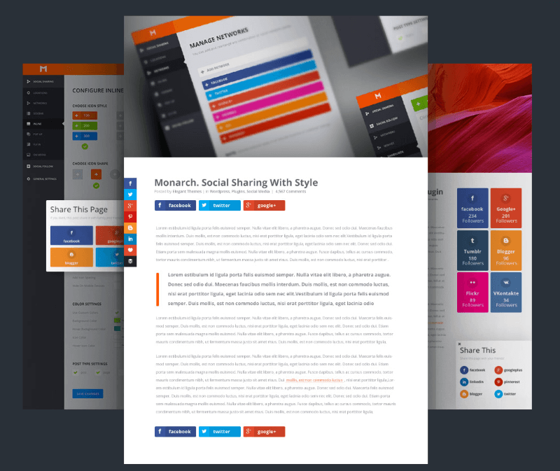
Monarch provides social sharing and social follow buttons and was designed to improve both. Choose the design you prefer and place them in multiple locations on your website. Place them on the side of the page, within the content, on media, within widgets, as a popup, or as a fly in. Choose from multiple styles and shapes, choose display options, customize the colors, and choose the post types that display them.
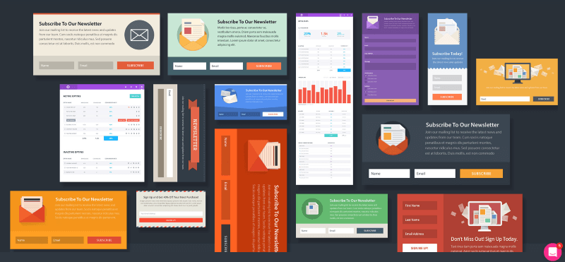
Bloom is an email opt-in plugin with built-in templates that you can use or you can customize your own. Choose from multiple newsletter providers, create multiple forms, perform a/b testing, display the form as a popup, inline, fly in, below the content, within a widget, and use it to unlock content. Choose your trigger such as time delay, the bottom of the post, after scrolling, after commenting, after purchasing, or after inactivity.
1. Monarch Social Sharing Fly In
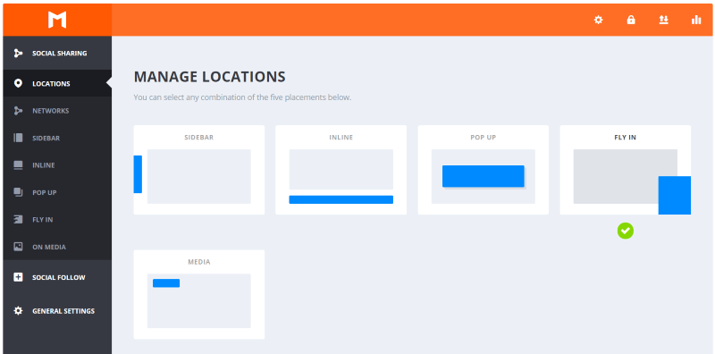
Go to the Monarch menu (in the dashboard, go to Tools>Monarch Settings). Here you’ll find Social Sharing and Social Follow. In the Social Sharing Locations tab you can create five different ways to use Monarch’s sharing buttons. In the Social Sharing Locations tab, click the icon under Fly In (it appears on hover).
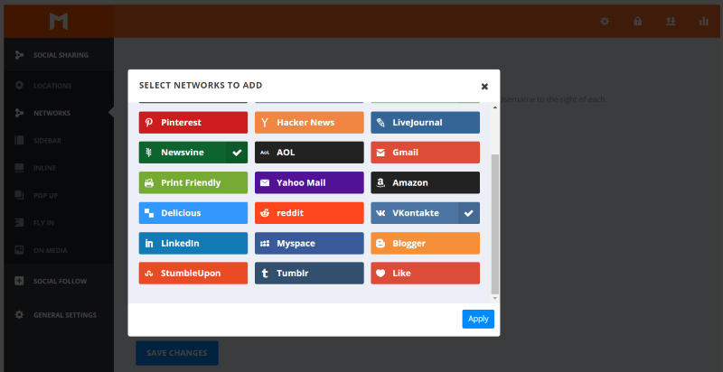
Select the Networks tab under Social Sharing to choose which networks will display.
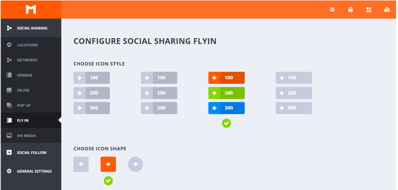
Click the Fly In tab under Social Sharing. Here you can choose your icon style and shape, and choose how it displays.

Scroll down and add a title and message that the icons will display.
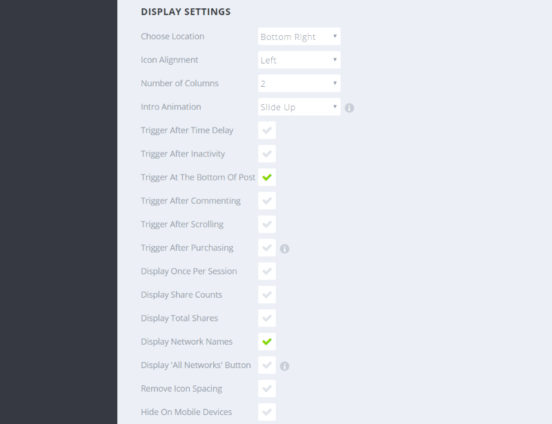
Next, choose your display settings. Choose the location, icon alignment, number of columns, animation, trigger, display options, etc. Triggers include time, activity, when the reader reaches the bottom of the post, after they comment, or after they make a purchase. Display the share counts, total shares, network names, the ‘All Networks’ button, remove icon spacing, and hide on mobile.

You can choose to customize it with your own colors. Adjust the background, hover background, icon, and hover icon colors.

Choose the post types that will display the fly in. Choose from the home page, posts, pages, and projects.
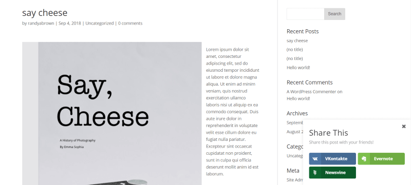
I’ve set the fly in to appear in the bottom right corner, where it’s displaying the three social networks that I chose from the list.
2. Monarch Social Sharing Media
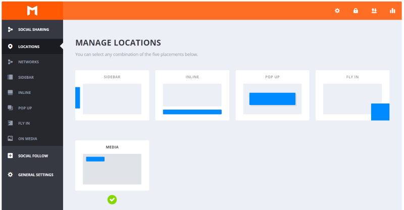
Go back to the Monarch Social Sharing screen and select Media.
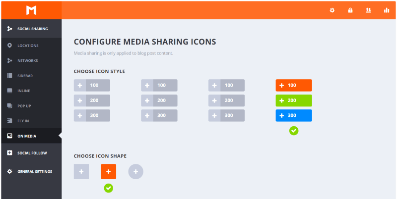
Select On Media in the Social Sharing tab and choose your icon style and icon shape.
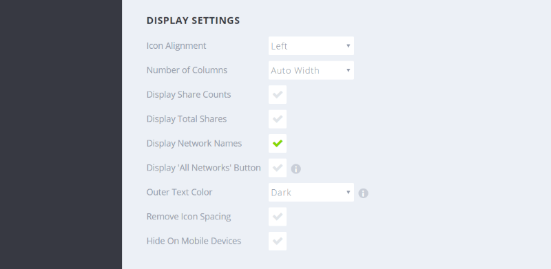
Scroll down and choose the Display Settings. Here you can choose a left or centered alignment, the number of columns (up to 6), and display the share counts, total shares, network names, the ‘All Networks’ button, the outer text color (dark or light), remove the icon spacing, and hide on mobile.

Enable Use Custom Colors and select your background, hover background, icon, and hover icon colors.

Select the post types you want the buttons to display on. Choose between post and project.
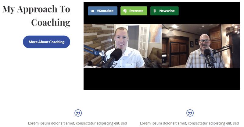
The social sharing buttons appear on the media on hover.
3. Monarch Social Follow Shortcode
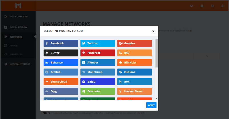
In the Monarch Social Follow tab, select Networks and choose the social networks you want to include.
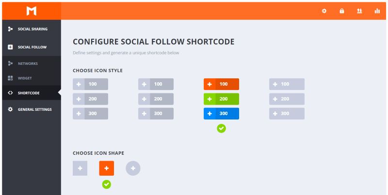
In the Monarch menu, select the Social Follow tab and click Shortcode. Select your icon style and shape.
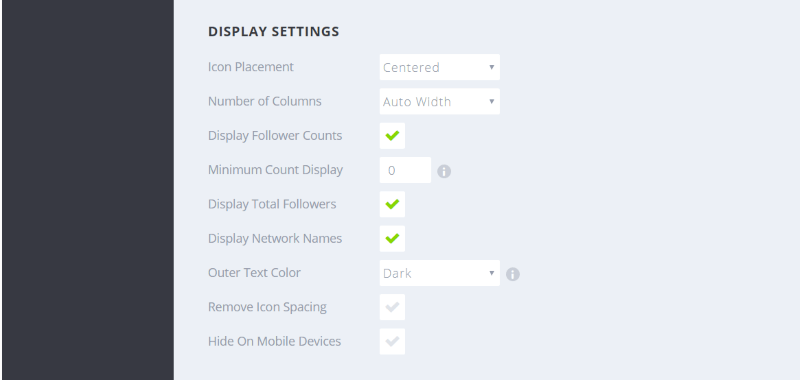
Scroll down to see the Display Settings. Choose the icon placement (centered or left, the number of columns (up to 6), display the follower counts, minimum count display, total followers, network names, outer text color (light or dark), remove the icon spacing, and hide on mobile.

Enable the color settings if you want to customize the colors. Choose the background color, hover background, icon, and hover icon color.

When you’re finished with your settings, click the Generate Shortcode button and copy the shortcode to place it within your content.

Place your shortcode anywhere you want in your content. I’ve added it to a Divi text module.

I’ve added the shortcode to a Divi layout. It now shows the follow buttons that I selected.
4. Bloom Popup

Create a new opt-in and select Pop Up. Create the opt-in’s setup and design as normal.
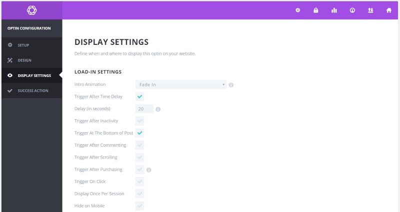
The Display Settings screen is where you’ll design how the popup works. The Pop Up opt-in does not require a shortcode. It works according to the display settings. The Load-In Settings determines the intro animation and trigger. Most trigger options have a delay option. Choose between time, inactivity, when the user reaches the bottom of the post, after they make a comment, after scrolling, after they make a purchase, or when they click something. You can also have it to only display once per session, hide it on mobile, and to automatically close after they’ve subscribed.
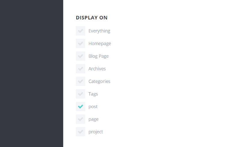
Choose on which content it displays. You can display it on everything, only the homepage, blog page, archives, categories, tags, posts, pages, and projects.
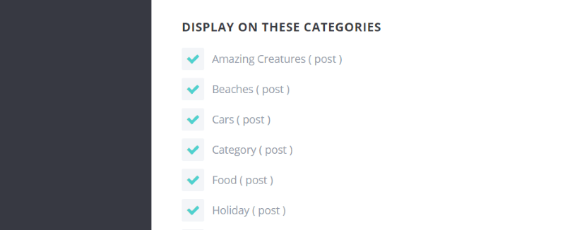
If you choose to display it on categories, you can choose which categories to include or exclude. They’re all enabled by default.
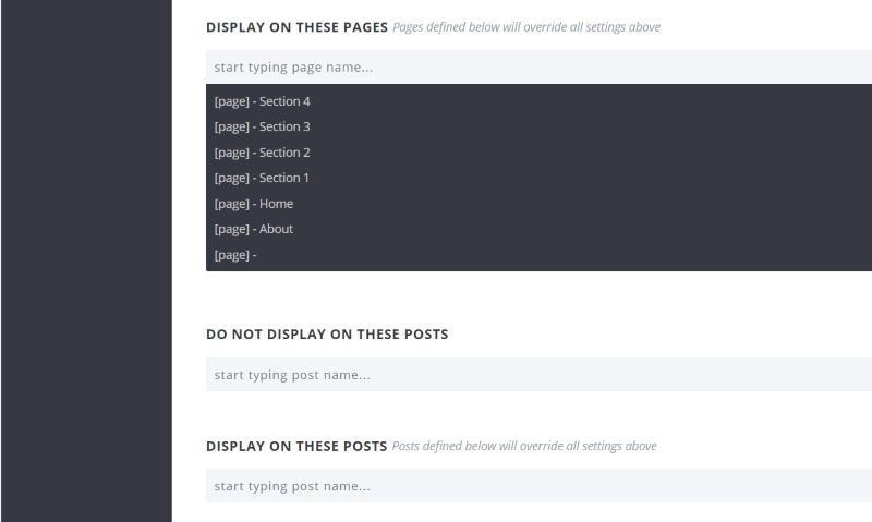
You can also enter the pages that it will display on and the posts it will or not display on.
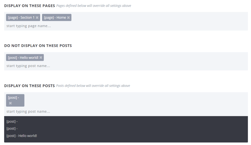
You can add to the list or remove them one at a time.

Choose the action type between a success message and redirecting to a URL.
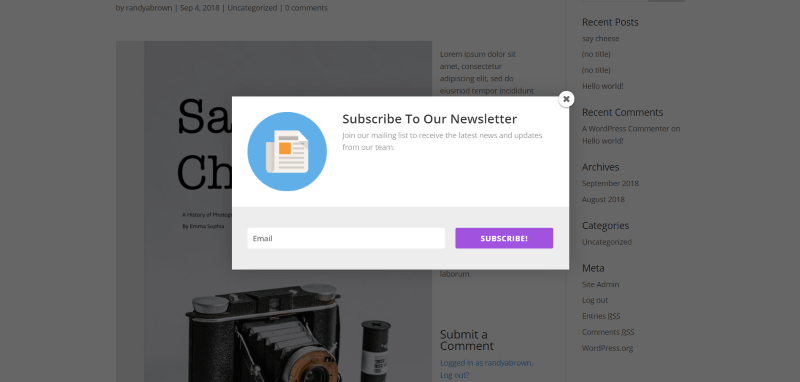
The popup works automatically on the pages, posts, etc., that you set it up for.
5. Bloom Locked Content
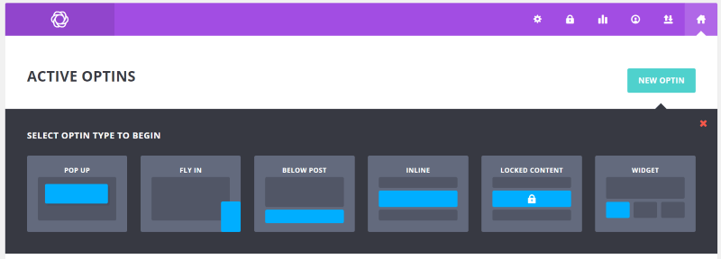
This requires someone to subscribe before they can have access to specific content. Create a new opt-in and select Locked Content.
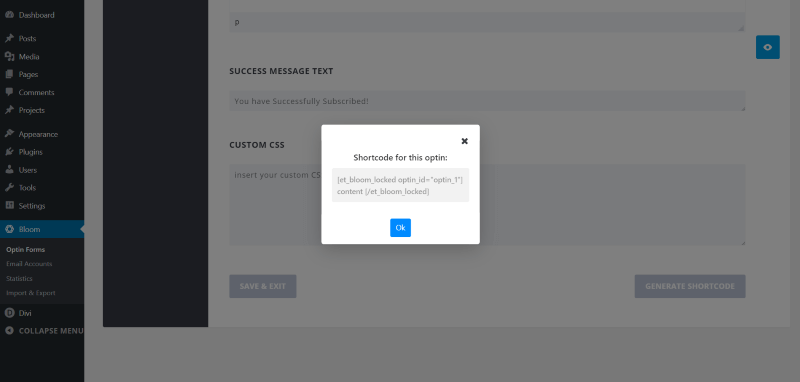
Create the opt-in as normal and generate the shortcode.
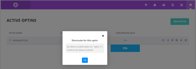
You can also generate the shortcode in the Active Optins list by selecting the brackets for the opt-in.
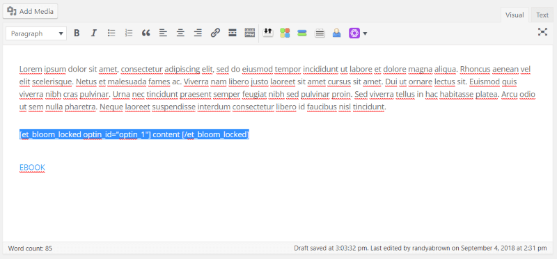
Paste the shortcode within your content. The shortcode is in two parts: the first half goes before the content you want to lock and the second half goes after the content you want to lock. Replace the word content with the actual content.
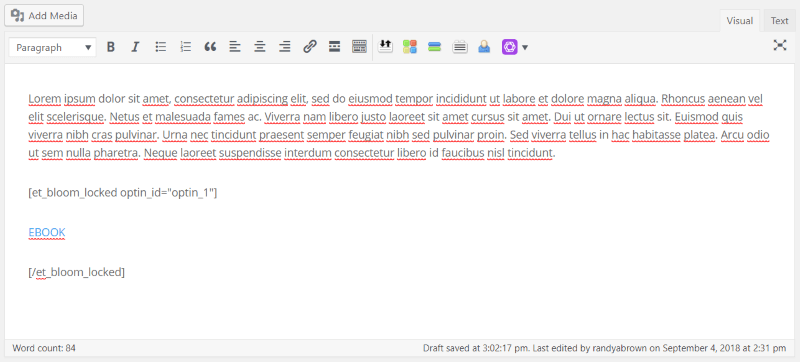
Now the download link will be locked. This content can be any type of media, a download link, text, video, etc.
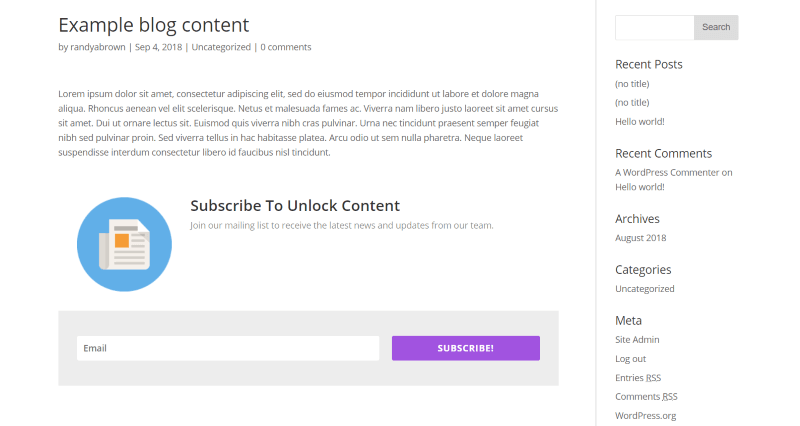
It displays the form instead of the content.

Subscribing removes the opt-in form and reveals the content that you placed within the shortcode’s brackets.
Ending Thoughts
That’s our look at 5 ways to use Monarch and Bloom. Both products are highly intuitive and do their job well. They offer lots of features designed specifically to improve interaction with your website. There are lots of ways to use them. These five are not used as often, but all 5 are excellent ways to improve to improve social follows, shares, and opt-ins.
Do you utilize any of these 5 ways to use Monarch or Bloom? Let us know about your experience in the comments.

We don’t have the Success Action tab on our Bloom pop-ups. Is there something we are missing? We’re attempting to add a “Thank You” page after people sign up
I think you can accomplish this by choosing Redirect to URL instead of Locked Content, then redirect to a noindexed thank you page which also contains the download.
By the way @Randy, great article! Somehow I didn’t realize that you could add social sharing buttons on media… now I just really wish they’d add Pinterest!
Can Bloom lock multiple pages at once with a single shortcode? This would allow a user to enter a section of the site on multiple pages but once they have subscribed all the pages would be open.
Thanks for sharing information on shortcode services. I really appreciate it
There’s no shortcode function for the Monarch sharing feature so precise placement is impossible.
On the locked content — what if a person is already subscribed? how does that work?
Great options. Wish the locked content had option to require sharing instead of only subscribing. People are more open to share vs. subscribing to a newsletter.
I really like the “Pay With A Like” plugin from WPMU DEV. It has several options to do what you’d like. Not sure if there if a free version of it though…
Good post. Some of these ways I was not aware of.
Will try #5 for a new client now. Thanks.
Great article! Thank you. I do have a question though. I’m trying to find out how to display the Monarch share feature on mobile but don’t want it to initially be stretched across the bottom of the screen. I want it to be in the closed position in the lower left corner until the user clicks it to open. Do you or anyone there know how to achieve this??? Much thanks