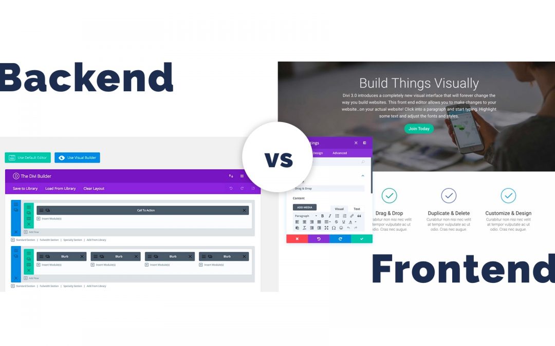
Divi started as a backend builder. This is known as the Divi Builder and includes modules that you drag and drop where you want them, but you can’t see what the page will look like as you build it. Many other building platforms let you create your layout from the frontend, allowing you to easily see what your layout looks like as you build.
Rather than converting the Divi Builder from a backend builder to a frontend builder Elegant Themes added a frontend builder to Divi, called the Visual Builder, making Divi both a backend and a frontend building platform so you have your choice. Both are excellent for building websites. So, how do you choose between the two? In this article, we’ll help you decide by discussing the backend vs frontend and the advantages of each.
Divi Builder: Backend
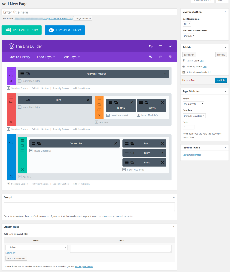
This is the Divi Builder creating a new Page. The Divi Builder backend gives you access to the normal (until Gutenberg completely takes over) backend elements such as excerpts, custom fields, publishing, page attributes (choose a parent page, choose a standard template or blank template, and set the page order), and featured image. You can add discussion, slug, and author options in the screen options. It also gives you a few Divi page settings such as dot navigation and hide nav before scroll.
You can save to library, load from library, clear your layout, and perform all of the Divi Builder functions to add standard sections, fullwidth sections, specialty sections, adding from the library, and all of the customizations with sections, rows, and modules.
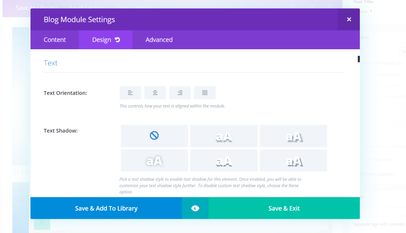
You can adjust all of the settings within the sections, rows, and modules, save them to the library, and preview them before saving the page.
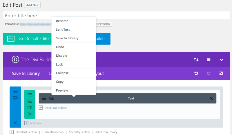
Right-click on any section, row, or module to see more options.
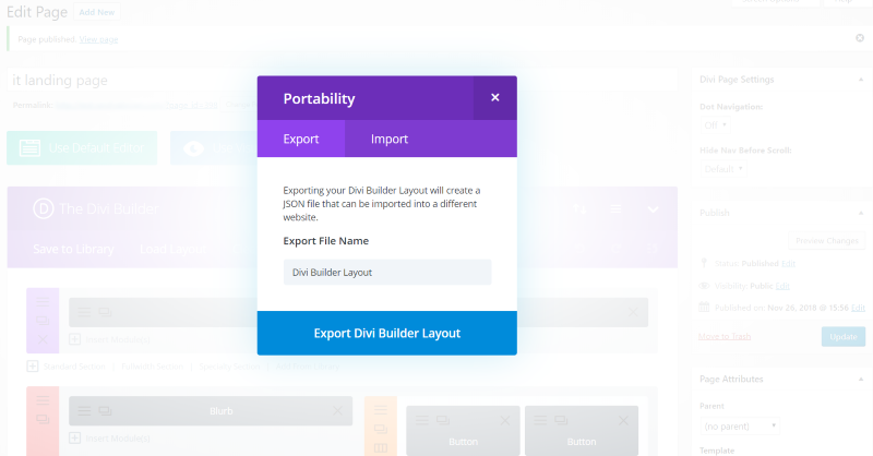
We have access to the portability tool where you can import or export layouts.
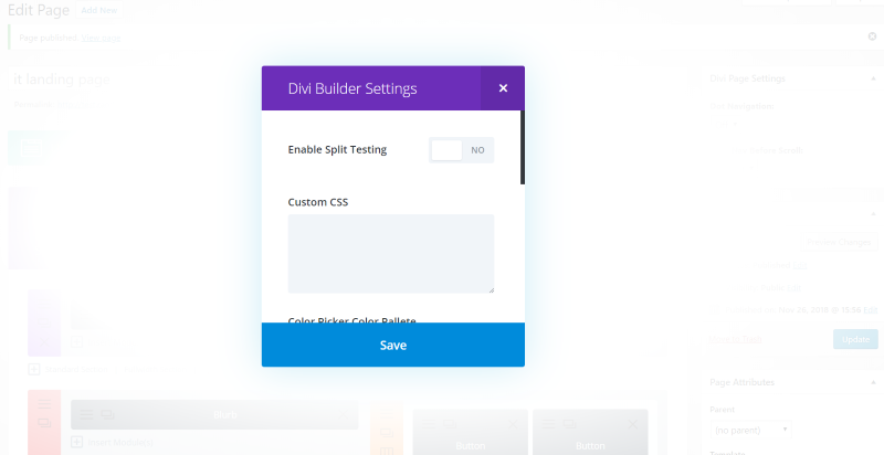
Divi Builder settings let you enable split testing, add custom CSS to the page, select a page background color, set the gutter width, choose the light and dark text colors, set the content area background color, the section background color, and enable static CSS file generation.
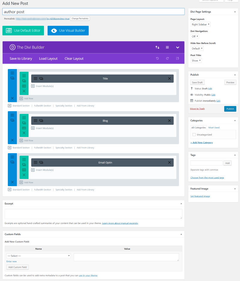
Here’s the Divi Builder creating a new Post. It includes the Divi page settings with layout options (choose from right sidebar, left sidebar, no sidebar, or fullwidth), dot navigation, hide navigation before scroll, and show or hide the post title. It also includes publish options, categories, tags, and featured image.
Divi Builder: Frontend

The Divi Visual builder lets you see the page design as it fits within your website’s design, including the header, footer, and sidebars, and on the screen. Make your customizations and see them live. All of the section, row, and module customizations are here.
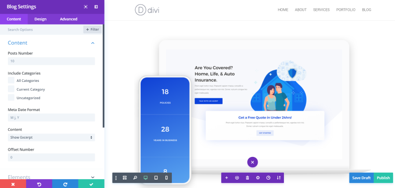
A list of tools across the bottom in the center provides many of the tools you’d find in the backend builder. Load or save to the library, clear the layout, adjust the page settings, see the revision history, and use the portability tool. You can also save the page if it’s been published already, or save the draft or publish the post if it hasn’t been published.
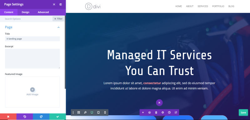
Page settings let you edit the title, excerpt, featured image, add a background, perform split testing, adjust the color palette, spacing, and text, add custom CSS, and enable static CSS file generation. It does not include dot nav, hide nav before scroll, keywords, and page attributes.
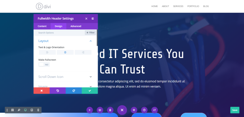
You can change the size of the settings window, move it around, or lock it in place.
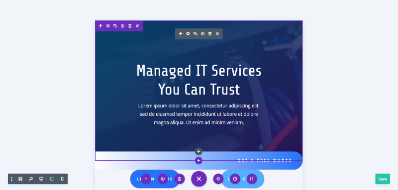
You can see it in three screen sizes: desktop, tablet, and phone. Here’s the tablet view.
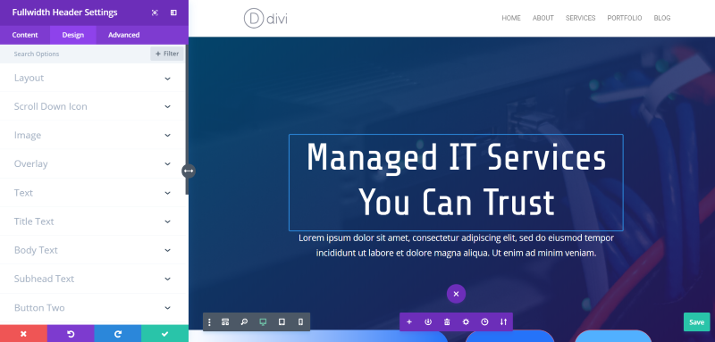
As you mouse over the section options, the elements on the page that those options correspond to are highlighted. In this example, my mouse is hovering over Title Text (the mouse doesn’t show in the screen capture). The design options are organized in tabs so you can open and see only the options you want.
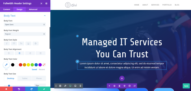
If you click on the brush that appears over the element, the module’s settings will open to that element’s options. In this example, I clicked on the Body Text, which opened the Body Text customizations.
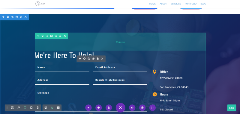
Add padding by dragging the edge of a section, row, or module.
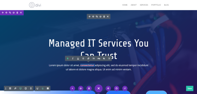
Adjust text by selecting it and then make your customizations from the text-tool.

The Visual Builder adds a feature to search the options and filter them. In this example, I searched for Link. It opened every option for this module that customizes links. The filter lets me choose the type of style I’m looking for.
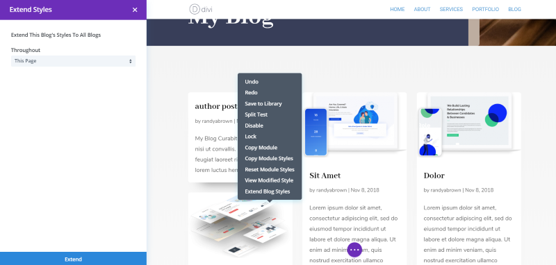
Fluid styling makes it easy to copy and paste, find and replace, and extend styles. This means you can customize one module and quickly extend the styling to the entire page.
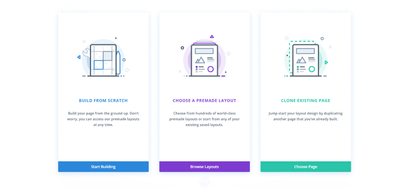
When you create a new page or post with the backend builder, you can load any layout you want or just start creating the layout manually. The frontend has creation workflows which present you with three options to help you get started. One of the best advantages here is you can clone an existing page.
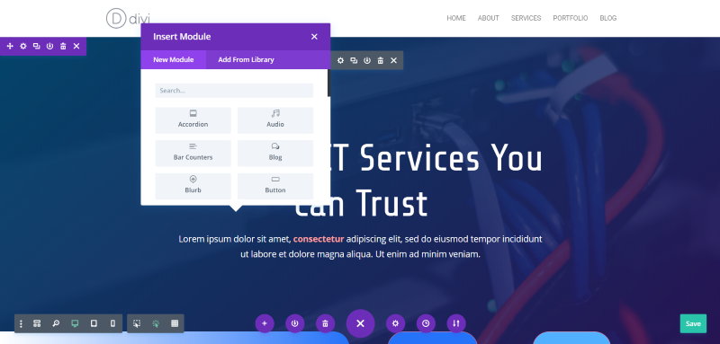
When you’re adding new modules to your layout, you can search for them instead of scrolling and hunting.
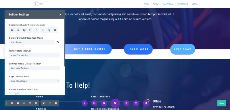
Builder Settings let you choose the features you see and how you interact with them. Add new tools to the view options, choose the interaction mode, history state interval, the default location for the settings modal, page creation flow, interface animations, the opacity of disabled modules, grouping settings into closed modules, and to add placeholder content.
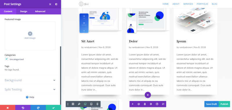
The Post settings include categories and tags. It does not allow you to hide the title or choose sidebar options.
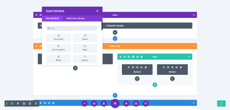
View the layout in a wireframe mode that mimics the backend builder. All of the Divi Builder tools are here. Open or close the sections, rows, and modules. Drag and drop, add elements, etc., but they have the advanced features of the Visual Builder.
Ending Thoughts
I like the approach that Elegant Themes took with the Divi Builder. Rather than staying with just a backend builder, or changing from a backend builder to a frontend builder, they gave us both. Having both the backend and frontend building options lets us design the way we want to, and both have their advantages.
Divi Builder Advantages – perhaps the main advantage of the backend builder is that all of the main settings are visible at the same time. All of the elements are visible so you can easily drag and drop, clone, open the settings, etc., from the intuitive builder. The page or post settings are also visible. It’s a great choice for working within the WordPress environment.
Divi Visual Builder Advantages – probably the greatest advantage of the frontend builder is you can see your layout as you build and customize it. It has most of the features you’d find in the backend builder. The publishing options, such as changing the date or scheduling the post, are not available. Some design choices, such as hiding the title or selecting the sidebar layout, will have to be selected from the backend. It has more styling options and it’s powered by React, so it’s crazy fast.
Elegant Themes has put a lot of work into the Visual Builder. There used to be more advantages to the backend builder, but that gap has continued to close as Elegant Themes continues to add new features to the frontend builder.
For example, at first the Visual Builder wasn’t compatible with third-party plugins, so we were forced to use the backend builder when we used them within a layout. Now, the Visual Builder works with them just fine. Also, it didn’t have a wireframe view, but now we can see the modules within the rows and sections just like we do from the backend. It’s now possible to do practically all of the work from the frontend.
Choosing between them really comes down to how you like to see the work as you create it. If you want to see the WordPress-based design area with the Divi Builder within it, then choose the Divi Builder. If you want to see the Divi-based layout and see the design in real time, then choose the Visual Builder. The most recent improvements are for the Visual Builder only, giving it the edge and speeding up your design-time.
Which Divi Builder do you prefer between the backend and frontend? Let us know in the comments.

There is a setting in Divi Options to revert to the Classic Divi Builder
It seems with the latest update, I don’t have the option to use the Backend Builder. It’s gone! I only used the Frontend Builder on occasion–for some quick changes. If I’m stuck with just the Frontend Builder, then I’ll jump to another theme. I imagine that jump won’t be fun because of all the shortcode involved. I got a message into Elegant Themes asking them what happened to my Backend Builder. The frontend is quirky and it has done some weird stuff that required me to reinstall a backup.
Val, if you haven’t heard elsewhere…the Backend Builder is still there, but you have to switch it on in Divi Theme Options on the Builder Tab > Advanced, then switch on Enable Classic Editor.
I’m an avid user of Divi and have been for several years, but the VB is just crap. It’s flaky and it’s an enormous resource pig and every update seems to break stuff.
I’m currently waiting a month or more on deploying each new Divi upgrade until I can see what crap everyone’s experiencing.
Elegant Themes is really in the process of destroying what was once a clean elegant product…
I agree with Chris in every single point! Same here…
And I prefer the backend. VB only for little corrections, never for the big and basic design and layout matters.
Since some weeks I have big technical difficulties in all my Divi websites (about 20) which is extremely frustrating. But I’m still waiting for any reaction to my questions in the ET help center! This is quite disgusting, as I am a lifetime member as well.
I’m am old school guy when it comes to the back-end builder with the exception of dealing with padding and margins. This, to me, is where the visual builder shines. I’ve experimented with Gutenberg a bit and in the end, I raced over an got the current editor plugin because I truly am a die-hard Divi builder at this point with my entire portfolio of sites being Divi based and growing.
Great article! Till today i´m not using the visual builder. Well, only if i need some features that aren´t available in the backend version. The main reason is that i´m able to handle sections for desktop and mobile. With the VB it´s really challenging because of overlapping sections etc. All the other stuff is pure css in the backend. To be honest. The features of Divi are really great. But for me it´s more simple to stick to the main features. Might be because i´m using Divi for years and i´m used to the old standard.
I would appreciate a smaller (lightweight) version of Divi with a better page load speed. Without any page load plugin like wp-rocket divi is horrible in loading time. But i think this is not really an issue for ET.
I´ll stick to Divi. All my projects are based on it and i know every part of it. And pageload etc. is something you can fix with cleaner code and some help from other plugins.
I have always preferred the BEB for laying out page structure and the FEVB for styling and find tuning especially when sorting out mobile issues. For me though there are two big problems with ET’s current approach.
Firstly in the highly likely event that you are using 3rd modules – the FEVB is unlikely to work. Yes i know it’s down to the 3rd party devs but at least provide full functionality in the BEB.
Which leads me onto the second point. The move to adding new functionality only to the FEVB means those of us that use 3rd party modules are kinda SOL.
I await with some interest the “new” BEB to see if it really does address these problems. Divi has been successful in part because of of the 3rd party developer ecosystem. Cutting them and their customers off at the knees may not be the best idea in a world of Oxygen, Beaver, Elementor et al.
Conflicted?
ET seems to be headed toward the Visual Builder (VB) and away from the Back End (BE) builder. What is difficult and confusing is that, as you point out, some features are only available in one or the other. Hover options, so far as I can tell, are only available in the VB. Broader page options are only available in the BE.
VB can be flaky. Poll a user group and it will become apparent that VB has issues. Lately, the BE is been quirky. All of this is part of development, but sometimes I wonder who ET sees as their target user. If inexperienced users are introduced to Divi, a fast ramp up to creating or editing a basic web page just doesn’t happen. That’s fine if the goal is to sell lifetime licenses to web designers. If ET wants mass appeal, Divi will have to be improved considerably.
Divi has a lot of good core features. I give them a solid B grade there. Configuring modules, rows, and sections can be very esoteric. I’ve spent an hour or more trying to find something as simple as a border in one of their pre-built layouts. Is it a border? Is it a background? Is it part of the row? Section? Part of the uploaded image? Would be nice to find a way to identify all things impacted in a single element. Like reading CSS, would be nice to have something similar to the inspector that would show how something is built and how it fits in a hirearchy of settings.
I bought Divi because I maintain 10 websites of my own. The goal was to standardize without having all the sites look the same. Having a lifetime Divi membership made sense. If someone is relatively new to creating web pages, and if they have a single site to build, I think it would be easier to buy a good theme that is pretty close to what the end look should be.
Finally, as for “crazy fast”, that isn’t my experience. After posting in a user group that my experience was slow and tedious, I got a split reaction. About half blamed me for having a bad host (I don’t) or having an out-of-date version of PHP (I don’t) or a plugin that crippled the performance. The other half confirmed having a similar laggy performance. Whenever some stated their issues, the ‘group’ jumped on them for being flawed. That tells me there is something there. I don’t think it’s my host but it could be my ISP or something outside of my immediate control. The only support response I can get is “disable all plugins”. That makes sense because plugins are a constant source of grief with Divi.
My conclusion is that Divi is an acceptable product if you want to standardize your development process and you have the experience to work around the issues. Otherwise, run in the opposite direction. Consider this one thing. If you build a page, have it for several months and decide to change the layout, you’re in for a ton of work because Divi has no way that I can find to change layouts without redoing everything. Other themes are fairly easy to swap out, but not so with Divi. The other flaws are pretty major (no standard blog page, no standard footers, type management is weak, color management is convoluted).
I’m staying with Divi because it would take months to redo everything. And, I’ve paid for it.
Dude! Nail on the head for sure. I couldn’t have said it better myself. And I’m probably one of those that got jumped on when I submitted my disgruntled claim to a FB group after updating Divi to only have it break something that had been working for over a year. Must have been affiliates attacking lol. After several support emails, ET finally admitted it was a bug. I’m not going to rehash what you mentioned because you pretty much touched on every point. I agree on the preloaded layouts. If you load one and need to change colors or text, you have to change every page/element. It may have been easy to produce by them just duplicating/clone pages, but having to change every little button hover, border color, divider, etc is a pain. Mind as well build from scratch. VB has lots of issues and it a resource hog. I’ve had it lock up and lose my whole layout before. BE has done the same, but I like seeing all the options even if I have to scroll versus having to resize a sidebar every time and go through a bunch of collapsible menus which is just as time consuming. I also have not seen my workflow increase (maybe for the ET design layout team) either. The copy module styles also seems to be flaky as I’ve seen it duplicate random stuff and screw up the new modules as well. Of course everything works flawlessly when you work on a local server like ET does when designing.
Great post – I feel you touch on a lot of issues I have stumbled on myself recently. We use Divi as our standard WP theme for our company as we try to standardize the process and won´t be left with dozens of various licenses and plugins to deal with. In that area Divi is great – lifetime license for unlimited projects.
However – all the tedious work in regards to conflicting plugins, the lack of blog customization, headers and footers etc (i know they are working on this with their upcoming theme builder) – it makes managing pages, especially larger projects, quite challenging at times. I´ve tried looking at other builders and themes, but i feel there are so many advantages with some of Divi´s features that i cant live without, like the cloning of pages, color tools, importing/exporting layouts, premade pages, etc…
Do you have any experience with some other builders and themes that could replace some of Divi´s great functionalities? Have you tried Elementor or Oxygen 2.0?
Thank you for your comments. It often seems like we are supposed to be positive only despite being the customer in the transaction.
The recent updates generally improve things in my opinion. Don’t know if the improvements were driven by the WordPress update to 5.X or ET’s desire to improve.
I wish they (ET) would offer sections or sets of sections as part of the Divi Library. I would much rather assemble a page using pre-formatted sections rather than massive layouts with lots of pieces I do not want. And, I would like to be able to switch layouts ‘on-the-fly’ rather than having to redo everything should I change look. Changing the look of a site is a huge undertaking.
Again, thank you for commenting.
Concur. My initial search term was could I do one page with VB and another page with the BE. So far haven’t been able to get a definitive answer. If anyone can throw some light on that it would be appreciated.
Thanks